Home › Forums › Sign Making Discussions › Gallery › biker signs – feedback/comments wanted?
-
biker signs – feedback/comments wanted?
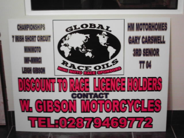
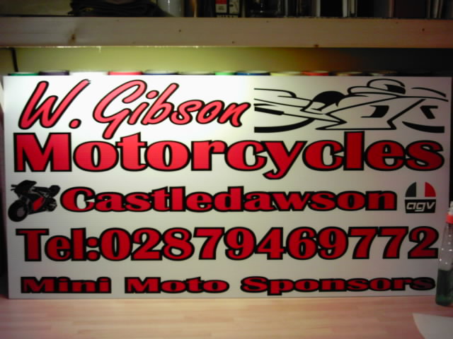
Posted by Craig Gibson on 10 February 2005 at 20:53couple o signs feedback wanted although i just did as i was told 🙄
Attachments:
 Craig Gibson replied 20 years, 10 months ago 5 Members · 5 Replies
 -
5 Replies
-

If you did exactly as asked there’s not much to be said.
However, both signs look a bit crowded. Some space around things wouldn’t have gone amiss. Also, avoid using black and red together (touching) as they tend to look a bit messy. Especially on the second sign.
Text size isn’t the be all and end all of a legible sign, these would have been much easier on the eye with smaller text all round. -

I’ll second that Mr Big!
No visual spaces to separate everything out.
Black outlines should be used for the MAIN text only, all sub text should only be one colour for easy reading.
-

Agree with Big G lettering as a guide covers about 75% of the area leave space around the edges.
There is a book you can buy that will tell you the best layout designs for best impact and pleasing to the eye for layout.
I cant remember what it is called Steve B takes it to bed with him every night and if you search for examples of his work you will see the standard of work that he produces
It is a very good read and explains a lot.Hope this helps
Goop. -

for what its worth!
echo previous comments, + don’t like the way that the ‘bike’ sits in a box,it’s got nowhere to go to,and its back end is lopped off.
still trying the work the phone number out.darryl

Log in to reply.