Home › Forums › Sign Making Discussions › Graphic Design Help › Backdoor Van Wrap. Design advice needed
-
Backdoor Van Wrap. Design advice needed
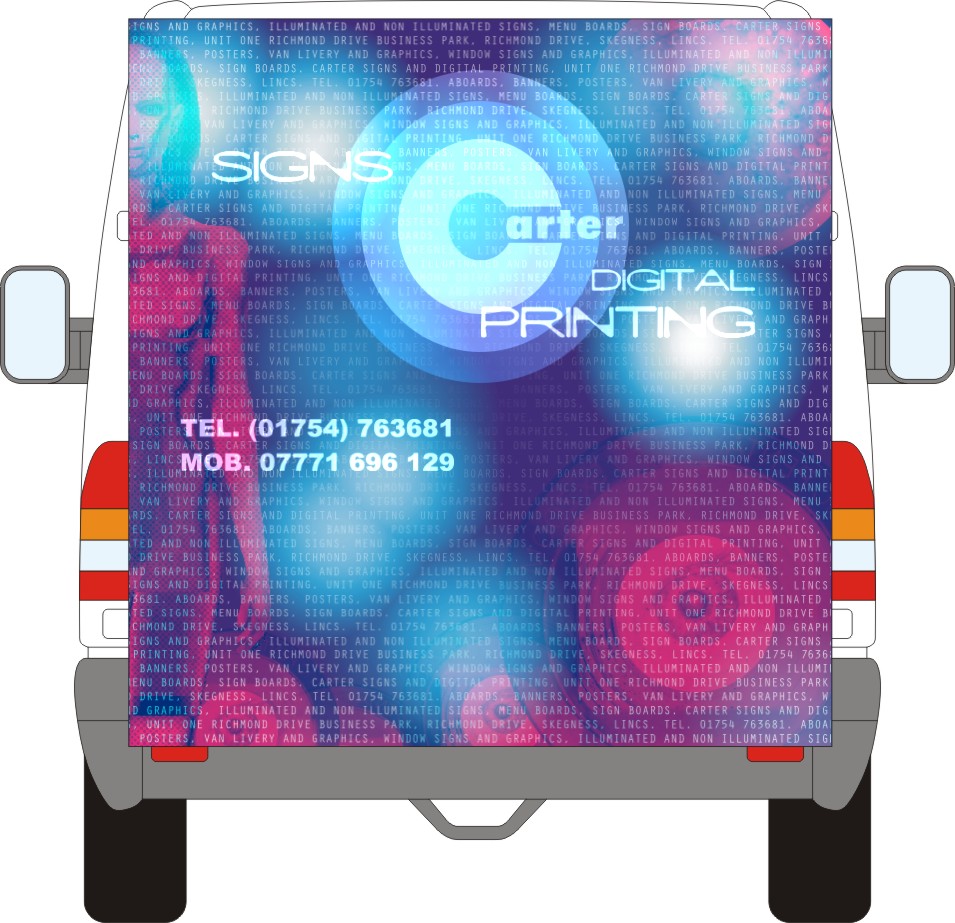
Posted by Pryam Carter on 22 February 2004 at 20:12I’m going to wrap the back doors of my merc sprinter. Trouble is l can’t get the design right in my head. What do you think of this? Advice will be gratefully received, hit me hard with it.
Attachments:
 Bill Dewison replied 21 years, 10 months ago 7 Members · 11 Replies
 -
11 Replies
-

I like it and it is ideal for demonstrating full colour capabilities. Just watch those panel recesses on the Sprinter, they are notoriously deep and without the right material and application method, the print is gonna pop out (speaking from experience here).
I’ll look forward to seeing the finished article.
-

Based on what you have mate..
I would maybe bring the female figure into the design more.
By the time you cut away the excess, you will loss most of the head etc
Maybe even an idea to mirror it onto the right hand side, as you will loose some leg with the deep recess and number plate.The orb like spheres next to signs & printing maybe better moved slightly sway from each as they may make the text merge too much with the background.
(I guess this may loose the feel to the design a little but Joe public can be lazy & overlook)I’m doing this blind of course but you maybe pretty close to the window panel recess with printing?
The overall design is very moody/digital & I guess that’s what you want to put over.
My downside thought is it doesn’t give me the impression of signs, more print.
Print as in printing, printers etcI’m rambling so ill stop. 😳
-

Carrying on from rob’s comments, and before i say anything i’ll apologise just in case i offend you or anybody else’s digi prints.
I’m speaking as a signmaker, i do like your design but i feel your design as do many others i see, give me the impression of i’ve just bought a digital printer and must cram as much detail and special effects in as possible because i can.
And in this quest for flashyness i feel the message that is being portrayed gets lost and taken over by a pretty picture.Once again its not a dig at your design
Cheers craig
-

Looks v smart to me mate – bear in mind what signdevil mentioned about the recesses on the sprinter, I’ve had problems with them too 😥
Possibly some minor tweeks along the lines of Robs comments and it should be fine, let us see the picture when you get it done !As Craig said, I does look very flash/effect full but I personally think that this is not a bad thing as far as joe public are concerned. It is more the “trade” who will look at it and think “oh they have a digital printer and want to show of with flashy full colour prints etc…” Just my opinion from what comments I have had about my van – people in general just seem to think “thats a nice colourful van…”, I guess they are fairly simple creatures at heart 😉
Nigel
-
Nice one!
I’d lose the brackets on the phone number but apart from that it is going to be stunning.
I’ve found Sprinter recesses to not only to be deep but also an uneven paint surface, rather bubbly compared to the panels – worse than on other models.
A good tip for anything you design for yourself is to print it out first about one tenth scale on the actual material and stick it up on your wall for a day or two.
Any changes in design or colour balance will then occur to you.
Wish I’d done that on my latest wheel cover design. Been on two days and then realised I’d left the address off. 😳
-

Humble opinion here Billy, but I think if you’re going with the whole nude woman thing, be a bit more brash and bold about it. Make her stand out more and even go to the lengths of defining the her charecteristics.
I don’t mean to offend here, but if we’re all honest, this type of image can sell as business in 10 seconds. If done correctly and reasonably tastefully, the image can really stick in the mind. Granted, the male mind, but there you go 😉
I like the way you have repeated your business info again and again as a background image. This will stick in ppls minds, even if they don’t realise it at the time. The thing I’d change is as has been said before, chuck the brackets. With mobile phones, you rarely see a bracket anywhere, more ppl are used to the number being plain with no spaces than ever before. I design with brackets quite often and get asked to remove them, must just be modern times demanding a different style. 😕
Other than that, I like your style Billy. And a Merc Sprinter! You lucky s*d!!!!!!!! 😀 I’m stuck with a Renault Espace atm 🙁
Cheers, Dewi
-
nude women? i thought that was billy doing the diet coke break! 😮
😆 😆 😆 😆ok ok i know it was rubbish, im scottish for god sake 😳 😉
-
😆 😆 😆 😆
Its just taken me 10 minutes to figure that one out!
😆 😆 😆 😆
Cheers, Dewi
Edit: Okay then 8 minutes! But its still a long time in Dewi-Years! 😉
-
Nude women?
Our design for the roller shutter door wrap coming soon!
-

Thanks for the replies guys……………
………..I don’t want to go with the nude woman in a big way dewi, just a bit on the subtle side. I don’t know what the rest of you think but l like a lady to leave a bit to the imagination, play with your mind. Not all her kit off and flashing her bits. Imagine the accidents l’d leave in my trail from male road users, not to mention pedestrians and lampposts. -
Exactly Billy 😉 I see where you are coming from with the whole subtle thing, I’m just not very subtle I guess 😉 I like those big bold billboards that shout at you everytime you pass them and I marvel at locatons like Broadway, Sunset Strip and other such entertainment areas. The signage just seems to talk to you.
I saw a huge Merc Sprinter this morning and I thought about your design, it’ll look great. Still jealous though, Dewi want a Sprinter, with a cup holder! 😉
Cheers, Dewi

Log in to reply.