Home › Forums › Sign Making Discussions › Gallery › assorted signage: basement cafe
-
assorted signage: basement cafe
Posted by Alistair Richards on 30 April 2006 at 13:47Hi All
Got my plotter in Nov, and been doing signs part time since then, main job building. Had a bit of a head start coz got a degree in CAD, but apart from that knew nothing about sign writing when I started. Haven’t posted any work up here yet, but here goes. Any construction critisism appreciated.
Ali :lol1:
Attachments:
 Alistair Richards replied 19 years, 8 months ago 12 Members · 13 Replies
 -
13 Replies
-

Nothing wrong with any of them Alistair.
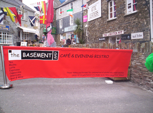
Well done mate. My only crit would be with the banner, lots of small text and plenty of space etc, but no doubt it was what the customer wanted.
Keep them coming, you’re doing a great job there by the looks.
Cheers
-

Thanks Shane, yeah, you’re right, just what the customer wanted. He wanted the space for additional banners, which I’m in the process of doing now to be attached for promotions etc.
Ali
-

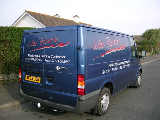
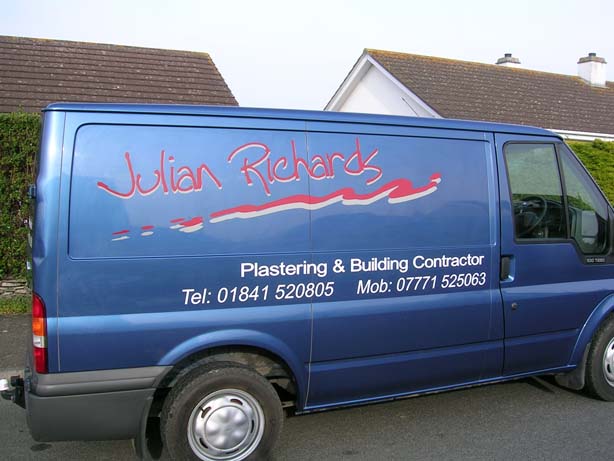
i like the signs – banners they look fine but red on the blue van NO not with out a outline.
the other day i did a red van the customer wanted gold lettering half way through fitting i striped it all off and redone it with a black outline not the most profitable way to do it but proud to put my sticker on the back when finished.
when we held the test bit up to the van for the customer it was fine but the just gold lettering looked naff.
chris
-

i would normally agree about blue on red, but think it looks fine in this instance !
some nice work mate,
the banner might wanna have a heavier end support though, looks like it’s about to go over !
-

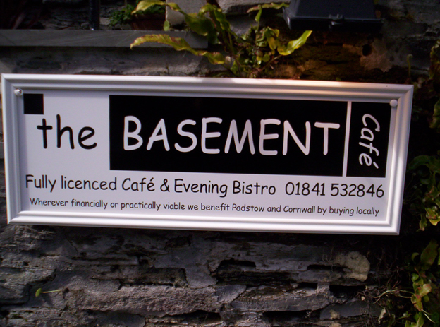
I think youre doing really well – keep it up, my only crit is i dont like the screw/covercaps on the basement cafe sign i presume the trim is that decorative plastic, a proper ally trim would be my choice. 😉
John
-

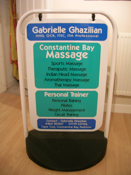
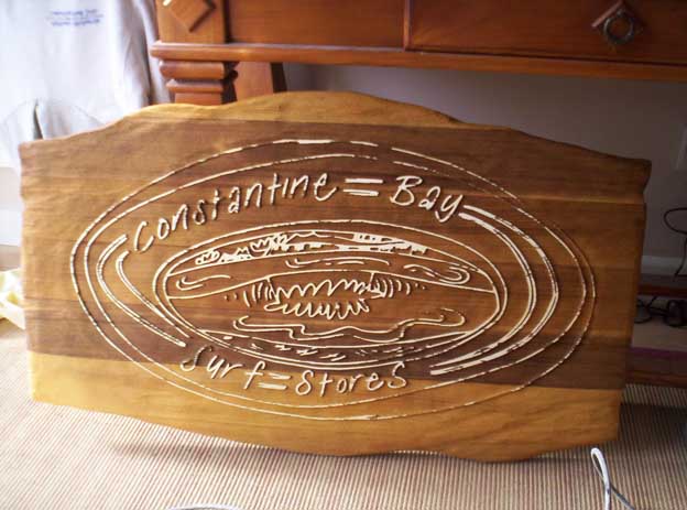
some very nice signs mate i like the layout and colours of the swing sign
keep up the good work mate -

Alistair, I like all of these nice work couple of minor crits. red on blue 🙄 ( aparantly they are the colour combinations colour blind people have the most trouble with) and you seem to have lots of wasted space on the red banner. but I could live with all of them well done 😀
Lynn
-

As others have said, the red on the blue lacks contrast.
An outline would have indeed helped.
I’m sure the customer requested the Comic Sans…
the new Brush Script! 😉
Looks good for a newbie and you can only go up.
Just watch your colors (red on black or navy blue is a no-no) and text size.
Have you read Mike Stevens "Mastering Layout" yet?
It’s quite helpful with colors.
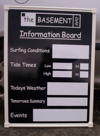
I like the window job the best.
Love….Jill -
Hi guys, thanks for all the great comments and support.
Hugh-Customer has proper banner supports on order, but wanted banner up immediately, so this is temporary.
John- I wondered whether anyone would spot the screws/cover caps. I just supplied sign, then went down one day, and saw how the customer had screwed it up, bit gutted.
Dave- Yeah, I blasted the sign myself. My friend restores Split Screen VW’s, so he let me borrow his stuff for a morning.
All the comments on the red on blue very much appreciated. I’d previously done a white site board for this client, and he wanted red, and then he went and got a blue van, but wanted to keep the same style. I was going through different designs/outlines etc. for ages, but couldn’t decide.
Here’s another angle, see what you think.
Thanks again
Ali[/quote]
Attachments:

Log in to reply.