Home › Forums › Sign Making Discussions › Gallery › A week of signs.
-
A week of signs.
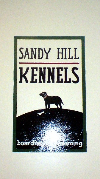
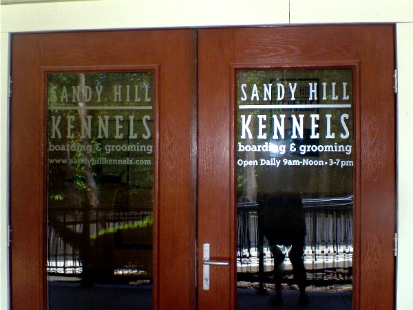
Posted by Jill Marie Welsh on 16 June 2009 at 16:35I have been busy with a lot of small jobs.
It’s been hectic the past ten days or so.
Thought I’d post pix of what I’ve been up to.
Love….Jill
Attachments:

 Duncan Wilkie replied 16 years, 4 months ago 19 Members · 29 Replies
 -
29 Replies
-

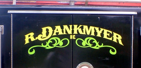
Good stuff Jill………………….I like the Dankmyer one……simple but classy
-

You have been busy Jill, they all look really good. I especially like the etch, and your banner-the font looks like fun!
Lorraine
-

Great selection of work Jill, you really are getting good at this 😉
Is that Gorilla Glue behind the gold on the small HDU sign?
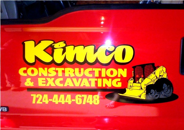
When will your font be on sale?My fave is the Kimco truck door, love that design.
Brilliant work, a true artist and craftswoman.
Neil
-

Thanks folks.
I don’t like my spacing on the wall sign at all.
No excuse for it really.
Yup, that is GG, Neil.
I set it out in the sun to dry and it got all bubbly. So don’t try that.
The font will be out in 4-6 weeks.
I admit to being rather excited about it.
😉
http://artandsignstudio.com/fonts.html -

Good stuff Jill, and thanks for sharing.
I’m not sure why the pic of you pole dancing got included though. 😀
-
That’s a merry-go-round!
I knew someone was gonna say pole dancing.
http://upload.wikimedia.org/wikipedia/c … CN2827.JPG -
quote Jillbeans:I knew someone was gonna say pole dancing.
Yeah. It had to be me, didn’t it? 😛
-

What’s the name for the twirly bits on the Dankmyer one?
Gordon
-
Those scrolls are from (I think, I did the damn layout last September)
"Best of UK Signwriters, Volume 1 Nigel Eyden"
which I got from buying a sample roll of SignGold many years ago.
Either that or an old VectorArt CD. -

Great work Jill
Yes my first thought was Pole dancing, it still is 😀
Maybe we could all buy Jill’s font the way everyone has bought Phil’s book? (-)
-

Always like seeing your work, Jill its always got an extra something to it.
-
 quote David-Foster-:Maybe we could all buy Jill’s font the way everyone has bought Phil’s book? (-)
What a great Idea…. I’ll buy one, let me know when its online Jill.
Is the bobcat thingy one of Stevo’s vectors? It has his style about it.
All great stuff though Jill.
-
quote Shane Drew:I’ll buy one, let me know when its online Jill..
Me too. 😀
if it works on a Mac
-

nice work there Jill…..how much work was involved in creating the font?
-
Thanks.
The bobcat thingie is from John Deaton.
http://www.thetoonfactory.com/vehiklescd.html
I make no money on the font.
About three or four years ago I painted my casual knock-off I use on panels onto a white panel and took a pic. I showed it to Letterhead Fonts and Sign DNA fonts but they were not interested in it.
One time, I was emailing to Steve Contreras (sp) the guy who makes Art & Signfonts about a font I’d bought from him and I casually mentioned that I had a font but nobody wanted it.
He asked me to send him a pic.
I did but forgot about it.
About 6 months later, he emailed me the font he’d made from my picture.
I was really thrilled, and it freaked my kids out because when you type it out it really looks like I did it by hand.
I told him he could do whatever he wanted with it.
I hope Steve C makes some money from it, I was honored that he liked it.
The subcopy in Kimco is Truckin’, Steve’s other new font.
Steve also made Valentino, that beautiful script I use too much. -

I’ll buy your font when it comes out Jill, it’s a happy friendly font – I’ll use it in place of Brush Script in your honour 😀
Don’t forget to resurrect this thread when it becomes available.
-
hhmm I’d have thought you should make some money out of it jill…. doesn’t seem fair that you designed it and don’t get a royalty of sorts.
I was going to buy Valentino too. I love the flowing style.
-
Yup – I particularly like Valentino too – so when "Jilbeans" is released I hope to buy a package including Jillbeans, Valentino and some of the other beautiful fonts that are listed. 😀
-

nice work, Jill, as always!
always a great use of space and choice of fonts
Hugh
-
Thanks!
Just found out about this today:
http://www.boatpittsburgh.com/article-b … er-09.aspx
It’s a boat I lettered last month for my son’s friends.
Sorry for the terrible cell phone pic (I didn’t take it) -

That’s cool Jill
Never easy for access are they?
was you lying on your belly to do this? -

Nice work Jill but I’am a firm believer of putting a space after an initial, if you have two names then you have a space so it should be after an initial. You see this so many times among signwriters. Sorry to be critical but thats why we’re here. R. DANKMYER Not R.DANKMYER
-
quote Martin Oxenham:R. DANKMYER Not R.DANKMYER
I know what you are saying Martin, but I think with a space it would look unbalanced, especially using a scrolly D.
I look at each design on the day, and make a decision based on the appearance generally.
That just my take tho.
-
Yup, I thought the scrolly D made up the space.
You know me, sometimes I am guilty of VERY tight kerning.
😀 -

That’s some great looking work there Jilly. You’ve been a busy gal. Congratulations on the font, it looks great. Nice design Stevo!

Log in to reply.