Public Outcry Over £532,000 GOV.UK Logo Redesign

The UK government’s rebrand of the GOV.UK digital platform has sparked widespread criticism after it was revealed that the redesign cost taxpayers over half a million pounds.
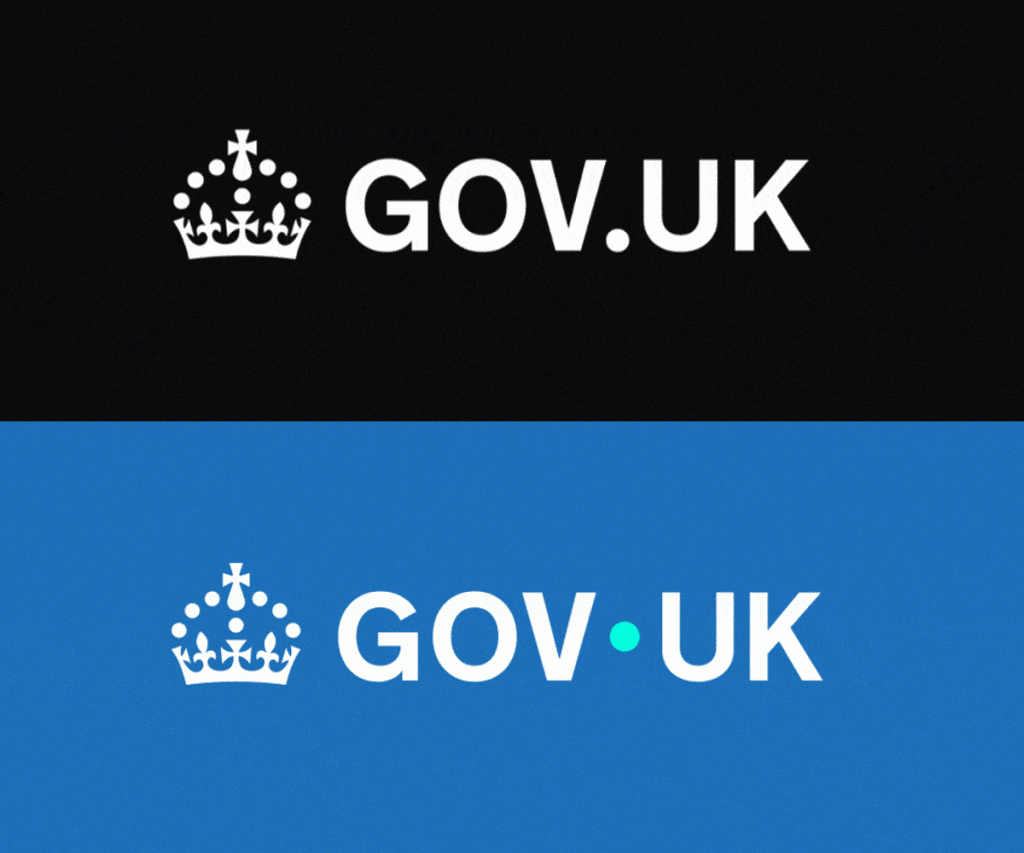
The updated visual identity includes minimal changes: the site’s black masthead is now blue, the GOV.UK dot has shifted position and turned turquoise, and a black crown has been added to the footer. The rebrand was developed by M&C Saatchi under contracts initiated by the previous government, with the final cost confirmed at £532,000.
Public backlash has been swift, with users on Reddit and other platforms questioning the value of the work. Many described the changes as superficial, arguing that moving a dot and altering a colour scheme does not justify such a high price tag.

One commenter noted:
“I really get annoyed when organisations get conned by consultants to replace a perfectly acceptable logo. What a waste of our money.”
Another added:
“So, we’ve moved the dot, made it cyan, and called it a rebrand? Someone got paid far too much to mess around with something that was already fine.”
Despite the criticism, some users praised the overall digital experience.
“The website has improved so much. You can tell care has gone into every decision made,” one user shared.
A government spokesperson responded:
“This was committed to by the previous government. The current administration has since focused on converting the work into digital products — including a new GOV.UK App and GOV.UK Chat.”
According to the GOV.UK Design System, the new brand identity includes an updated 60px-high header (up from 50px), a refreshed logo and wordmark, a blue background replacing the original black, revised service navigation, and an updated cookie banner. These changes are being rolled out across all GOV.UK platforms, including Notify, Pay, Forms, and social media.


Responses