Make a quick logo that looks like a stylised signature


Here’s an idea to make a quick logo that looks like a stylised signature.
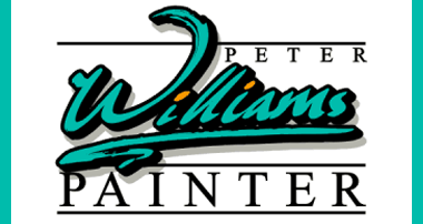
A quick look at the details and we decide to make the Surname the dominant element in the design. Why? well because it’s the one thing that will distinguish this business from all other similar ones. When People look at this sign they need to remember one or two things about it – so let’s make them remember the surname and have them associate it with the word ‘painter’!

Take a big fat felt-tip pen and write the surname on a piece of paper. Use a little flair to make it look like an actual signature this will give it a more ‘personal’ feel and we can extend part of the ‘W’ to look like the stroke of a paintbrush too! (note: to get faded or ‘scuffed’ areas just speed up your stroke or lift the pen slightly).

Next, stick it under the scanner and ‘Accuscan’ it into the program (if you’re using Signlab) or digitise/trace it in depending on the software. It won’t pick up every little bit of detail but that’s fine – not only because we have yet to physically cut this in vinyl but also because it gives it a nice ‘ragged’ look more like chalk than paint – very artistic! (note: we’ve added a centre to the ‘a’ to aid legibility).

Now, choose a colour for the title and add a drop block shadow with a small amount or surround to the word too (check your software manual on how to do this) this gives the title more weight and gels (links) the text together nicely too!

Adding a subtle Grey shadow to the main title gives it more depth and now we’ll try tucking the name inside the arc of the ‘W’ and place the secondary text below. Well, that’s not too inspiring – we need to bring the entire design together…

…so we’ll lay down some lines that intersect the logo and then place text in and around these. Think of this as bolting railway track in place over the sleepers, it just links everything together – if we didn’t use any track you’d just have lots of sleepers looking very unconnected… We’ll emphasize the ‘painter’ word as we said originally and include the remaining ‘peter’ and ‘and decorator’ phrases to compliment each other using a similar style, size and placement..oh and let’s add a highlight in the form of two orange dots just to draw your eye.
There, done – you may have to address one or two small welding issues prior to cutting but it’s still a smart-looking personalised logo in under five minutes!