Give any Font a stone-faced look in cut vinyl.
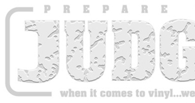
This next demo is a clever little cut vinyl text effect for you to try in the shop. Not only can it be applied to countless typefaces but you get to choose the level of detail and ultimately create your own personal style that is guaranteed to be different to everyone else.

It’s called Rocky because loos like a heavily pitted stone face and, depending on the colours used and the level of detail employed, can suggest either a rugged text or a subtle texture applied to the face of the text.
The images accompanying our step-by-step notes use coloured elements throughout to help you follow the process (e.g. the orange-coloured ‘J’ seen at the end of the procedure is the same orange ‘J’ shown at the beginning).
Be assured that whilst the process may seem difficult at first, repeating it a few times will reveal just how straightforward it really is. So, have fun with this fun cut vinyl text effect – which can also be recreated digitally.
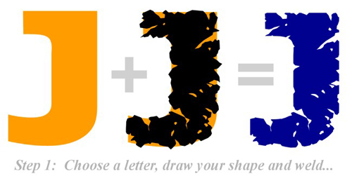
We’ve chosen the letter ‘J’ in a font called ‘Aardvark’ and coloured it Orange. Using a ‘freehand’ draw function we make a ragged shape that roughly follows the letter’s outline. Weld these two items together using an AND weld function (one that leaves those parts common to both shapes).
TIP: Keep a copy of the original letter ‘J’ and save it to one side for later.
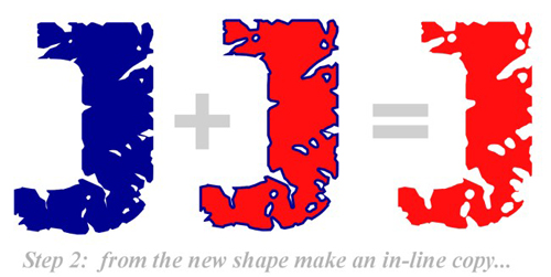
Take this new shape and make an ‘in-line’ copy ( a slightly smaller copy) in a different colour.
TIP: Once again, keep a copy of the original piece (shown in blue) to one side.
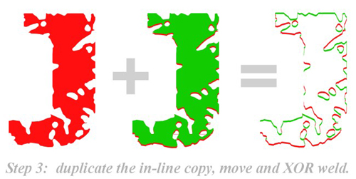
Make a duplicate of this in-line copy. Place one directly over the other and then move one a small distance in any direction. Weld the two using an XOR weld function (one that leaves those areas not common to both) and then colour the remaining pieces to form two coloured groups. One of these will become the highlights and one the lowlights.
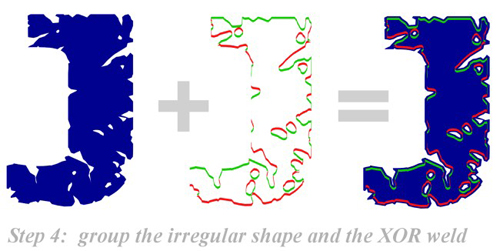
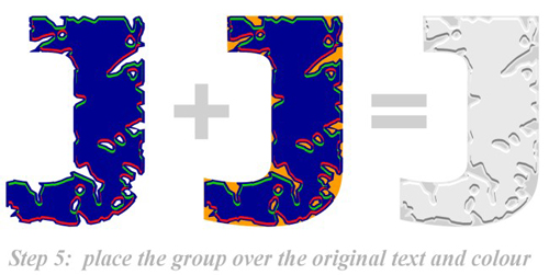
Take the shape created in step 1 (the blue piece) and group it with the newly formed highlights and lowlights – be sure to carefully align all three.
Take the original Orange letter ‘J’ and place it behind this newly formed group taking care to align all of them carefully. It is at this point that you can apply your chosen colours to the various elements of the design. Often the effect is created using three shades of the same colour together with white highlights.
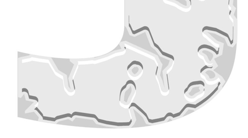
Here’s a close-up of the effect and the colour uses.
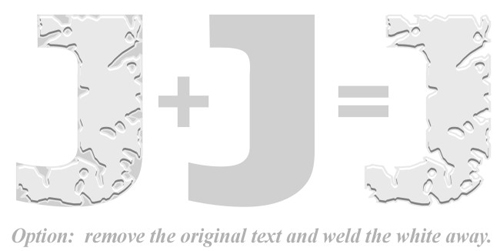
You can simplify the final stage of this effect (and the number of colours used) by NOT using the original letter shape behind. In this example, using white behind, only two other colours are used – mid-grey (with the white highlights welded through it) and a dark grey shadow.
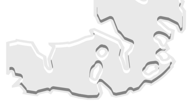
here is that same lesser colour option in a close-up:
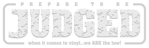
Our last image shows ‘Rocky’ used to great effect in a fun splash…