Sweety Anyone? Multi-layer vinyl application in progress
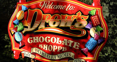
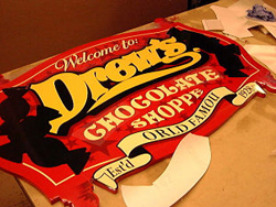
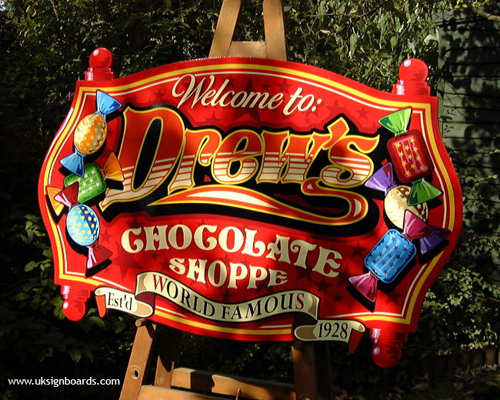
The initial inspiration for the decorative name of this sign came from a similar styled word in the title of the old TV hit comedy ‘Cheers’, whilst the general theme of the sign is one close to my own heart…chocolate!

This review features more than twenty photos taken during the making of this colourful vinyl and timber sign.
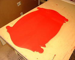
The substrate is a piece of three-quarter-inch ply. This was shaped using a hand-held jig-saw to a pattern drawn up on the plotter (using paper instead of vinyl and replacing the cutting head with a pen).
This was then taken to the local car body paint shop where it was grain-filled, primed and then painted using conventional two-pack auto paints.
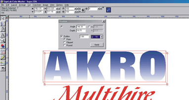
The vinyl used was Oracal and some Metamark was thrown in to give us the different shades of colour we needed. It was compiled using Signlab software from 429 pieces in over 30 colours!
I don’t recall how long it took to design but I would guess 8-10 hours, everything being created on-screen using just a mouse.
The entire design was later welded in various stages so that not one awkward overlap exists throughout the entire design, with all the pieces being either stacked or nested with a maximum depth of 5 colours at any one point.
Anyway, I hope you like it… and here are the photos of the making of ‘The Chocolate Shoppe’!
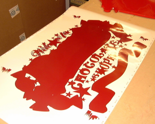
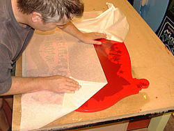
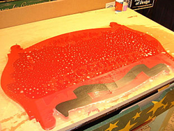
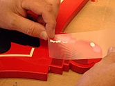
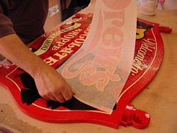
The sign panel (below left) was cleaned with both natural wood turpentine and ‘panel wipe’ (available from car paint suppliers). The workshop was pre-heated to over 75 degrees to aid drying during the wet application process. The main piece of vinyl (below right) was dark brick Red in colour and incorporated shadows, background stars and the shapes of all the key elements within the sign.
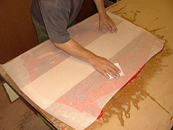
Because this main piece of vinyl was wider than my plotter, a good friend called Dominic at Kingdom Signs cut it on his 1220mm wide Graphtec and that’s why I ended up having to use two pieces of my narrower application tape to both cover and apply it (below left). We used a lot of water during the application of this piece (you can see it shooting out from under the tape) to ensure we had ample time to both position and ‘work’ it. The tape was eased off within minutes of application to allow us to troubleshoot this piece (below right), particularly where the join occurred in the application tape which is where bubbles typically appear.
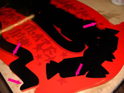
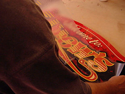
Next, two Black pieces would underlie the main elements of the sign, giving definition and detail. First, the lower ‘banner’ (below left) which was applied using clear app. tape, followed by a much larger piece above (below right). To create different effects in the finished piece, the Black had an outline of dark Red in some places but not in others.
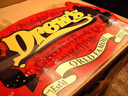
The Cream body of the banner went on next, again using clear app. tape to aid alignment (below left). The first outline of the title is applied in Yellow with the aid of two alignment blocks (seen as two yellow pieces both to the left and right). These matched the edge of the black vinyl to give an exact registration for positioning. This was very important, as numerous subsequent layers would rely on this piece being in just the right place!
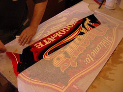
Next, more Cream pieces – this time text. These were placed directly over their corresponding dark Red shapes in the initial layer. The Cream line around the edge of the sign was laid, as one, with the cream text which ensured its precise positioning (below right).
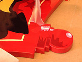
The shape of the sign included four ‘knobs’, or finials, whose ‘shading’ was part of the dark Red layer applied first of all. Now it was time to add highlights using first pink and then white (below left, middle and right).
Time to apply the main title! Using normal paper app. tape we first wet and then slid the Red layer into place centrally within its Yellow outline (below left)…followed a few minutes later by a set of cream-graduated stripes that were the decorative in-fill (below right).
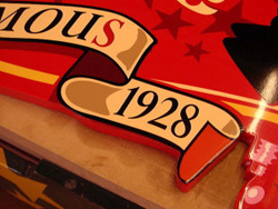
The banner that runs along the lower edge of the sign would now receive its detailing (below left). A bright Red-letter or two was added, plus a Burgundy ‘fold’ together with some biscuit-coloured lowlights and an Orangey-Red end piece too. The thick Yellow edge lines to the sign were added next (below right).
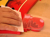
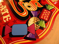
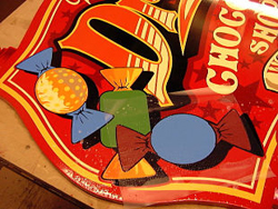
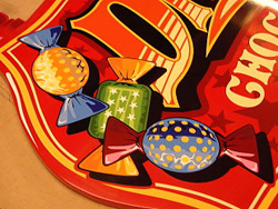
Now we’re on the home straight! Onto decorating the Chocolates. To begin with, we apply the various base colours that form the body and ends of the wrapper for each sweet (below left). Then, slowly, and painstakingly, we add the various colours to create the highlights and lowlights within each. First one sweet…
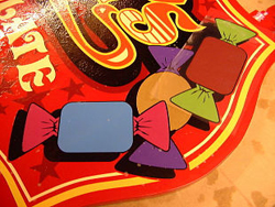
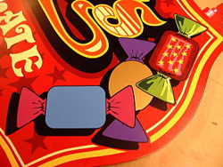
…then two……….then three.
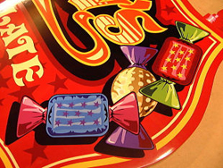
Same for the other side of the sign – same process, only different shapes and different colours too!
It’s finished! Placed outside in dappled sunlight on a simple artist’s easel – it looks splendid.
The sign was left for four or five days to ‘cure’ and dispel most of the moisture from between the layers. Surprisingly enough, the entire application process took less than a morning with cutting and weeding having taken all of the afternoon before. Not once did we use a tape measure during the fitting or, come to think of it, throughout the entire process – sign-making without ‘rules’ indeed!
I hope you enjoyed this demo and the sign itself. The third sign in this series is in pre-production now with only the welding and separation of the file to do before cutting begins…