Understanding why certain Colours do & don’t
Most people instinctively know when colour combinations work and when they don’t. Instinct is one thing though – understanding the underlying reasons why certain combinations work and why others don’t can be explained by the use of a colour wheel.

Understanding how a colour wheel is constructed, and how it is used, is very useful knowledge for the signmaker. This knowledge will allow you to discover and experiment with a wide range of compatible colour combinations.
Much of what follows is based on the teachings of the late Mike Stevens who wrote the book:-
“Mastering Layout by Mike Stevens“
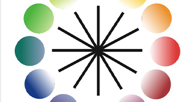
Constructing a colour wheel:-
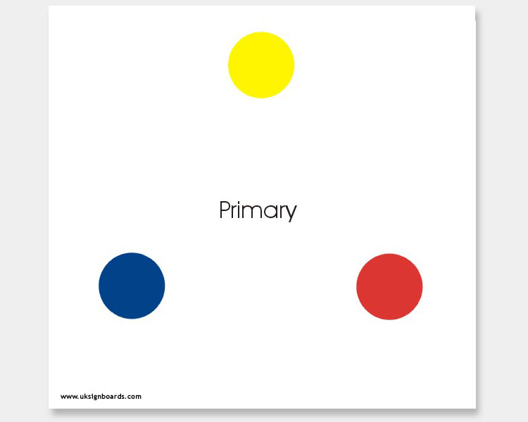
Step 1
Begining with the three primary colours:- Yellow, Red and Blue – (This is the first of four basic groups of three colours making up the wheel that always works well together.
(A group of three colours is called a “Triad”)
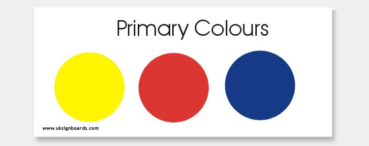
These are arranged in the positions shown next:-
Step 2
Now we must create our secondary colours. This is done by mixing Blue and yellow together to create green. Yellow and red together create orange, and red and blue together create violet. (These secondary colours form the second “Triad” that works well together)
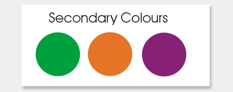
These are placed onto the colour wheel in the positions shown next (i.e. between the two colours mixed together to create the secondary colour).
Step 3
Finally we must create our intermediate colours. These are created in the same way by mixing the two colours next to each other on the wheel to create a third colour. These six intermediate colours can be grouped into two “Triads” that work well together (red/orange, yellow/green and blue/violet being one group – yellow/orange, blue-green and red /violet being the second group)
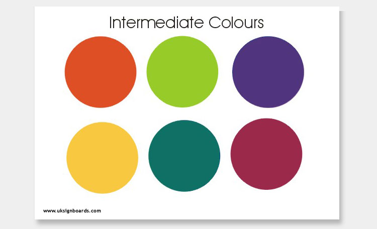
These are arranged as shown next:-
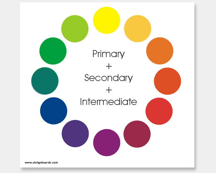
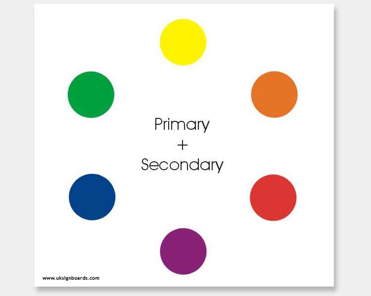
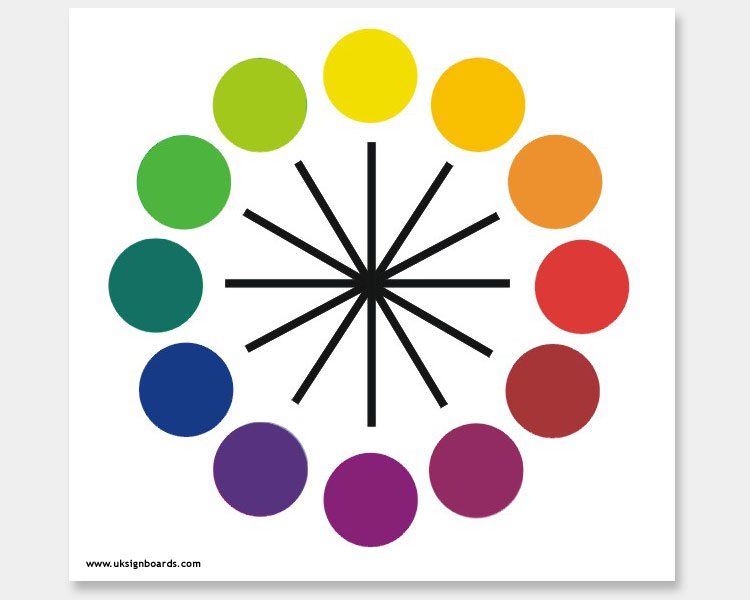
Step 4
This is our finished colour wheel. In addition, each colour has a range of tints and shades (from light to dark versions of each colour to produce an infinite array of colours)
Now, having constructed our colour wheel, we can begin to look at other patterns of colour combinations that are known to work together in addition to the four Triads already mentioned:-
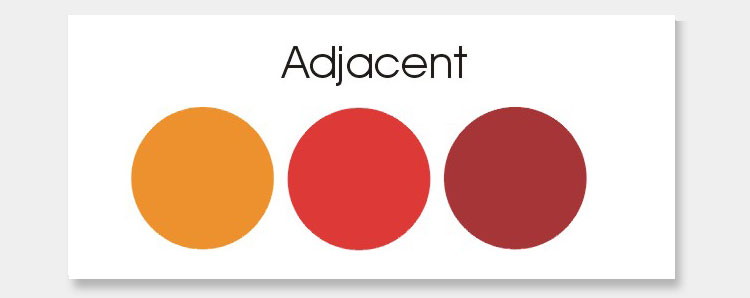
Adjacent Colours
One rule to follow is to use adjacent colours. (i.e. colours that lie next to each other on the wheel)

The example above shows three adjacent colours. We can all agree that this set of colour combinations works (However, bear in mind when using adjacent colour schemes, it is often necessary to introduce tints to maintain a contrast between the colours).
Look again at the colour wheel (this time a simplified version without the various tints) and see how all the adjacent colours work together to produce pleasing results.
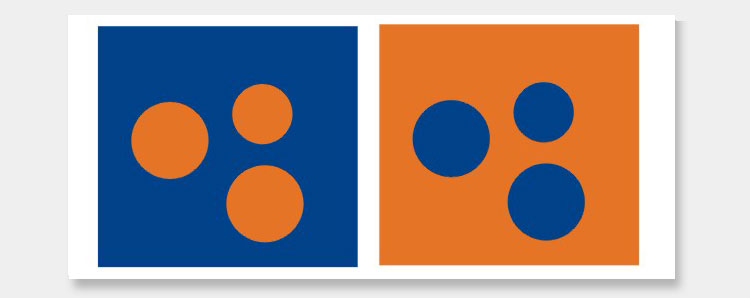
Complementary Colours
Another rule to follow is to use complementary colours. Complementary colours are directly opposite each other on the wheel. In this example, we have orange and blue which produces a hot/cold contrast.
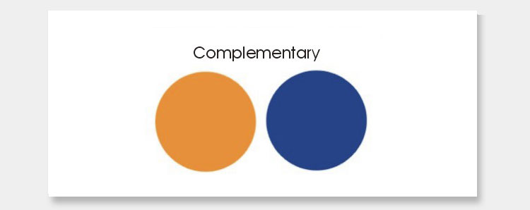
Generally speaking in signage, cool colours should be in the background, with warm colours used in the foreground
(See the left-hand example below – whereas the right-hand example looks unnatural and unbalanced)
Look again at the colour wheel and examine all the other complementary colours (directly opposite) and see how well they work together.
Split Complementary Colours
The final rule to follow is called split complementary. These are colours that are on either side of the complementary colours. In the next example, you can see how well orange works with the two colours on either side of Blue (its complementary colour).
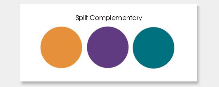
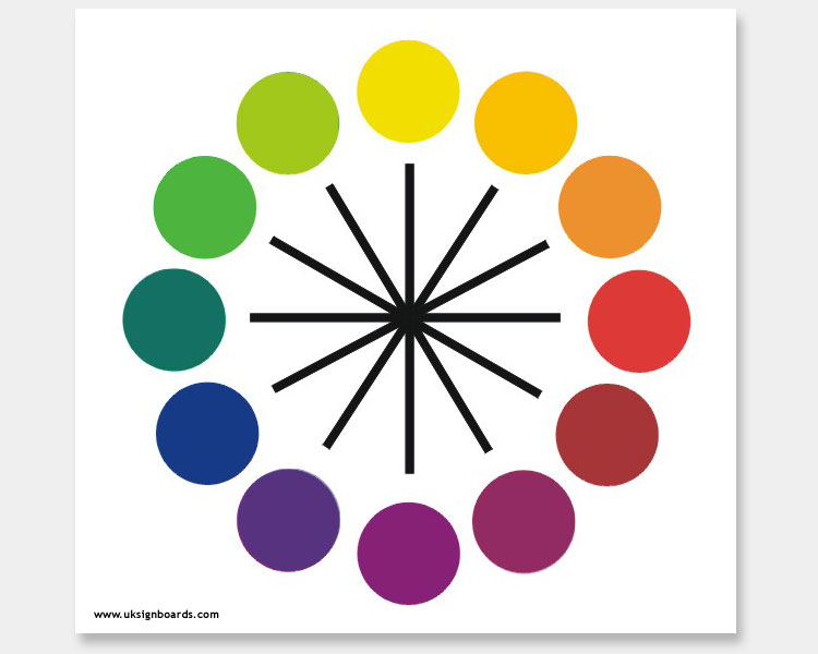
Look again at the colour wheel and examine all the other split complementary permutations and see how effective these combinations are on the eye. Split complementary colours are more pleasing then simply using complementary colours and there is a wider range of combinations to choose from
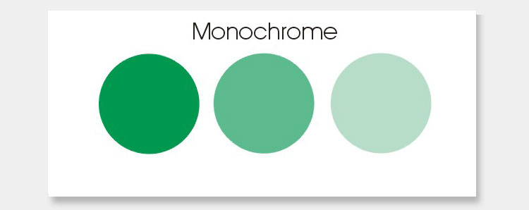
Monochrome Colours
Monochrome colour schemes use tints and shades of a single colour. The most well-understood example being a black-and-white photo. However, we are not restricted to just black and white – any colour can be used (e.g Green)
Unifying Colours
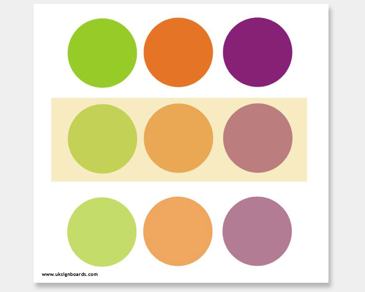
Finally – as an aside to the colour wheel, consider the following experiment:-
A “trick” that landscape artists use is to copy nature. The colours in natural landscapes tend to meld together which is caused by the greying effect of distance. We can do something similar to help to unify our colours. In this final example, I have chosen colours which do not obey any of the rules described above. However, by applying a sepia “wash” over the top we are able to unify the colours to produce a more pleasing colour combination. (Landscape artists do the same thing by adding a little of one colour to all the other colours creating unity).
I hope this demo is of some use to you…
Phill