Chrome Lettering Effects using Corel Draw
Chrome Lettering in Corel Draw.

A fairly simple method I have put together, based on how to make your text lettering look like chrome using CorelDraw. The procedure involves some gradient filling.
No photo filters were abused or harmed in any way! These can be digitally printed or you could even spray paint vinyl!! I like to use a fairly beefy typestyle with this effect. If your letters are too thin you won’t quite get the full effect.
Fig 1:
I’ve typed in my text, outlined it and have drawn a box and placed the top of it around the middle of the lettering.
Fig:2:
Now I want to put some waves on the top of the box. What I used was the Eraser Tool here. (shortcut key “x”). There’s an option to resize the size of the eraser so I made it .026 in this case. Simply click and drag the eraser on the top of the selected box. Always good to have a pot of coffee in ya to get those shakes or a few pints!! After you’ve got the waves on it I like to grab the shape tool and round over some of the nodes. Sometimes it may look too sharp so a minute or two of node editing may be required.
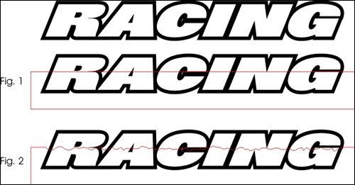
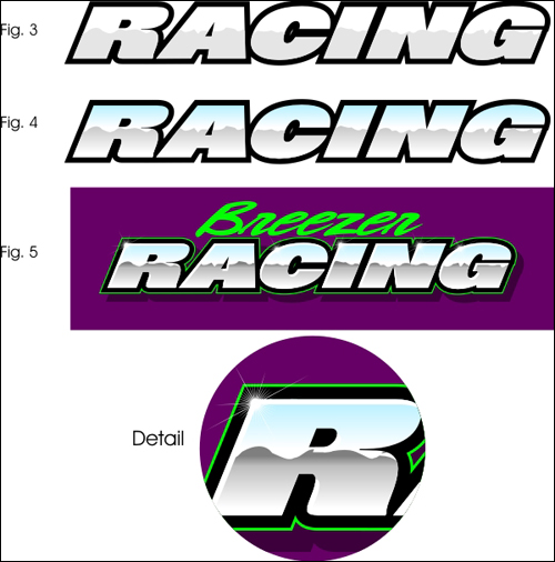
Fig: 3
After we’ve got our box all wavy we will Intersect it with our lettering. Select the box first, then the lettering and go to Arrange>Shaping>Intersect. Your box will remain so you’ll have to delete it. Now it’s trimmed perfectly on your lettering, I changed it to grey here so you can see it.
Note: In earlier versions of Corel the intersecting step is different. You’ll have to select your box then go to Arrange>Shaping> Intersect then a side menu will appear. Click on the Intersect button and a big arrow will appear. With the box already selected click on your lettering with the big arrow. Then delete the box.
Fig: 4
Now this is where we start to see it come together!! Typically you would want a gradient fill on the top portion to be Light blue on top to white on the bottom. On the bottom portion, I decided to use a grey gradient fill instead of a brown. I use the Interactive Fill Tool for this and I hold CTRL to keep the fade at 90 degrees. Try not to get too dark with your colours it may hinder legibility! Starting to look shiny now!
Fig: 5
Here are a few finishing touches. I added a highlight, as per my previous demo, and filled it with white. This adds just a touch more dimension. Also added some twinkle here and there to make it look even shinier!!
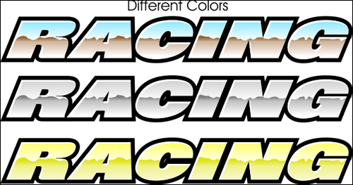
Different colours.
You can play around with different colours for this effect. Here are some more examples.
The top one has the typical old-style look of chrome with the bottom half being a brown fade.
The grey version has more of a polished aluminium look to it. Looks nice but not really chrome-looking.
And you could try and always make it look gold! I used a yellow fade on the top and more tinted yellow for the bottom.

There ya have it! It’s really not too hard to accomplish and looks really sharp too!!
If anyone has any questions don’t hesitate to ask!