-
Admiral Lord Nelson’s flagship gets a paint makeover

The lettering for the name ‘Victory’ on Admiral Lord Nelson’s famous flagship has been changed back to its original font after a handwriting expert found it has been wrongly labelled for decades. The seven large letters which appear on the stern of HMS Victory have been repainted numerous times since it was put in a dry dock in Portsmouth, Hampshire, by the Royal Navy in 1922. Little was thought about the style of the lettering until a £16million conservation programme to restore the historic vessel back to its original condition got underway.
The lettering for the name ‘Victory’ on Admiral Lord Nelson’s famous flagship has been changed back to its original font after a handwriting expert found the New Roman style it featured did not date back to 1805:
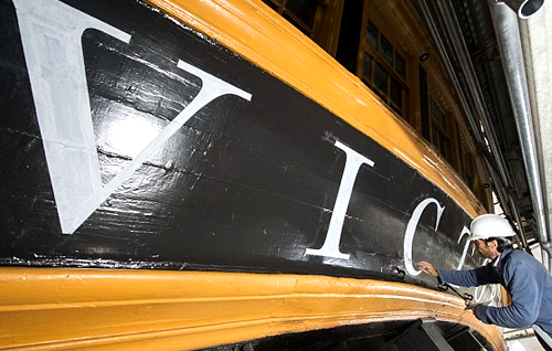

The seven large letters which appear on the stern of HMS Victory (pictured before they were amended) have been repainted numerous times since it was put in a dry dock in Portsmouth by the Royal Navy in 1922
Experts have now corrected the 2ft 6ins tall letters on the back of the ship that sits at the National Museum of the Royal Navy in Portsmouth, Hampshire (pictured), where it is visited by thousands of visitors every yearProfessor James Mosley, who teaches the history of letterforms at Reading University, found that the New Roman style of lettering painted on HMS Victory was not known of when the ship sailed to Trafalgar in 1805. In fact, New Roman lettering was not studied by people until the 20th century when it was created for the Times newspaper to use in print in 1934. Professor Mosley set about researching the correct font for HMS Victory – which was used in the Battle of Trafalgar in 1805 – and came up with a much ‘bolder and vigorous’ type that was known as ‘fatface’ at the time. Experts have now corrected the 2ft 6ins tall letters on the back of the ship that sits at the National Museum of the Royal Navy in Portsmouth. Professor Mosley said: ‘I discovered the original style wasn’t being used and it seemed like a good idea to get it right. ‘All the other details on the ship are absolutely right but the name was not from the 18th century. ‘There aren’t that many pictures of Victory from the back but I traced one to the National Maritime Museum at Greenwich that was painted by Nicholas Pocock, who knew the ship well, in 1807, two years after Trafalgar. ‘It was clear to me that the original letters were bold, straight letters. Fatface is the term used for it. ‘It hits you in the eye and leaves you in no doubt you are looking at something very important. By the time you wonder whether you are going to read the name you know what it is.’

Professor James Mosley, who teaches the history of letterforms at Reading University, asked to amend the lettering on HMS Victory after he found that the New Roman style was not known when the ship sailed in 1805He said the lettering on the iconic vessel had been repainted several times, with the letters ‘coming out different’ each time. He said: ‘Every time it was pained it was done by an individual signwriter so there was an element of personalisation and the letters came out different as different people were doing it. ‘When the ship was repainted in 2005 for the 200th anniversary of Trafalgar they used a kind of Roman lettering, a kind of a timid style. ‘But people didn’t study Roman at that period, that happened in the early 20th century. ‘I wrote to the National Museum of the Royal Navy more than once to push the idea of changing it and I was delighted when I received an email saying they were going to take me up on it. ‘I am very pleased with how it looks now.’ The restored lettering has been finished in a white lead paint by Philip Surey, a lettering craftsman who has worked in historic environments including the Houses of Parliament
One of the main problems with the job is that the high stern of HMS Victory protrudes a water-filled basin within the historic dockyard so it has not been possible to step back and get some perspective of the work until the scaffolding is taken down. Mr Surey said ‘It has been one of my most satisfying jobs particularly considering the historic importance of the ship and because many millions of visitors will see his work. ‘I love the lettering and think it reflects the awesome power of HMS Victory.’ Andrew Baines, of the National Museum of the Royal Navy, said: ‘The lettering was wrong when ownership of HMS Victory passed to the NMRN. ‘James has undertaken a huge amount of research and suggested how we might replace it with a more appropriate letterform. ‘It is a small detail but important in demonstrating the museum’s commitment to research and accuracy in our approach to Victory’s conservation, interpretation and display.’
.

Sorry, there were no replies found.
Log in to reply.