Home › Forums › Sign Making Discussions › Gallery › Rock and Roll Illuminated Burger Bar signage project
-
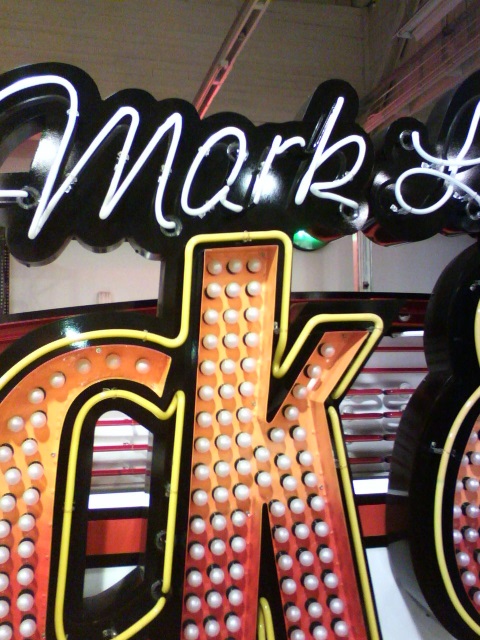
Rock and Roll Illuminated Burger Bar signage project
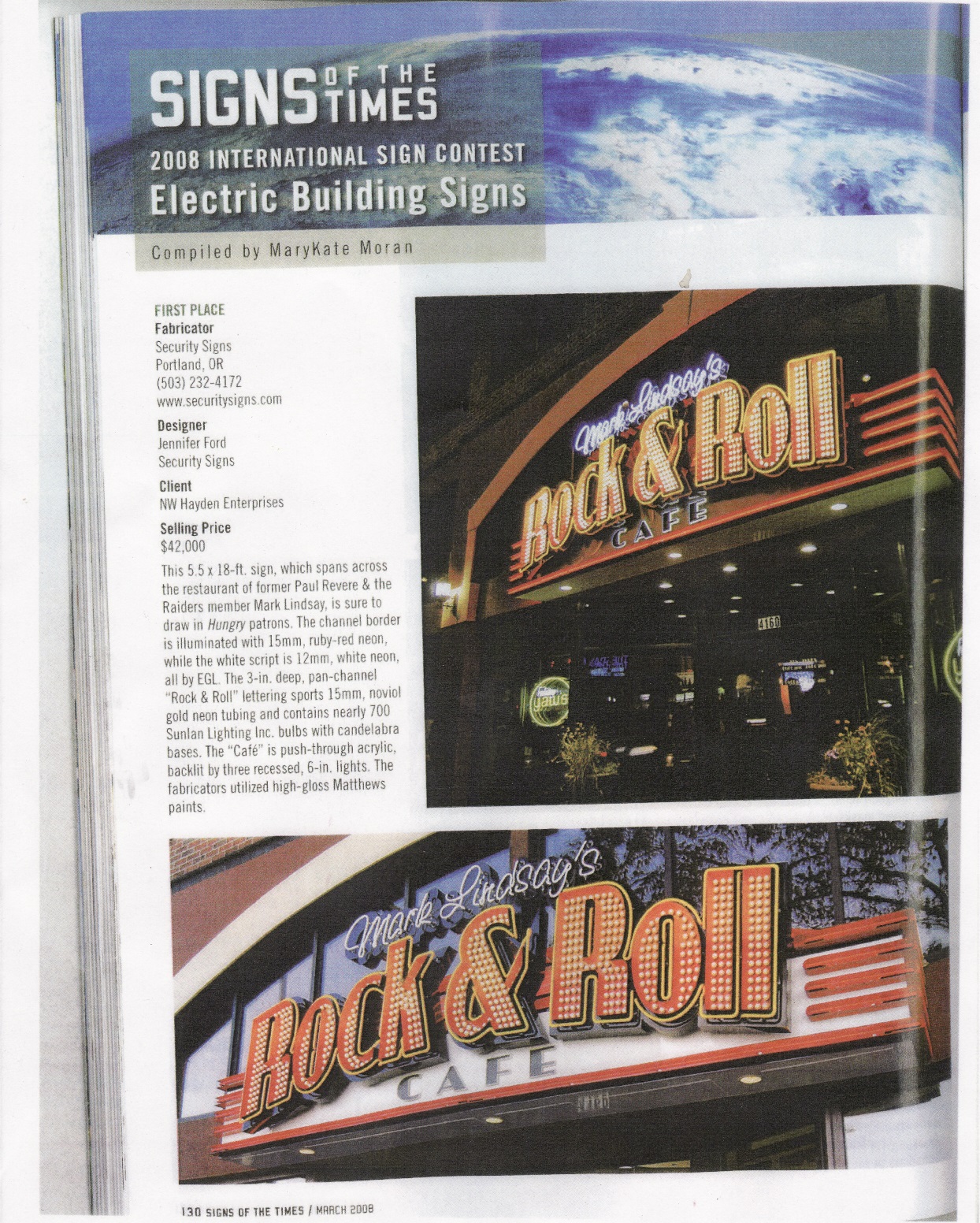
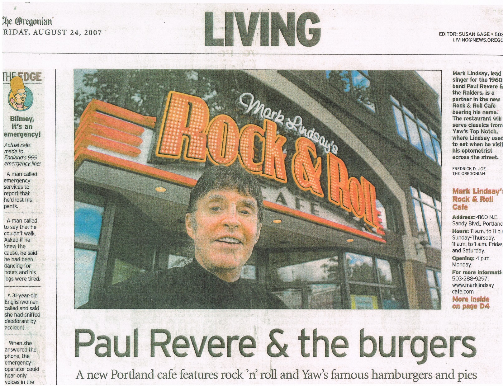
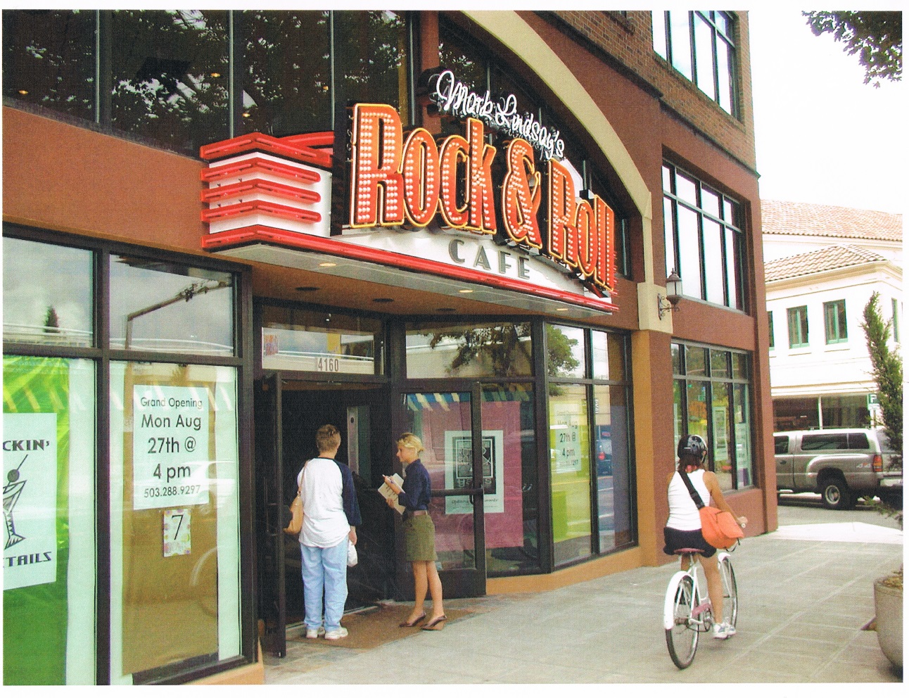
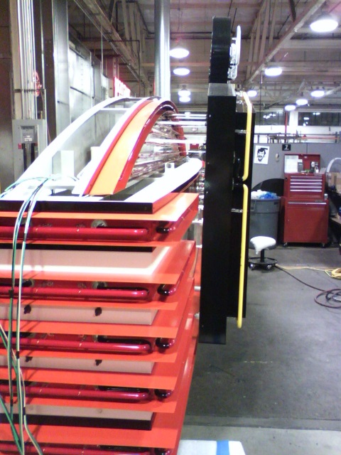
Posted by Del Blanchard on 31 August 2015 at 08:24This was a very unique sign and got alot of attention from the local news paper and it won the best wall sign in the 2008 Signs of the Times magazine best design contest. The whole shop was involved in this one. I made the main body and the black reverse pan letter backgrounds.
The owner of the cafe was Mark Lindsay the lead singer for Paul Revere and the Raiders, which is one reason it got so much attention.
Attachments:
 NeilRoss replied 10 years, 4 months ago 5 Members · 11 Replies
 -
11 Replies
-

Yet another impressive project you have posted Del, great stuff, love it!
I like these old style signs with the individual bulbs making up the body of the text. I see a lot of it these days as it certainly does seem to be making a come back! I remember at the BSGA Industry Awards last year one of the categories was won by a company creating this style of work and it was actually my favourite of the short list in that category. Does this old style of illuminated letter have a name?
As always, thank you for taking the time to post your work mate, and congratulations on winning the "Signs of the Times" competition. that in itself is a great achievement! :appl:
-

Does this old style of illuminated letter have a name?
I am not aware of a specific name for them. In my appr 30 yrs in the business there have been only a handful of projects I have done with bulbs. Mainly I have worked with neon.
I love the old retro signs with flashing bulbs and neon. I would love to make nothing but retro signs but getting someone to pay for it when they quibble over the price of a correx sign is going to be a real challenge, not to mention planning permission. I would love to see a Las Vegas strip type area in Belfast but I don’t think the planning dept. would. -

They seem to the ‘thing’ at the moment. We are seeing more & more of these lately. I think they look great, some people refer to them as Circus letters. Here is one we finished, partly using them
Attachments:

-
That is nice work. I have even seen these type of letters for sale in furniture stores. I saw a wooden one appr 5 feet tall selling for 400 pounds.
The thing I like about retro is that it is cheerful. The streets around here look pretty bland and bleak with all the tray signs and foamex letters. It looks like some kind of dead zone. -
quote Del Blanchard:The thing I like about retro is that it is cheerful. The streets around here look pretty bland and bleak with all the tray signs and foamex letters. It looks like some kind of dead zone.
Agreed :thumbup2:
The trouble with many new high street type shops is they want their signage like McDonalds… FAST, CHEAP, CRAP MATERIALS, and NO EXPERIENCE NECESSARY by those making them. 🙄
-
I know what you mean. It’s getting to the point that a digital print on a sheet of correx is normal.
-
 quote Del Blanchard:That is nice work. I have even seen these type of letters for sale in furniture stores. I saw a wooden one appr 5 feet tall selling for 400 pounds.
The thing I like about retro is that it is cheerful. The streets around here look pretty bland and bleak with all the tray signs and foamex letters. It looks like some kind of dead zone.Wholeheartedly agree with that. Not even a tray or frame on a lot of shops around here, just a sheet of foam straight onto the stone. Nothing brightens up a high street better than smart interesting signage – especially illuminated. I was just saying the same thing the other day about signage around here – dead and more like simply addressing the business rather than promoting it.
Businesses see price as all important, and you can’t blame them if the rest of the neighbourhood looks much the same – no contest, but a shame!
-
quote NeilRoss:quote Del Blanchard:That is nice work. I have even seen these type of letters for sale in furniture stores. I saw a wooden one appr 5 feet tall selling for 400 pounds.
The thing I like about retro is that it is cheerful. The streets around here look pretty bland and bleak with all the tray signs and foamex letters. It looks like some kind of dead zone.Wholeheartedly agree with that. Not even a tray or frame on a lot of shops around here, just a sheet of foam straight onto the stone. Nothing brightens up a high street better than smart interesting signage – especially illuminated. I was just saying the same thing the other day about signage around here – dead and more like simply addressing the business rather than promoting it.
Businesses see price as all important, and you can’t blame them if the rest of the neighbourhood looks much the same – no contest, but a shame!
I have said that to my wife many times, that the signs look more like a way to identify where they are like a building number rather than make any kind of statement. The logos usually look like someone just tried to make a weird shape with purple/pink or blue, white and yellow colors. I think a company logo should say something about what the company is or does, not just some boring highlight, and what would it hurt to brighten things up a bit with some creative light animation or 3d design? Then again price seems to be driving the whole thing. Nobody is going to lay out a couple thousand for a premium high profile sign when they can reap all the benefits of a sheet of foamex with an unlaminated digital print on it.
-
Robert
When you say cheap, several of the McDonalds in our area are flat panels with vinyls, yet they have an image already. They replaced full face lit letters for these. Looks cheap & nasty….a bit like their product. We made large letters for a well known fitness centre, they said that they had covered all the cost of the signage before they opened through new memberships, that’s after the signs had gone up. A good sign can make all the difference. No surprise that many major retailers pay a lot of money for signage.
-

Both jobs…fantastic… that’s what you call a proper sign.
Love the side profile picture of the Rock n roll sign and agree with all the comments.
Strange how the fairground letters are all in vogue at the moment.
-
quote Martin Cole:Both jobs…fantastic… that’s what you call a proper sign.
Love the side profile picture of the Rock n roll sign and agree with all the comments.
Strange how the fairground letters are all in vogue at the moment.
Perhaps it’s because if anybody knows how to engage their clientele and sell to them, it’s the fairground operators. Fairly effective marketing really 😉
Maybe time to get my own signage redone and illuminated. Alas the shoemaker’s bairns are always last to get shod! 🙄

Log in to reply.