Home Forums Sign Making Discussions Industry News (Archive) Chicago Trump Tower sign design fail + Video

  • Chicago Trump Tower sign design fail + Video

    Posted by .News on 23 January 2015 at 01:19

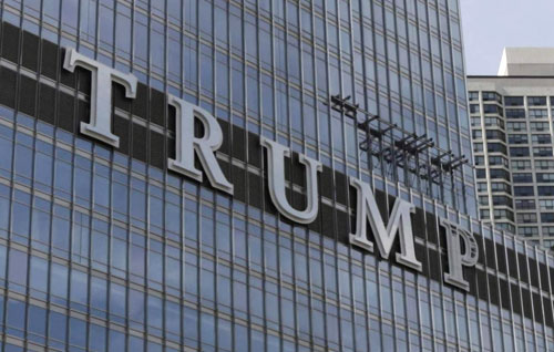
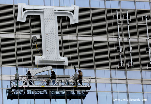
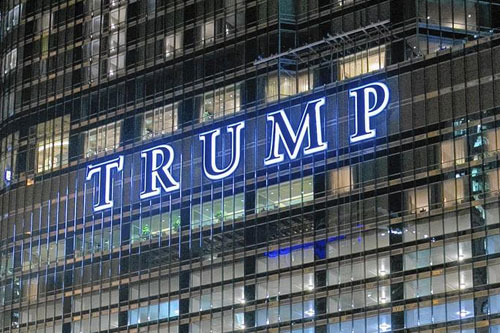
    What makes this fail is not it’s a state of incompletion. That’s understandable. The beginning of this week was rainy in Chicago. What makes it fail is an ineffective design. In my view, the letters interfere with the aesthetics of the building rather than enhancing them. The letters are grossly ginormous. Much larger than they need to be for readability and recognition. And the serif font? Really? It doesn’t go with the building. In other words, it doesn’t match, doesn’t harmonize, doesn’t create resonance.

    “Like” and “don’t like,” even “good” and “bad” are not words to use when meaningfully evaluating the design. Much more helpful are, “works,” “doesn’t work” or “effective” and “not effective.” Designers are problem solvers. Solutions to problems, including visual solutions, are either effective or not effective at solving a particular problem with specific considerations. The solution either works or doesn’t work in visually communicating the intended message.


    In the weeks before they started to paste this giant name badge on the Trump building in Chicago, there were news reports about it. The angle of the reports was whether we should put names on buildings. Of course, there was a range of opinions expressed. There was no mention of how it would look because design professionals are charged with that question. In this, the designer failed miserably.


    Part of me wants to say that, if you have as much money as Trump does and an ego that matches the size of your financial fortunes, you could do anything you want within the bounds of the law, including making the letters of your sign a size that matches your ego. But that doesn’t mean a city has to be visually branded with your misguided arrogance. News reports did say that this was approved by the zoning board. That means the zoning board was either asleep at the wheel or paid off. The paid-off explanation would not be difficult to believe. This is Chicago.

    .

    Cheryl Smith replied 10 years, 8 months ago 4 Members · 6 Replies
  • 6 Replies
  • Adrian Neill

    Member
    30 January 2015 at 15:20

    WOW !! That’s a very damning opinion of this signage.

    In my opinion, design doesn’t just ‘work’ or not ‘work’, it’s a totally subjective thing. I send through designs for all manor of signage on a daily basis and sometimes I get quite exciting about a design idea only to have it rejected because whoever was at the ‘top of the food chain’ and ultimately paying the bill didn’t like the colour i’d chosen or something that simple. It also works the other way too when i’ve been asked to lay out a project to an exact spec and i’ve thought it looks pretty ‘naff’ yet the person who’s specified the elements totally loves it.

    This TRUMP signage to me actually looks pretty good. Of course ‘Mr Trump’ wants his name as big as possible, that’s who he is and these letters portray his character and the way he is ….. i’d say that’s pretty good design myself as the designer has managed to sum up Trump’s ego in five letters.

  • Craig Brown

    Member
    30 January 2015 at 16:15

    agree about the subjective comment but still think the kerning is iffy 😉

  • Robert Lambie

    Member
    1 February 2015 at 02:09

    Hmmm… I am not so sure about it. 😕
    Personal taste does come into play, so I agree there.
    But looking at the chrome serif letters with the white backing outline makes it look like a high street Kebab or Fast Food shop.

    • * There is nothing elegant, powerful, corporate or modern looking about the font used.
      * Trump also doesn’t appear to be consistent with his brand, which is a major fail in itself.
      * The white outline on the chrome letter doesn’t work in contrast, so makes me think it is there purely for evening viewing purposes when back illuminated against the dark background.
      * The height of the chrome letters is borderline fine… but I think the addition of the white border was an afterthought and now over steps the mark and looks too tight.

    The size of the letters are huge though and I can only imagine how big a task it must have been creating and installing in that location.

    .

  • Robert Lambie

    Member
    1 February 2015 at 15:06

    Looking at those letters being positioned with the "dark slat" type background, i am now more certain that that white outline is there purely to spread light when illuminated, rather than any design factor as such. Without it, that dark slat background would have absorbed any light reflection and gave virtually no spread/glow out with the letter.
    Do not get me wrong, its a problem we are all faced with daily and we too put up exactly the same scenario in Glasgow City Centre only last week for Hairdressers. Which is why my comment of Fast Food Type sign in previous post. But considering the customer and the money behind the project, i would have thought more clever solution to the problem would have come about, if not scrap it and look towards a possible front illuminated sign. anyway, guess work on my part and as has been said already, a self preference thing. 😀

  • Robert Lambie

    Member
    4 February 2015 at 04:04

    Found a couple more pictures 😀

  • Cheryl Smith

    Member
    5 February 2015 at 12:57

    When I first saw this image and saw the word ‘fail’ my initial thought was good Lord …they have spelt Triumph wrong on a huge scale…and discovered the error before installing the final letter…then after reading…just thought of huge fart.
    🙄 (plumpet)

Log in to reply.