Home › Forums › Sign Making Discussions › Neon, LED, Lighting › stainless lettering with blue halo leds advice please
-
stainless lettering with blue halo leds advice please
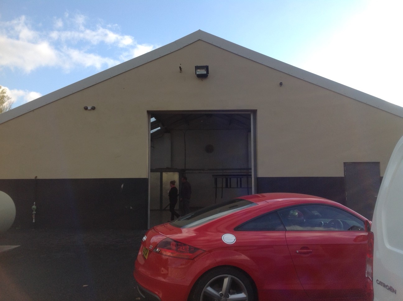
Posted by Derek Heron on 28 November 2013 at 09:36hi all a customer has aked for the above signage
fabrication is not a problem
the building is painted and i am worried that the lettering will be lost in the daytimeany recommendations
i was thinking of mounting all the lettering on a coloured pan tray
just not sure what colour to get the best results day /nightany pointers apreciated
derek
Attachments:
 Martin Pearson replied 11 years, 10 months ago 7 Members · 9 Replies
 -
9 Replies
-

Hi Derek,
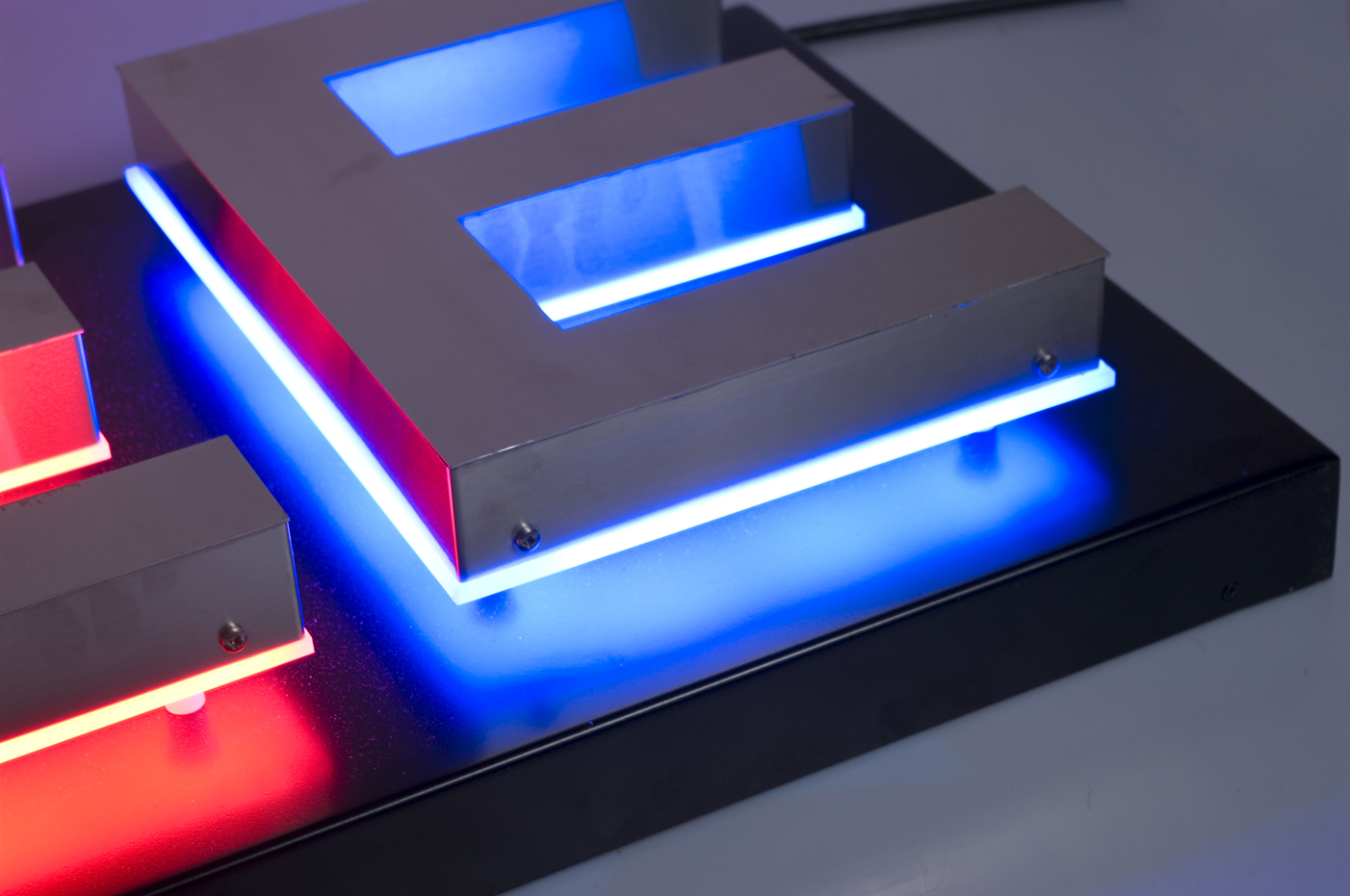
The best halo you can achieve is if the background is a matt light colour – looking at the building this seems to be the case, although a tray painted matt white would give the optimum halo.
Halo illuminated signage is meant to look delicate and understated rather than in your face like a face illumination but with the halo being blue rather than white I think this would stand out quite well. You could also oversize your backtrays to create a key line as well as a halo which will give it an extra punch. See picture…
Hopefully this will help 😀
Katie x
Attachments:
-

Brushed rather than polished would help it stand out a bit better during the day especially in the unlikely event that the sun shone on it. :lol1: :lol1: :lol1:
-

hi kate and martin
thanks for the info
all food for thought
more and more customers asking for this sort of thing
so all info appreciatedderek
-
 quote Derek Heron:h
more and more customers asking for this sort of thing
derek
Your a lucky man Derek, I’m finding them few and far between.
I have done a few stainless on cream with LED and find they look good in daytime aswell
-

i like the look of that keyline effect kate, almost looks like a neon band.
i am guessing from the picture this is a polished edge acrylic, looks a nice effect against that dark back. -

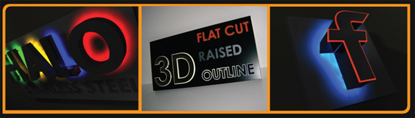
Speak to fabricut, they can make edgelit and backlit stainless letters,and they work really well. the "f" is the example! Goodluck
All the best
Dan
Attachments:
-
quote Robert Lambie:i like the look of that keyline effect kate, almost looks like a neon band.
i am guessing from the picture this is a polished edge acrylic, looks a nice effect against that dark back.No polished edges Rob, just 4mm opal polycarbonate back tray that is oversized by a few mm rather than sunken.
Katie x
-
 quote Katie Waterhouse:quote Robert Lambie:i like the look of that keyline effect kate, almost looks like a neon band.
i am guessing from the picture this is a polished edge acrylic, looks a nice effect against that dark back.No polished edges Rob, just 4mm opal polycarbonate back tray that is oversized by a few mm rather than sunken.
Katie x
Great idea…can see that being offered to a few customers 🙂
-
Robert, if you polish the edges you won’t get the same effect, to get that sort of effect the edge needs to be a bit rough but obviously not to rough :lol1: :lol1:
Log in to reply.