Home › Forums › Sign Making Discussions › Graphic Design Help › My new shop sign… design idea’s welcomed!
-
My new shop sign… design idea’s welcomed!
Posted by Hugh Potter on 15 April 2013 at 23:03Hi all,
as some of you know, I’m soon moving from the studio / workshop (shed) to a retail shop front, I’ve been thinking so hard about the interior, and working on pricing etc. that I’ve neglected my signage,I’m not certain on size yet, probably around 6-8ft x 3ft, I’ll measure up tomorrow! it has seen illuminated signage before, and I’d like to do so n this sign, or at least have the option to add the illumination later on if it comes in over budget initially!! I’m probably thinking ali or comoposite tray.
I want to use ‘signs & Print’ in the name as that’s what I intend to do, push the short run business printing, posters, large glossy prints, canvases etc. etc.
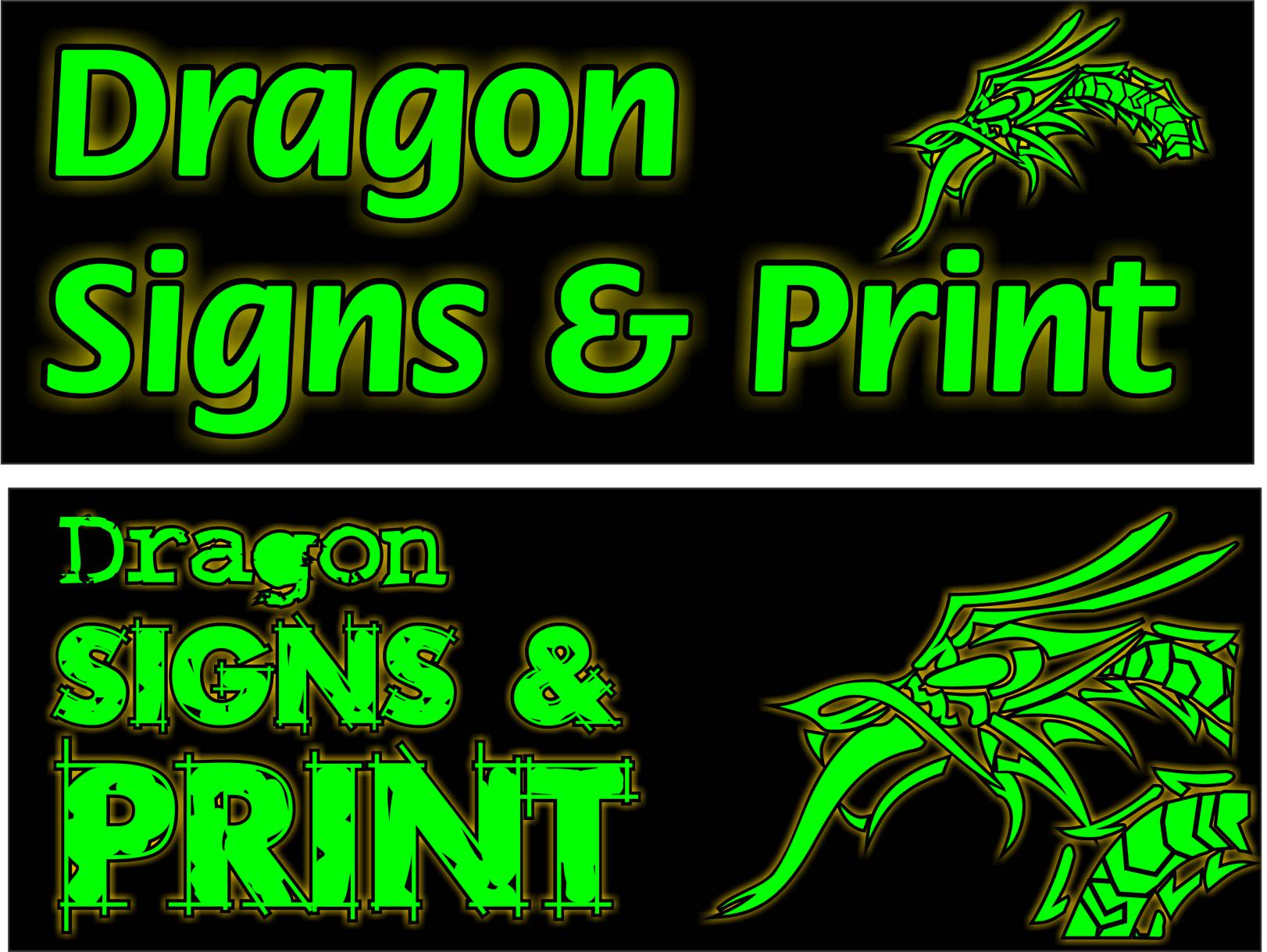
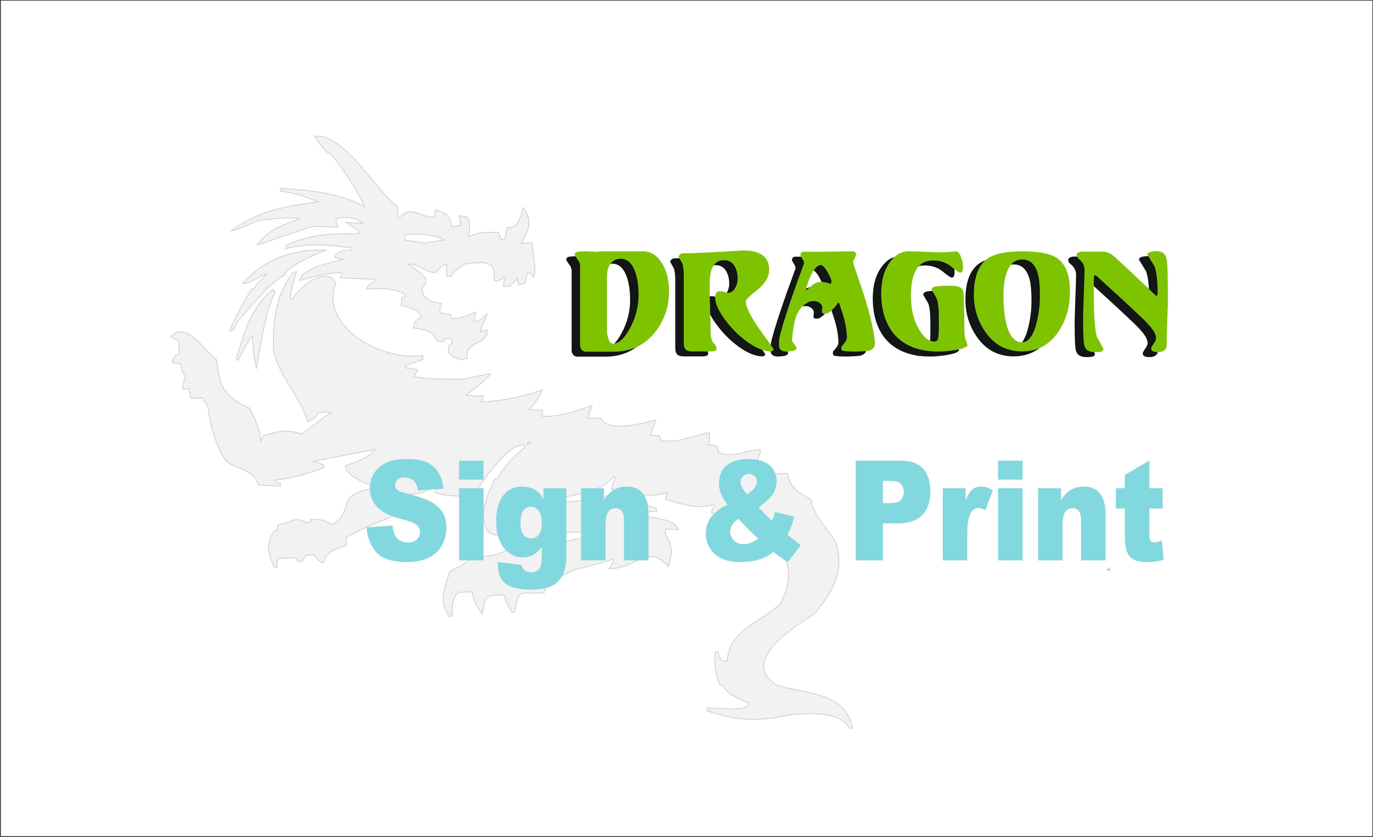
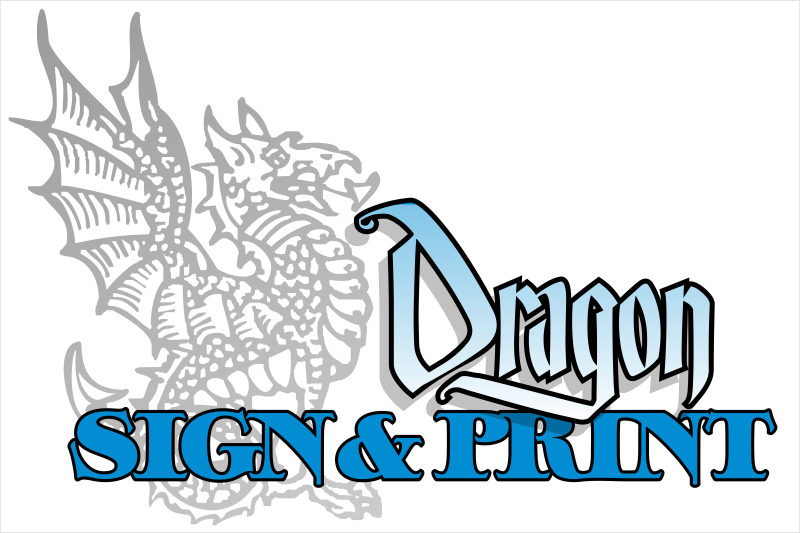
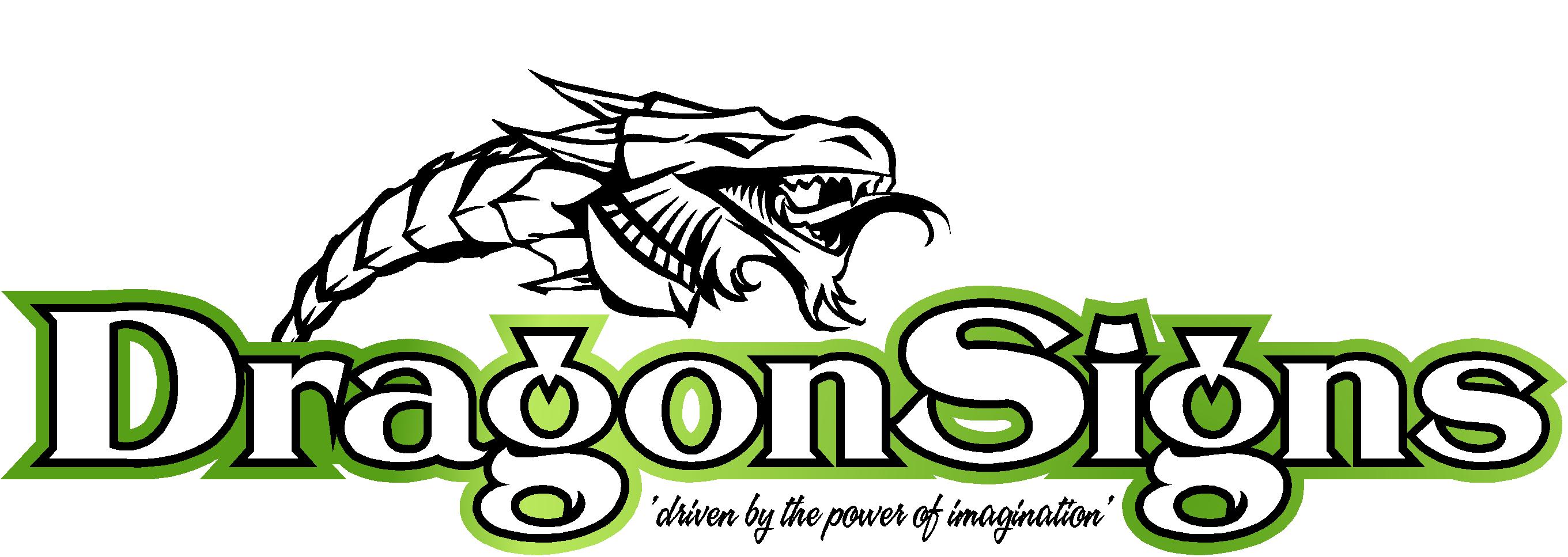
my own 5 minute attempt got no further than the attached pdf (shop sign crap ai) which is total pants, you’ll have to imagine the yellow outline is a yellow halo / light effect, can’t save it small enough for the boards any other way!
simply illuminated flat cuts’s or built-ups, I did have something a bit different / clever / smartarse in mind for the illumination / halo but buggered if I can recall what I had in mind now!!
anyway, very ‘middle England’ type village so I want to try and keep it civilised rather than just attracting landing aircraft and boy racers!!
I’m open to just about any ideas and I’m not adverse to rebranding the van if need be, it will be sat outside while I’m working so may as well double as an A board!
I’ll post up an outline fo the building shortly
thanks in advance,
HughThorp replied 11 years, 11 months ago 21 Members · 52 Replies -
52 Replies
-

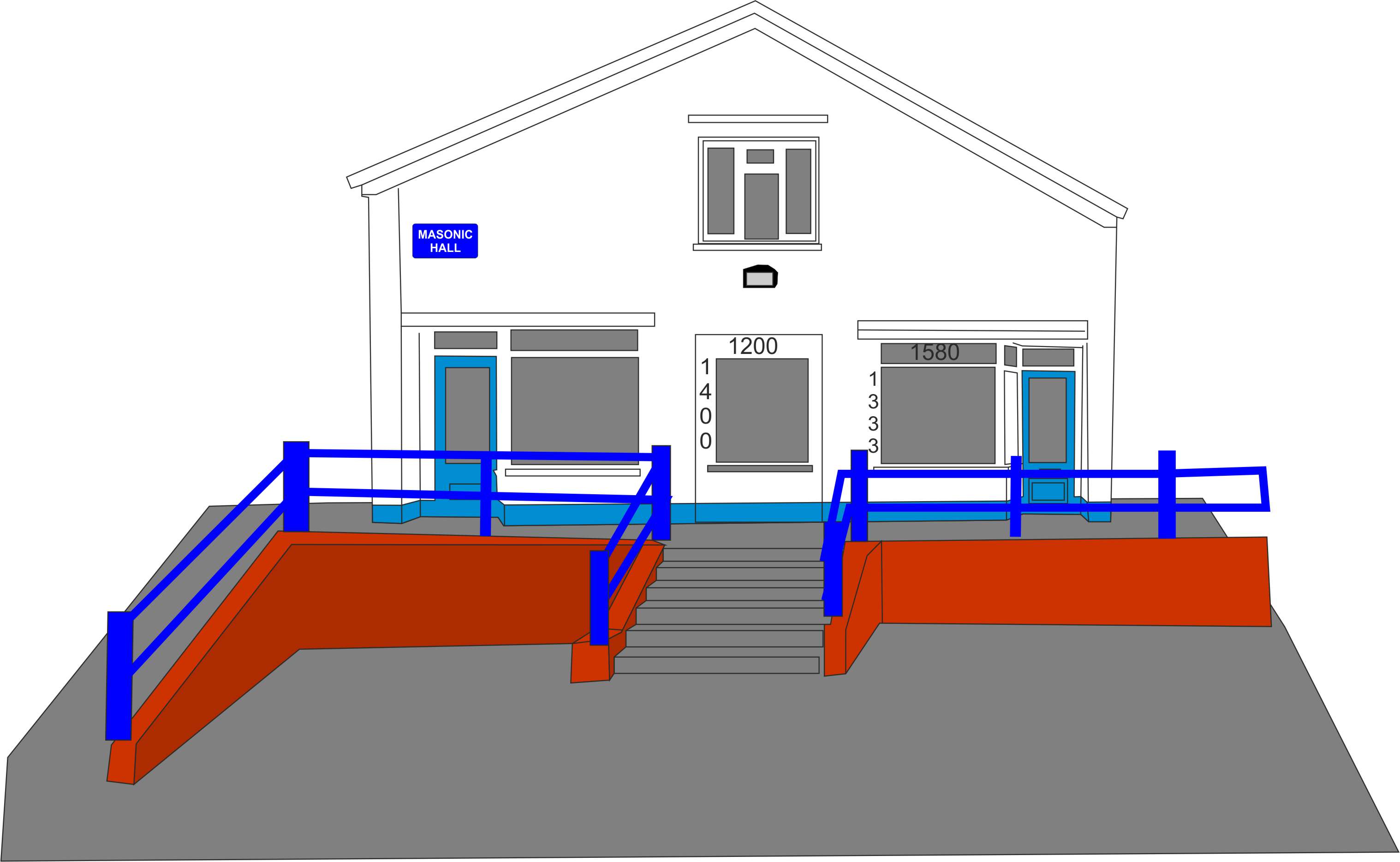
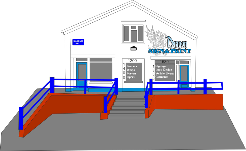
shop outline, windows scaled pretty close…
-

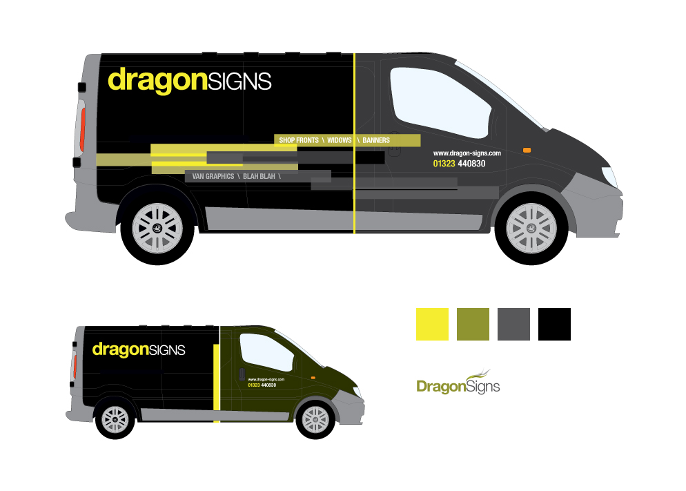
Can you not incorporate & Prints into the "Signs" style as on the van? (with the guidelines etc on letters.)
-
Hi Craig,
I did have a bit of a play with the idea, see attached, but just don’t think I’m happy with it….
Attachments:
-
Got it as a .AI?
If I get 5mins, I’ll have a play. No promises it will be any good though! ha!
-

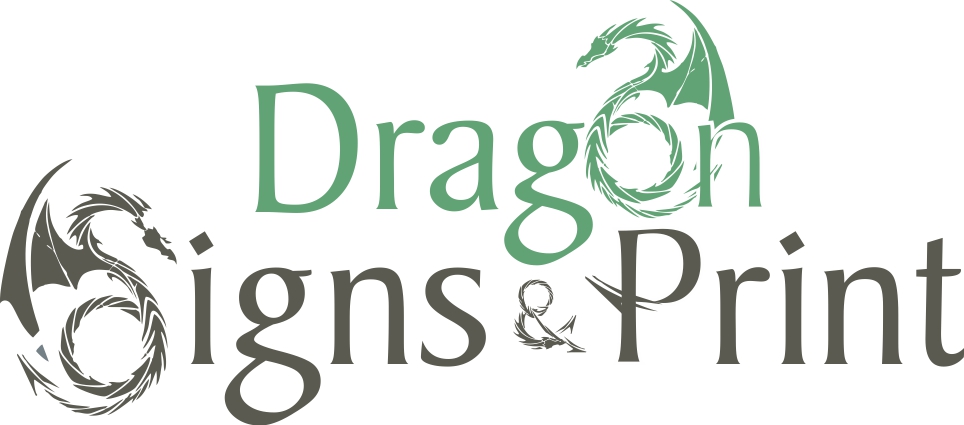
My honest opinion Hugh is that you should take this opportunity when you are making a quantum leap up the scale and re-design from scratch.
The logo is tired looking, gives me the impression that you would only be doing work of a very specific type and honestly doesn’t look in any way professional.
Took me a good long look to see the graphic as a dragon too.Don’t mean to sound harsh but it’s my honest opinion.
🙁 -
All the elements are in the ai’s above, font is rough draft, free on fontyukle.com
Harry,
the yellow halo is supposed to represent back lighting but as you say, it just doesn’t work on the building, I think it’s ok on the van though.A rebranding is definitely on the cards and now is as good a time as there will ever be, just a struggle coming up with something new for me!!
Hugh
-

got to agree with harry hugh…
as you are taking the step up the ladder i too think you should take the opportunity of a complete reface to your company. the dragon also had me looking at it for a few seconds before i realised what it was mate.
im in Manchester doing training so have no access to my phoptoshop, but will have a go when i get back.
nice looking place you have there! -

Hugh…I know you’ve already mentioned in the other thread that you didn’t want to go over kill and attract the wrong type of customers….
Personally I would go fairly subtle on the outer building itself with some quality built up letters and then use the windows to show examples of what you do…….high quality photographic images direct to the glass in one window and maybe LED light pockets in the other window with various examples of your products
Just thinking it would attract people upto the window without shouting accross the street too much
Attachments:
-

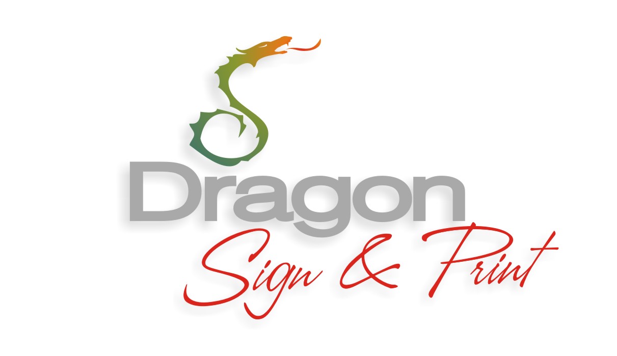
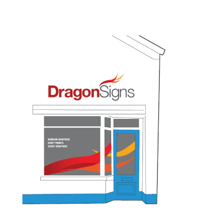
I agree. I think the new step requires a new image. I have had a bit of a go. I think less of a garish look will grab attention.
Attachments:
-

I like that one Jonathan.
Maybe tweek the S on signs, as the loop on the bottom makes it a little harder to read.
It certainly looks clean, modern and professional.
Not the typical dark, gothic dragon look.
-
quote Glenn Sharp:Hugh…I know you’ve already mentioned in the other thread that you didn’t want to go over kill and attract the wrong type of customers….
Personally I would go fairly subtle on the outer building itself with some quality built up letters and then use the windows to show examples of what you do…….high quality photographic images direct to the glass in one window and maybe LED light pockets in the other window with various examples of your products
Just thinking it would attract people upto the window without shouting accross the street too much
I’m not sure my budget stretches to that just yet but I do like it! I was considering using an old pc in the showroom with a screen showing various work on it, then at home time I turn the screen around to face out of the window, I also have a few of those 7" digital photo frames – I get a new one every xmas! they’ll go in the showroom too I expect.
-
quote Jonathan P McGovern:with print
I quite like the dragon but I’m sure I’ve seen it elsewhere, I don’t know whether to do away with the dragon altogether, which then led me to thinking that I maybe change the outward name of the business to Village sign & print, or something – though I guess that incurrs lots more cost with websites etc!
I think stay with dragon signs & print for now.
ps.. in defence of my dragon, he is much more colourful on the van – black reflective and holographic looking most of the time, by night in headlights he really comes alive, though up there on the shop front it wouldn’t really work!
-
I agree with a previous comment, the dragon is difficult to see without really looking at it, (plus it reminds me of those tribal dragon tattoos that were popular) but if it works on your van then no point in fixing something that is not broken.
I always think it is best to have a uniform approach, something that fits both your van and shop. So stick with what you have got on the van rather than going for two different looks.
I personally don’t like the garish, but that’s just me, I am not a designer. I just like the subtle and clean look.
Yeah the dragon was used from a vector site so may have seen it before, I just looked for a quick way of incorporating into the text. What you need to think about is customers don’t have access to the same as us so they are unlikely to see it.
Best thing to do is give yourself a few very different designs and each time you see a customer ask for there opinions, that way you get a very honest response. I would also stick with the name!
Look forward to seeing the pics of the shop, good luck, I am very very envious!!
-
I agree Jonathon! while the dragon works on the van, it doesn’t on the shop, unhless perhaps I went the lightbox / fret cut tray option and added the colour it should have, even then I don’t think it’s what I’m looking for on the shop!
-

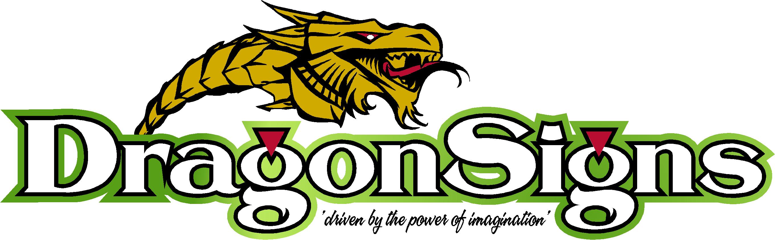
Been reading this Hugh and think for the market you are going for you need something more funky and eye catching, especially from the road.
The Dragon you use doesn’t work on a sign, i have dragged one off the net for an example.
It wont get you blue chip clients but would entice the kind of punters you want into the shop more.
this could be way off the mark but always nice to see things from a different angle 😉
Attachments:
-
I really like that Martin, the Mrs smiled and loved it too!
it certain a direction I hadn’t considered and as I’m trying new things and directions it might well be a good way to go! thanks for the input!
-

Nice design as usual Martin, do like to see your designs on threads like this
Kevin
-

Sorry but I have to agree with what’s been said. Your layouts are kind of choppy looking, dated, and incohesive.
🙂
I would try painting a dragon on the wall (easy using a projector) then adding standoff letters.
You could do a list of services very simply in those windows as well as a phone number/website.
I would not change your name.
Here’s a quick mock-up. If the building has blue trim I would go that route rather than the slime green. I was going for more of a traditional look.
Love….jill -

Here is my attempt!! not up to the required standard i don’t think 🙂
Attachments:
-

Hugh, I agree it would be good to look at things fresh 😀
Maybe work out a colour palette etcI looked at incorporating a dragon, then just flames…. I not sure you need it, but maybe that could just be me 😕
Here’s a logotype using just the name plus stroke widths taken from the different stroke widths of the letters, maybe something you could transfer to windows, literature etc.
Maybe too AFW
Cheers 😀
Attachments:
-

Jill thats gorgeous! High marks to Andrew too! Two different markets.
Specially like the BLAH BLAH on the side! -

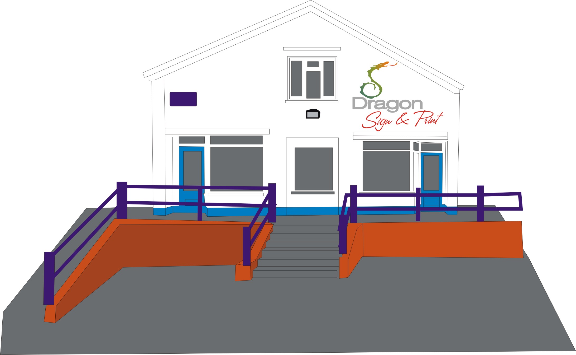
Like Jills building design, works well within the confines of the roof angle….
Im guessing Hugh got the place with a nice handshake :lol1: Better learn the art of guilding…… 😀
-
Loving the thread, once again!
Here’s a wee go from me.
Attachments:
-
Hi Guys n Girls,
wow, certainly some very different ideas there,
I like the idea of going onto the walls Jill, I hadn’t considered that (typical vinylist!), I’m not struck on the fonts but the principle I do like!
Hi Greame, thanks for the input mate, I think it’s probably too close to what I’d come up with already but thanks for having a stab at it for me 🙂
Andrew, Thats really got me thinking!! I like it, certainly not something I would have thought of, I’ll need to think on how it could be incorporated into a shop sign, manbe a tray with print and painted stripes on the wall flowing off of the sign? I like the little flame too, keeps a link with Dragon but without the need for the physical presence of one… hmmm! thank you!
Hey Harry, again – I like the idea of using the wall instead of a tray or other typical signage, Not keen on the dragon though -sorry, I’m rather particular about my dragons!!
Thanks for the input guys, it’s really giving me lots to think about,
thanks,
Hugh -
No bother Hugh, I know how fetishistic you Welsh are about your dragons. 😀
What is fascinating about the different logos is the ‘image’ they project. From Martin’s to Andrew’s.
Much careful thought ahead about where you want to pitch yourself and to whom! You’re in the Premier league now. 😀 -
No problem Hugh,
I’m not in the same league as some of these guys, I just like having a mess about
All the best on the path you choose mate.
Graeme
-
You don’t really have to have a dragon in there at all.
I like Andrew’s really corporate looking take, looks very posh.
What you could do, rather than painting a dragon (if you must have one)
when you finally find the one you like, ya picky git, you could project it as a light up onto the wall of the storefront at night.
So by day you look corporate but by night it looks more dramatic.
You’d just have to worry about local yokels messing with your projector.
Attachments:
-
I like the idea of projection but have no idea if ‘the village’ would like it!
-
the other option I did last night 😀 maybe it sits in the middle a bit more 😀
Attachments:

-
I really like that lower option Andrew, looks really smart 🙂
Thank you!
Thinking its between Martins idea and Andrews now!
Fun or corporate??!! -
Loving this thread, and all the different takes on the logo.
What about digital wall vinyl applied directly to the wall? (Sorry brushies)
I’m liking Andrews also, a great balance between the corporate & retail appearance.
-
Yep Andrews second one for me.
Looks fun and corporate at the same time.
-
Love the way Andrew’s work’s on the building. Very smart and classy.
-
quote Harry Cleary:Love the way Andrew’s work’s on the building. Very smart and classy.
I’m liking it a lot too Harry,
just figuring now whether it’s gonna be Andrews or Martins style of signage, both have their merits…
Adnrews is very clean, modern and classy – exactly what I would expect from him!
Martins, again, modern and fresh looking but with that "hey, we’re fun, come in’ type of appeal, certainly a good thing on the printing side of things, and being next to a school….
decisions!
oh well, it’s moving day today, van is to the rafters with subli kit and rolls of vinyl, over 100 rolls – eek! need a thin out!
-
 quote Hugh Potter:quote Harry Cleary:Love the way Andrew’s work’s on the building. Very smart and classy.
I’m liking it a lot too Harry,
just figuring now whether it’s gonna be Andrews or Martins style of signage, both have their merits…
Adnrews is very clean, modern and classy – exactly what I would expect from him!
Martins, again, modern and fresh looking but with that “hey, we’re fun, come in’ type of appeal, certainly a good thing on the printing side of things, and being next to a school….
decisions!
oh well, it’s moving day today, van is to the rafters with subli kit and rolls of vinyl, over 100 rolls – eek! need a thin out!
are you expecting lots of school kids poping in ?
-
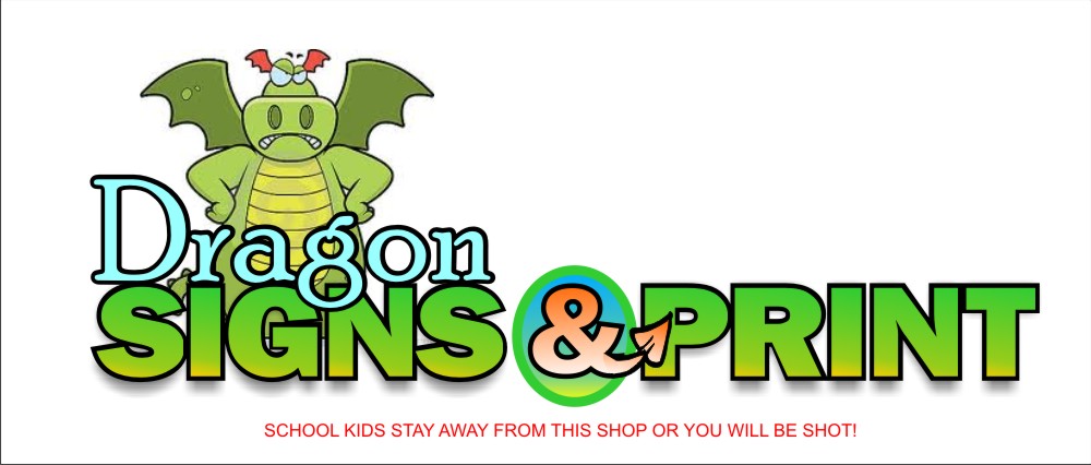
If you are located near a school I would not use a friendly dragon, you will be inundated with sticky-fingered kids wanting little annoying stickers.
😀 -
I agree with Jill you don’t want kids hanging about making your shop look scruffy and causing trouble.
-

Don’t do it with a glossy black background – it will show up all the grubby fingerprints from the school kids 😕
-
 quote Phill Fenton:Don’t do it with a glossy black background – it will show up all the grubby fingerprints from the school kids 😕
Are they all carrying step ladders about with them these days Phill or are they just good at making human pyramids? :lol1: :lol1:
-

get a couple of flame throwers and sink them flush with the wall.
Not only will it give great dragon effects but blasting the kids occasionally and a few tight customers will sort em out
-
Nice Neil!
Here’s a revised version from me.!
Attachments:
-

Some of these designs are really good, you’re a clever lot!! 😉
-
Sorry I’ve been quiet, been busy moving everything to the shop this past two days, lots of work still to do, a bit emotional deconstructing the workshop though!
Would like to thank you all for your input and time spent fiddling on my behalf, really go appreciate what a great community this forum is, thank you all 🙂
I have decided, after lots of thought, to work with Andrews design, most likely the second design but, the first one he offered is also growing on me rapidly and both work well with the building.
Martin’s dragon layout was a very very close second choice, I would live to find a use for it within a kids range of garments we’ve been planning – if you don’t mind Martin?
Thanks again
Hugh
-
Cheers Hugh,
The first option may look flippant but it is considered and would showcase all skills,
may need a bit of tweaking but would work 😉 the other logo on a van would work too 🙂 let me know and i can send vectors? -
I know it’s a slightly old topic but just had a read through – awesome topic with various designs.
Hugh how did you get on in the end have you got any pictures of your shop now?
Dan.

Log in to reply.