Home › Forums › Sign Making Discussions › Graphic Design Help › Design help needed on a Joiners van please?
-
Design help needed on a Joiners van please?
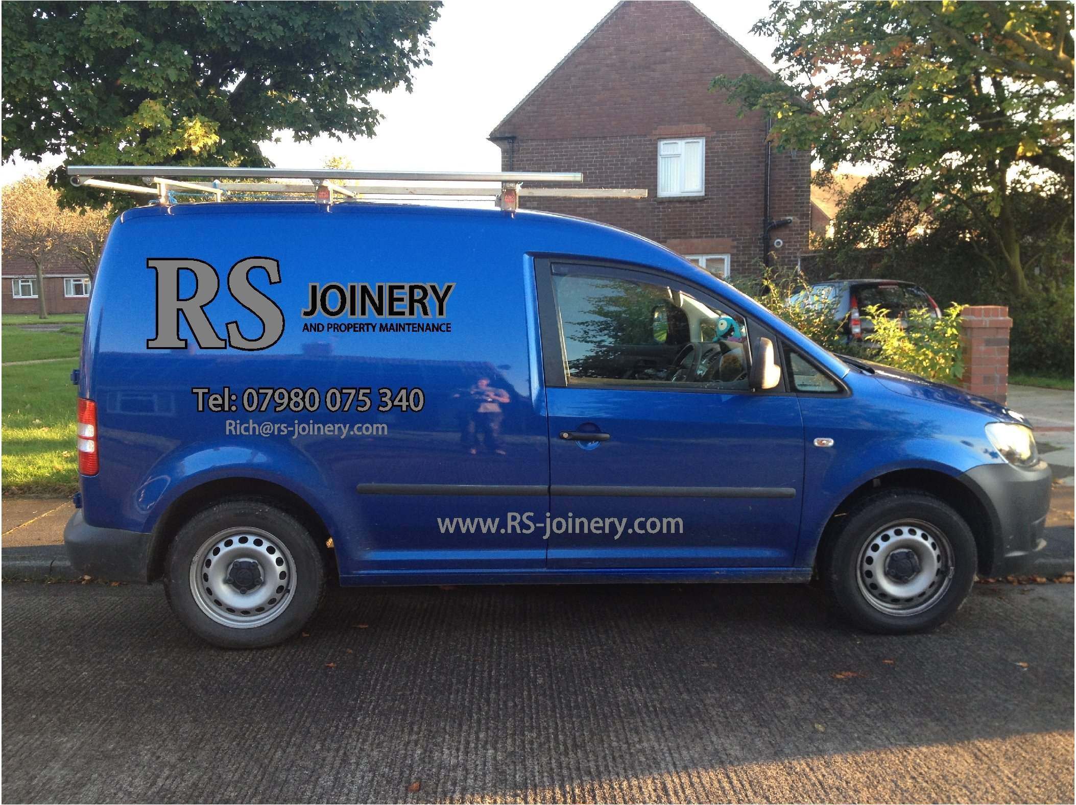
Posted by Nikolas Cooper on 15 November 2012 at 19:27Hi can someone send some advice my way on this one. I dont think its good enough.
Any comments welcome.
Thanks in advance.
Niki
Attachments:
 Nikolas Cooper replied 13 years, 1 month ago 6 Members · 6 Replies
 -
6 Replies
-

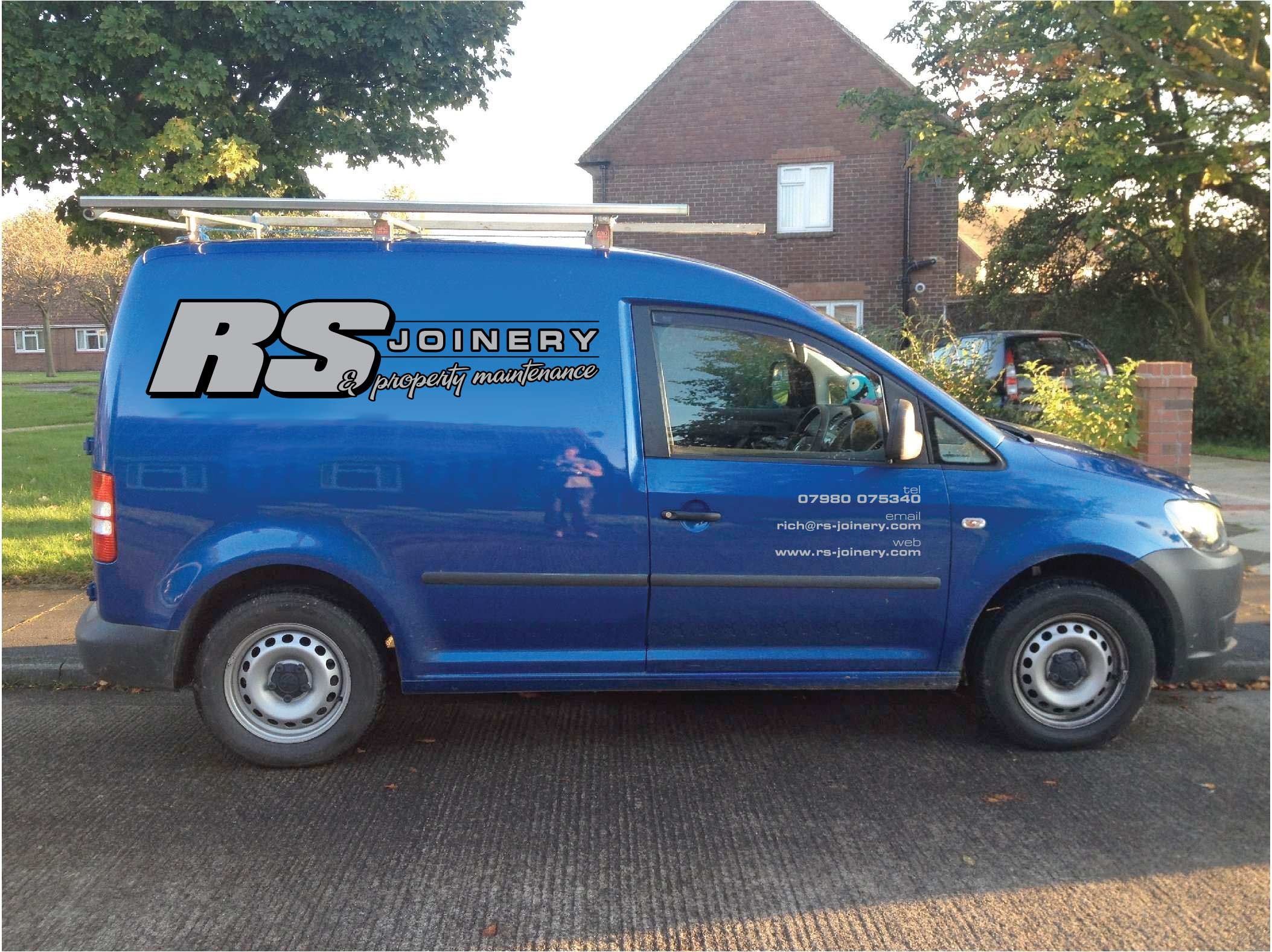
I’ve had a quick go at a similar layout. See what you think.
Attachments:
-

prefer Harveys layout so far…
in both cases i think the RS is overpowering.is black and silver the only colours to be used?
-

Am i the only one reading that as (A)RS(E) Joinery?
😮
-
 quote James Phillips:Am i the only one reading that as (A)RS(E) Joinery?
😮
not now you’re not 😕
-

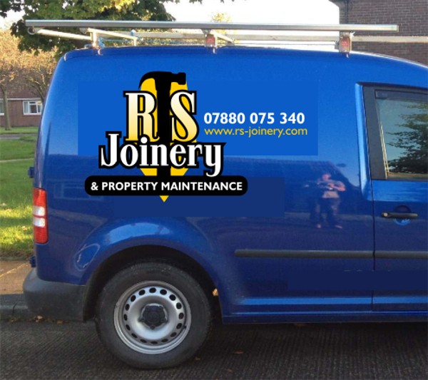
I’d be more like this.
I like to see everything kind of unified up on the biggest portion.
If the website is on the van there should be no need for an email.
And I hate "tel" sorry.
😀
I think you would be better leaning towards white than silver and black.
Love….Jill
Attachments:
-

Thanks for the replys, all look better than my effort! 😳

Log in to reply.