Home Forums Sign Making Discussions Graphic Design Help caravan service van help

  • caravan service van help

    Posted by Stephen Ingham on 11 April 2012 at 21:51

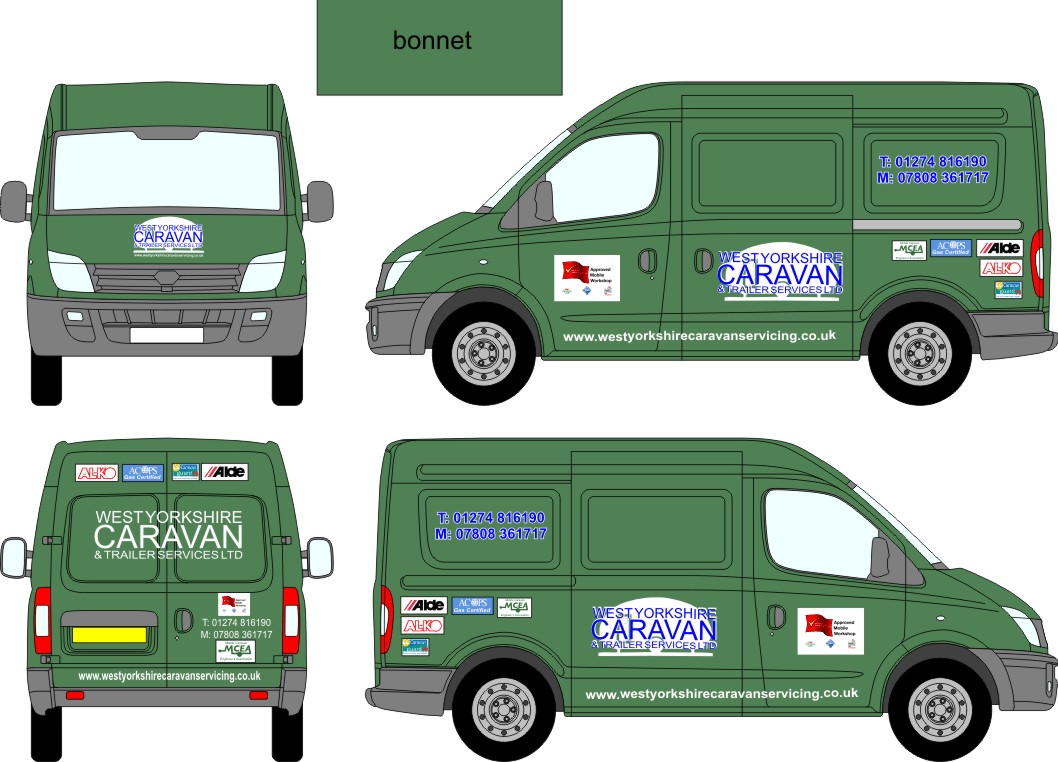
    Hi all, can anyone throw me a little inspiration please?

    I have been sat staring at this for a little while and i have to say it is doing my head in and i am struggling somewhat…

    The logo is a must, and the front "window" panel actually has a window so is next to useless.

    I have to say this is one of the worse designed vans spacewise i have ever worked on….

    Any help and advice is much appreciated.

    Cheers
    Stephen


    Attachments:

    Tim Painter replied 13 years, 6 months ago 5 Members · 7 Replies
  • 7 Replies
  • NeilRoss

    Member
    12 April 2012 at 07:44

    Separate the text from the underlying caravan logo – I could hardly make out what it was. Can you get either the telephone numbers or the website URL running the lenght across the top above the side panels? Stuff needs to be spread out – too boxy. The company name needs more presence – probably change of colour scheme?

    Just my initial thoughts…

    – neil

  • Stephen Ingham

    Member
    12 April 2012 at 07:49

    Hi Neil, thanks for the reply.

    I must say this is one of the worst vans for surface area i have ever had the misfortune to design on, there is very little actual available space and the window recesses are really deep too…

    There isnt really very much flat space above the window panels to run anything…

  • Daniel Warren

    Member
    12 April 2012 at 08:04

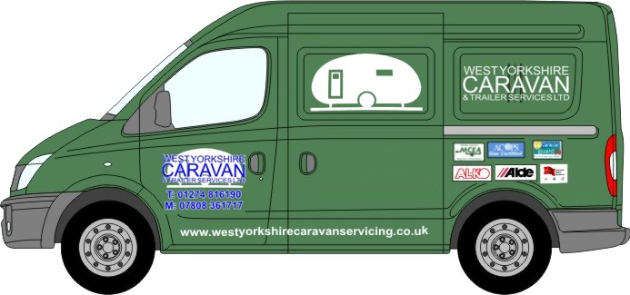
    Perhaps swap the logo to up to the middle panel next to the ‘window’ and have the text which is currently there put back where the logo was.

    Looking at it, my eye is wandering about wanting to know what to focus on.

  • Stephen Ingham

    Member
    12 April 2012 at 08:06

    Hi Daniel, yes i agree it doesn’t seem to work….the logo is where it is at the moment because thats the biggest flat area…but yes i will put the logo in the rear window panel and see what it looks like

    cheers
    stephen

  • Philip Gibbs

    Member
    12 April 2012 at 08:48

    i would try to keep all the small logos together

    Niel is right about splitting the logo up, they have done it on the website.

    also i find the web address hard to read so i would adjust the kerning to give the hint of a space

    maybe add in
    "Friendly & Affordable Mobile Caravan Engineer working throughout West Yorkshire"
    below the window panels


    Attachments:

  • Stephen Ingham

    Member
    12 April 2012 at 08:50

    Hi Phillip, thanks for that, yes i agree the separated does work well…

    cheers
    stephen

  • Tim Painter

    Member
    12 April 2012 at 20:23

    I would run the brand logos as one strip if you must have a white background rather than individual blocks.

Log in to reply.