Home › Forums › Sign Making Discussions › Graphic Design Help › A Board design help
-
A Board design help
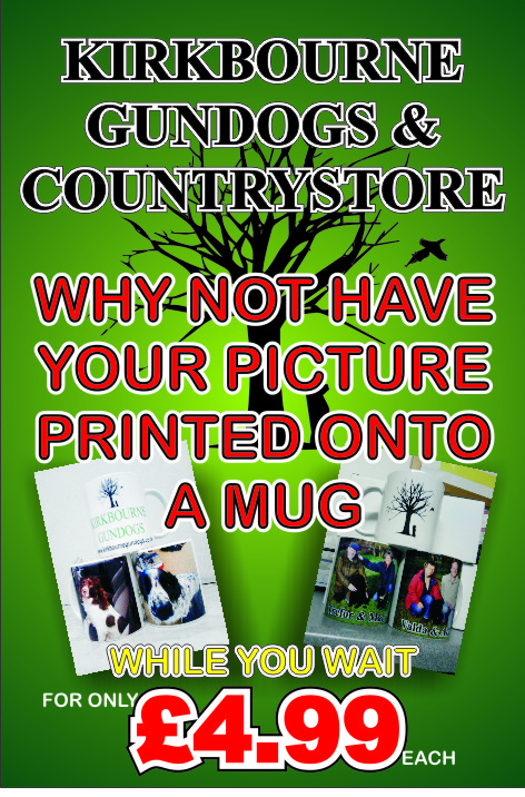
Posted by Stephen Ingham on 7 February 2010 at 16:45Hi all, can anyone help me with the layout for an a board we need to produce?
It is to be used at a game fair where printed mugs will be made and sold.
Any help or advice is appreciated
attached is what i have as a starting point…
cheers
stephen
Attachments:
 Stephen Ingham replied 15 years, 10 months ago 5 Members · 7 Replies
 -
7 Replies
-

I can’t help Steve but I have a load of dye sub ink for sale for an epson if they are interested???
😀 😀 😀 😀 😀
-

Hi Stephen,
The only thing id suggest is making their logo smaller, this sign isnt about branding no-one will care who the company is and their logo takes up most of the sign.
Make it clear what the service is Id have MUGS PRINTED WHILE YOU WAIT or HAVE YOUR PICTURE ON A MUG NOW! (dont use the word not in text) as large as poss with a pic of a mug.
Nigel
-

i would remove the tree from the background as it makes the text a little hard to read.
Liam
-

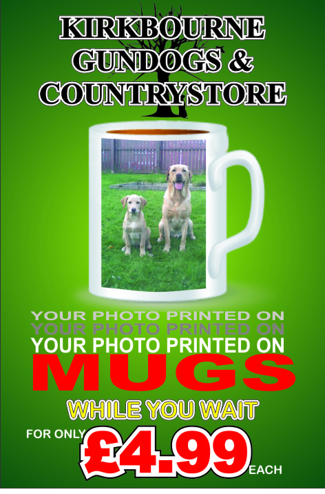
Hi all, thanks for your replies
How about something like this…..
cheers
stephen
Attachments:
-
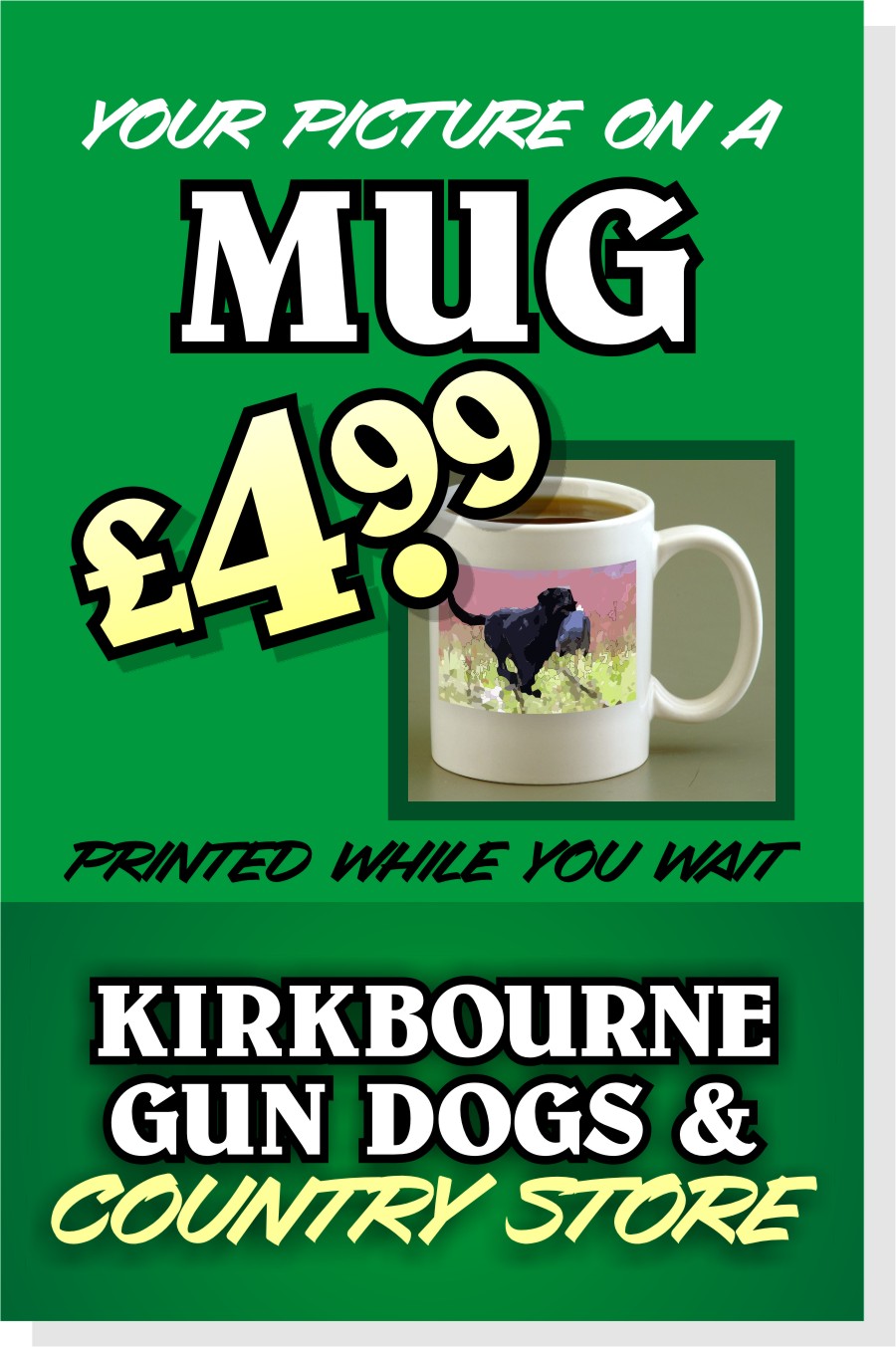
Steve, too much green in it with the green grass in the mug. I can make a suggestion (I don’t do this very often). I like some of the top design. I would keep the image with all of the mugs in and replace the two images below with one larger mug in the centre, I think it’s good to see other alternatives. Hope that helps.
-

It’s too busy.
You want it to grab attention quick.
I would decrease the words and rearrange them.
I do not care for the black lettering with the white outline as it offers very little contrast.
(sorry for my cruddy mug mock up, and I don’t have the right Roman font)
The red lettering makes the other version look like Christmas.
I always make the £ or $ a bit smaller than the number.
You could make the tree as a watermark in the background.
Love….Jill
Attachments:
-
Hi, thanks for the replies.
Jill that does look much cleaner and easier to read, i’ll have a go at changing mine…
cheers
stephen

Log in to reply.