Home Forums Sign Making Discussions Graphic Design Help Fothergill logo: help design and advise

  • Fothergill logo: help design and advise

    Posted by Hugh Potter on 18 January 2010 at 21:29

    Hey All,

    I’m not usually one to ask but, with everything i have going on at the moment i’m struggling to be ‘inspired’ on this one!

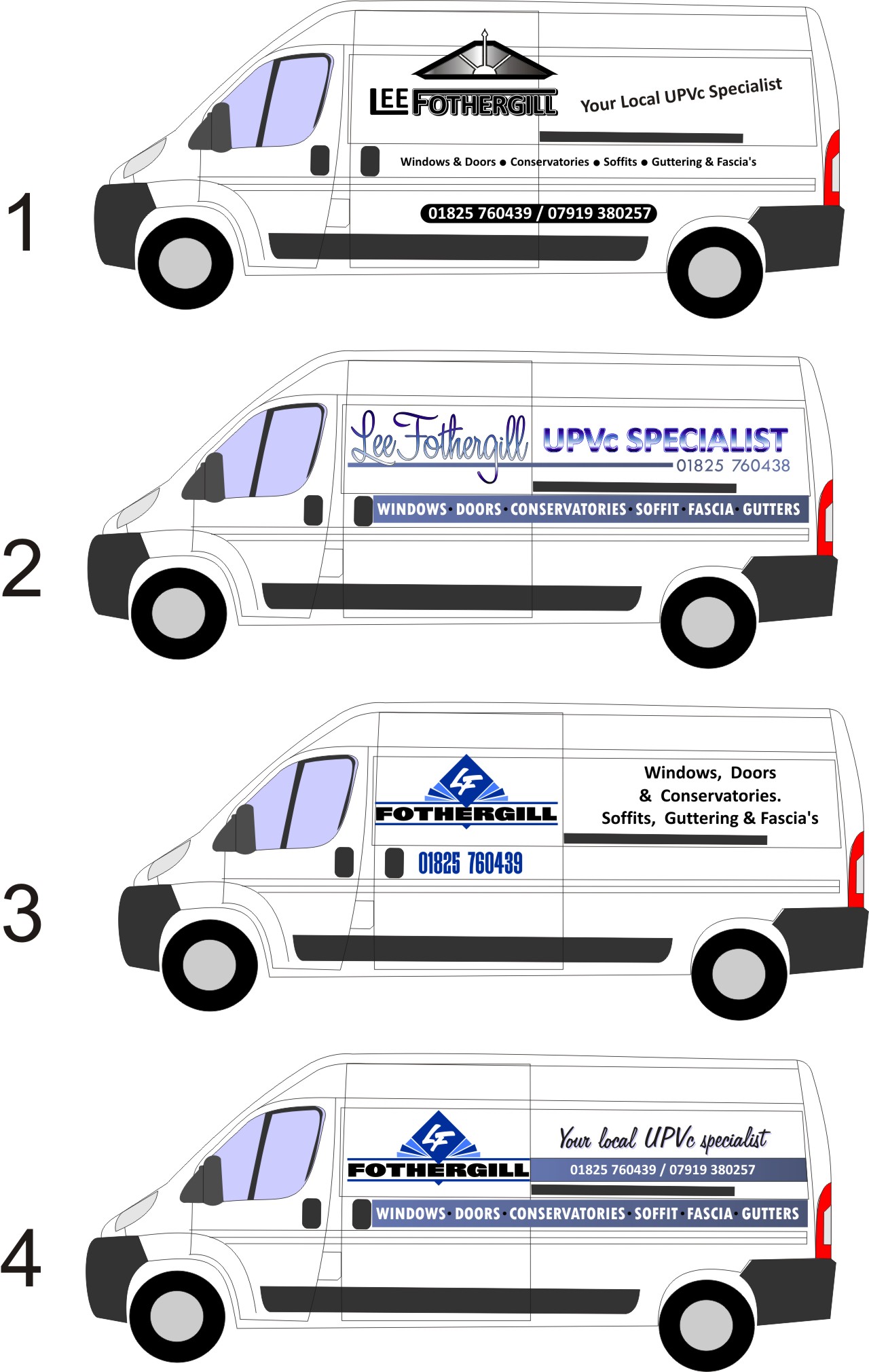
    ok, the customer has come to me on recommendation and I obviously want to do the referee and myself justice,

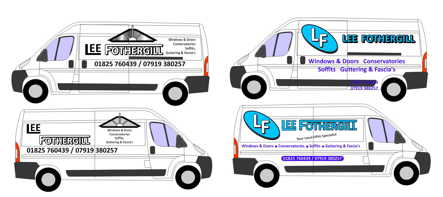
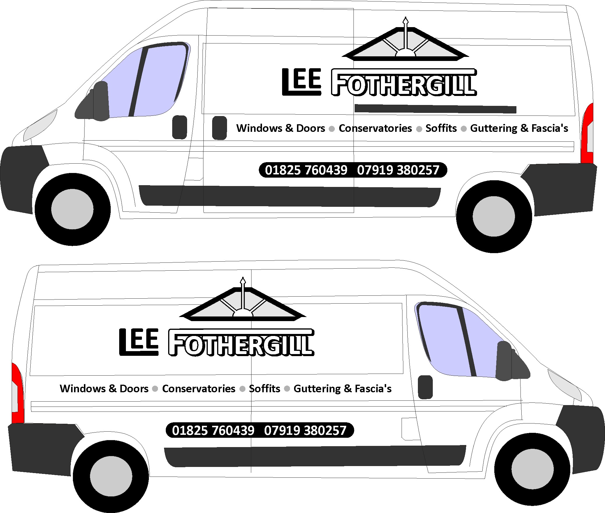
    the first layout (left) is based upon the customers sketches – the design rather than layout- they looked ok on paper but i’m struggling on the van,

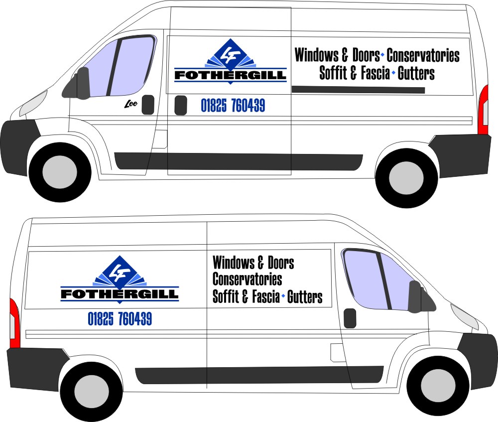
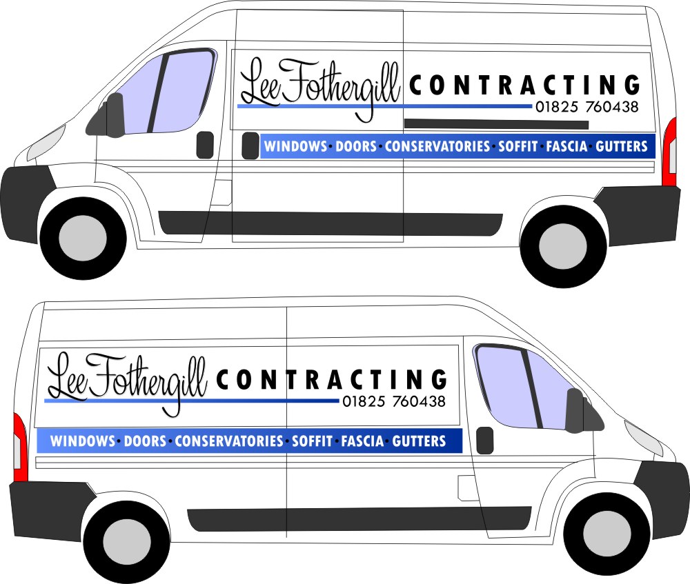
    the second idea (right) is just something i was playing with, no real idea where it’s going!

    customer spec is "eye catching yet simple", ie, to be able to read it from 10m or 50m yet have a ‘wow’ element to it, wow isn’t flowing in me at the mo 🙁

    colours pref’d in the main are blues and whatever works with it, he just doesn’t want something which looks a mess. we can use digi print, cut vinyl, any effects, font is calibri although it’s not set in stone, i just used it cos it’s clear to read.

    I must have looked at fifty vans and trucks out on the road today and saw loads of little things i though i could incorporate but ,when i sat down i was just blank!!

    anyways, hoping someone can help…

    thanks in advance

    Hugh "desperately in need of some inspiration" potter!

    can’t save as ai i’m afraid, took me ten mins to strip the few effects i’d used to bring it within 400kb file size as it is!


    Attachments:

    Martin Oxenham replied 15 years, 9 months ago 8 Members · 20 Replies
  • 20 Replies
  • Graeme Harrold

    Member
    18 January 2010 at 22:11

    Not too sure about the roofing feature, but just keeping it simple…….


    Attachments:

  • Jill Marie Welsh

    Member
    18 January 2010 at 22:20

    Keeping it even simpler.
    I wish it was something like "Lee Fothergill Contracting"
    because making the surname the focus doesn’t tell the consumer what they need to know at a quick glance.
    Love….Jill


    Attachments:

  • Lynn Normington

    Member
    18 January 2010 at 22:41

    Like that Jill but I would put a comma between windows and doors instead of "and" to compact it more also on the last line a comma instead of & and a bullet point jmh 🙄

    Lynn

  • Jill Marie Welsh

    Member
    18 January 2010 at 23:17

    OK here’s another one.


    Attachments:

  • Hugh Potter

    Member
    19 January 2010 at 10:50

    thank you Greame and Jill,

    I like both of those,

    Greame, i think you’ve clearly shown i was trying to go too big, looks much clearer than my brainfreeze attempt! the roof window feature thing is his!!!

    Jill, the first design i really like, the LF logo is quite art deco, i think, i’d do the list of jobs differently i think but otherwise i think i could offer something similar as an alternative,

    your 2nd design, i like the principle but, i doublt he’ll want contractor written on there, i’ll see if there’s another way of doing it. he’s very well known in the town and people are used to seeing his old van about, he’s just worried people will think he’s gone if he’s not written quickly on his new van!

    thanks again,

    Hugh

  • Peter Dee

    Member
    19 January 2010 at 12:09

    Just viewed this topic and before reading posts or enlarging images I looked at what you had.
    From the small images all that hit me was Lee Fothergill, not a clue what he did.
    I often find that people want their name up in lights rather than what they do. Far more prominence should be given to what he does IMHO.

  • Jill Marie Welsh

    Member
    19 January 2010 at 12:17

    Everybody in town may know him and what he does but what about new residents?
    I just said Contracting because that’s what he’s be called here.
    We could always make him an exotic dancer or a Jack of all Trades or something.
    😉
    I thought of making whatever service he does the most the largest, as when I saw the original idea I just assumed he was a window man.
    Then listing the other services smaller.

    Usually on something that is a known type of vehicle, like a tow truck, I will make the name bigger and stand out so people remember which towing service to call. We have a ton of plumbers in this area so I tend to make the surname bigger on those too.

  • Hugh Potter

    Member
    19 January 2010 at 12:21

    thanks Peter and Jill,

    point well made and humbly taken 🙂

    regards,
    Hugh

  • Hugh Potter

    Member
    19 January 2010 at 14:12

    right, think there’s something to show him and work with amongst this lot, with your permission Jill, i’d like to use parts of your layouts / designs.

    i think these all want some level of tweaking etc but in general, which do you, my peers, think is the better? what major boobs have i made?

    my preference, looking at them all side by side would be for 2 or 4, though i want to better integrate the phone number in No.4.

    Jill, i like both those fonts, where might i get them please?

    Hugh


    Attachments:

  • Jill Marie Welsh

    Member
    19 January 2010 at 14:51

    I like #2 but only if the title was in all black, you are getting a bit happy with all those effects.
    🙂
    The script is a beta font from Art & Signfonts called Layla, as yet unavailable. I mixed the two versions.
    (see description on main page)
    http://www.artandsignstudio.com/fonts.html
    The other copy is a mix of Twentieth Century.
    http://new.myfonts.com/fonts/agfa/twentieth-century-mt/
    The one with the deco-ish icon (from the ABCDesign CD but modified) uses the Mike Stevens fonts Arroyo (body) Big Red (surname) and Art & Signfont’s Blaze.
    http://www.artandsignstudio.com/blaze.html
    (I always enlarge the lower case letters)
    And here is a free Arroyo:
    http://www.2-free.net/free-fonts/arroyo/32008.html
    And your last line has an unnecessary apostrophe.
    (Fascia’s should be Fascia or Fascias)

  • Hugh Potter

    Member
    19 January 2010 at 15:01

    Hi Jill,

    a font of knowledge as per usual 😉 (pun intended!)

    i thought i’d removed the fill on the name font but… will do so, as I will the apostrophe!

    thanks,
    Hugh

  • Jill Marie Welsh

    Member
    19 January 2010 at 15:14

    Thanks for being such a good sport, Hugh.
    It’s a rare man who listens to a woman.
    😉 😉 😉

  • Harry Cleary

    Member
    19 January 2010 at 16:01
    quote Jillbeans:

    Thanks for being such a good sport, Hugh.
    It’s a rare man who listens to a woman.
    😉 😉 😉

    Potter’s a wuss! 🙄 😀 😀

  • Phill Fenton

    Member
    19 January 2010 at 16:05

    He’s always been respectful towards his elders

  • Jill Marie Welsh

    Member
    19 January 2010 at 16:08

    Watch it, Phill!
    hahaha
    You know the only two words in a man’s vocabulary should be "Yes, Dear", Harry.
    😉
    Sorry for the hijack Hugh. Now get cracking on that van!
    No stopping to fish either!

  • Harry Cleary

    Member
    19 January 2010 at 16:15
    quote Jillbeans:

    Now get cracking on that van!
    No stopping to fish either!

    See Hugh? You give them an inch and ……….thats weemin for ye! 😀

  • Hugh Potter

    Member
    19 January 2010 at 21:18

    i’m well used to it Harry!

    fishing? can’t remember when i last went, november i think! totally missed the beach cod season 🙁 might have to sneak out for a trout or three this week sometime though!

    thanks again all.

    Hugh

  • Jill Marie Welsh

    Member
    19 January 2010 at 21:20

    Not until that van is done and the honey do list is complete.
    😉

  • Hugh Potter

    Member
    19 January 2010 at 21:33

    you’re probably right Jill!!

    anyways, only just got in from rugby so must go get cleaned up or i’ll get told off for that too!

  • Martin Oxenham

    Member
    21 January 2010 at 19:50

    I prefer Jills designs as they fit the panels. I don’t personally like it when a design goes over the panel as your window thing does.
    It looks Ok on paper but on the van this is a recess of about 20mm so it gives an ugly step in the design. I think names, designs should be within the panels unless they go over the whole side evenly. If its just a bit like the top of your window I think it looks like its been measured wrong and won’t fit.
    Just my opinion.

Log in to reply.