Home › Forums › Sign Making Discussions › Graphic Design Help › can anyone help me with Banner design please?
-
can anyone help me with Banner design please?
Posted by Nicholas Gormley on 22 September 2009 at 09:46Hi all,
Im making a couple of banners to advertise my business and want your comments and opinions on them or what i should do or not to do??
Any help would be greatly appreciated.
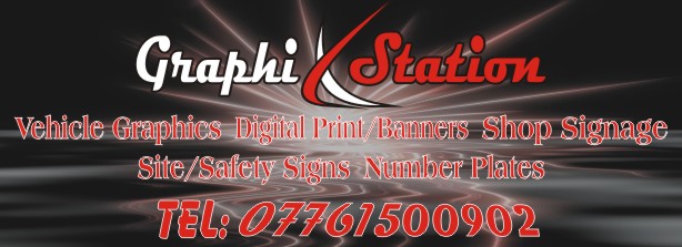
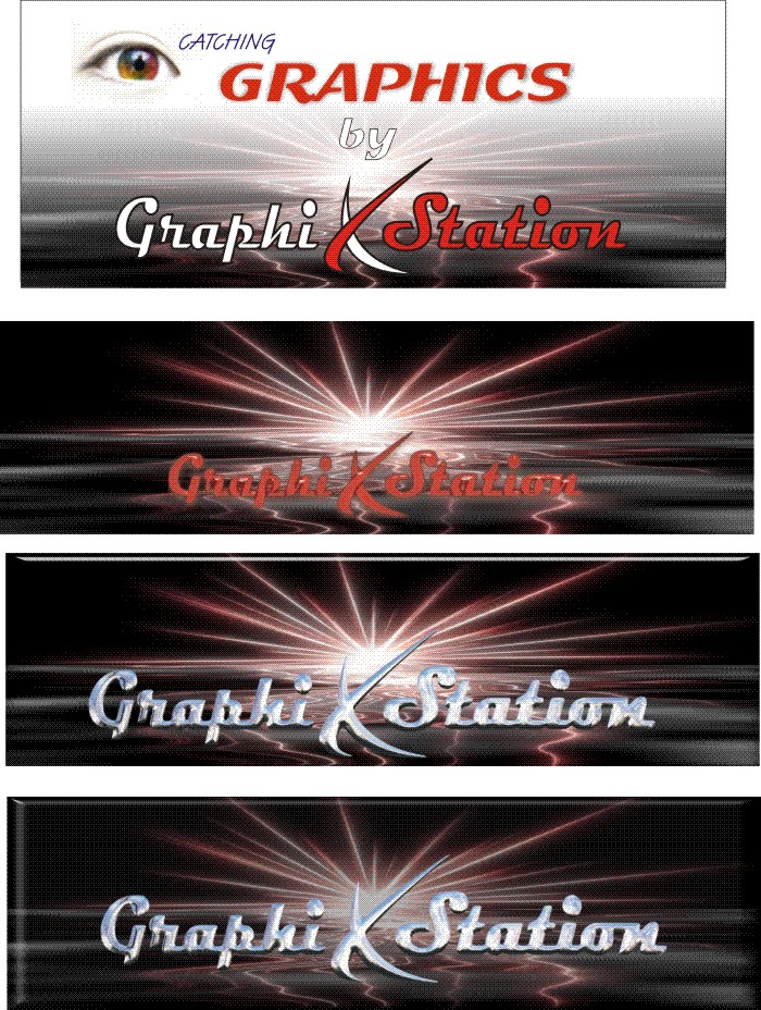
Ive attached my logo and the front of my business card. my background fill is to large a file to upload. Anyone any ideas on something nice and eye catching?? im open to offers.Thanks
Nicholas
Attachments:
 Nicholas Gormley replied 16 years, 2 months ago 9 Members · 23 Replies
 -
23 Replies
-

Your design has almost no contrast.
It is very hard to read.
The most legible thing is the phone number (featuring the dreaded "TEL:")
and it is full of weird angles that are jarring to the eye, but that might be what you mean by eye-catching?
And using "X" in Graphics is as trendy as a mullet hairstyle these days.
God I sound like a real b!tch.
What you need to do is not focus so much on the background, yes it may be cool but it renders your copy illegible.
Black with red is usually a design mistake, as it lacks contrast.
With a background as busy as yours I would go for white text.
You are also using a lot of fonts in a single layout. I try to never use more than two.
I think you should invest in the Mike Stevens book:
http://www.amazon.com/Mastering-Layout- … 091138068X
to learn basic layout.
A design needs to be able to stand on its own in black and white before you tart it up with effects.
The top part (the name) has potential, I would scrap the rest and start fresh.
Love….Jill -

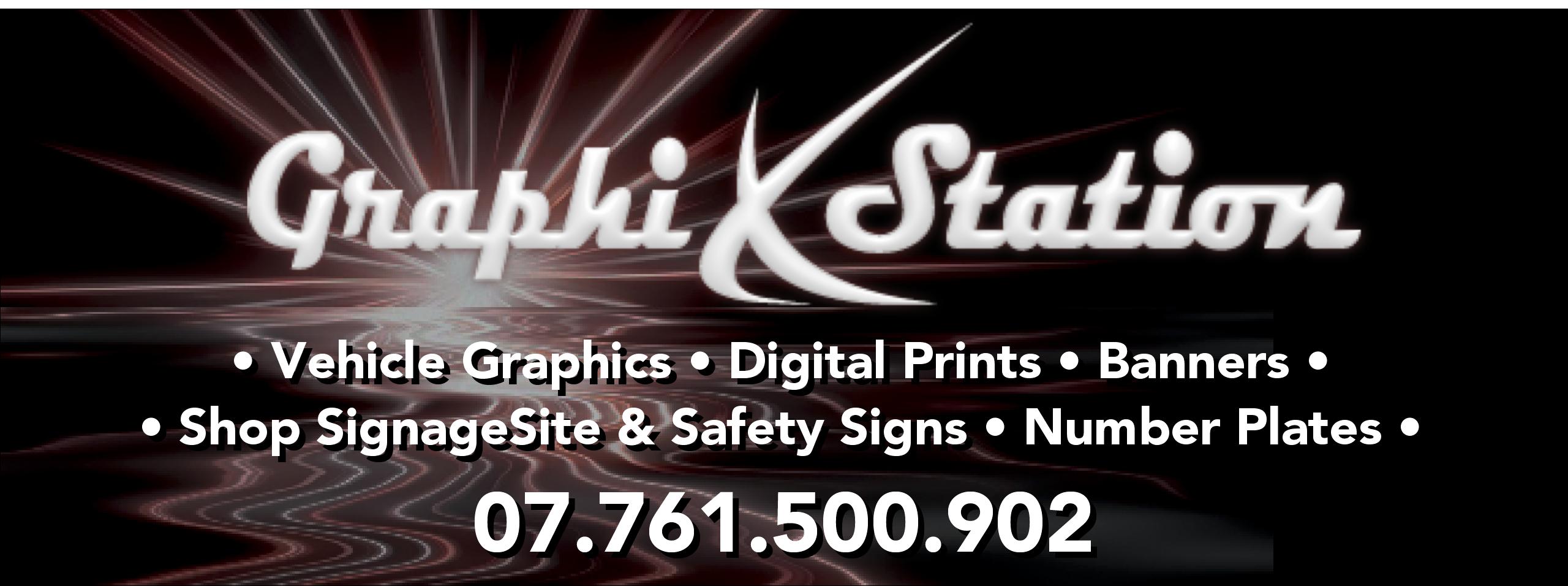
Jill has got it spot on again
What started out as a nice looking, modern background fill has been lost amongst all the text, leaving a design that is hard to read and not easy on the eye at all.
I’d be tempted to try a mainly black background with all text left adjust and with the sunset image much smaller over to the right where it can be seen on it’s own and not interfere with the text
-

I agree with all that’s been said. I dimmed the background and offset the image in the background. Would need more work, but just an idea sketch. The logo is kind of hard to size because of the shape in the middle. I would like to have the tag lines a little larger, but there’s not enough room.
Attachments:
-
Oh yeah, on more thing. I just put the periods in the telephone number. I was too lazy to look up where they go on British numbers. Sorry.
I would put them in there or some type of breaker to make the number easier to read / remember.
-
 quote Jillbeans:as trendy as a mullet hairstyle these days.
is it not trendy?
(hot) 🙁 👿 anybody know a good barber?I agree with all that has been said too.
-
What Simon did is nice, I would take it a bit further and put the laundry list in a solid black panel, with white lettering.
PS
Harry do you really have a mullet? Even Bono got rid of his! -
I thought about that Jill, but didn’t spend much time on drawing. You’re probably right though. It would be easier to read on a solid bar.
Ok, not to hijack the thread, but this is too funny.
This is a excerpt from the the movie "Ronnie Dobbs". It’s a movie by an Atlanta area comedian named David Cross. I’m posting it because he has a mullet.. and it’s hilarious.
-
quote Jillbeans:Harry do you really have a mullet? Even Bono got rid of his!
😀 😀 I don’t have enough hair left to even have a goldfish! 😀
-
 quote Jillbeans:Your design has almost no contrast.
It is very hard to read.
The most legible thing is the phone number (featuring the dreaded “TEL:”)
and it is full of weird angles that are jarring to the eye, but that might be what you mean by eye-catching?
And using “X” in Graphics is as trendy as a mullet hairstyle these days.
God I sound like a real b!tch.
What you need to do is not focus so much on the background, yes it may be cool but it renders your copy illegible.
Black with red is usually a design mistake, as it lacks contrast.
With a background as busy as yours I would go for white text.
You are also using a lot of fonts in a single layout. I try to never use more than two.
I think you should invest in the Mike Stevens book:
http://www.amazon.com/Mastering-Layout- … 091138068X
to learn basic layout.
A design needs to be able to stand on its own in black and white before you tart it up with effects.
The top part (the name) has potential, I would scrap the rest and start fresh.
Love….Jilli only wanted to know how nicholas went about making it :lol1: :lol1:
and like everyone else has commented…your spot on jill 😉 -
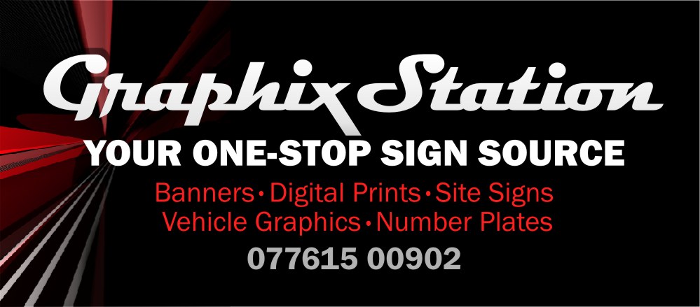
Here’s a mock-up.
I hate to use red on black.
This, in my opinion, is kind of a poor layout on my part.
I just threw in the laundry list without really checking the contents.
But I thought maybe a tagline referring to traffic/station/etc. might help.
Attachments:
-

is the background critical? much nicer ones out there
-

Im liking Jills last take on the banner, slightly lighter background and its workable without being too far removed from your businesscard
John
-

Jills design is much simpler, Sometimes more is less. I don’t like the X on the original design. Whilst it is X shaped it does not look like a letter X.
So the design looks like it says graphi. -
Yeah, I’m a big Leslie Cabarga fan. I have a few of his books. Don’t own the font either, but me do likes. 😀
-

I truthly threw that first idea together really quick.
I want till get my name out and about and make people aware of my business. Whats the ideas antbody wlse has for a banner??

Log in to reply.