Home › Forums › Sign Making Discussions › Traditional › First paid job: comments, advice etc appreciated.
-
First paid job: comments, advice etc appreciated.
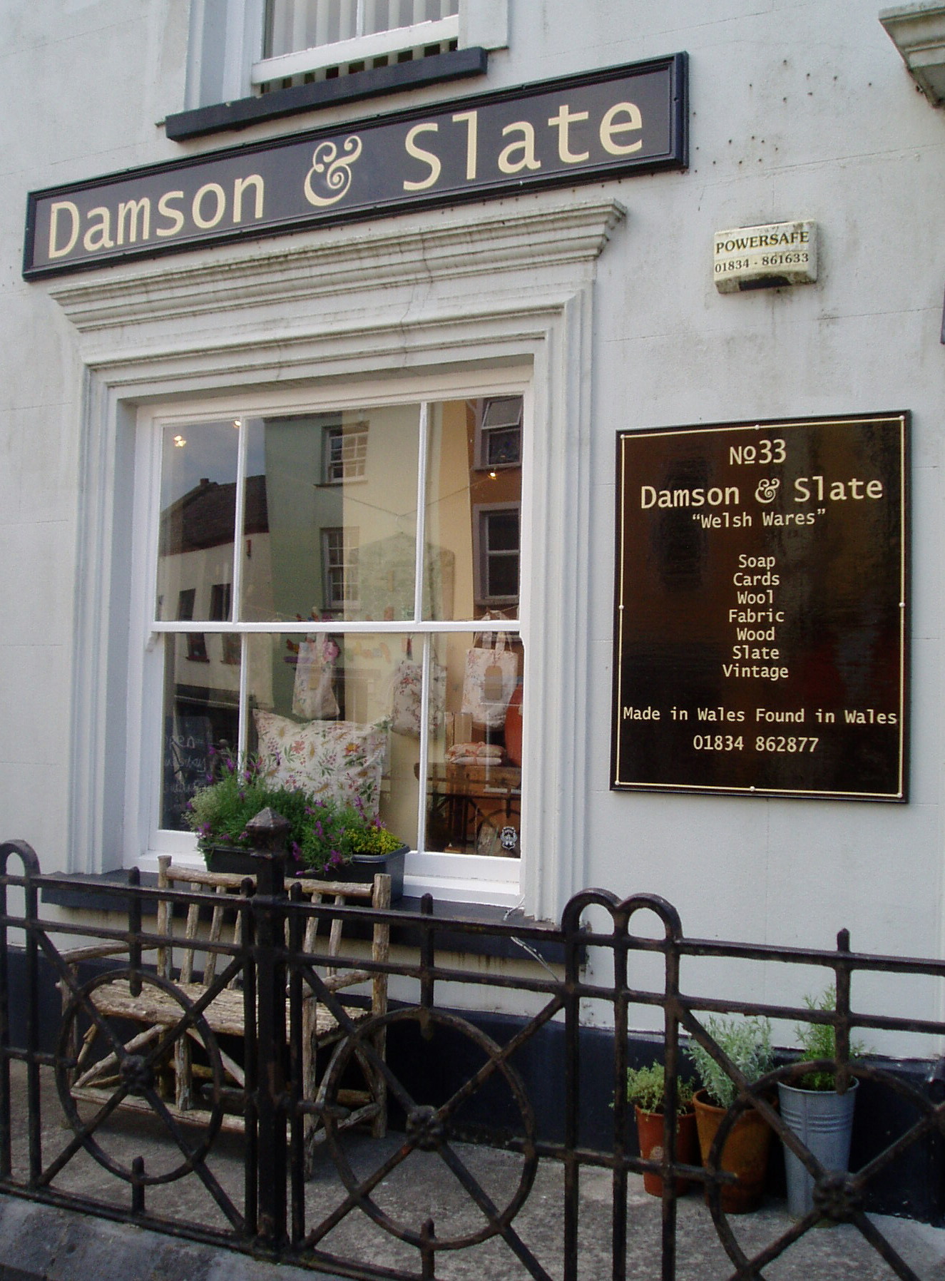
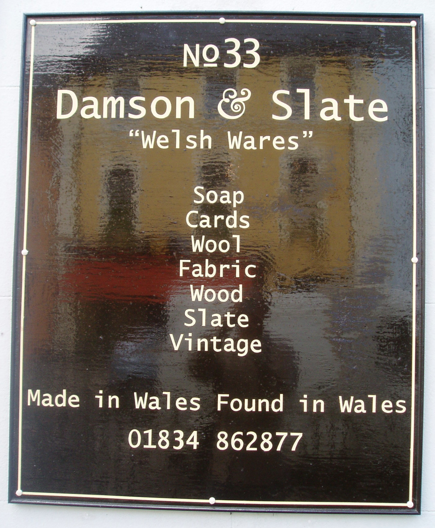
Posted by PatrickBoothman on 2 June 2009 at 20:18Finished putting these two up together today. Felt like a weight off my shoulders. Learned a few lessons on the way and irritated the misses no end! Still all his happy. Looking forward to a breather between the next job.
Attachments:
 Steve Maple replied 15 years, 2 months ago 16 Members · 42 Replies
 -
42 Replies
-

looks good mate, i’m not keen on the font but i guess that’s their choice! it works nicely on the main sign but looks a little odd to me on the wall sign (just my opinion!).
good first effort anyways,
Hugh
-

it does look quite good, but you need more space around your words on the top sign, the font choice makes the L look like a one . on the board you need more line spacing, no one else would notice apart from a sign maker 😀 which is why you are here 🙄
Lynn
-
quote Lynn:. on the board you need more line spacing, no one else would notice apart from a sign maker 😀 which is why you are here 🙄
Lynn
i was thinking that too, if you mean the list of soaps etc?
-

Excellent work Patrick, have to agree with Hugh and Lynn about the font, and the layout on the smaller sign.
I guess these are painted and I think they look great for your first paying job, don’t stop now, get your brushes out again and on with the next job and you’ll it gets easier and you’ll get faster.
-
Neil I thought these were cut vinyl ?? they don’t look painted 🙄 well may be but I don’t know
Lynn
-

Excellent bot of writing there. Agree with points above but classy looking job for a first go.
-
Harry where does it say it’s hand painted ? I still think it’s cut vinyl 🙄
Lynn
-
quote Lynn:Neil I thought these were cut vinyl ?? they don’t look painted 🙄 well may be but I don’t know
Lynn
Lynn, these look painted to me, I’m willing to put 50p on it…….. 😉
-
quote Lynn:Harry where does it say it’s hand painted ? I still think it’s cut vinyl 🙄
Lynn
How much do you bet? 😀 😀
-
go on Neil, I think vinyl so £1.00 or maybe a pint at sign uk next year 😀
Lynn
-

NEGATIVE Space Google it and get to understand it. What it is and the reasons for it. The sign on the wall with the line going almost full with is what I’m talking about should be around 70 to 80% of the width. Don’t scrunch or compress to make it fit either. Choose a font that fits or put it on two lines.
You will get to understand now you know about it.Goop
-

The signs do look like vinyl but I too will bet they are painted with you Lynn
Great first effort too Patrick but agree with the negative space comments and also slate looks like it is kerned more than damson so looks slightly inconsistent but as above unlikely anyone other than a sign maker would notice
-

I think they are painted , you can tell from the 33, slight variations, very well done, 😀
-

It’s vinyl, and its probably andale mono font – too perfect for hand drawn.
-

Some of those ‘e’ letters on the smaller board look way too different from each other to have been produced from ‘plotter cut’ vinyl, although I’m still not convinced it is painted….
-
quote John Gregson:It’s vinyl, and its probably andale mono font – too perfect for hand drawn.
Show us the colour of yer money!!! 😀 😀
-
quote Gareth Lewis:Some of those ‘e’ letters on the smaller board look way too different from each other to have been produced from ‘plotter cut’ vinyl, although I’m still not convinced it is painted….
Nice first go by the way, much better than my first ever.
-

Good for a first go, agree with all the comments though.
Your Kerning is wrong too. You have too much space around your ‘l’ and ‘i’ letters.
Looks like a poor rendition of the cut font in vinyl, or a paint mask cut and painted.
The letters seem like they have lots of nodes Lynn, which is making it look painted.
I’m not putting money on it though. :lol1:
-
Sorry Harry, Had another look and I’m definitely wrong – there are deviations on the lettering so hats off the the artist – well done – wish I could do the same – i’m not that gifted.
-
-
lol, i actually thought it was painted but assumed vinyl, thought it was a very good rustic affect acheived 😳 😳
even better if hand painted,
-

Thank you for your very kind words, it is hand painted. The font is the customers choice, and I will try and Google and understand Negatove space. One of the things I did find hard was managing doing a good job, considering kerninf, spacing etc and procucing an end product within a tiime constraint. I guess people just get quicker and quicker! 😀
-
As you get more experience with brush lettering Patrick your eye becomes more attune to spacing. As you are probably aware, the trick is to obtain a sense of equal space between each letter. If you stand back & squint at the lettering as you go this will become more obvious.
Also, how do you lay your lettering out? I usually just rough it in with a Stabilo and letter straight off the brush
And Lynn, you owe me 50p 😀
-
Neil I’ll gladly pay 😀 Patrick really well done that is something I couldn’t attempt to do, as Neil says it will become easier with practice.
Lynn
-
I think you’ll have no trouble getting to grips with kerning naturally and spacing Patrick….your lettering has a nice flow to it. There is no hiding when you just cut the letters like that without shading to hide behind. Very well done….you should look out Bill Stewart’s excellent book on the trade.
http://www.amazon.co.uk/Signwork-Crafts … 0632033657How much is 50p in euros?? 😀
-
Does this mean painters are coming back, and taking over our vinyl stuff 🙄 only kidding I am hat’s off to all you painters 😀
Lynn
-
quote Lynn:Does this mean painters are coming back, and taking over our vinyl stuff 🙄 only kidding I am hat’s off to all you painters 😀
Lynn
We are not going away, you know! 😀 😀
-
quote Lynn:Does this mean painters are coming back, and taking over our vinyl stuff 🙄 only kidding I am hat’s off to all you painters 😀
Lynn
We never went away Lynn…………the lunatics are taking over the asylum 😀
-
I can’t write properly with a biro, I’d have no chance with a brush 😳
-
 quote Neil Davey:. If you stand back & squint at the lettering as you go this will become more obvious.
😀
Excellent advice, Paul is good with the brushes, and when I have something on screen that I have designed for cut lettering, he tells me to stand back and squint! I used to think he was a nutter, but it really works! (well 4 me anyway)
Katie
-
or look at it in a mirror is good too….works for life drawing too, shows up the flaws straight away.
-

Looks a million times better than my first painted job.
Hey, I was also told (by John Jordan many years ago)
if you want to see the flaws in your work just turn it upside-down and they jump right out.
Needless to say, I rarely turn my signs upside-down.
Kerning comes automatically with time and practice.
Love….Jill -
As i was in a bit of a rush for this i did the following.
1) Roughed it out on Corel. Adding lines to aid aligning when prined onto a4.
2) Printed it out onto a4 tracing paper.
3) Stuck all the pieces togerther aligning guidelines.
4) Carefully drew the boundaries of each letter with a 6B pencil on the rear.
5) Placed the joined sheets onto the board with the rear (6B) touching the board and taped it in place to avoid movement.
6) Went over the boundary of each letter again with a HB pencil thus tracing the boundary of each letter.
7) Painted the letters in.
8) Cleaned off any pencil marks.Would love to have the confidence just to use a stabilo to mark out a basic form, one day, maybe!!
-

you need to thin the paint out
paint the panels flat
—————————you need to kick the habit of using fixings through the surface
-i.e. on the larger panel affixed the panel , countersink, then fit the trim and nailed it with lost heads, touched in the nails.the other method, on the door panel, would have been to use a ‘hockey stick’ moulding – spell checker is wrong
-inch and a half, if the panel is 1/2 inch, screw a batten to the wall, and nail it up sideways.
-this also is the method you should use on the longer sign, also i bodes well if your next go wants a panel length of more than 8 feet and you have a central joint.
battening across the joint-fill sand, fit hockey stick all the way around
-it does actually help you in the long run, as when you come to install it you are fixing a 2 by 1 to the wall, then simply hanging the sign on that – it helps if you are on your own.plus the job will last longer, as there will be no water ingression into the joint.
plus on the long one, you could have had the longer runs curved, the trim would have bent at least a few inches, then the central ampersand ‘could’ have been as big as it is….
😀
Attachments:

Log in to reply.