Home › Forums › Sign Making Discussions › Graphic Design Help › Help please with my own Renault Traffic
-
Help please with my own Renault Traffic
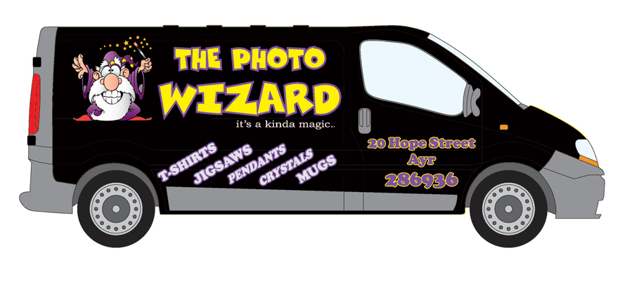
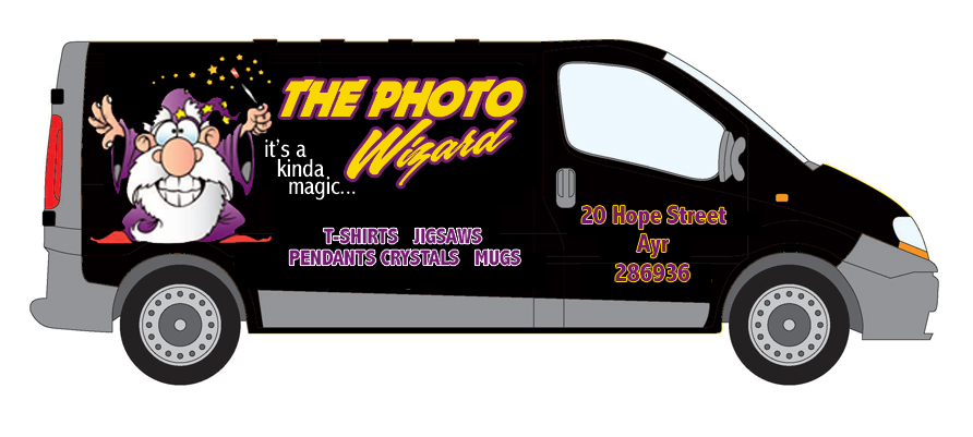
Posted by Neil Speirs on 18 February 2009 at 14:19Seeing as how things are really quiet at the moment I’m trying to come up with something really eye catching for my own van, so far the best I have managed is this :-?…. I’m going to change the angled text at the bottom to "Personalised Gifts, T-Shirt Printing, Photo Engraving & Photo Crystals" but not to sure how to lay it out for best result?
Any criticism welcomed :peek:
Neil Speirs replied 16 years, 8 months ago 6 Members · 12 Replies -
12 Replies
-
Hi Neil, Is there any reason why "Pendants / Crystals" is in italics and the rest of the text at the bottom is normal
Cheers John
-
maybe it’s the crystals doing wierd things man….. :lol1:
Ian :lol1:
-
I like what you’ve done so far Neil. The main message and Wizard graphic come across nice and clear and the colours suit the black background.
I would maybe put the address on the door in a lighter font and perhaps just one colour (white?) so that this part of the van is not competing against the rest of the van for attention. The tel. no. could perhaps be done in a bolder and larger version of the same font you choose for the address. This way the door section is a little sign in itself with the copy carefully prioritised
-
-
-
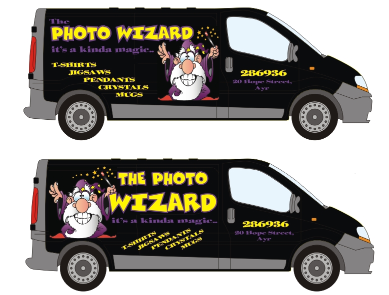
Thanks John/Brian, your alternative layouts have been a great help!
cheers
neil -
quote Brian Maher:just had a quick play dunno if it confuses you more or helps 😕 :lol1:
Any luck with that font id Brian?
cheers
neil -
quote Brian Maher:helter skelter Neil apologies for delay
Any chance you can send me it Brian?
Any I see on tit’internet don’t match up with your design 😕
Appreciate your help with this!
neil
Log in to reply.


