-
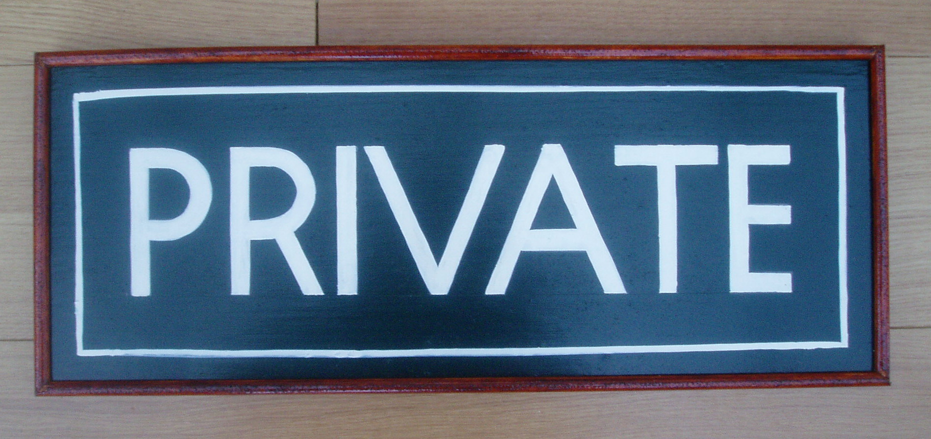
Second ever sign: Comments / advice appreciated.
Hi everybody, Thank you for all your advice. I have tried to take on board as much as possible and found the best bit of advice was to purchase Bill Stewarts " Signwork". An amazingly helpful book. Cheers.
Not wanting to set myself up for a fall i have kept things simple and produced the sign below. There are a few things I am unhappy with. Iam sure you will spot some and it would behelpful to hear how I could avoid these mistakes in the future.
Cheers Patrick.
Attachments:


Log in to reply.