Home › Forums › Sign Making Discussions › Traditional › First ever sign: Comments / advice appreciated.
-
First ever sign: Comments / advice appreciated.
Posted by PatrickBoothman on 16 September 2008 at 19:57Hi everybody.
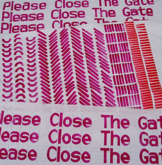
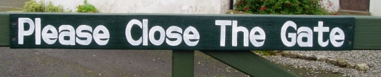
These are pictures of the practice strokes and sign that I have been working on. It is my first ever piece so no where near as good as some of the amazing artwork that graces these pages but its a start.Its an unpaid job and was made using a scrap of ply and left over gloss paint so it was never going to be great but any advice would be welcome.
Cheers Patrick
Attachments:

 PatrickBoothman replied 17 years, 2 months ago 8 Members · 13 Replies
 -
13 Replies
-

nice first attempt patrick……keep practising you’ll get there 😀
a second coat would have finished it off too, you dont have to go right to the edge when doing so, just makes it nice and opaque 😀the way you have layed out on the sheet, was the way i used to practise, and practise and practise…keep at it 😉
nik
-

Patrick that is better than my first attempt, only thing I can add is well done for posting it I think a bit more spacing would be good,( don’t think you call it kerning with hand painting) and as Nik Say’s practice practice practice then a bit more, maybe you can get one of the brush painters on here to give you a few tips well done
Lynn
-

Well done Patrick, that looks very impressive for your first sign.
Practice as much as you can and you’ll see the benefit.
What size brush did you use?……. and are you using 1 Shot as it really makes a difference.
Give a thought to negative space to allow the sign to breathe.
Neil
-

Miles ahead of my first attempts.
Neil is right about the negative space (the space around the lettering, try to give it some breathing room)
Nik is right about the double-coating. It’s a pain but it really makes a difference.
About the spacing, I kind of like it tight. There is plenty of space between the words so that’s good.
Remember that round letters (O,S,C,G,Q etc) are slightly bigger than the straight letters, height-wise so allow for that.
Get the book Mastering Layout by Mike Stevens.
http://www.amazon.com/Mastering-Layout- … 091138068X
If you don’t already have it, it has a lot of good letterforms to study.
Arthur Vanson is a second-generation traditional signwriter since a very young age and has digitized his alphabets into fonts, they are well worth checking out as I feel he has the perfect style:
http://buckssigns.co.uk/Fonts.html
I enjoy seeing your progress. Keep on practicing!
Love…..Jill -

Hi Patrick, just to add to Jills comments, a book Ive used a lot &srill use is
SIGNWORK ‘ A CRAFTSMAN’S MANUAL’ by Bill Stewart published byCollins 1984 .Dont know if its still available but I have seen 2nd hand copies in my nearby town, (the Book Town of Hay on Wye) Also I still use Letraset books ! I’m always checking on myself and I think its a good standard rule to work from good letter forms. Keep at it, John -

Wow,
thanks ever so much to all of you for such kind words, ( I was imaging alot worse) i will try to taken on board as many points as possible.Our house backs onto a golf course so next its bi-lingual PRIVATE signs to keep the golfers out of our apple trees!!
Anybody have any advise in how to present two languages ie WELSH/ENGLISH on one board.
cheers patrick
-
Neil,
I used a number 6 long flat pro-arte brush nothing fancy.
I beleive its worth spending a bit of money on brushes and paint so what is "No 1 shot" enamel/gloss?
Would a smaller brush have looked better? -

Hi
Good start. I would look at a sign writing suppliers web site. Try Wrights of Lymm for brushes and 1 shot enamel, they do their own brand…
http://www.stonehouses.co.uk/index.php
Sable pointed/chisel writers, a No. 2 and a No. 6 (I think) I am sure someone will help with better choices.
-
Yup, you can’t go wrong with sables.
What’s that other signwriting enamel?
Kemp’s? Keep’s? Something with a "K", it’s nicer than 1-Shot.
1-Shot is not the same paint as it used to be, I use a lot of Ronan now.
We generally have plastic-ferruled lettering quills here, UK brushes are far superior (metal ferrules)
The Bill Smith book is great, I have it, also some other alphabet books from SignCraft (you should subscribe to that too)
http://www.signcraft.com/
Lots of links on that site.
I still have my two ancient Letraset catalogs, used to use them exclusively before I had a computer.
Love….Jill -
Hi Patrick, it’s worth having a selection of brushes, say a No. 2, No. 4. No. 6 and for bigger work a No. 8.
I use sables in a quill not a metal ferule just personal preference.
A 1" flat is good for larger areas.
You can get 1 shot from http://www.stonehouses.co.uk/1-shot-paint.htm
or http://www.goldleafsupplies.co.uk/
Some Keeps paint is discontinued now but there are others.
Where you based Patrick?
Neil
-
Neil,
am based in Narberth, Pembrokeshire, so am able to admire the work of Fforest signs (Newcastle Emlyn) in the local area.
Cheers patrick -

Much better than my first try Patrick.
Here are some things to help with lettering:Use top and bottom guidelines – you can snap them, pounce them or draw them in very lightly with blue or white Stabilo pencil.
On an actual sign, taping the the tops and bottoms of your uncurved letters with 1/4 high tack tape or artists tape when you paint is not cheating – it’s recommended. It gives you a nice sharp line.The stems – the vertical strokes of letters (the width of the upper case I), determine the relative thickness of everything else – keep all the stems the same thickness.
The bars – the horizontal strokes, are a tick thinner that the stem.
The curved tops of O,C,G,Q,S or curved tops of lower case letters are a tick thinner than the stem, and extend just slightly beyond the upper guideline.
The sides of these same curved letters are a tick thicker than the stem.
Diagonal lines are a tick thinner than a stem, the place where two diagonals meet or where a diagonal meets a stem are a tick thicker than a stem.
I prefer tighter spacing myself, but a conventional rule is that there is one stem width between letters, and one normal letter width (A,E,H) between words.
That being said, spacing between letters has to vary slightly so there is visually the same amount of space between them. The rule is to envision an amount of sand being poured into the space between the letters, you want the same amount of sand between each letter, so you would need to move the letters TV closer together than you would the letters MM to visually balance the amount of sand between the Tand V.For use with oil based enamels like One Shot:
Get a selection of quills and lettering flats for smooth surfaces, and a selection of fitches and cutters for rough surfaces like brick or stucco walls.
Clean your brushes well with mineral spirits and then dip them in oil for storage – I use olive oil, some people use lard oil, motor oil or transmission fluid. Clean it out with mineral spirits before you paint.That should be enough to thoroughly confuse you for now. Keep up the good work.

Log in to reply.