-
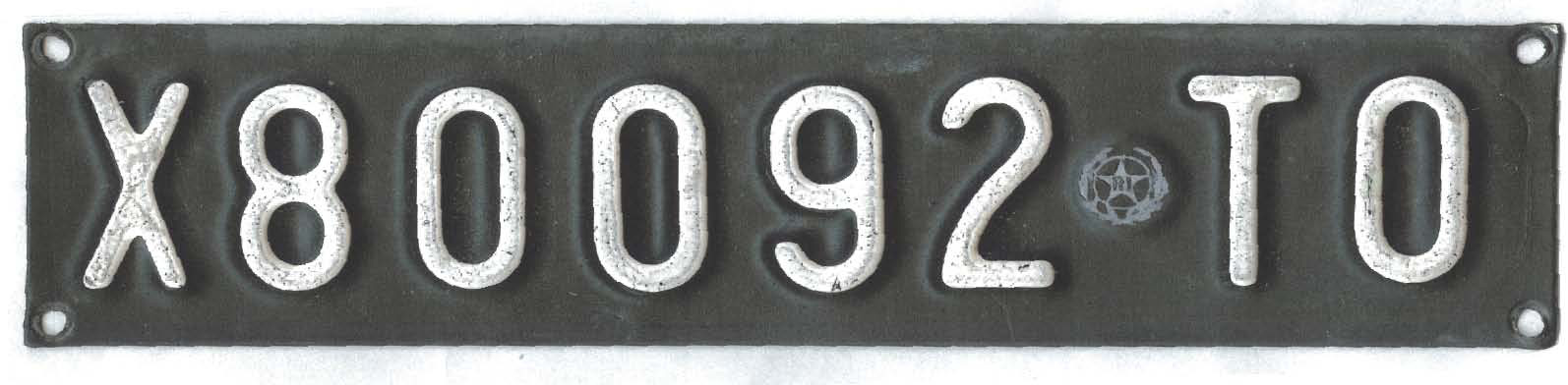
font identification please: Italian number plate
Can anyone help with this letter style? SignLab file, Pdf or the font name.
I’d rather not have to draw it.Steve
Attachments:
Log in to reply.
Can anyone help with this letter style? SignLab file, Pdf or the font name.
I’d rather not have to draw it.
Steve
Attachments:
Log in to reply.
Please confirm you want to block this member.
You will no longer be able to:
Please note: This action will also remove this member from your connections and send a report to the site admin. Please allow a few minutes for this process to complete.