Home › Forums › Sign Making Discussions › File Swapping › Font Help
-
Font Help
Posted by Marcella Ross on 7 July 2008 at 14:16Only me again …………. looking for a font suggestion. I need a font that looks tubular ……………. square but tubular (if you know what I mean)
It’s for a fabrications company whose logo looks a bit like pipes. I don’t need to replicate this just something vaguely similar.😕 oh I wish it was friday …………… (!)
Paul Humble replied 17 years, 5 months ago 6 Members · 12 Replies -
12 Replies
-

Marcella,
What about VAG Rounded. Simple, but nice (a bit like me).
-

My camera battery is flat so I can’t photograph this and upload it
😕
VAG Rounded isn’t square enough, I’d thought of that. Copperplate is nowhere near what I need. It’s very like a pipe, but square in shape.
Oh, I’m not describing this well am I? 😕
If you could imagine a drainpipe bent into the shape of an F the the only rounded part is the top left corner ………..should I just go back to bed?????? 🙁
-

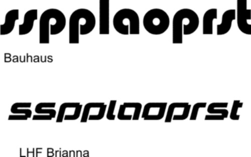
Brianna might need too much modification if there is a lot of text, but is this the type of thing you mean?
Attachments:
-
Bauhaus is waaaaaaaaaay too rounded. The other is too fussy.
It’s dead simple, very square in shape but rounded at the corners.
Oh, this is driving me nuts. 😕 :lol1: 😕 :lol1:
-
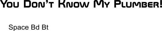
Bank Gothic isn’t rounded at the corners ………… it’s too sharp.
I think I’m gonna give up on this. If I could upload a photo you guys could probably have sussed it right away.
Worst thing about this is that I’ve done this before and lost the file ….. 😳 😳 😳 and can’t remember what font I used. 😥 😥 😥 😥
-
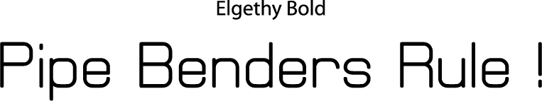
that’s better Warren!!!! That’s the closest yet. I could fatten that up I suppose as it’s too thin. But the shape is much better. 🙂
-
Warren any chance you could type out
FSL FABRICATIONS LTD
in that font for me please? 🙂
-
quote Marcella:Bauhaus is waaaaaaaaaay too rounded.
😀 😀 😀 any closer?
Attachments:

Log in to reply.