Home › Forums › Sign Making Discussions › Gallery › fabricated signage: the spa galgorm
-
fabricated signage: the spa galgorm
Posted by Ian Johnston on 26 June 2008 at 20:11Ian Johnston replied 17 years, 4 months ago 4 Members · 4 Replies -
4 Replies
-
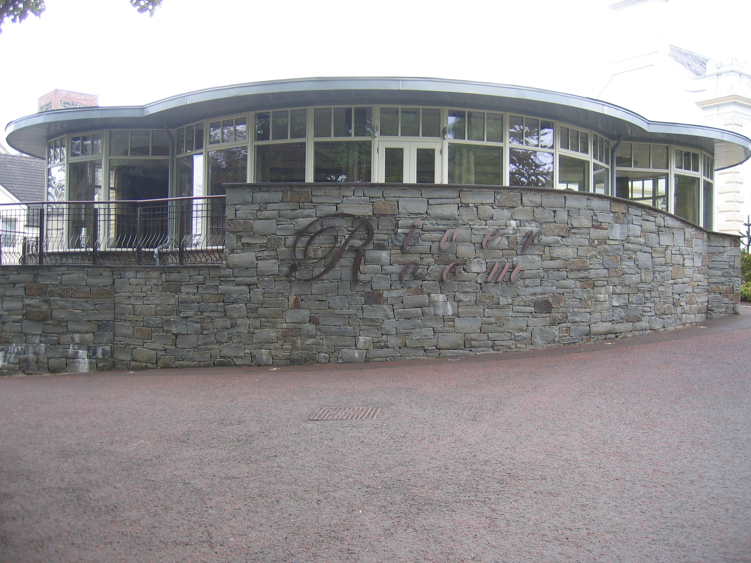
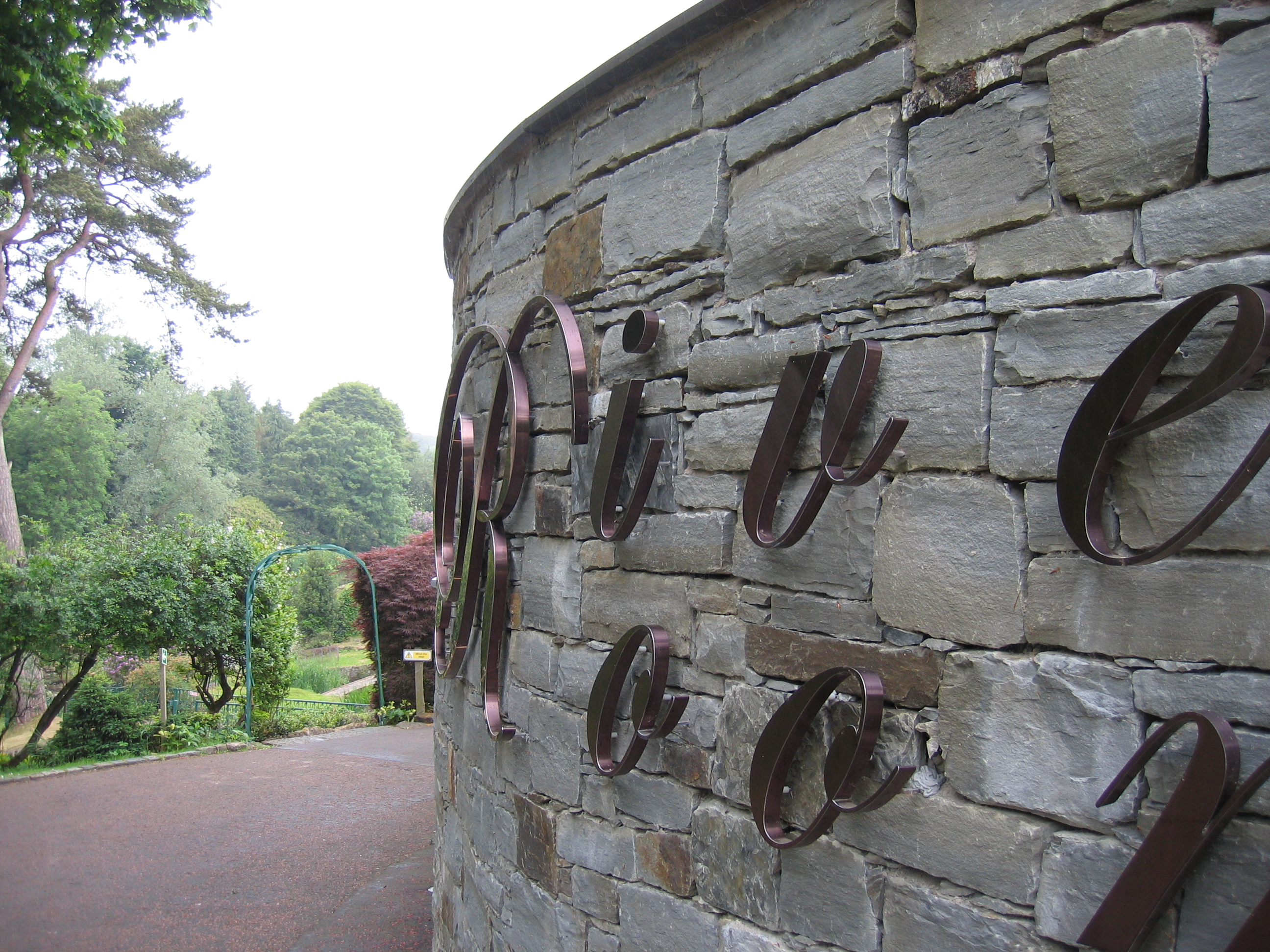
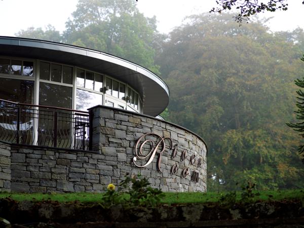
Nice signs but diabolical spacing on the River Room. Sorry but that’s just plain ugly
-
Not to mention the total lack of contrast.
It’s nearly illegible.
Some fonts are meant to be connected.
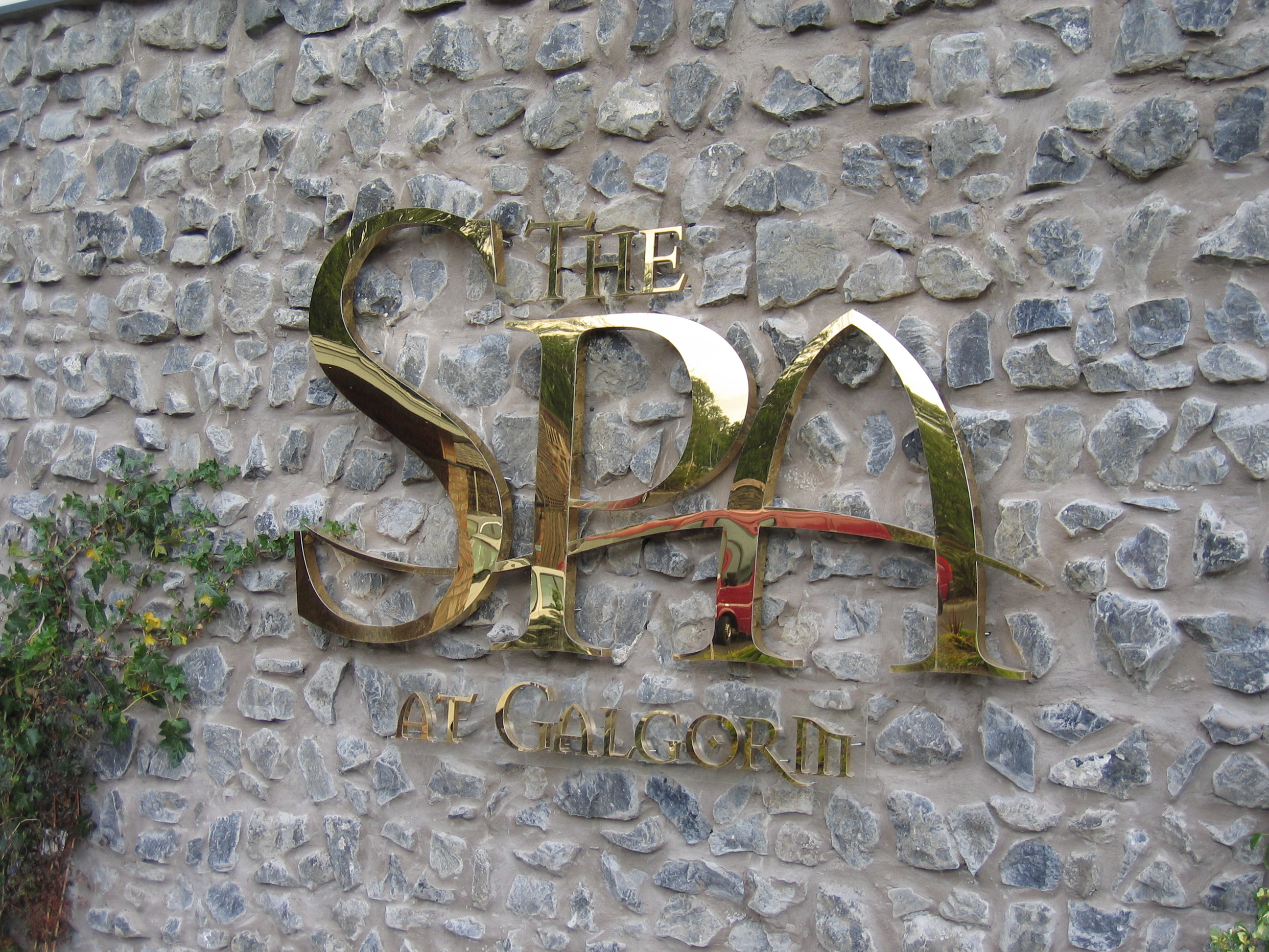
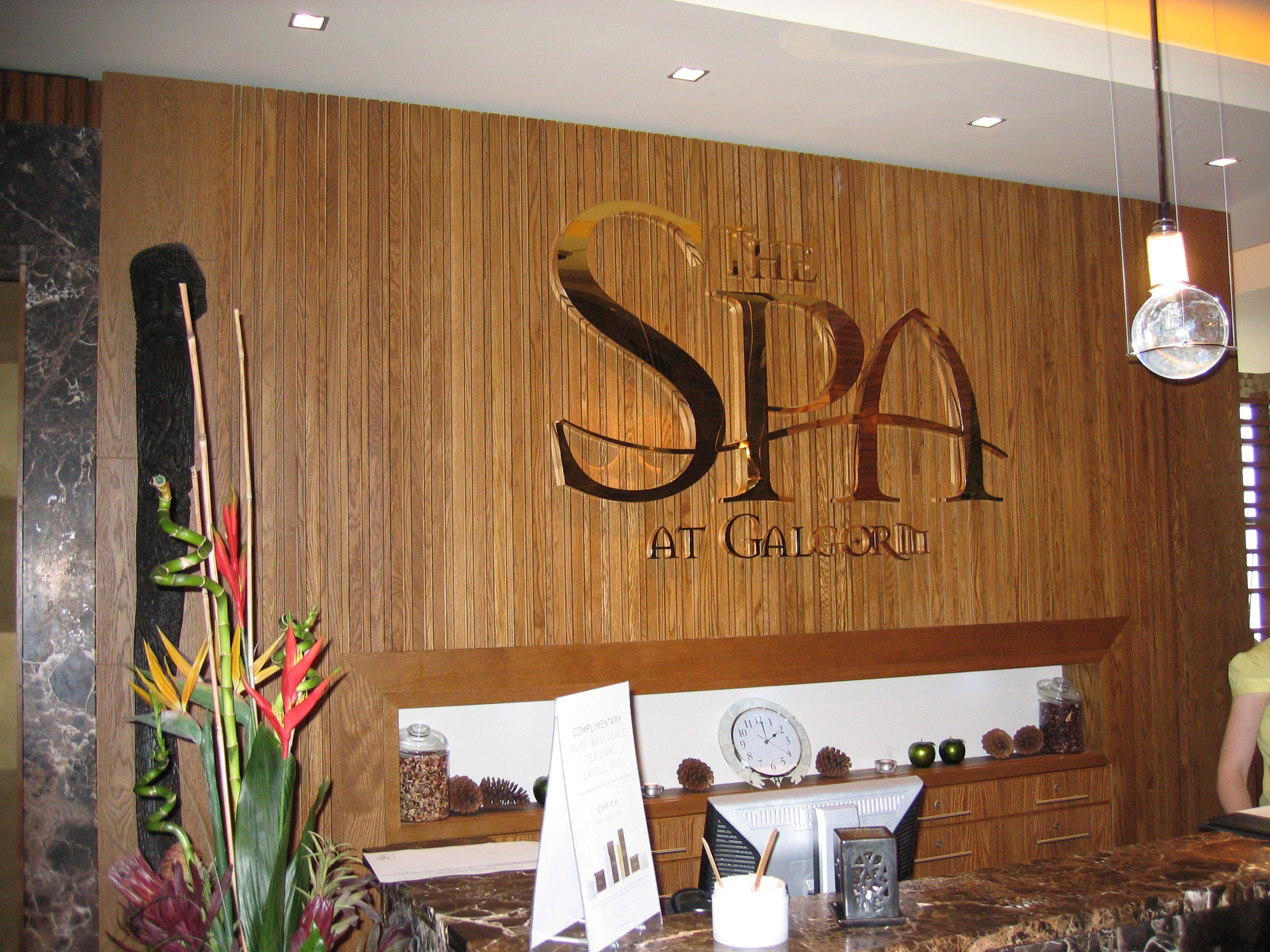
The first sign, however, is absolutely striking.
I love how the shiny letters look against the rough stones.
Love….Jill -
quote Mike Grant:Nice signs but diabolical spacing on the River Room. Sorry but that’s just plain ugly
Don’t shoot me, I only do what the architect tell me to do. 😀 . i did tell him it wasn’t right but thats what they wanted, tried to convince them not to go for brushed matt bronze as it wouldn’t stand out but they insisted on it rather than polished.
It doesn’t look as dull in reality but picture was taken on a rainy dull day. there is a better picture on there website of it
http://www.galgorm.com/photo-gallery/with the spa sign they listened to me and it worked well.,
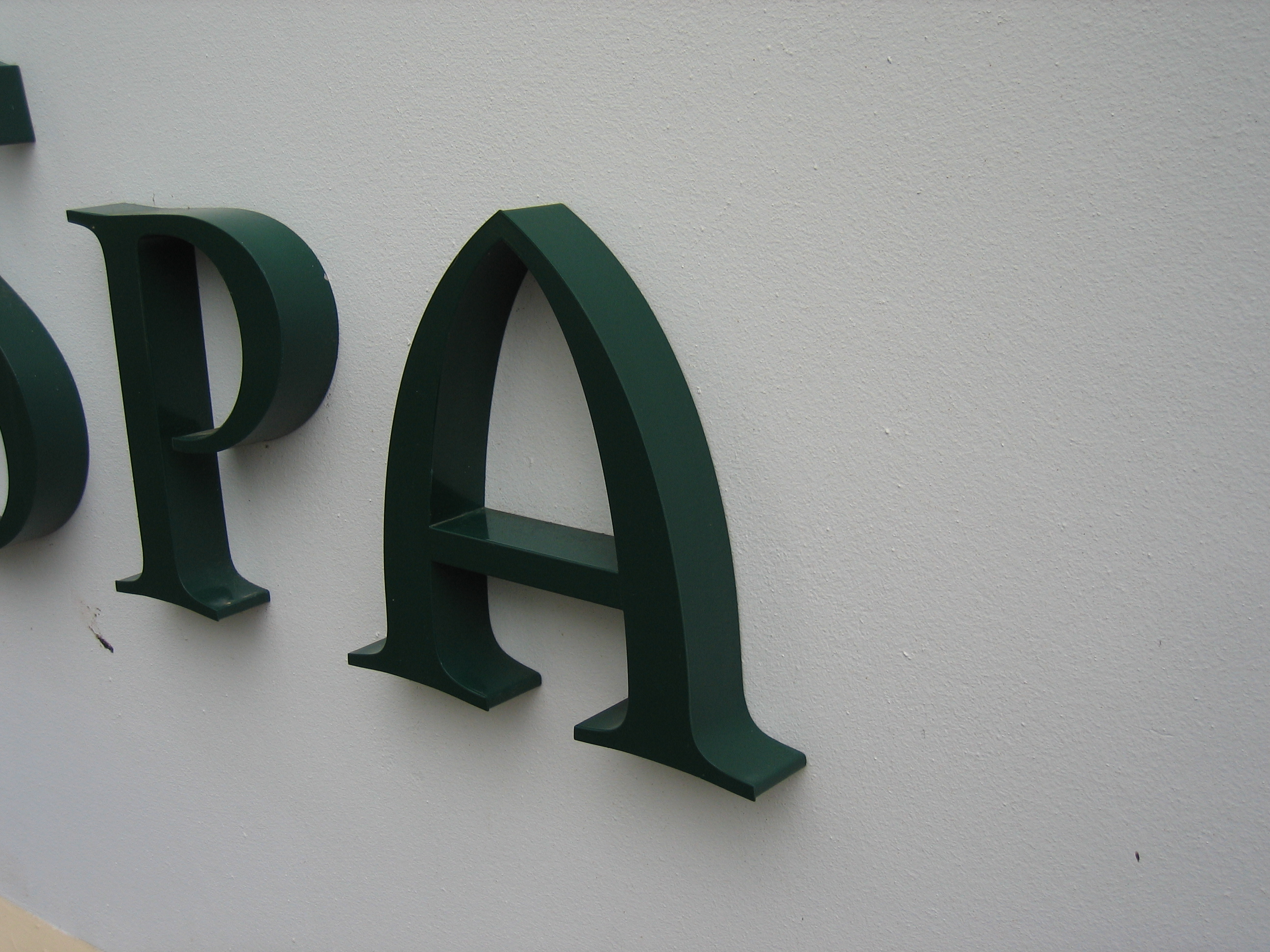
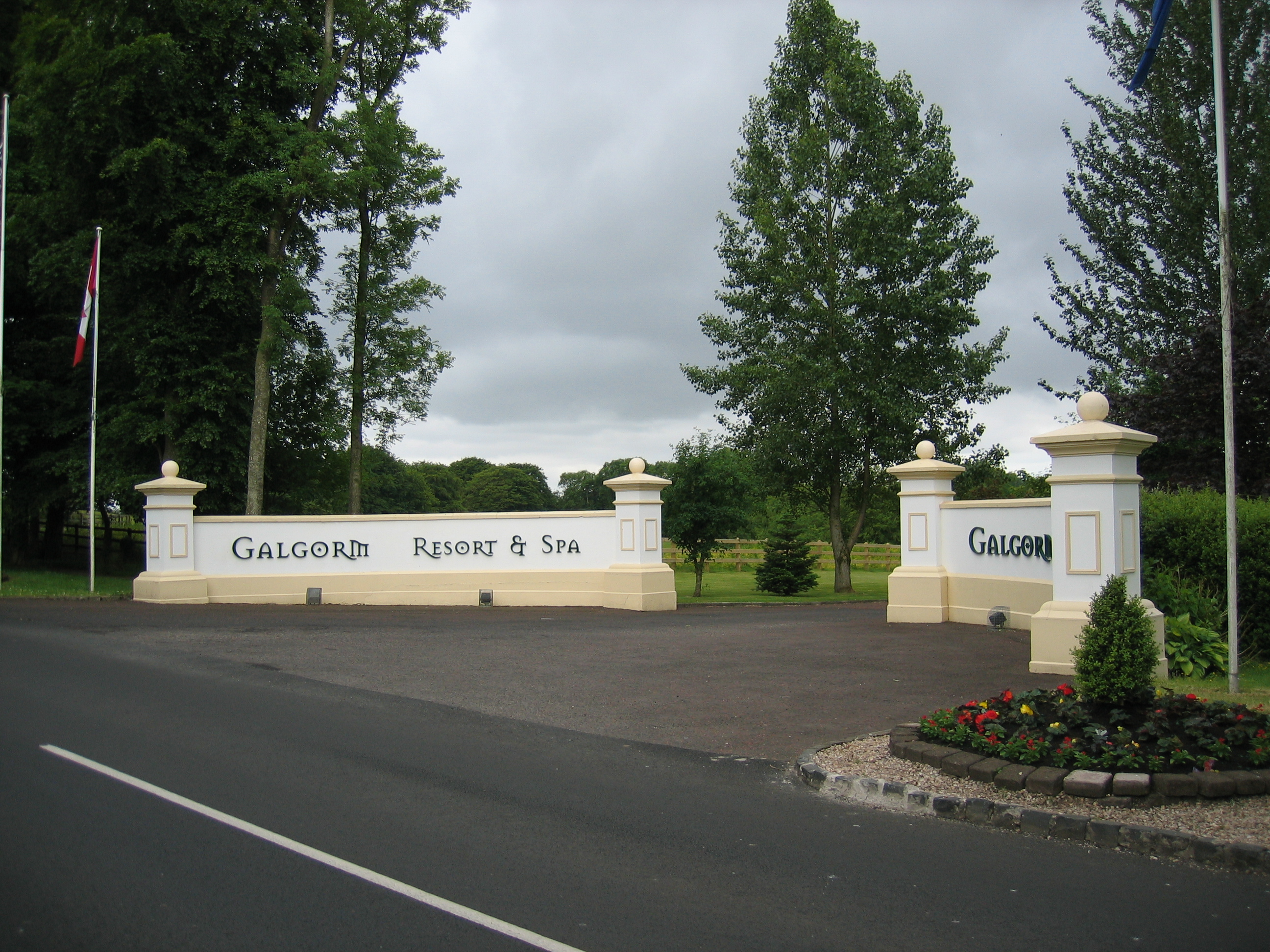
attached is another internal sign of polished gold titanium, also turned out well., also the entrance signage, and internal door names
Ian
Log in to reply.


