Home › Forums › Sign Making Discussions › Graphic Design Help › help needed please with my own company logo?
-
help needed please with my own company logo?
Posted by Graeme Harrold on 11 March 2008 at 22:07OK……starting to get more stand alone signage work coming my way even though I bought the cutter for doing lettering on slat signs etc.
Now think it is time to augment the engraving side of the business with more mainstream signage as I tend to do brass and reverse engraved plastics.
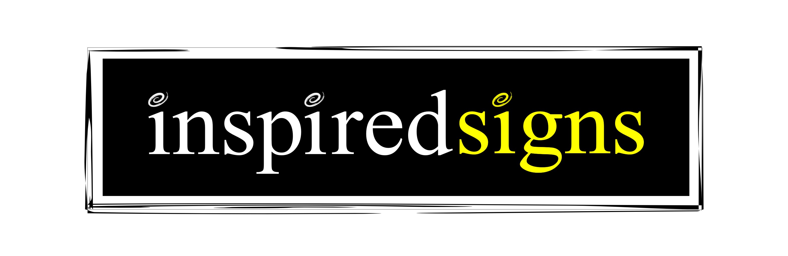
After some long hard thinking and searching on the net and locally we have come up with the name Inspired Signs (basically Inspired deSigns was already taken….)
The two main colours are that of St David’s (Dewi Sant) flag (yellow cross on a black background)
Font = Architecture and my need a little tweaking unless ruled out by future comments, trying to keep it simple yet punchy. Background colour is only for clarity, but will need something other than white to highlight the yellow outline.
Comments warmly welcomed.
Graeme
Attachments:

 Martin Cole replied 17 years, 7 months ago 12 Members · 22 Replies
 -
22 Replies
-

Thanks, and more like it. The more I look at the one I did the more I hate the font. So much that it will probably be deleted off my system by the morning :lol1: The ‘e’ just looks wrong with an outline………
keep em coming
-

I’m having a bit of a problem with that colour combination. It seems just a bit stark.
Anyway, here’s one using black and a slightly warmer yellow……..
Attachments:

-
Im liking the colour more, might be the conversion to jpg loosing the harsh black, as its showing on my screen as a mid gray. Not so sure on the light bulb though
-
It is a mid grey. I thought it worked well with the shade of yellow.
-
quote Andy Gorman:It is a mid grey. I thought it worked well with the shade of yellow.
Cracking….nice clean combination
-

Graeme the font you had originally would probably work better if you opened up the kerning before applying the outlne.
Trouble I’m having with it at the moment though is that it doesn’t look very inspiring, having chosen a name like that I think you need a really striking logo. Quite like what Neil has done though but also prefer Andy’s choice of colour. -
quote martin:Graeme the font you had originally would probably work better if you opened up the kerning before applying the outlne.
Trouble I’m having with it at the moment though is that it doesn’t look very inspiring, having chosen a name like that I think you need a really striking logo. Quite like what Neil has done though but also prefer Andy’s choice of colour.Ive binned the font as there are too many little problems with it. Inconsistent letter heights/kerning and the ‘e’ just looks horrible with the diagonal line formed between the centre and the tail. Playng with Neils style and Andy’s colouring.
-
Thanks all, like what you have done Glenn and will have a play with that later, whats the font you used??
Anyhoo, taking Niel’s layout and Andy’s colour…………
Attachments:

-

That’s not going to do you any favours Graeme.
You should take inspiration from some of the other suggestions.
-
quote Peter Dee:That’s not going to do you any favours Graeme.
You should take inspiration from some of the other suggestions.
Was that referring to the one I posted or the "Times New Roman"………This is a font I never use in less I get a specific request, it was just the "i"’s that threw me……. 😳 😳 😳
-
quote Peter Dee:Sorry Graeme, it was the one you posted.
Cheers,
Nose is still on the drawing board……….. :lol1:
-
 quote Matt Hards:i really like glenns, very classy
I agree,
it’s very nice, you won’t get much better than that Graeme, imo


Log in to reply.