Home Forums Sign Making Discussions Graphic Design Help help needed please with colour combinations?

  • help needed please with colour combinations?

    Posted by Shane Drew on 12 February 2008 at 11:21

    Hi friends,

    I need some help. I’ve seen a customer today that wants signs on his building, and I have no say in the colours.

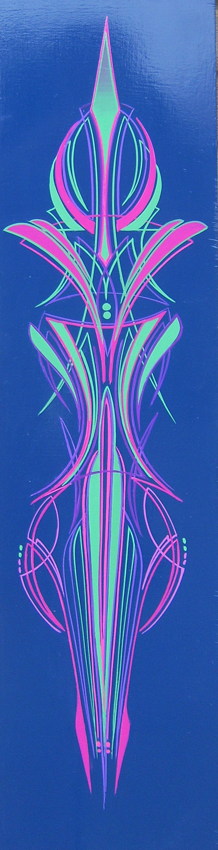
    He’s just painted the fascia a deep blue, not as dark as reflex, but darker than blue.

    He presented me with a colour chart today, and he wants apple green (lime) text over the deep blue.

    Is it just me, or is this going to look awful?

    I just can’t picture this as being a good combination without a keyline at least.

    He doesn’t want one, but thinks white is all he’s prepared to consider, but I’m not sure. What do you guys think? Black maybe?

    I’m really not in the mood today… much rather be in bed, with a glass of something and a heap of panadol 🙁

    As usual, any suggestions would be appreciated…..

    Shane Drew replied 17 years, 8 months ago 9 Members · 14 Replies
  • 14 Replies
  • Andy Gorman

    Member
    12 February 2008 at 11:31

    Sounds terrible. Show him a printout with and without the outline, so he can choose. Even a fine white outline would help the green to contrast more.

    Customers don’t know nothing!

  • Shane Drew

    Member
    12 February 2008 at 12:03

    Thanks Andy, good idea!!

  • Jill Marie Welsh

    Member
    12 February 2008 at 12:43

    Actually the lime may have more contrast than black. Yellow is a good choice with many blues.
    White would be good as well.
    Love….Jill

  • Terry Bull

    Member
    12 February 2008 at 21:15

    Am i missing something ..apple green ( the Kawasaki colour going on a dark blue base
    whats wrong with that ,it works for me
    don’t like white outlines they distract the character and shape of the text

  • Steve Underhill

    Member
    12 February 2008 at 21:17

    Blue and green should never be seen.
    I remember that rhyme from when I was a kid,
    Now I am a sign maker I tend to disagree, sometimes it can work, but I think it also needs a lot of work on the right Shades of blue and green, as a lot of combo’s wont work.

  • Lynn Normington

    Member
    12 February 2008 at 21:23

    I also like dark blue and apple green I think it works well have used it several times, I would also leave the white out 🙄

    Lynn

  • Andrew Boyle

    Member
    12 February 2008 at 21:30

    the dark blue up to the pale green is not ideal…not close enough or opposite enough but I like it..petrol would be nicer 😀 mint

    http://www.dandara.com/

    😀


    Attachments:

  • Terry Bull

    Member
    12 February 2008 at 21:46

    not letters but it is lime n blue … and a bit of purple
    Terry
    Sign and Custom


    Attachments:

  • Steve Underhill

    Member
    12 February 2008 at 21:58

    Might not be exact but thats what an apple type green on dark blue looks like,
    Added a white stroke (awful)
    and a black one, (makes it stand out and makes the colour look a different shade even thought its just a stroke of black applied)
    And last one just green on black.


    Attachments:

  • Shane Drew

    Member
    12 February 2008 at 22:48

    Thanks for the replys… I think… more confused than ever now.

    I’m going to lay up a real one here to see in real life, before I get back to him with suggestions…

    I’ll let you know how I go

  • Steve Underhill

    Member
    12 February 2008 at 23:03

    Its strange how the greens in my post all lok different eh, they are all the exact same shade, one without, and 2 with strokes applied, how different they make it look.

  • Bill McMurtry

    Member
    13 February 2008 at 01:30

    Steve’s s bottom image of light green text (no outline) on dark blue looks fine to me. Perhaps not the best colours to stare at if you’re feeling a little bit off – get well soon, Shane 😀

    PS: Steve, the greens are all different – I just had to measure them 😳 Maybe your export profile (or file type) altered them depending on adjacent colours?

  • Dave Martin

    Member
    13 February 2008 at 10:07

    http://kuler.adobe.com/ is a good resource to check what colours go with what, just click on create and enter your colour value in the middle box.

    you can then select the various colour rules that bring up complimentary colours.

    Using the triad rule it does infact seem that the dark blue / apple green can go together.

    I generally use it for web stuff but should work for print as well.

  • Shane Drew

    Member
    13 February 2008 at 21:43

    Thanks all,

    I’ll check out that site too thanks Dave.

    Shane

Log in to reply.