Home › Forums › Sign Making Discussions › Graphic Design Help › can someone help me with this customers van
-
can someone help me with this customers van
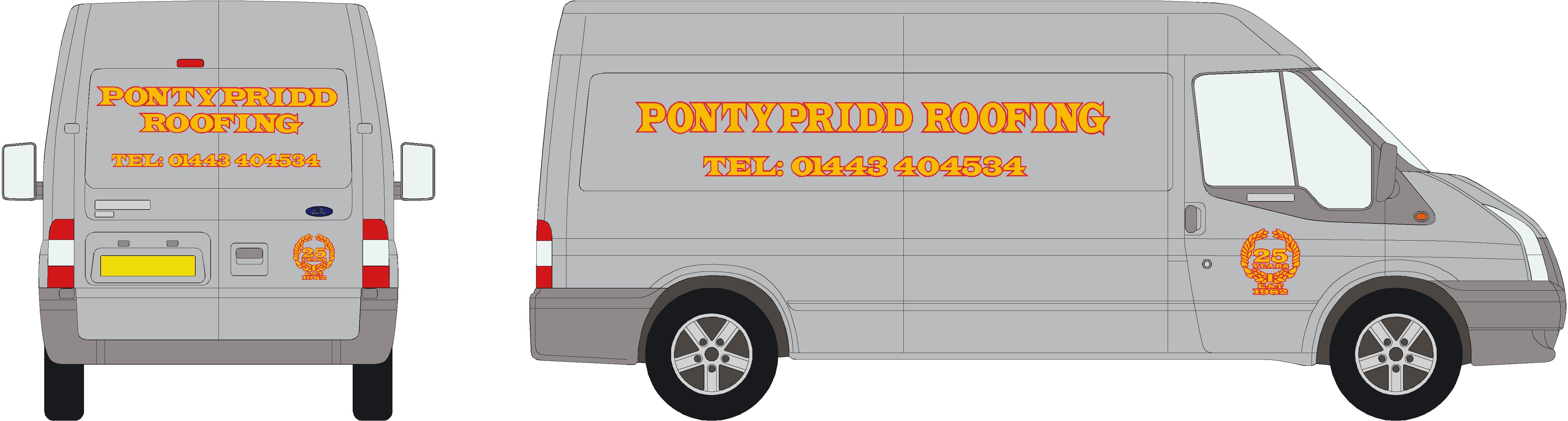
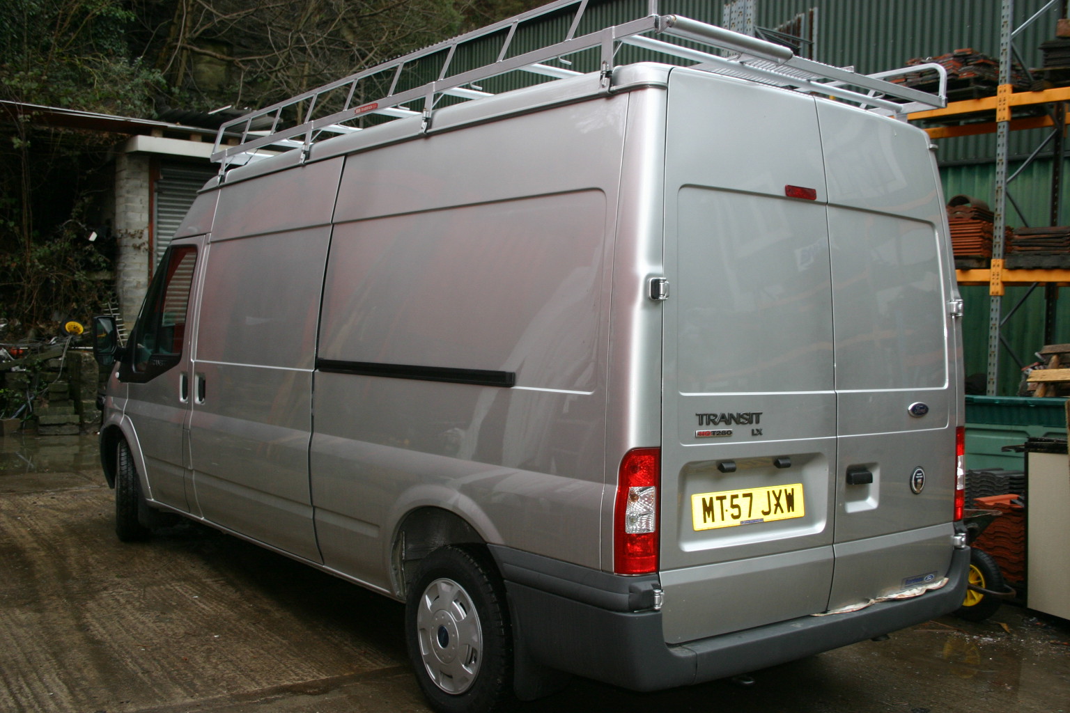
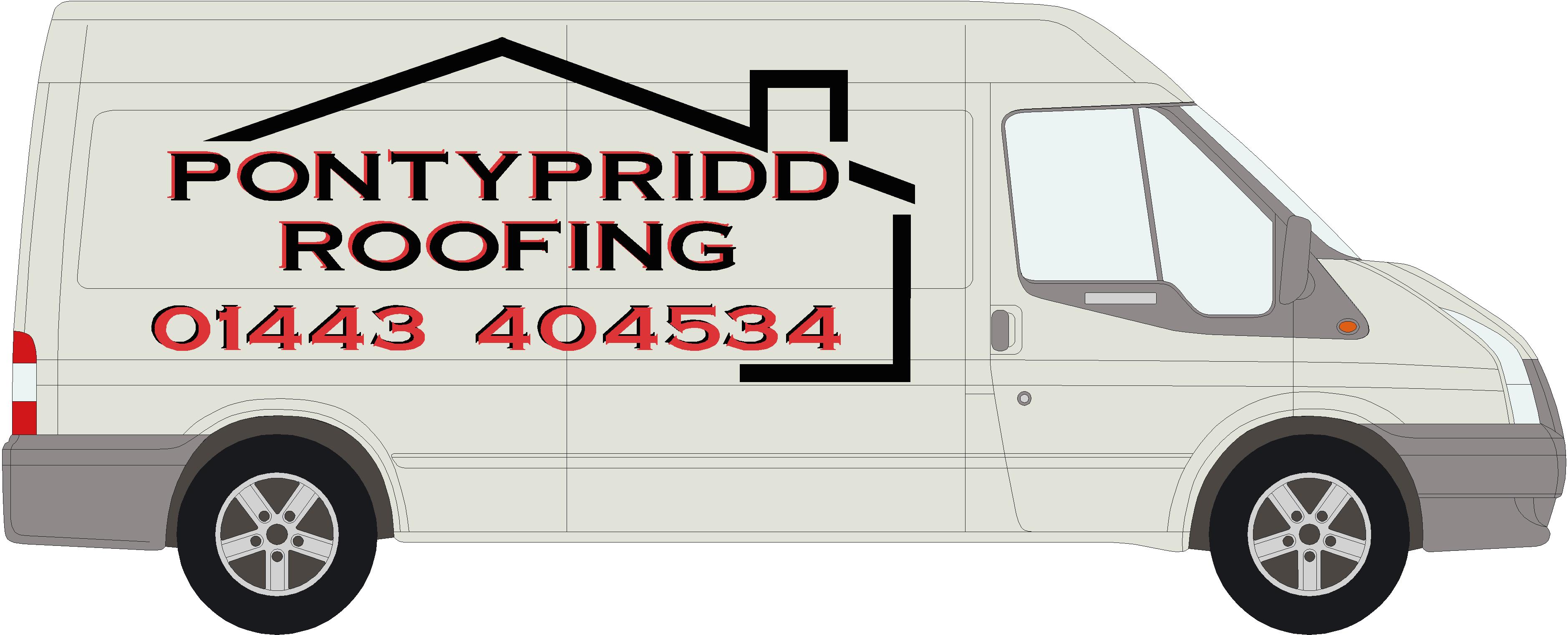
Posted by Scott.Evans on 7 January 2008 at 08:55here is his current design that he has had on one of his other vans.
van = metallic silver
any ideas as what i should do to improve his design. the customer wants a different font. and wants to keep to red and gold.
will post my new designs
thanks
Attachments:
 Steve Underhill replied 17 years, 11 months ago 8 Members · 20 Replies
 -
20 Replies
-

Hi Scott
Whatever you end up doing, alter the kerning so the outlines of each letter do not touch/overlap. I’m sure you knew this though…
Cheers!Gareth
-

Personally I would put the text on an angle running up the side you may get the text a bit bigger if thats all the customer wants on. 😀
-

You are overusing a heavy display font.
Try a simpler font for the phone number and please eliminate the dreaded "Tel:"
Try stacking the name on the side like you did on the back.
Don’t be afraid to go a little bigger on the sides.
Here’s a quick suggestion adding another color.
If it were my choice I’d eliminate the red altogether but we know the customer is always right.
Those colors are just awful on a metallic silver van.
Love….Jill
Attachments:
-

I agree with Jill …………… I don’t like red on a metallic silver van. 😕
-

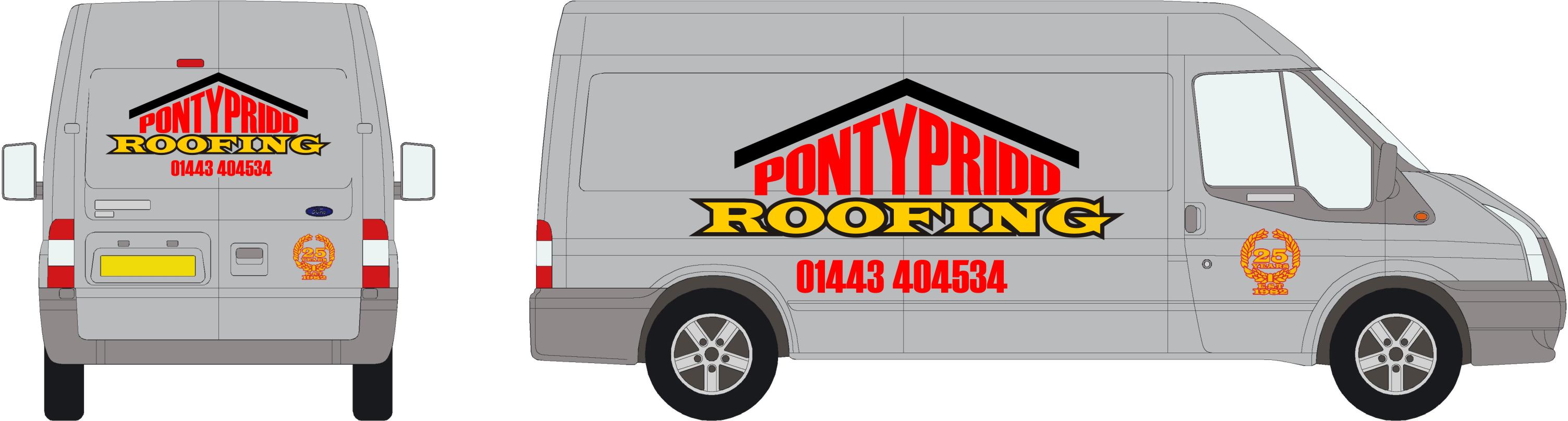
his company colours are red and gold but i can get him to change i think.
here’s a few quick designs ive put together.
Attachments:
-
hi jill thanks for the help.
he wants the design simple and plain.
i like the way you made that roof up 🙂thanks all
-
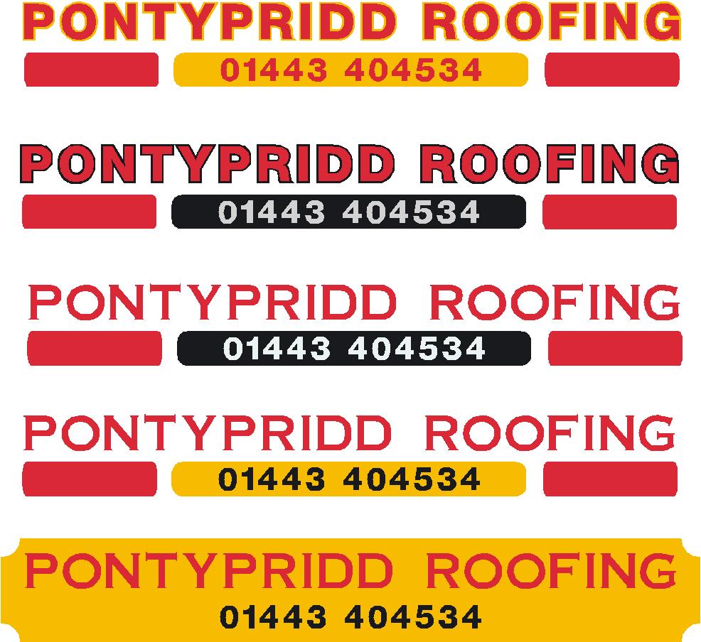
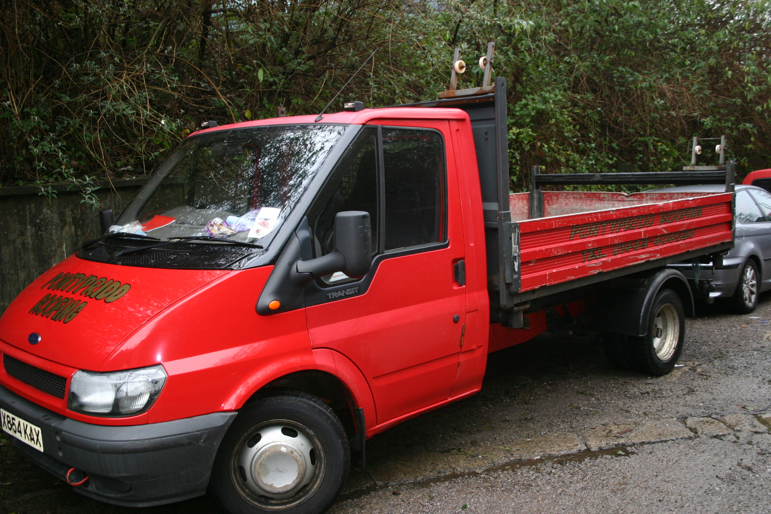
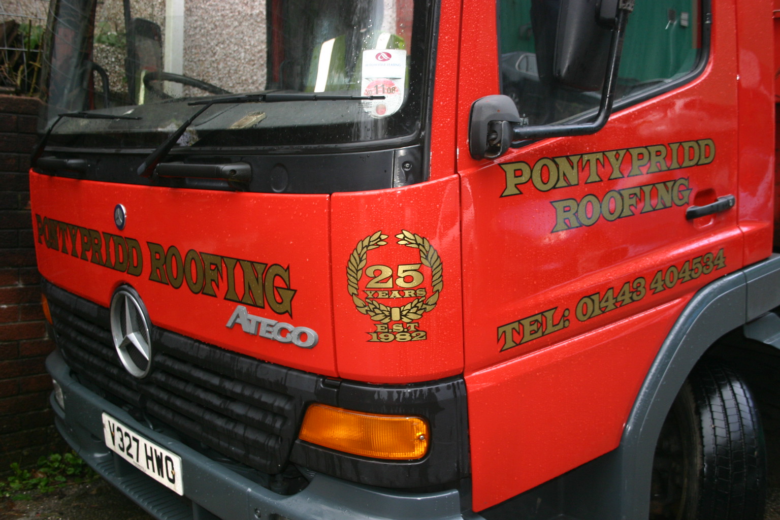
here are his vans all will be redone with his new design that ive got to do 😕
Attachments:
-

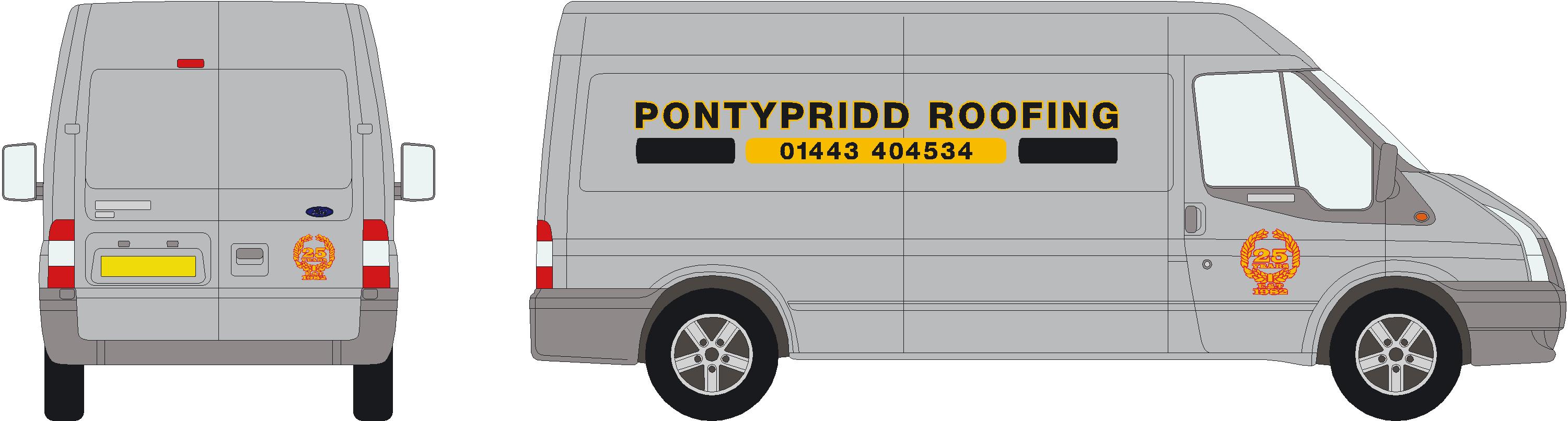
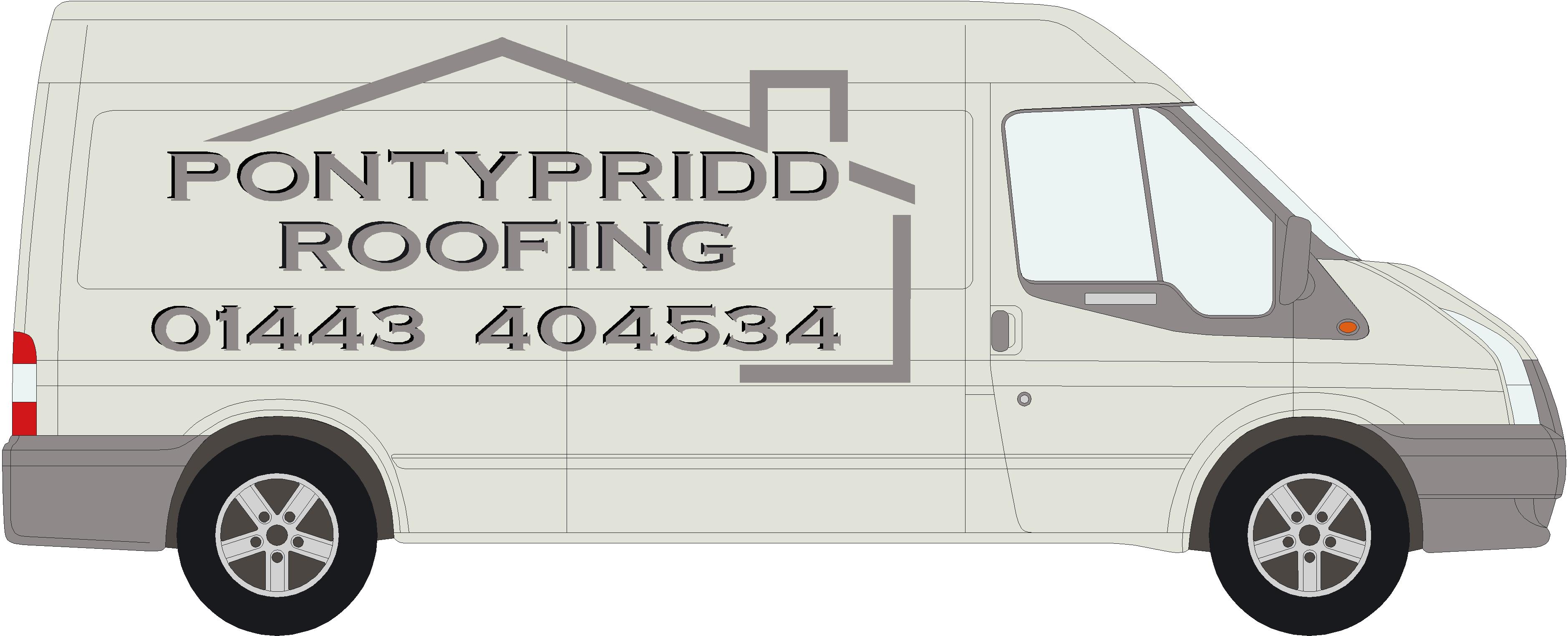
Its the first font I came to that was thick, and dont have time to do anything properly, but I always like to see a metallic graphite colour on silver vans, its subtle and matches, like some of the garish colours like yellow & red.
Like I said knocked up in 10 minutes in photoshop just to show colours on silver.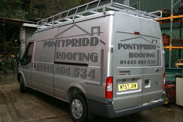
-
The font is called "Bastion"
not sure where I got it from, I have millions of them but do a search for it.
and itll show up somewhere, Its NOT he one on myfonts for $12 by the way, I will do a search for it later when I stop making shelves.
Cheers
Steve -
Thanks John,
It could do with a bit of tweaking but was just knocked up quick in photoshop just to show Scott the Graphite on silver effect, lots of sporty cars have the logos of the famous brands like Brembo/Spax etc on the wing done in that colour, and with the slight drop shadow done in a slightly darker colour it makes it stand out quite well.
Oracal 751/851 do the metallic colours in nice complimentary shades
They would be Graphite for main letters, & anthracite for the drop shadow, in either vinyl.
932/093 respectively -
he want’s red on the van and i cant tell him different "customers always right" 👿
steve ive tryed copying that design but with the red it dose not look as good. will keep playing with it.
anyone have ideas?
the vans ain’t in till next week.
Attachments:
-
Red can work on white vans but use a darker red and give it a drop shadow in black,
This customers van had to be dark red and black, with a John handy font 😕
Not too much of a shadow and it should look fine and not overbearing, I used oracal 751 and the colour was 030 dark red,
The light in the photo doesnt do it much justice as the 2 blues were the same colour as well but look different.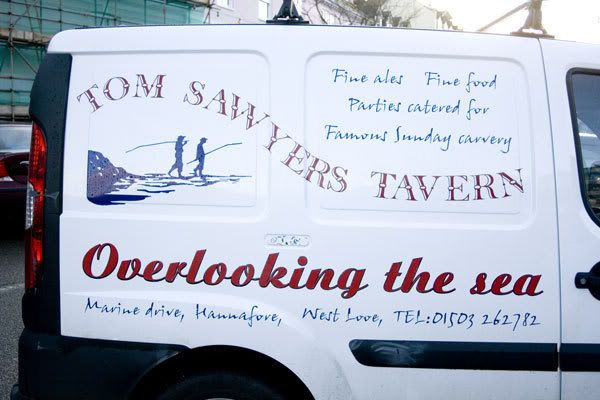
-
Phone number looks too big.
Try outlining the red in a pale grey or white…I try to avoid outlining or shading red with black (unless it’s a very bright tomato red) because of contrast issues.
I did like the charcoally grey metallic.
Love….Jill -
The photo doesn’t show the outline very well in the picture, but it does look quite nice in the flesh, not too in your face, but the contrast is ok, just subtle, but that said the lettering is a small script font and not big bold letters.
It would probably make a difference being a lot bigger, the best way is get a bit of white foam board cut a few bits and experiment. -
Steve, crits on your van would be using two scripts in one design.
I think that red script line would have looked neat in the font used for Tom Sawyer.
Also, you used the dreaded "Tel" too! (in all-caps script no less!)
🙂
Love….Jill -
I was pretty limited on fonts I could use, John handy had to be in there, as did the other script, I wouldn’t usually want to do this but he was insistent on 2.
I chose the traditional looking text as it fitted in with the old Mississippi theme etc, and think it looked nice.
Hold my hands up to the TEL number being in caps, to be honest I didn’t even notice till you just pointed it out, maybe I had caps lock on lol.oops 😳
but even though you explain that you don’t need it people still insist you put it there, lest its mistaken for a fax number or a lottery number etc.In fact quite the opposite of people you tell they don’t need their phone number on their T shirt, they agree with me when I explain people will ask for a card not chase you round trying to write a number down off your back.:lol1:
If you like the Tom sawyer text, its called "Beffle" very nostalgic I think, It also looks brilliant used in window etch on mirrors.

Log in to reply.