Home › Forums › Sign Making Discussions › Graphic Design Help › which logo design should i go for?
-
which logo design should i go for?
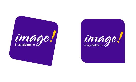
Posted by image on 30 December 2007 at 13:53Hi All!
I’m working on our new logo, but I can’t decide: rotated or horizontal background?
Some arguments:
Rotated: dynamism, freshness etc.
Horizontal: stability, reliability …and easier design in layouts.I am asking you, write your opinion!
Thanks!
Attachments:
 Neil Churchman replied 17 years, 10 months ago 22 Members · 39 Replies
 -
39 Replies
-

lol… i can’t really decide either.
at first i thought No2, but then No1, then couldn’t decide!
-

I like the layout and the colors, but the shape seems lacking to me.
If forced to choose, I would go with the straight look for this shape.
Love….Jill -

I’d go with the slanty one.
But Jill’s better at this sort of thing than me – so maybe straight.
That’s not very helpful. Sorry. 🙁
-

I’m not keen on slanty things so if it’s a choice of the two I go with the straight one, like the colours though 😀
Lynn
-

I think the straight one …..but I think the website looks too small
here’s a twist on both of them……………
Attachments:

-

of the two i prefer the first… but not too keen on the font for "image"
due to the angle and the italic font, it does give the impression of movement, moving forward etc
ive dropped the size slightly, off set to the right and lowered it to try give make the name/company appear to be creating the movement/pushing?amyway, other than the choice of script, i like its simplicty.
http://www.uksignboards.com/images/graphichelp/image.jpg
.
-
Now I like the slanty one. Whatever you did, Rob, it helped it 100%.
I like that script.
Used a lot over here tho.
Love….Jill -
my personal opinion of the slanted one (even though Rob’s was an improvement)….is that it looks like a gift tag rather than a logo……….I think 😳
-

Sorry i think there’s too many elements all together and not fitting very well on a background that’s making them all unbalanced and cluttered
Well done Glenn i feel that your version has cured all that
Terry
-

I like the text aligned closer to the bottom the way Rob has done it ………. but not sure whether it ought to be slanted or straight 😕
But definitely aligned closer to the bottom of the shaped panel. -

I’m not a big fan of the script font either…..maybe a curved font to compliment the rounded square ?
Of the ones you posted I prefer the upright and think it would work well 😀
[the mark could be an inverted i !]
Attachments:
-

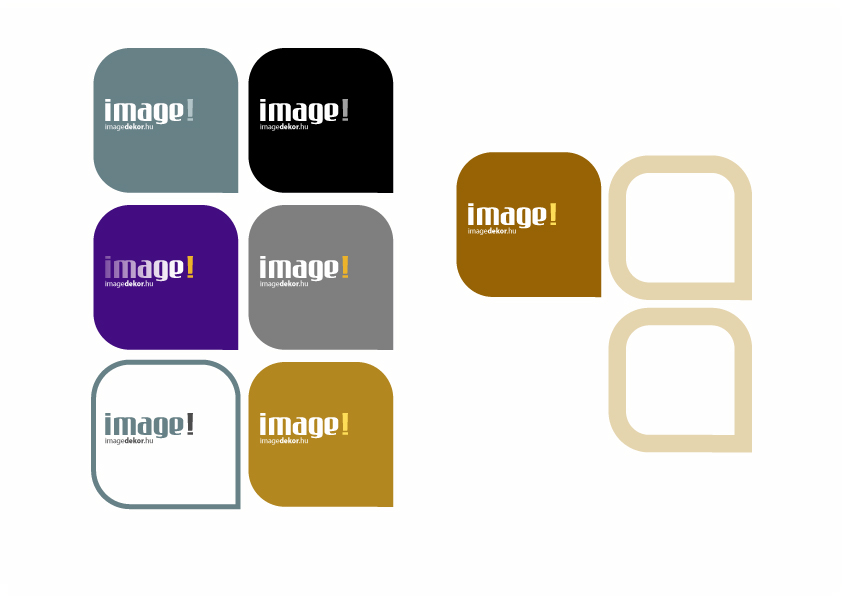
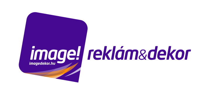
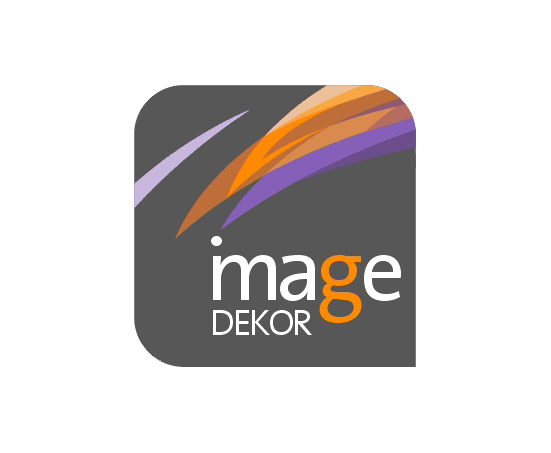
Thanks for the comments! It helped to me. I like Robert and Andrew’s modification very much!
In our old logo was a script font, but maybe we need something new. I like minimalism, and I want something else visual identity, than the rest of the sign makers. So I think, the slanted will better.
I made a new version (now with English text). The logo has more variants (Without signs&posters, and without website name). For example, on a business card i do not leave the website name in the logo.
What do you think?
Barna
Attachments:
-

For me I’d maybe move the text within the slanty box slightly to the left, having said that I prefer Andrews take on the whole design thing.
John
-

Just wanted to see what it would look like in comparison.
Attachments:
-

I feel that at first glance, the eye goes straight to the shape rather than the name.
-
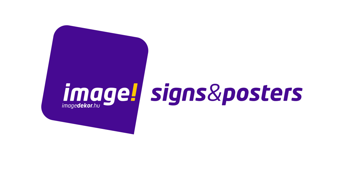
Hi All!
Thanks for the tips and inspirations. Here is the new version.
Write it if you have an opinion!Thanks!
Barna
Attachments:
-

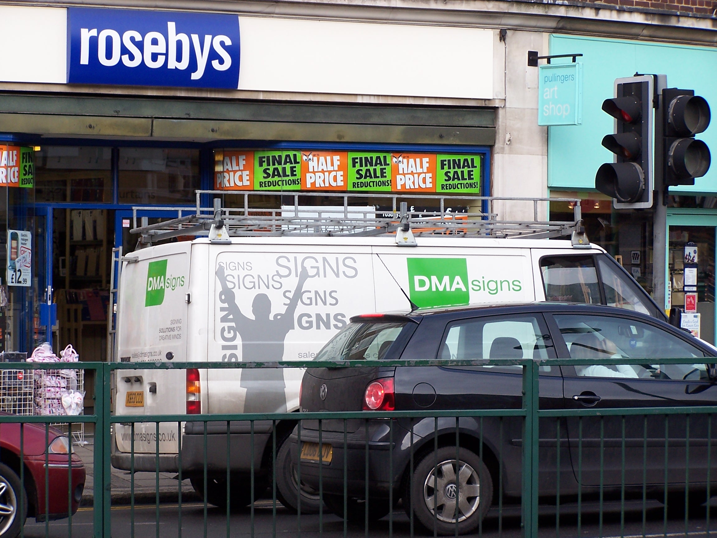
Hi Barna
Although I like it I have noticed that since you first posted your new logo I have noticed almost the exact same type of logo for 2 other companies here in the UK. 1 was on TV but for the life of me can’t remember what it was called the other is the guys in this picture below, I don’t know them just saw the van go past and quickly snapped a picture.
It seems like a very common design, not sure what it’s like there 😕
Attachments:
-

It’s obviously the fashionable shape right now. I remember 4-5 years ago you would see the square with the corner sliced off like on a Sim card or CPU chip. Before that it was the crescent shape everywhere.
-
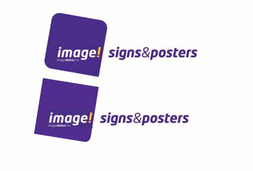
I felt, probably due to the size/length and the colour of the text next to your logo that it was a bit overpowering. i am not sure if i am explaining very well, but using the text along with the logo, the text should be secondary. anyway… I have altered the colour to give another take on it.
http://www.uksignboards.com/images/general/toexplain/barna.jpg
p.s. i have colour filled my text wrong, in doing so beefed up the font a little and doesnt appear as sharp as the original. so could be improved 😕
.
-
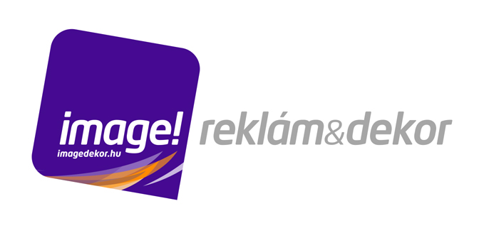
Yes, it’s fashionable shape. (Maybe, after a couple of years, it will seem obsolete.)
Robert! You are right. The "reklam&dekor" text was too strong. In your version the pink text harmonize with the logo colors, and very nice, but I am afraid, the logo will be too "feminine".
I made it with gray:
Attachments:
-
I didn’t like the one on an angle at first….but seeing the latest version I think it works well
It looks good to me
-
i like the logo very much.
Just be careful about the full colour section. it can sometime be a hassle when printing a vehicle decal or sign. As the logo lends itself well to cut vinyl but then the full color section will mess you up. you will then need to digitally print as as you know inks never last as long a cut vinyl and never look as nice.
you will then need to die cut which can be a pain. even if you print the logo section then use purple cut vinyl for lettering etc. the two purples will never match.
-
I like it……don’t no if more conventional spacing might improve it…there’s a lot going on even though it’s pretty simple (?) 😀
Attachments:
-
these seem to be popping up everywhere now 😕 I’m not trying to find them (not that you can search for a shape 😕 ) but they just keep popping up.
Attachments:
-
the "shapes" are similar. however, even if they were exactly the same, it is only one element of the overall logo. the radious corners on a square/rectangle is popular just now i agree. but still, the angle it sits at, the amount of corners it has the radious on, the colour of it, then the rest of the graphics, all play a part in making it original. because we all work in graphics in some form or another, we take note more of it all going on arounds us. e.g. the advert at the top of this page for Roland, is that a modified version of "Orange" the telecom company’s logo, or is it just one element of a design?
i think the addition of colours and other text in barna’s design more than helps it feel more original. -
very true Rob, I did say I liked his logo and just thought I would post the others I had seen as I started seeing them everywhere 😮 They all look different although has a similar element. Nothing wrong with any of them just thought interesting how many were out there 😕
-

there’s even one incorporated into the holiday search on skideals.com
I found that as I was looking for a snowboarding Holiday tonight. -
And interestingly 😀 😀
I think it looks great and has progressed nicely since the beginning of the thread 😀 😀
-
quote Andrew Boyle:And interestingly 😀 😀
I think it looks great and has progressed nicely since the beginning of the thread 😀 😀
Maybe I should have used it too :lol1: :lol1: :lol1: I think that might have been a problem then 😉 🙄
-
Thanks for the comments!
daneread: Yes, I must use printer, but I think, in the last 10-15 years a big technical change happened in. Nowadays we may display a full-color logo everywhere. Because of these, the full-color logo is a trend. For example: the British Airways ribbon, and British Telecom logo. Although I do not have so much money onto advertisement, than for them…
I made a couple of tests with the previous logo variant, but I am not satisfied with it unfortunately. Eg. I placed it in the plan of a web page, but the slanty logo looks oddly. 🙁
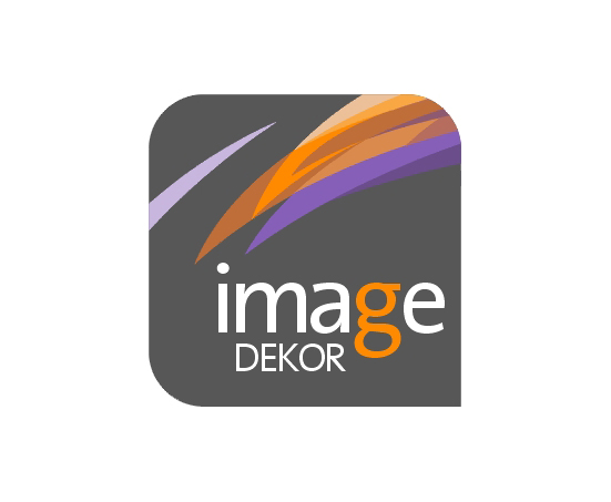
I want something unique, so, i made newer versions. The new "image" lettering seems readable for me. What do you think about it? image or mage?
Attachments:
-

i like it alot not too sure about the i in the n…would like to see one with the full word, i like it 😀
nik
-

If your going to use the i as part of the m break it up so its the same shape but the i is a different colour.
-

I prefer the logo where Robert changed the text to grey.
The new logo doesn’t seem so ‘friendly’ to me.


Log in to reply.