Home › Forums › Sign Making Discussions › Graphic Design Help › new van design help needed please?
-
new van design help needed please?
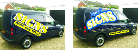
Posted by LeeMorris on 31 October 2007 at 16:57Hi All
Getting a new van friday and want to get it signed up.
Like always its hard trying to design your own van so all ideas would be appreciated .
I would like to include some colour prints but not sure where.
I’ve been changing it from one design to another but its just not looking good.Cheers
Lee
Attachments:
 Phil Barnfield replied 18 years, 1 month ago 12 Members · 16 Replies
 -
16 Replies
-

Lee,
If you un-distorted the second version, made it smaller, and tucked the number panel underneath the "SIGNS" part it would look better.
And just put it up in the panel rather than making it honking huge.
As far as color suggestions, lime green would look good somewhere on that van. Also hot pink…but I don’t think you’d like that!
Love…..Jill -

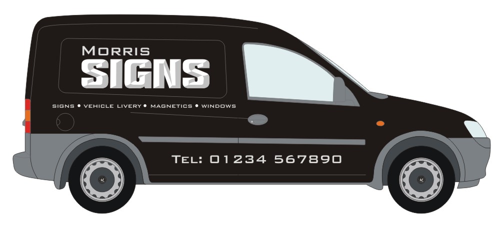
I like the idea of something like this…….
http://www.uksignboards.com/viewtopic.p … 062#242062
Look at the close up of the projecting sign further down the post.
Maybe silver with chrome. Looks nice and smart, I did something similar onto a black van a while back. More suited to a tidy layout than big in-your-face graphics though.
Maybe like this but better…..
Attachments:
-

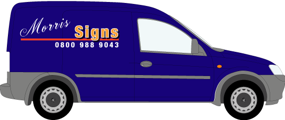
Hi Andy
I like that clean and simple
The van is dark blue but looks black in the picture.Not sure if i should do simple or big and bright
Cheers
Lee -

Just be careful what effect the distortion going into that recess will cause on the letters going into it. Sometimes when applied it makes it harder to read etc.
I saw a van on the highway the other day and it was a van with two recesses and the phone number was split up between the two. I nearly didn’t notice it was the phone number.
-
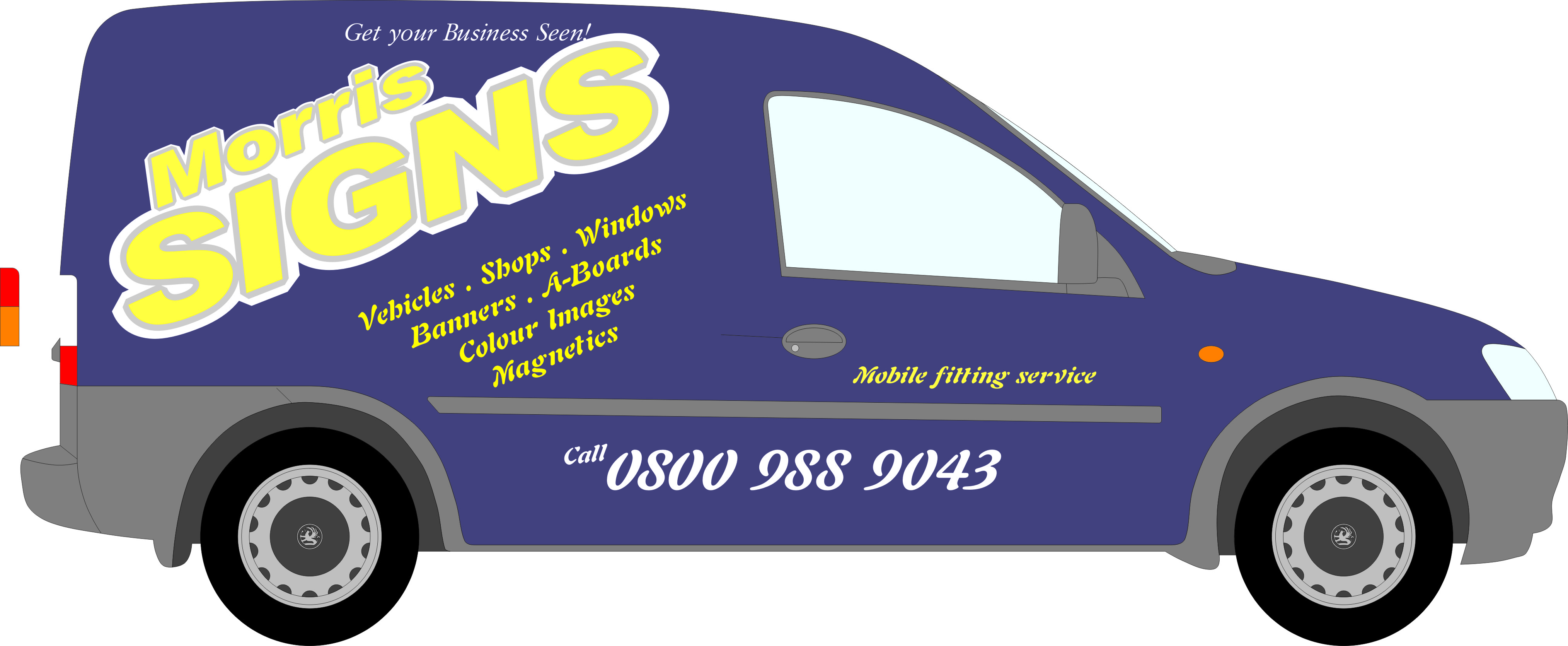
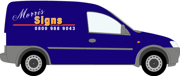
Been having another play with this design
Any commentsCheers
Lee
Attachments:
-

Lee
just my opinion but phone number below the moulding is a no-no. Becomes unreadable very quickly on winter roads. Why not try swopping the what you do list with the phone number. Your name speaks volumes of what you do, so the listing can become secondary.Kev
-

Lee why do you want it at an angle ?? don’t like the big outline it is not necessary and I think it was Kev that said phone number need to be higher, in the panel or just below it, also Jill suggested lime/apple green which looks good on that colour, or as Andy said silver is good as well. Keep it simple and sweet
Lynn
-

Still not floatin’ my boat. I’d lose the list of what you do (save that for the back if anywhere) ‘SIGNS’ says it all – drop / reduce the angles and make it as readable as possible – BIG name, BIG phone number.
I’ve never been keen an ‘jaunty angles’ for any advertising as it can lessen the impact if not executed perfectly.
Can you post up an EPS so I/we can have a go?
Dave
-
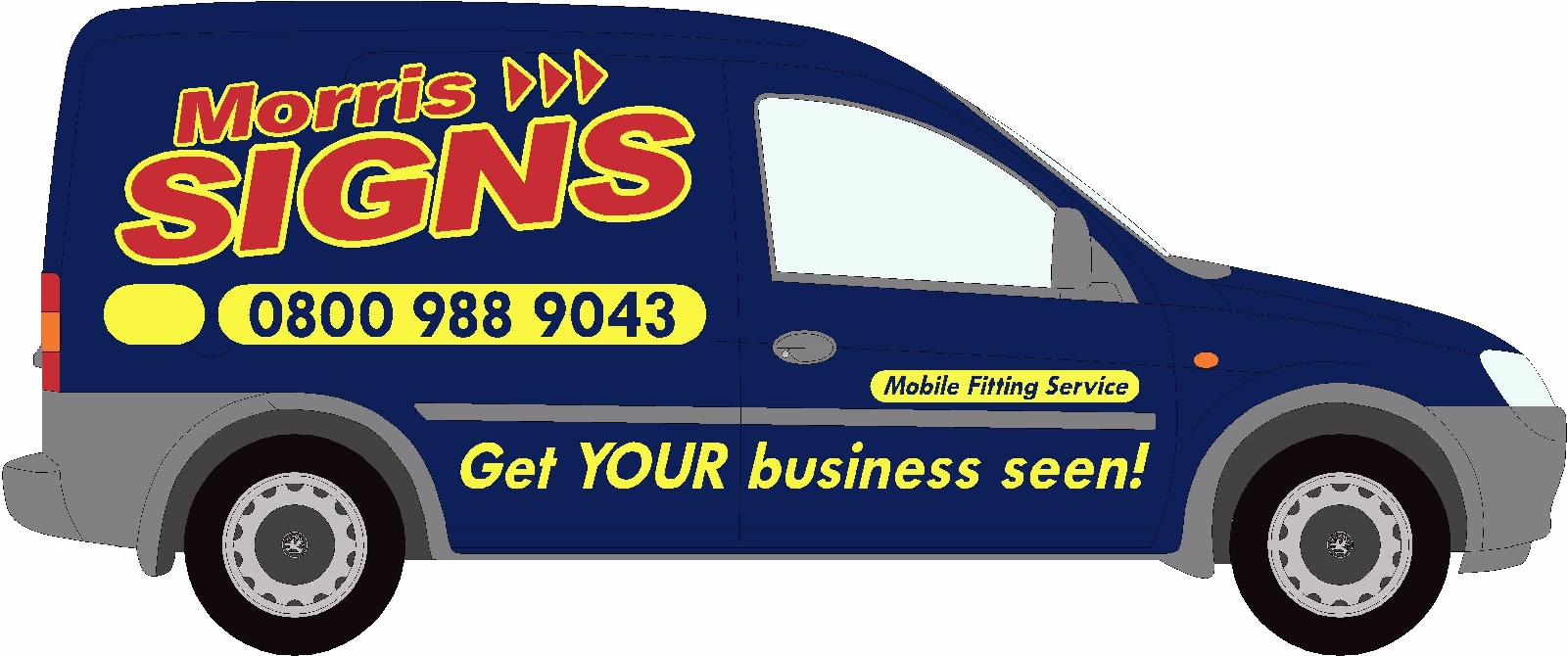
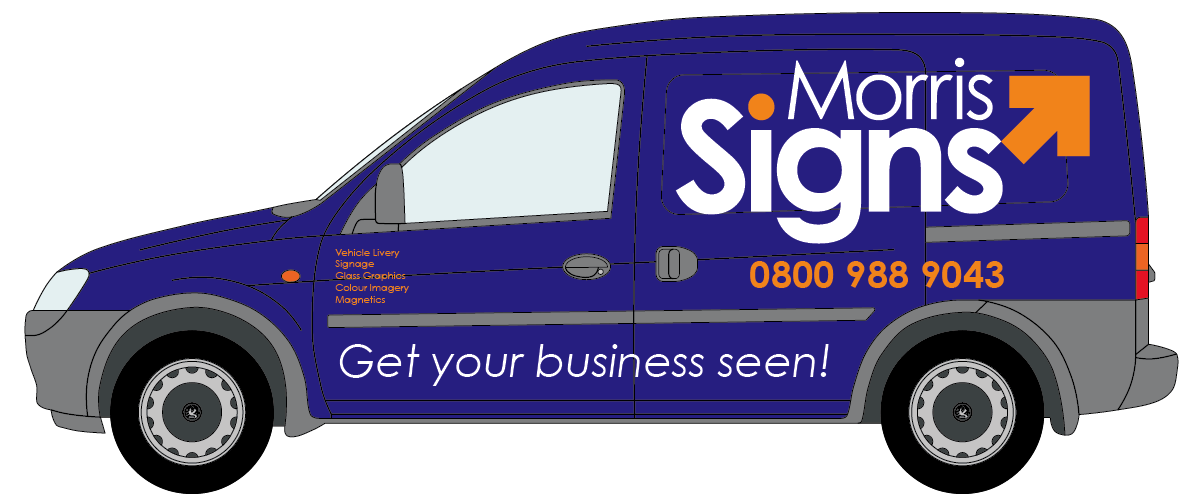
Had a quick wee play – kept a bit of an angle, got most of your features on – except the list.
Big, Bold, Bright.
Attachments:
-

lee
lists are ok, but not over curves and recesses.
One disadvantage of a list though, if you make one and omit something you can do, customers may assume you dont.to explain:-
M. Wall
Bricklayerif I saw that I would call to get a quote on building a house or a garden wall.
M. Wall
Bricklayer-Garden walls
fireplaces
conservatories
landscapingIf I wanted him to build a house, I may think he wouldn’t do it,
because its not on his list.
if you see what I meanPeter
BTW
M Wall is the name of one of our customers, and he is a brickie!😀
-

Hope this adds something to your ideas.
It is hard coming up with your own stuff.
Attachments:
-

Another perspective Lee. Hope this gives you some ideas.
Attachments:
-

I know the feeling here Lee!
I signed my Citroen Dispatch up in a bit of a rush…. ahem. Not paid enough attention to colours or contrasts and tbh I don’t think it is working for me, so it needs a revamp.
I do like the big bold and brass version by David.
I will start another thread soon enough with my issues for slaughtering!!! lol. I really don’t understand why many of us struggle with our own designs….. funny really aint it? 🙄

Log in to reply.