Home › Forums › Sign Making Discussions › Graphic Design Help › Need help with design for my front shop window?
-
Need help with design for my front shop window?
Posted by Nik Nieuwenhuis on 17 October 2007 at 04:08Hi all,
Need help with design for my front shop window?
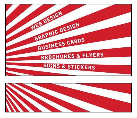
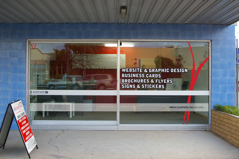
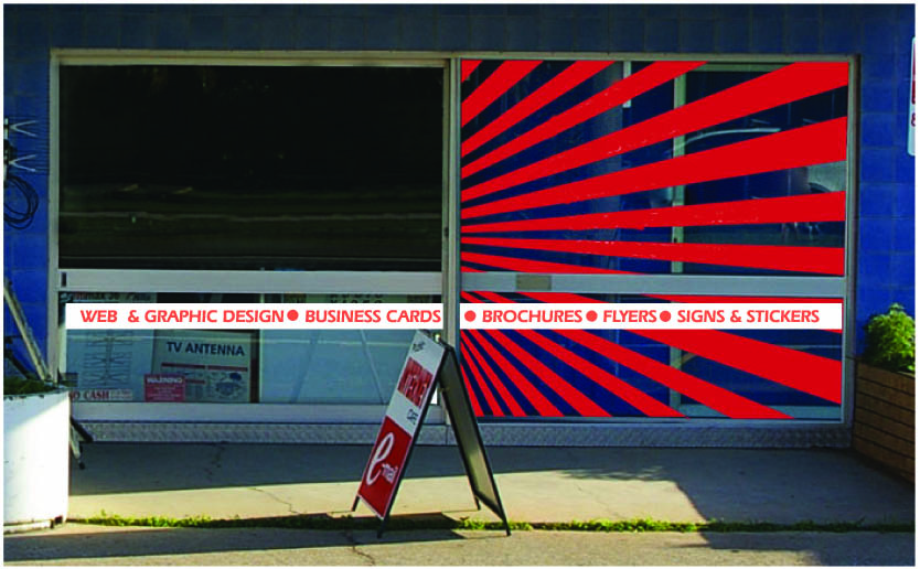
Attached is the design I have in mind.
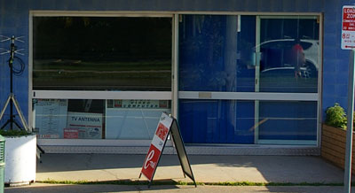
also I’ve attached a small photo of the front shop.The designs are going on the right hand windows.
the left hand side is a glass sliding window.Sizes are 2 big glass windows
Top is approx 2200mm x 1200mm
Bottom is 2200mm x 700mmNot sure if what I’ve done is too much? Bit full on? Or if the angles on the words will make it too hard to read?
Thoughts? Comments? Suggestions are all welcome…
Attachments:
 Jason Xuereb replied 18 years, 1 month ago 20 Members · 41 Replies
 -
41 Replies
-

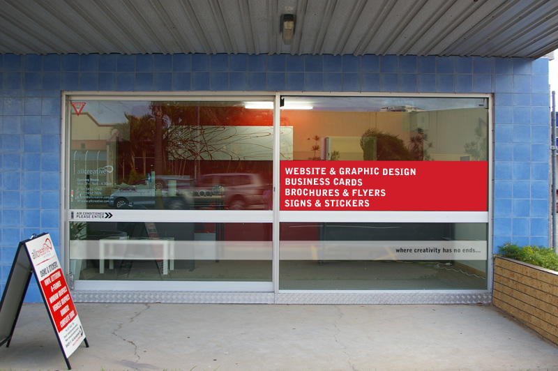
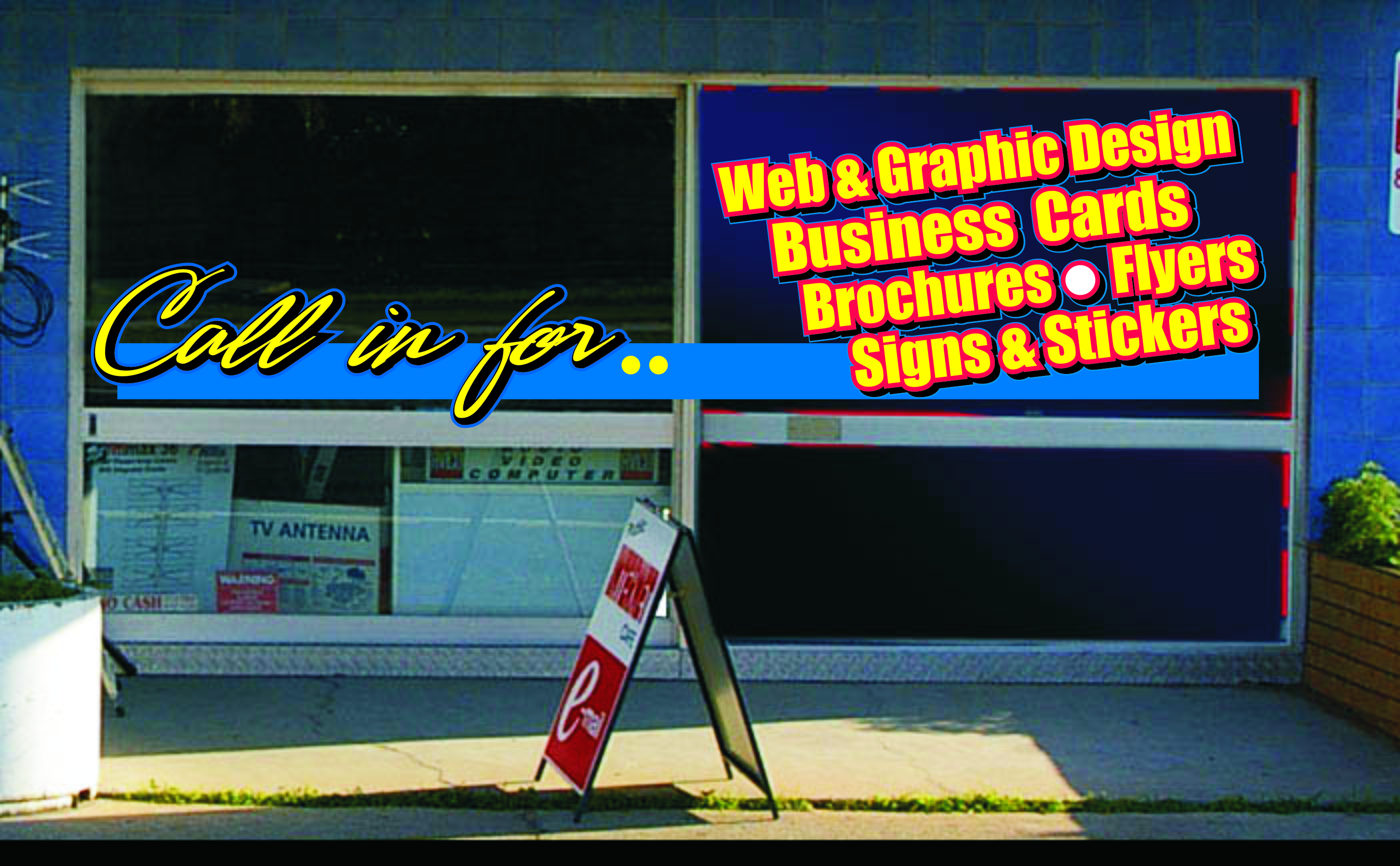
Can you mock it up on the window? Is the white going to be the glass or you flood coating it in white and using red over the top?
-

it’s not going to be flood coated. Just the red panels & the glass.
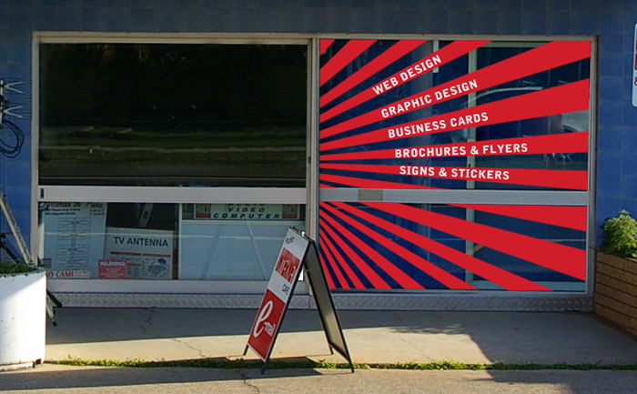
i’ve attached a mock up of the window…
Attachments:
-

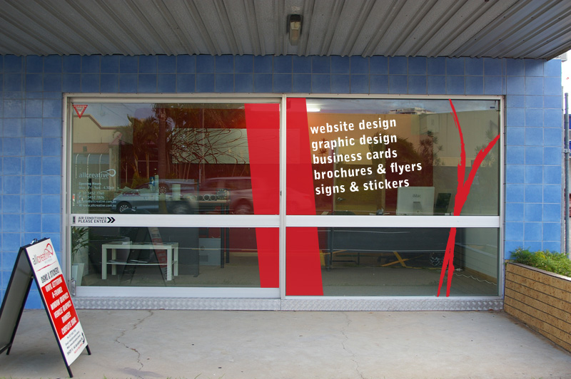
The radius of the text is not consistent and therefore breaks up the readability.
Drop the "Web Design" and include it in "Graphic & Web Design".
Adjust the start radius of the text so that its all the same.Ensure all of the red fingers are the same thickness
Make the red lines actually line up between the two windows rather than split the graphic and shifting it down i.e. create the full size graphic and chop out the strip for the window frame.
Just a few pointers based on looks[/list][/list]
-

Is it not possible to put anything on the left hand window or is it that the sliding door will be open most of the time so anything on there would clash with the right hand door? …if that makes sense
If that was the case I would try & come up with something clever that when the left door covered the right door everything still read perfectly normal 🙂
-
yeah, that could work…
the sliding door is closed 99% of the time, so I could use it for signage also.
i wanted to keep it blank for light if possible… but open to suggestions… -

Sorry Nik but IMHO it just doesn’t work.
First glance I saw the Japanese flag.
Second glance, the stripes.
Third glance the vacant left window.
Fourth glance – the wording.It’s just too much and requires study rather than a catch-the-eye get the message across.
All the lines congregate at the left edge as though there is something to point at yet there is nothing. Left like this it will look as though you’ve just had a window replaced.
If you want to stick with the idea I would have at least half as many lines, add a focal point at the convergence, and continue the idea in to part of the left window.
Personally I would try a few other designs (you did ask and only trying to be constructive)!
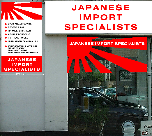
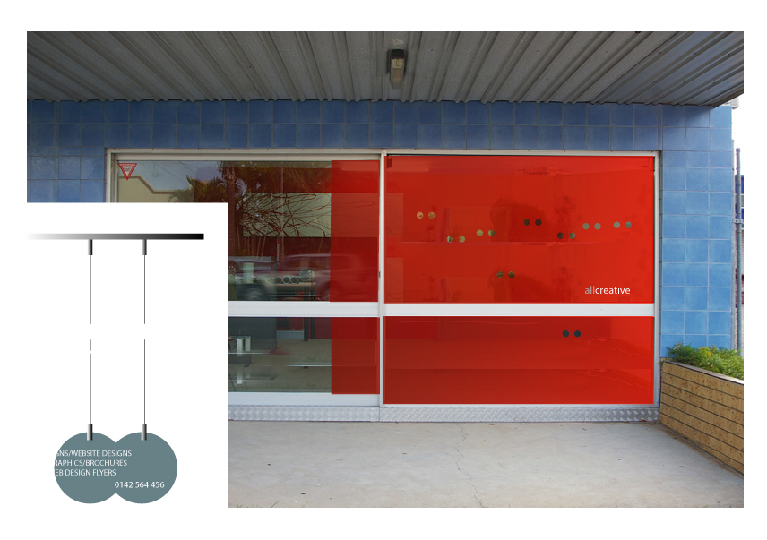
I’ve shown a draft of a job done many years ago on a similar theme.
(fascia not actual).
The design on the glass did not extend down the window as full visibility was needed.
However, the main message they wanted to convey was the Japanese theme to their products, and of course that is done even without any wording.
Attachments:
-
great! thanks for your comments guys!
will come up with a few more idea’s and come back soon with some more designs… -
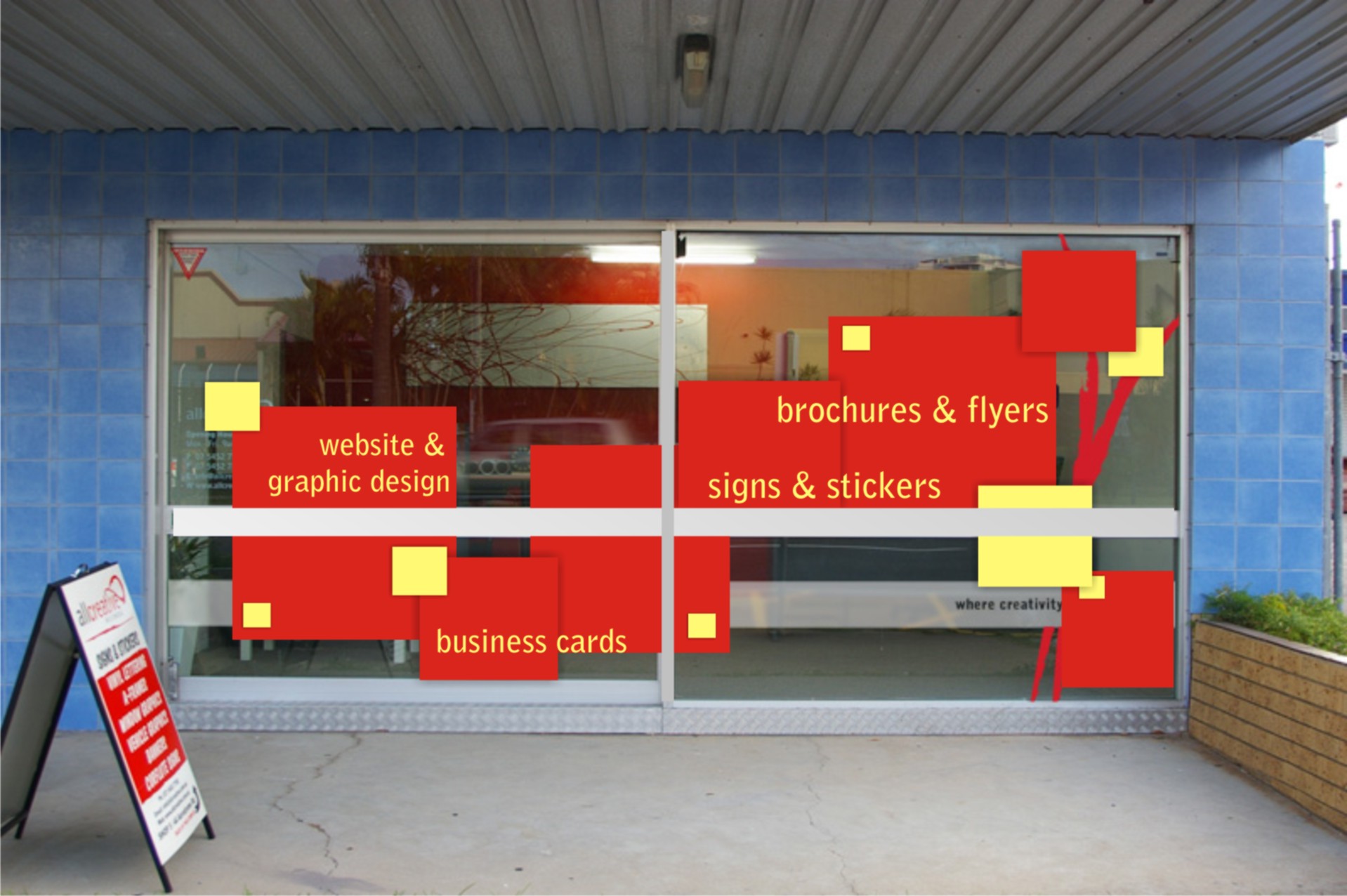
ok, worked on a couple more designs for you guys to have a look at?
please let me know what you think of these designs?
comments? suggestions?
Attachments:
-

I think design _01 catches the eye better. Looks more contemporary, but I think the text still needs a little bit of tweaking, maybe it’s just the picture that’s making it look as if it’s not sitting quite right though. (?)
-
I like idea 1 with changes.
Take away the big red block.
Move the text block a bit to the right, do the text in red and back it with a rectangle of etch.Put the bottom window etch band back, again with red text where placed.
This will tie the top and bottom windows together.Lower case is far better than all caps, so much preferred.
-

i like one too, but have to agree with changing the font, look forward to seeing your job finished 😀
nik
-

Hi Nik, I’m liking designs 02 / 03. I like that piece of artwork on your wall inside (red and white abstract), why not create something like the red element of it and place that within the frosted band on the bottom panes and align it to the left. If i passed by in a car i would expect to see a company name on the glass or a sign above.
I can some Swiss elements going on here, Brockmann maybe?
Maybe its just the red making me think that. -
quote chris gusman:I can some Swiss elements going on here, Brockmann maybe?
WTF? 😮 Chris, it’s just a red vinyl ‘thingy’. 😀
-
 quote Marcella:quote chris gusman:I can some Swiss elements going on here, Brockmann maybe?
WTF? 😮 Chris, it’s just a red vinyl ‘thingy’. 😀
😀 😀 😀 think she is trying to say ‘this isn’t UKBS’!!! 😀 😀
Welcome to the madhouse Chris!!! 😀 -
It wasn’t just the "red vinyl thingy" i was getting at Marc, it was the use of simple shapes like the red rectangle behind the text and the frosted banding to create a contemporary design. In design 01 the use of scewed text was a typical element used by Brockmannn and the red panel.
You should check out some of his design Marc and Swiss Graphic Design, its beautiful , in my opinion he was a master of creating outstanding design using only simple elements. Check out his typography as well, a true legend.
-
quote chris gusman:Only about Drinking!
…….. kettle ……………..pot ………………….black …………..!!!!!!!! :lol1:
-

I like all 3……….not sure about the type….can you post the pic without graphics 😀
Nice Though 😀
-

I like Terry’s 2nd go, can’t you go with the change of colour or does it have to be red??
-

Had a bash at this… I’m not keen on the bottom one that i have done… kinda lost the plot mid-way with that one… (need to lay off the acid i think!) 😕
[c]
 [/c]
[/c].
-
I like them both, the first one just about gets my vote though. 😀
-

Great design work there Robert, the second one is really eye catching but it makes the writing hard to read!
The first one is really good, simple and effective. I like it! :2thumbs:
-
 quote Robert Lambie:Had a bash at this… I’m not keen on the bottom one that i have done… kinda lost the plot mid-way with that one… (need to lay off the acid i think!) 😕
[c]
[/c].
there the dogs dangelys :2thumbs:
I would definitely go for the in your face approach 😎
-
Liked Rob’s a lot so thought I’d do something completely different!!!!!! 😀 in your face 😀
"alright wee man!"
"HIGH BIG GUY"
"you must be a dog"
Attachments:
-
:lol1: :lol1: :lol1: nice one andrew 😀
rob love the first one….superb 😉
nik
-
Robs designs do it for me. You are offering an advertising service. Your potential clients need to believe you can make them stand out. I always use photos in my own designs and find this works well.
Karl.
-
robs first one is great!
my only thing though is I don’t have a digital printer. Just a cutter. Was trying to avoid getting it outsourced if possible….it gave me a couple of idea’s though… i’ll have another go today and see what i can come up with…
-

sorry Rob,
looks like an escort agency advert 😉Peter
-

I also like Robs ideas, they make you look twice. Whether you take in what or not the shop is all about is down to the individuals.
On another note, where can you get high res images like the top model and similar?
-
Pryam istockphoto.com is pretty good and easy on the wallet.

Log in to reply.