Home › Forums › Sign Making Discussions › Graphic Design Help › help needed please with digital printed signage?
-
help needed please with digital printed signage?
Posted by Scott.Evans on 16 October 2007 at 17:49this will be my first printed sign.
the customer wanted a background with masks in.
i was looking at getting the art work printed out at a print shop down the road.
could anyone give me a rough idea on what i should be expecting to pay?
the print is 6ft x 2ft
exterior sign so i imagine it would need a laminate.and any tips on applying or what not to do!!
applying to 3mm alupanel (dibound)
Attachments:
 David Glen replied 18 years, 2 months ago 6 Members · 8 Replies
 -
8 Replies
-

I pay about £35 a square metre laminated. A one-off small print like that may be costlier, depending on what width material they are printing onto. (I’m guessing a bit there.)
Applying a laminated print is a doddle. Be careful of scratching the laminate with your squeegee. Put application tape on first to protect it. You should be doing it dry – you can always get it printed a tad bigger than the panel to allow for any mis-positioning.
-

I used to pay £30/m for the first metre and £17/m thereafter. Any width up to 1500mm. And I must say I was getting a good rate.
Everybody will be different depending on their volume / materials – but budget £70 to £80 for the print.
As Andy says – easy to apply – but watch out for scratching / scuffing.
Apply wet or dry – it’ll make little or no difference on a flat panel. (Dry gives the best adhesion – but wet will make it a doddle to do on your own.)Also, just a note on the layout if it’s the final artwork.
Unless it’s a specific design feature – ‘use of borders’!! Free space between lines should really not be greater than the outside borders. It gives the appearance of it being too big for the background.
Also – be VERY aware that on-screen vibrancy can be nothing like a print, especially of purples on a complex ‘dark’ background can almost disappear at a distance.
Print it out on an A4 sheet & stand 6 feet away from it. If you have any trouble distinguishing the text from the background – time for a change.
try fading the background down to 70% to make the fonts stronger / reduce the ‘bevel’ on the main text – personally, I feel it’s a bit too big for the characters.And personal preference aside – the fonts could be a little stronger / clearer to enhance their ‘readability’.
Dave
-

Just my preference, I wouldnt use application tape with a laminated print,
just make sure you use a clean and soft squeegee. It goes down far easier without tape as the print is able to "flow"
With regard to price, just make sure that you specify a good quality material, all to often a cheap per metre price, means a cheap 2-3 year material, for a fascia sign you need at least a 5 year (providing the print lasts that long…)Peter
-

thanks
i was wary about putting application tape on the print.i have flood coated much larger sheets than this with vinyl so i was thinking to use the same method???
that made it look a lot better fading the background
will make boarder bigger to.will let you know what price they give me tomorrow
-

Couple of tips following on from Davids earlier wise words.
If flood coating wet, soak the panel and vinyl glue side with app fluid.
Use a 6" hard roller working from the centre out in the form of a Union Jack. Easy, no bubbles and no marks.
I usually lay the print face down, peel off the backing and soak with fluid.
Soak the panel and lower down on to the print.
Turn it right way up and start rollering.Apply some transparency to the background so that the eye is not distracted.
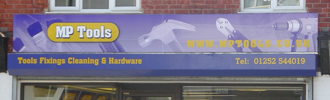
I’ve shown a sample.
Attachments:
-
ok then ill try that method will post the result when done.
thanks -

dont know if its the photo…but the mp tools website address could have done with a darker background/shadow/or outline just to throw it out…..the yellow is a bit hard to read 😀
nik
-
Yes Nicola I thought that might get a mention but it’s a mobi photo and cropped in as well. In reality it was as clear as day with my back to the wall on the other side of the street.

Log in to reply.