Home › Forums › Sign Making Discussions › Graphic Design Help › comments & suggestions please for this van layout?
-
comments & suggestions please for this van layout?
Posted by Steve Sandy on 12 October 2007 at 12:01Good afternoon,
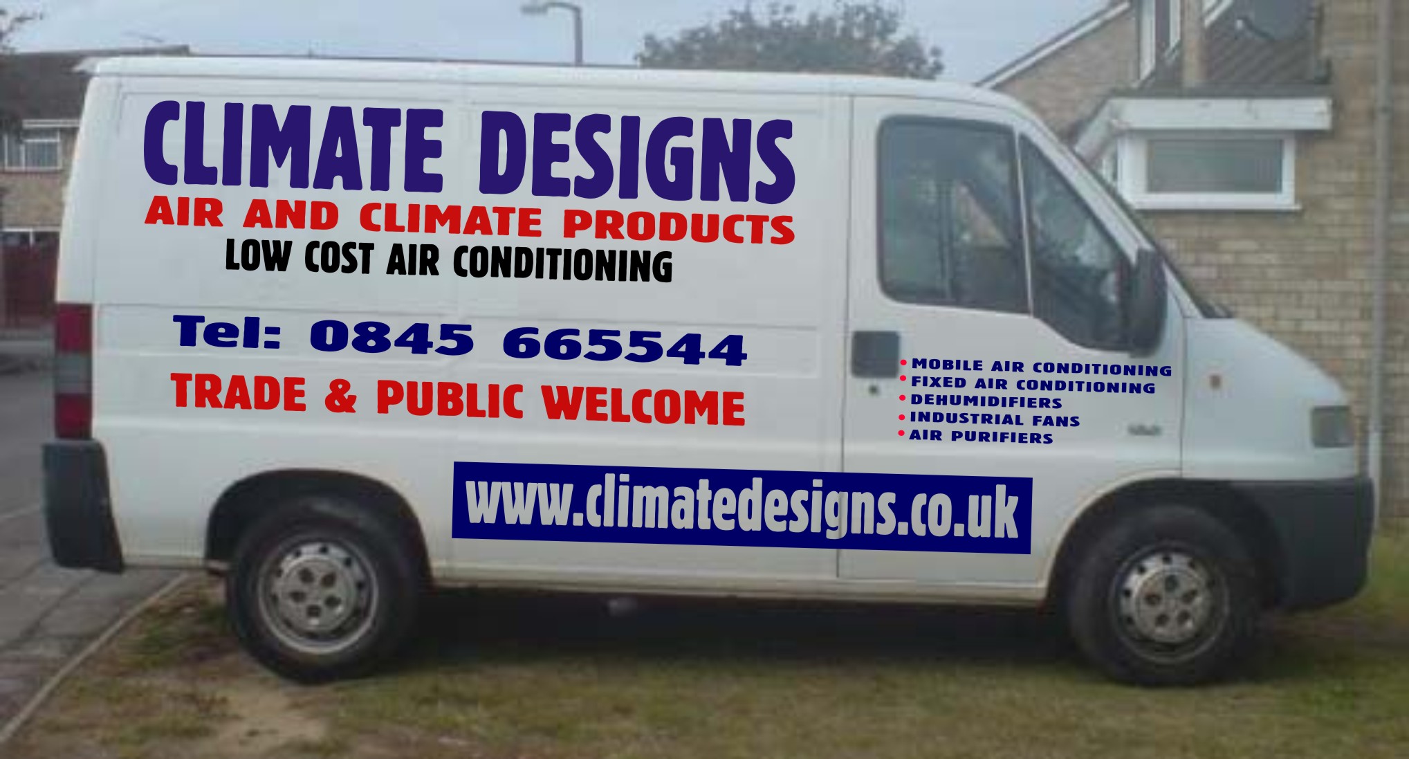
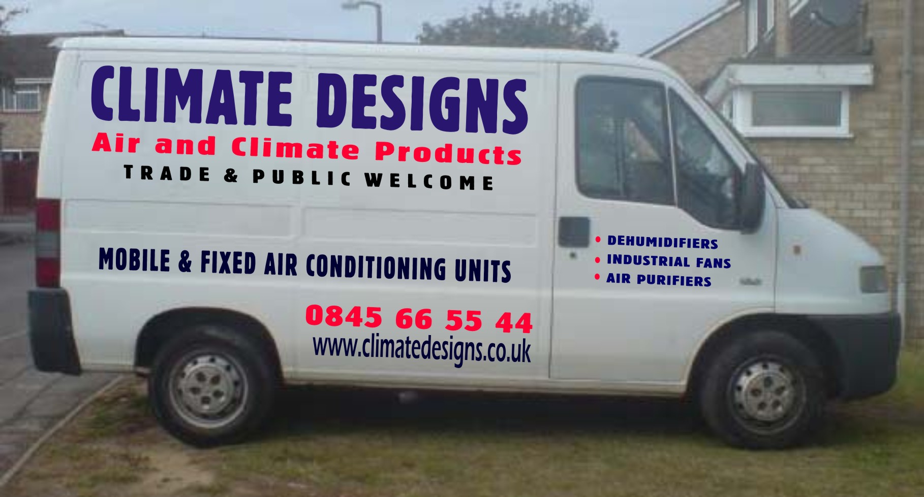
My customer wanted big and bold and all the same font, with his 3 favourite colours. I have done signs for him before and the van he wanted the same. He is happy with what I have done but I wanted your comments on this design so I can take onboard your views for the future. I would say this is a bulk standard design for the right price, But could I ask you all to give some tips and tricks to turn this into a top standard van. All comentents and suggestions would be great. Thanks guys & girls.Steve
David Glen replied 18 years, 2 months ago 4 Members · 13 Replies -
13 Replies
-

One of those cases where the customer wants what he wants I guess.
Anyway, red clashes with purple, orange would be better.
Three lines of capitals, especially condensed and closely kerned produce hard straight lines above and below each line.
The middle line might be better lower case capitalised (except "and").
Maybe swap middle and bottom lines to move the red away from the purple and use a wider (extended font) for the black line. In this case still make the middle line lower case with capitals.
Increase the kerning a bit on the top line.
The condensed font for the web address makes it a blur from a distance.
I would consider this more important than the trade/public bit, so might swap around.
A little more clear space around the door graphics would be clearer.
Phone number is obviously designed to be read 66 55 44 so should be spaced as such.
Just my humble opinions… -

Crikey Dave, When I saw your name come up as the replier I thought here we go I’m in for a slating here (lol). Very good comments mate, It was as you said customer wants what customer gets. I had done him alot of designs before for his unit and I gave him about 4 really nicely laid out designs. He wanted big and bold, big and bold. I only managed to get him off arial black onto blockDreg which is on the van as it has wavy lines and he said it looked like heat.
I will take your comments onboard and change the design around for my own benefit and practice.
Thanks again DaveSteve
-
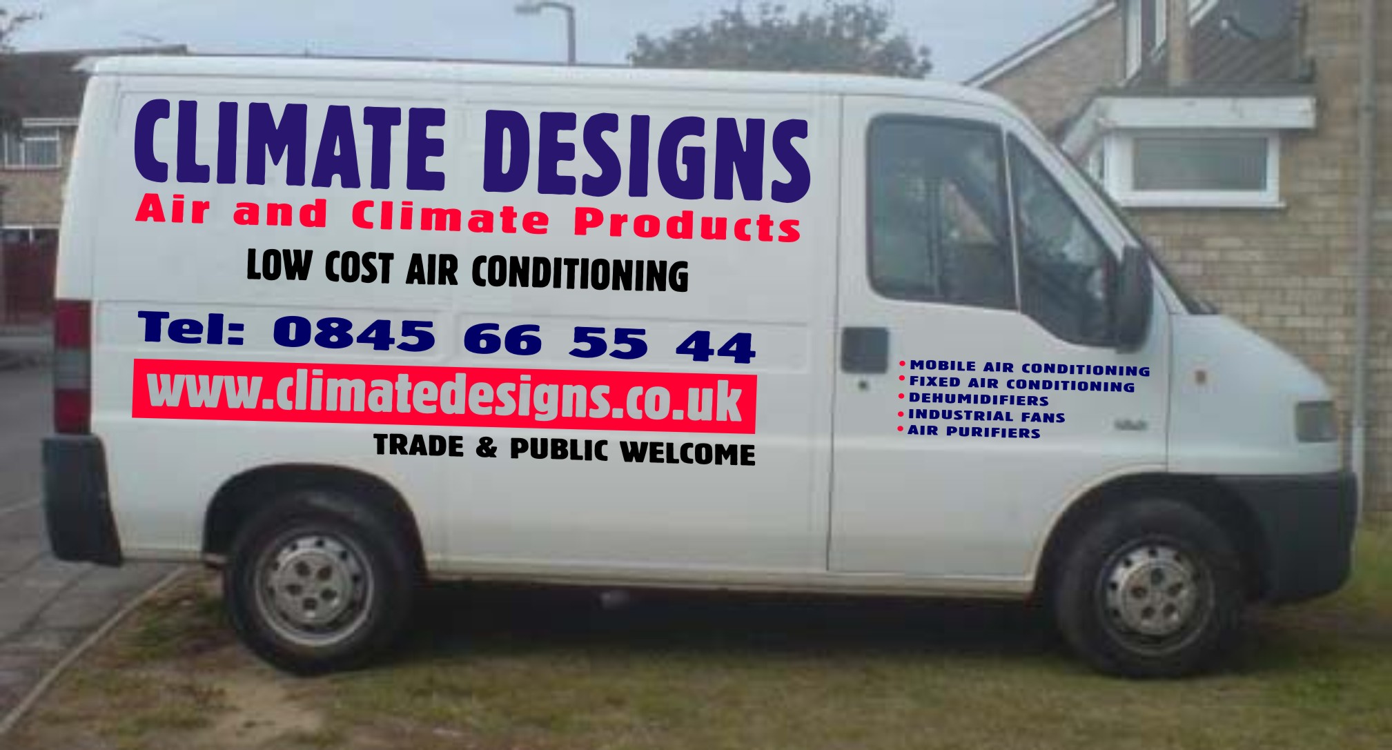
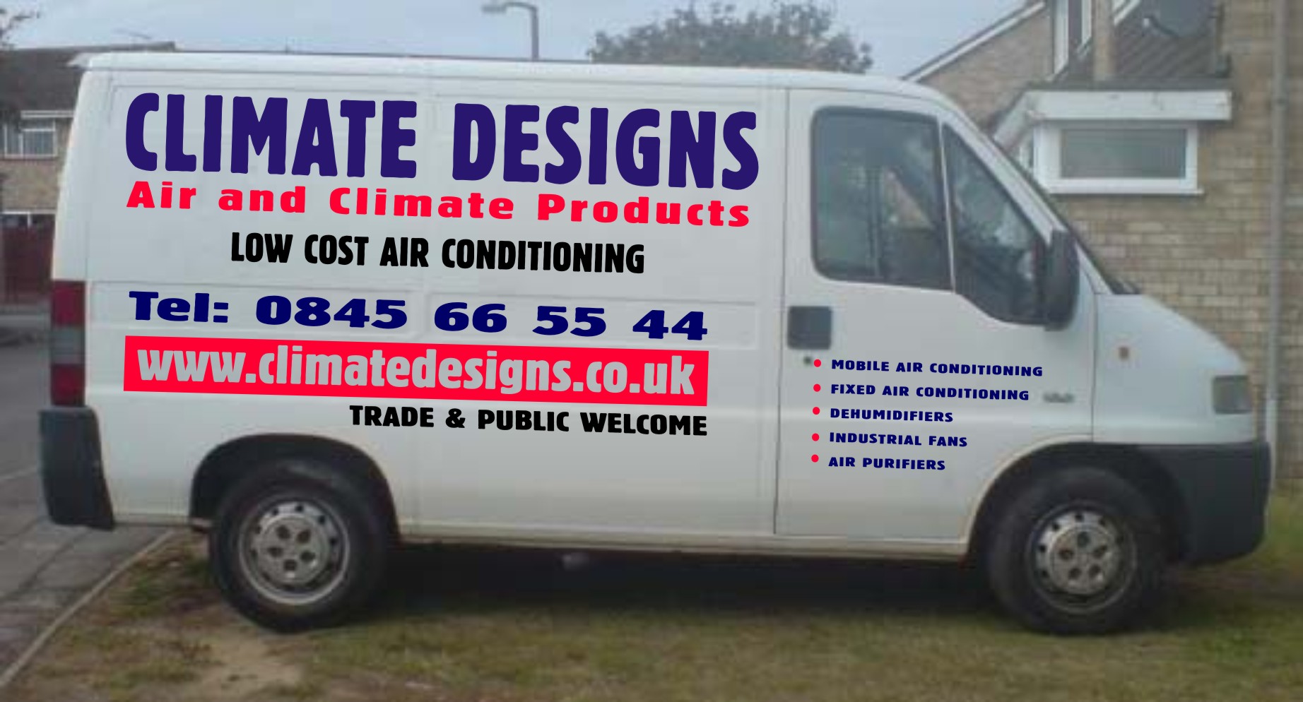
Made some changes, colours a bit out but the design I think are what you were suggesting.
Steve
Attachments:
-
See how those three lines now work together?
Now for that door…
Just reduce the overall block a tad then increase the line spacing letting the bottom lines go below the body crease.
-

Looks better overall. Always gonna have a problem on the door with that much info in such a small area. But if the customer is happy and pays, we can’t make every job perfect.
Peter
P.S.
Great suggestions Dave. It makes a big difference when the comments are constructive. For what it counts, I am glad you are posting these comments in this manner. Obviously you have some skills that can be shared with us all. :thumbsup:
-
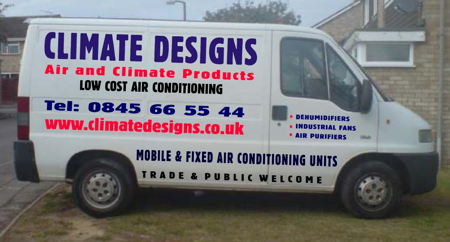
I might try that door with the top line level with the phone number and the bottom line level with the trade and public line. You’ll have to move it all forward on the door so reduce the overall outline size of the text block to keep the top line a good 50mm away from the edge.
Just move the 2nd line (side panel) down a fraction – it just looks a bit close to the top.
Also, try reducing the overall size of the top 2 so that they’re not so "pinched" at the ends.
I’m not sure about the web address in a block. The block seems to be the focal point rather than the address itself, which is also too condensed to be easily legible from a distance. Also, it will be a sod to fit on that curve.
Try it with a more extended font without the block and see how it looks compared. Without the block it will be a doddle to fit on the curve.When doing designs like this I walk away for an hour then a fresh look often inspires some useful tweaks.
-
Hi Peter,
Your right about the customer, He is happy with his idea for the van but I had to throw it open here because his idea is not what I am trying to achieve. I have seen so far what a major difference small changes can make and am taking it all onboard, I did try to get him to scrap the door lettering and have a pici of an air conditioner, But guess what "he said No". A happy customer is a paying customer.David,
Just got off the phone to my customer he wants me to add another 5 lines to the door, Can you beleive that, He is mulling the idea over now about having it on the rear doors only. Lets hope he for once sais yes.
I will play around with your idea for the door a little later as all your input has helped me alot. Cheers Dave. I am off to sea tonight for a week so may not be able to get back to you till next Friday, But I will keep working on it.Thanks all
Steve -
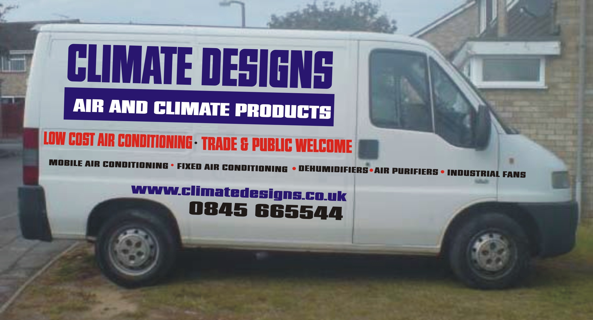
A couple more changes,
Removed the large lines on the door panel combined them into one, where it sais mobile and fixed. Changed the web address and did some kerning to trade & public. Has any of the changes been helpful to the design do you think.
Steve
Attachments:
-

Here’s my take. I don’t have the same font in my Corel so I had to use Tallington.
I like to keep stuff off the door when I have a big old list of services, and I never use "Tel:".
🙂
I think this would have looked better with just two colors but you gotta make the customer happy.
Love….Jill
Attachments:
-
You’re right about the Tel Jill. I also hate having to put fax numbers on vehicles.
Steve, looking good. That line you’ve added mobile & fixed etc, could it replace the 3rd line on the side? Just seems a bit too much of the same thing.
Personally I thing the web addy looks better now but would be clearer in a less condensed font, reducing the text size if need be to maintain the length.
I always think a web address should be very basic in its style as they are never the easiest things to read and remember. -
Yep like your effort Jill, Have taken the advice and dropped the Tel. No need for it really what else could it be other than a phone number. I did this last one as I wanted to try and clean it up a bit. I have learnt that simple and not big is what looks best. As I have said thanks to everyone for there help I will take all comments on board. But now I have to go onboard myself to sea for a week. I will take my laptop but no internet. Will work on all the help given to me today.
Thanks all, Big shout to Dave for all your help today mate.
Regards
Steve
Attachments:
-
Looks so much cleaner.
BTW, those contact details need to be up on the body, not hidden down low.
Trade & Public bit is least important but it now has most prominent position.Look forward to seeing it done.
Have a good break.

Log in to reply.