Home › Forums › Sign Making Discussions › Graphic Design Help › help needed please for new sign layout?
-
help needed please for new sign layout?
Posted by Caroline Ingram on 9 October 2007 at 21:38Hi,
Have to put up a road sign and I cannot design for myself, wanted to keep it plain and simple, here are two bad options.
Be gentle
Rgds
Caroline
Attachments:
 Caroline Ingram replied 18 years, 1 month ago 19 Members · 33 Replies
 -
33 Replies
-

Caroline bottom one is better colour wise, you need a different font and adjust the sizes, just a quick observation too tired at the mo 🙄
Lynn
-

Bottom one definitely better, Scale the overall size down a little and increase the margin space. Allow a gap between the services and the phone number, this can stand alone just as a string of numbers.
Guess who has just read Mike Stevens "Layout" book!!!!
-

Yep…I agree with Lynn & Graeme
Reduce the text in size….Increase the line spacing slightly between the bullet points
I would do your company name in a different font & colour to the bullet points aswell…just to make an obvious distinction if your reading this quickly as you pass by
-
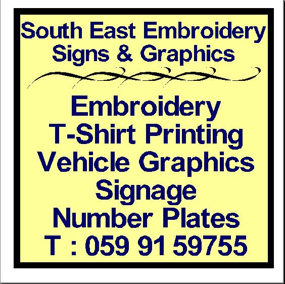
Just my tweaked version of your second option
Attachments:
-

I’m always amazed at how someone can set up in the sign business and yet not have a clue about even basic design.
I’m forgetting, all you need nowadays is a cheap chinese plotter, some dodgy software off ebay and a corner in the living room. -

😕 david, i dont see how that helps caroline … we all struggle at times when doing signage for ourselves…thats why the uksb is such a good resource, we learn from others errors..
afterall everyone has to start somewhere, knowing a little…and then continuing to learn all the way to the grave….
maybe you could show caroline how its done 😕
i like what glen has done with the tweaked layout,
much clearer and easier on the eye 😉 -
David…I’m always amazed how arrogant you come across………I’m not sure whether intentionally or not but for me comments like that are best kept to yourself
I don’t profess to be a designer at all but tweaking that design for Caroline took 10 minutes of my time & if it gives her any help..great….if she decides it looks crap & doesn’t like it…fair enough
You seem to talk a good job …..but I haven’t seen a post where you’ve put up one of your designs to show others where they might be going wrong
Sometimes…in my opinion…it’s just better to say nowt
-
With regard but it is so often the very person I have described who will be undercutting sign makers with years of experience and heavily invested in their business.
Would you have a surgeon operate on you who doesn’t know the basics of surgery?
The gist of my comments are that people are leaving school and buying in to a profession without any kind of learning at the start.
I am all for helping people but they must also help themselves with just a little bit of learning of the game before touting their wares.It’s also obvious that many people just do not read through forums and pick up tips as this particular design flaw has been gone through so many times – even in the last couple of weeks I believe.
So to be constructive, it is the white (negative) space around the graphics/text which has the most impact on your layout.
Think of it as buying a 6 x 4 picture frame for a 7 x 5 picture.
It cuts off and ruins the picture. -
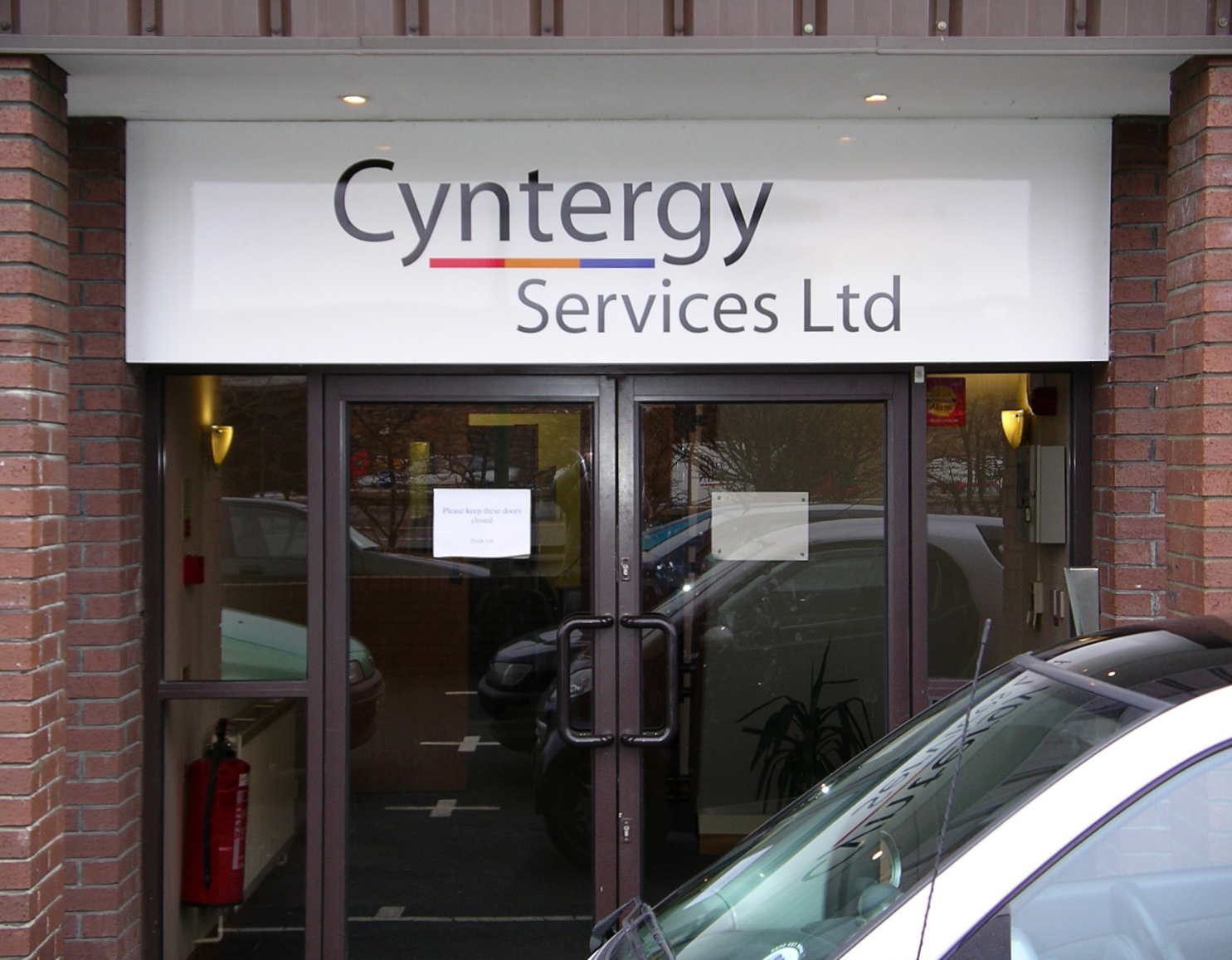
Here’s one I did where plenty of space was left around the name to give impact. The panel is full face white with nothing to detract from the company image.
Attachments:
-

I notice Caroline has a gold bar and you have none David, which shows at least her willingness to learn!. What pi55es me off on forums is arrogant pedants who cant see that this is a resource, not a soapbox! The cheap chinese plotter issue has also been raised ad infinitum on these forums, and plenty of good designers are using them.
You that pontificates (about how those ‘lower in the food chain’ should read previous posts) would do well to read the posts about how expensive it was to get into this business 20 or 30 yrs ago. Its a simple fact of life that equipment will get cheaper…..dry your tears!
And surely dodgy software is a moral issue not a design one!I think Glenn has given sound advice here Caroline.
I’m in a bad mood now! 👿
-

Hi David,
Well you certainly know how to get a discussion started ! 😉 . I have to agree with Harry with one of your comments
‘And surely dodgy software is a moral issue not a design one! ‘
– I’m not sure if you are implying that I have dodgy software, but, I run this company and a web design company and all my software is fully licensed, and I have just purchased Corel X3, I also own full copies of Photoshop, Illustrator and all the Macromedia software required for Web Design.
I also do not own a cheap Chinese plotter, Nor am I working from the corner of my living room, I rent a retail unit that is 1000sq feet.
I started in the area of Embroidery and T-Shirt printing, and have slowly been building up the business to the level where I can confidently do vehicle graphics and signage. If I am given a customers logo I have no problems doing the job, but I cannot design my own stuff and I never could.
I also HAVE NOT under-cut sign makers with years of experience who have invested heavily, I too have invested heavily, so I too need to ensure that everything I do is done to a professional standard, with professional prices. Nobody wins if you do it for nothing.
Actually, the more I type the more annoyed I’m getting (hot) , wind your neck back in and as it has already been said, if you have nothing constructive to say, don’t say anything ! I’m sure when you started your weren’t perfect, but with help and guidance and a little bit of support you got to the level you are at now.
Rgds
Caroline
-

I don’t understand why owning a chinese made plotter means that you are going to undercut those who own more expensive and reliable machinery.
Funnily enough a couple of years ago I found myself in the position of wanting to get into the industry on a self employed basis after 12 years as an employee. I didn’t want to get seriously into debt and couldn’t afford to anyway, so I purchased a chinese plotter for £800, thinking that was the cheapest option. Now, two years (and many wasted hours using substandard software) later I have recently purchased a spanking new graphtec which cost me – wait for it – a little over £800.
As has been discussed to death, you can spend little or much on equipment but if you do not have (or learn quite quickly) the basic ‘eye’ for layout (as David has) then you probably will not pose much of a threat to those who have been in the business for years. So nothing to worry about then.
Can we all pleeeeeeeeeeeease stop going on about this – as Harry has said this site is a resource that anyone (mostly) can subscribe to then use as they wish. (and of course allow others to criticise their efforts)
Gareth
Nice sign David – nice company name they have!
-
criticism is one thing…….a cynical attack on somebody without knowing a thing about them is another thing entirely
-
Hi Graeme,
Just bought the book, couldn’t remember the name of it, so it’ll be happy reading !.
Watch this space 🙂
Rgds
Caroline
-
glenn,
I absolutely agree.
Also, surely investment is about much more than just a plotter – like subscribing to this site (it has earned/saved me many £££££££s) and ‘that book’. Both have made my plotter do amazing things in their own way!
Cheers!
-
Caroline, apologies if it appeared that my comment about new people setting up with cheap gear etc applied to yourself – it didn’t. It was a generic comment on how this profession (and others) has evolved.
I have indeed made a couple of constructive posts on your layouts.
:shutup: -
🙂 Apology accepted !. It is hard, and you are right, at the end of the day undercutting effects everyone. I see it in the embroidery and heat printing side. People saying so and so down the road can do it cheaper, my answer is simple, you get what you pay for. It’s normally cheap for a reason, maybe the work is substandard, quality of garment different etc.
Yes, when I started up my prices were lower than they are now, and when I sat down to work it out, I was coming home with less than minimum wage for working too many hours in the week, so I now cost appropriately and if they don’t like it, yes they can go down to so and so down the road. I would be better off not doing it than doing it for those prices.
By the way – I like your sign – eye catching !
Rgds
Caroline
-

Believe it or not, my views echo David’s, on a general level.
I try to be helpful to newbies, however, because maybe one of them will listen and it will start a good seed inside of them and make them want to better themselves as sign makers. Sometimes I cringe when I see their work, but I was once there and even after 22 years I do learn something new every day, mainly from sign forums.I do think one must offer advice rather than just a put-down. I see that he’s apologized, and his comparison about the picture frame is excellent.
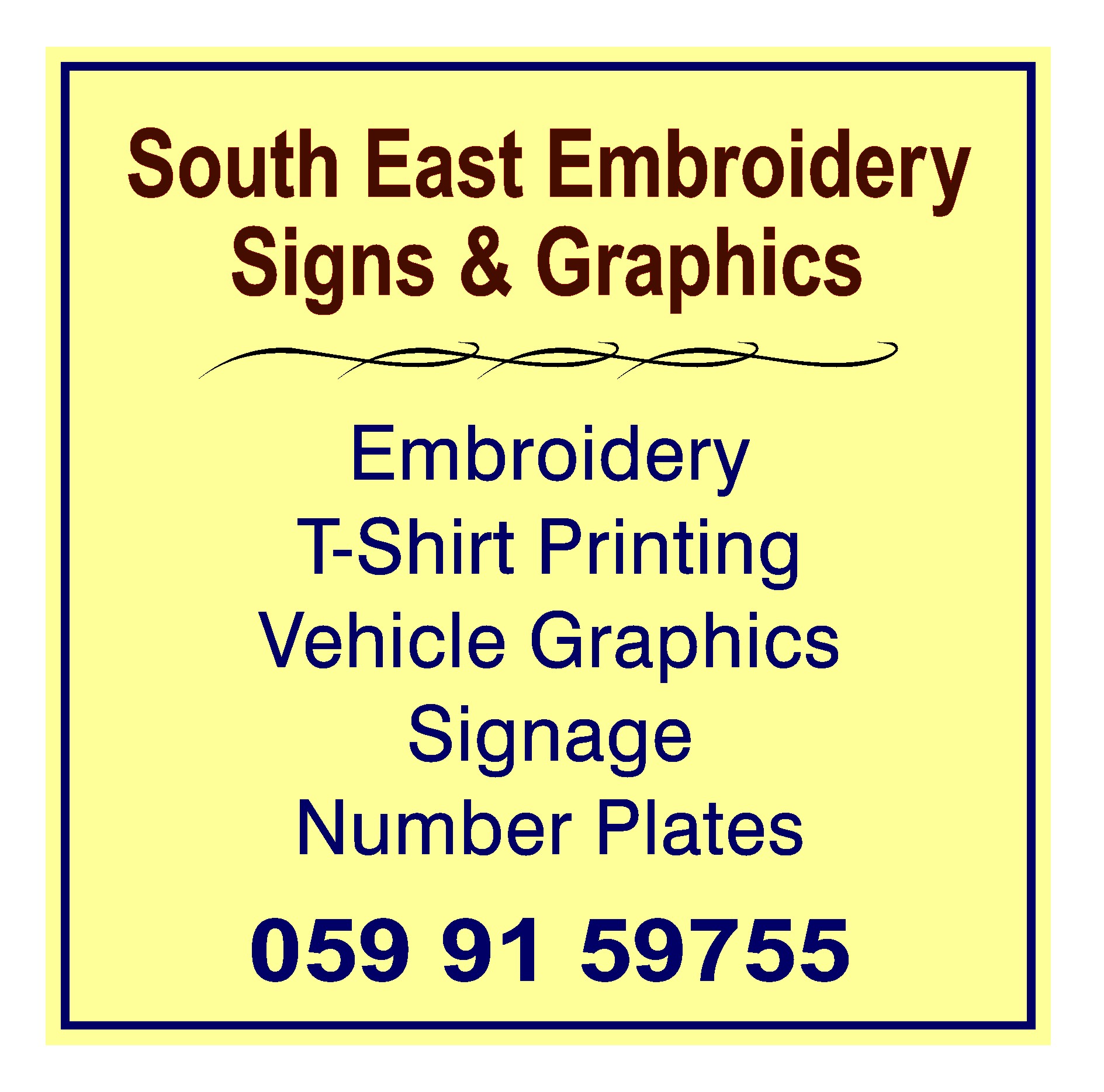
I think more folks rushed to Caroline’s aid than if she wasn’t a pretty young thing but some hairy-knuckled bloke asking for a free Harley-Davidson logo. It’s nice to see some chivalry!I took Glen’s idea one step further and added the old reverse panel idea top and bottom. Gives you more bang for your buck on a simple sign. Also edited the verbiage, do you really need embroidery and graphics twice on a road sign which folks have little time to read?
I just overlaid my stuff on Glenn’s, hence the tattoo looking thingie being a bit high.Good luck, kiddo. Read that Mike Stevens book. It will sink in.
Love…..Jill
Attachments:
-

David this is a forum for like minded individuals to help each other and offer constructive criticism when asked ( and sometimes when not) and enjoy not only our mutual businesses but also bring fellowship and warmth to what can sometimes be a lonely trade. I have learnt loads on this site and hope have contributed also.
You are arrogant and in my mind do not deserve to be in an environment that quite frankly, you just cannot understand, let alone comment in. I look forward to your next seminar or comment and I am sure we will be enjoying the delights of your own web site showing us the ultimate in design and of course diplomacy and tact when dealing with not only clients but sign makers. I was going to put ‘fellow sign makers’ but that would have been inaccurate.I suggest you take an ego pill and join in the spirit of the boards instead of trying to score off other people.
Peter
-
quote Jillbeans:I think more folks rushed to Caroline’s aid than if she wasn’t a pretty young thing but some hairy-knuckled bloke asking for a free Harley-Davidson logo. It’s nice to see some chivalry!
I happen to be very fond of hairyknuckled blokes!!!….I talk to George don’t I?? 😮 😮 😀 😀
-

Ive been in the printing trade since i left school, if its any relevance, so when my employers closed their doors i bought off them a litho printer and a few bits and pieces. Knowing nothing about the pre-press side of things (computer graphics) i had to have a go. I’m not brilliant now and some things i do in a hour some of you can probably do in 10 minutes but, Ive now expanded and am doing signs, t shirts and anything else to help my business grow and i am self taught for the last 15 years.. I was crap when i started i will readily admit that, but we all have to start somewhere and anyone who is willing to try instead of just giving up deserves all the help they can get.
-

Have to agree with many of the comments said here. Me too I am new (18 mths into it), use a Chinese plotter (so what) and just started renting a 1200sqft unit 4 weeks ago….. does that instantly mean I am going to fall into the same category as "non professional, cowboy, no-hoper, rogue trader" type??? I surely hope not.
Having seen some of your comments David, I can agree that you have a flair for design. Maybe this is something you were given as a blessing….. but what you don’t have is any tact or common sense it so seems.
I have always found UKSB to be full of nice people from all over the world, helpful and a great place to be. I don’t tend to be on here that much, but when I do post someone comes to my rescue.
I too am like Caroline (and many others I guess), in the sense that I have difficulty designing for myself. I am now on my third A-Board design in 4 weeks since taking on this workshop – just can’t seem to get it how I want it!!! Its a strange thing, but it seems to be common.
As for the topic, I like Jillbeans take on this. Inverted text in a block works well – not sure about the tribal design bit if using this method – just looks a bit lost at the top there. Other than that should work well. If it’s one thing I too have learned with A-Boards – SHORT, BOLD and SIMPLE…. people wont have time to read reams of text, straight to the point works well – catch their attention without causing an accident on the road (my first attempt was a bit bad – dayglo vinyl in a big way. Even made my eyes water looking at it!!!).
I hope that when I ask for help, David you come along and offer it in a nice critical way that makes me think that you are genuinely looking to help me…. rather than shoot me down (:)
-
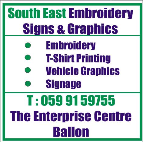
Well,
Its up. The sign went up yesterday. I decided to go with Jill’s idea as I really liked it.
So I have attached an image of it up.
Rgds
Caroline
Attachments:
-

Very nice Caroline, it came a long way and looks great :thumbup2:
-

Looks good Caroline.
My only comment would be a little bit more space above the address text at the bottom.Trying to be constructive not critical.
Tim.
-
Looks good Caroline
I’ll second what Tim said, but even so it has come on leaps and bounds since the original design.
Looks effective enough – lets hope it brings in the work for you! 😎
-
Caroline nice work girl, it’s nice to see you have listened and used the advise given. I also am guilty of trying to use all available space am trying very hard not to do this, as open space around gives a cleaner look.
Lynn
-

nice first sign caroline…agree with comments made, and also the main heading should be higher so there is less space at the top than the bottom…so when the eye looks at it, it looks even… hope it keeps you busy 😉
nik
-

Looks good. I agree with some of the other suggestions though. I use a general rule of thumb (of course I don’t always stick to it strictly) of a half cap height for leading (interline spacing) for copy that is part of the same thought. Usually if the thoughts are more separate I’ll use a full cap height. Also typically I use at least a full cap height when copy gets near any type of border (be it a rule line or the edge of the part) I’m going to attach two drawings that I recently did. Some of the spacing might look misleading as I used small caps. These actually have a half cap height height for each block of text with more than a full cap height for different thoughts (already breaking the rules) Just keep at it though. Like anything else, the more you practice the better you’ll get. 😀
Attachments:
-

I would just like to follow on a little, firstly well done on taking advice and completing your sign. A few years back I painted cars for a living and did very well from it. I started painting bikes and needed decals cut and started doing them my self I spent what money I had on a good plotter which helped but the best help I had was from Uk Signboards and its members, having stopped painting full time now for over 2 years and full time sign making I always thanks the boards and its members I,m glad I didnt get the comments that David chose to use.
Rich -
Hi Tim,
Your right, I only noticed that after you said it. Mental note has now been taken for all future signs, and you too Nicola, when it’s pointed out to me its soooooooooo obvious about the spacing :).
I am only taking small orders at present, and will upload the 4 that I have done so far.
Rich, funny, poor David came in for a serious bashing on this post, but god bless him, I have read alot of his posts since this one and he seems to have thought about how he words his posts now…. Sorry David if it sounds patronizing, but, you are definitely more constructive in your comments instead of blunt, which is great !! We all learn something new on the forum, and not always about signs 😉
Rgds
Caroline

Log in to reply.