Home › Forums › Sign Making Discussions › Graphic Design Help › which layout should i go for?
-
which layout should i go for?
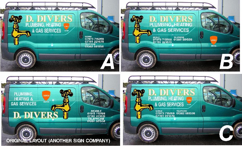
Posted by David Rogers on 4 October 2007 at 08:19Sort of been given a free reign on this – but absolutely MUST use these styles, logos etc.
What’s the best of the bunch?
Dave
Attachments:
 Simon Strom replied 18 years, 2 months ago 13 Members · 18 Replies
 -
18 Replies
-

You guys don’t like the letter B or something? I’m calling Elmo
Peter
-

I agree Peter
BBBBBBBBBBBBBBBBBBBBBBBBBBBBBBBBBBBB
Hope that helps 😕
Warren
-

B for me but I would go
m 0123456789 m 1324678909
t 78945678900 -
that didn’t work^^^^^…the telephone number was meant to be centred between the two mobile numbers
-

B it is then.
Was my favourite anyway. 😉
Dave
ps. Out of interset – and naming no names, what is the opinion of the Original. (Was also using the really OLD corgi emblem).
-

B for me but with the phone numbers on the door and the Corgi logo somewhere else.
The original is completely broken in half by having the tap in the middle, stopping the whole thing from "flowing"….
-
quote David Glen:B for me but with the phone numbers on the door and the Corgi logo somewhere else…..
So ‘A’ then? 😉
-
Van is being done – it’s all cut to ‘B’ and thanks for the input.
Dave
-

I guess it’s too late for me to say "A" then…
with only one damn phone number if at all possible!
🙂
O would have made the spigot in glass etch like Carrie did on that one van once.
Love….Jill -

I would have said "B" as well I think, I think it’s the telephone numbers that I have a problem with as there are 2 mobile numbers.
Very nite picky but I would have put the main telephone number before the mobile numbers as people generally read from left to right. Plus put the 2 mobile numbers on the same line if they will fit.
-
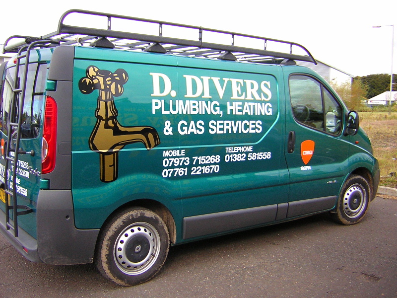
Well the ‘green thing’ is done…
It was a complete sod of a design – as there HAD to be all of those components, in those colours, including the extra mobile…(which are their ‘main’ numbers).
Anyway…here’s it done.
It’s ‘all right’ – not a stunner, but it’ll do for the money!
Dave
Attachments:
-

I agree on B as well. All of the text is so closer together, making it easier to read when the van is in motion. Also the spigot facing forward looks better.

Log in to reply.