Home › Forums › Sign Making Discussions › Graphic Design Help › Comments on my new Logo please..
-
Comments on my new Logo please..
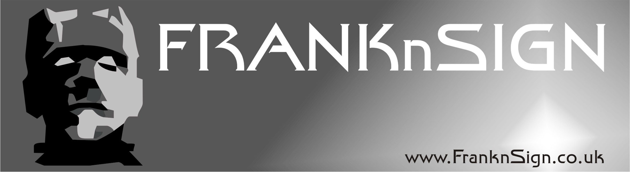
Posted by Frank_Galloway on 14 September 2007 at 18:27and of course feel free to make any suggestions 😉
I’m currently in the process of setting up my website so need a Logo and such things…
what do you think of my 1st attempt ? – any feedback gratefully received – good or bad – I’m here to learn ! 😀
Attachments:
 Frank_Galloway replied 18 years, 2 months ago 18 Members · 32 Replies
 -
32 Replies
-

I like it…the only thing for me is the word sign loses contrast a bit in the lighter fade
-

I think it will work fine. Just hurry up and register it because a guy on a US sign forum has basically the same company name!!
(it is clever)
I think I’d bump the name down just a tad so it’s not so close to the top.
Love….Jill -

He wont need to register it unless it is going to be a trademark.
US and European trademarks are different in such that you can have exactly the same name in 2 different countries, unless the other one has registered a US and worldwide trademark in which case you cant.
Its ok if you have different trades and cannot be mistaken for each other but if you sell the same thing you’re out of luck.I know nothing to do with signs but I think you should call yourself
"FRANKnBEANS"
its way funnier -

I like it – it’s one of those names that just won’t be forgotten-like Walter Wall carpets. I know of a horse charity that’s called ‘Only foals& Horses’. Like Jillie says, it’s clever, hope it brings you loads of work 😀 😀 😀
Barbara
-

Thanks for the feedback people 😀
I have already got the website domain as mine ( franknsign.co.uk is mine all mine! 😀 ) but do you mean FranknSign as a TM ?
what would be involved in that ?…. I’ve seen the other guys website ..
would you beleive i did actually have one of those lightbulb moments on the name – it wasn;t till a week after when a friend of mine told me there was also a website in the US with the same name..
at least mine is .co.uk
but worried bout this TM lark now ????? 😮
i know what you mean about the white gradient conflicting with the word "SIGN"… I may address that again at some point.. but i didn’t find anything i liked when i tried before… cue any ideas !!??
please if anyone knows or can put my mind at rest about this Trademark thingy it would be very much appreciated 😕
thankyou
Frank. -

like it
I wouldn’t worry about it too much Frank I don’t think it would be an issue..
a la godfather 😀
Attachments:


-
Ok trademarks.
Unless you have a brand as such with which you are going to market products, IE I have a brand called REVERT. which is snowboard clothing and skateboard wear, If I am to market this I will need to trademark it, however a guy in Spain who is called Manuel revert, who produces curtains and upholstery mainly, has already taken the TM and is also listing his goods under sections I wanted to list in, IE hats, shirts etc.
I cannot now register REVERT as a trademark I have to Use R3VERT, which is not a problem as a reverted 3 is also an E, and a revert is also a trick in both snowboarding and skateboarding, so the name fits in well with what I am doing, boring for you maybe but its how it works.
So basically unless you are selling an identical or similar product worldwide and need to have surety that nobody can be mistaken for you then you have to both register in the USA and Europe, not sure about other continents but I’m sure it applies if you register a worldwide TM, a specialist trademark solicitor will have to be appointed to do the appropriate searches and this will cost in the region of £400 whether successful or not, (this is for each region you apply for)
Look up trademarks on google and see the minefield you can get into it is horrible.
However this ensures that if you get somebody replicating your brand name they will be stopped outright, its very similar to inventions which you have to patent, a trademark is basically a patent of your trading name.
Glad that’s over time for beer.
hope that helped
Steve -

franknsign.co.uk, maybe yours, but go register the Full domain family now! the .com, .eu, .mobi. etc etc should only cost you another £60 a year at most… thats nothing if your serious about what you do mate, buy now or loss out!
on a side note. 😕 im really not keen on the name mate. monsters dont spell out signs to me, i just cant associate a TV zombie with an artistic trade. (i do know your name is Frank, but do new customers know that?)
i dont mean that in anyway negative towards you, just trying to be constructive with my crit. 😕i like andrews profile of the monster…
-

Have to agree with Rob, it’s a funny play on your name….but if I saw that company name in yellow pages or elsewhere I would chuckle and move on. Just my opinion.
-

Hello Guys
Harry and Rob – Sorry have to disagree, its not a negative IMHO as a funny/not so serious name does get you noticed, and yes for everyone that moves on after reading it another will think differently and phone, and lets face it we all need to have a bit of identity to stand out from the crowd.
My co name raises a few smiles so I speak from some experience and haven’t had one negative from clients/potential clients.
John
-

I agree with John. I quite like the name. I think people would remember it. A reference to a ‘classic’ like Frankenstein is allright to me. If it was something like the ‘texas chainsaw massacre murderer’ it might be different…..
So Harry or Rob might not ring you for business.. but I would……….
I suppose it is hard to please everyone 😮 -
I try and look on it further down the line, as opposed to just the gimmick scenario. general local signage type work maybe great today, but at some point we all aim for the bigger companies in the hope of ongoing work. will the name still be as appealing to theses type of businesses?
i think regardless to what name you have, if your work is very good you will succeed. However, having a good name helps in many ways. Opting to maybe change it further down the line is very difficult…
i guess its a self preference thing… -
Hi Robert – i do hear what you are saying and very much agree with you about it being difficult to change a name down the line.
It’s an interesting split of opinion – some say good, some say clever but not for them.. either way i see both camps taking an interest in the name as a bonus. – if i can use this to gauge joe public opinion – if you see what i mean.
i do take on board the fact that they (public) will not know it’s perhaps a play on the owners name at first.. but I will be putting my name in the company email & on advertising and suchlike – so I’m thinking people can put 2 and 2 together if it matters.
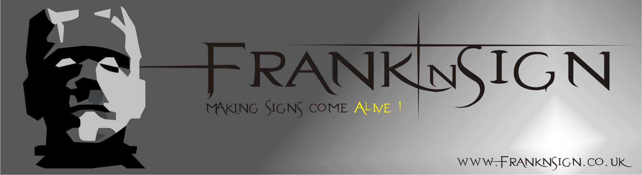
Obviously quality of work will always be the deciding factor but a little humour as a headstart will help the name stick / be effective. I do reiterate "little" however as if you go overboard people will not think you are a serious company & work will be of a "comical" standard – it’s one reason why i chose a non cartoony frankenstein head and font.
On that point – been having a play – is this version overboard in people’s opinion ? you can always play too much on these things – sometimes simple is more effective! interested in your comments.
Attachments:
-

I’m thinking that it’s maybe TOO clever for its own good.
I think it looks great and really well though out, but put that in with 15 other companies in the yellow pages and as a member of the public I’d be hesitant about making the call.
Frankie’s monster does not engender thoughts of quality workmanship and a ‘coming alive’ in MY opinion…rather, usually of something cobbled together from a load of nicked bits, cartoon or not.
It will work for some customers – but might put some off, and putting ‘some’ off is a big enough reason (for me) to think again.
Dave
-
Hi David,
the logo above is for the header of a website – it’s not a design I’d use in something like a Yellow Pages….
When you say too cleaver for it’s own good do you mean the whole thing – ie comapny name, logo, the font…. is there anything you would consider using ? – or start from scratch including the name ?
Not sure what you mean by "cobbled together from a load of nicked bits" 😕 – are you saying in your opinion that people might think that deeply about how the monster was created – and associate this with the quality of my work ?
Frank and Sign – my name and possible future trade
just thought it was a good play on words..I’m taking on board the crit- 😀
-
I prefer this one….I really like the font
I hear what Rob and David are saying & it’s difficult not to agree but the one thing that stands out for me is that it looks quality
I think it is very nicely put together….it looks like it has been designed by someone who knows what they’re doing……..it is different from the norm in a good way…..and because of these points I think it would stand out in the yellow pages for all the right reasons
It probably depends on the market your after….it would probably put off some corporate types but I can see it attracting a whole lot of business aswell
I would say go for it….if you’ve got any doubts yourself …why not try playing the image down a bit & leaving up to the name
-
I think what we are talking about here is the ‘subliminal impact’ of graphic design. I absolutely love the concept and the style you have carried it off in……but I would never use it as a company image though. Don’t underestimate the subliminal power of your image…..its why graphic designers are paid fortunes!!
Again…just my humble opinion. 😀 -
I agree with both Glenn and Harry and I think it’s about where you want to be and go and what type of customer you expect to attract………
Nice design
😀 -

I like it 😎 Very nice design of the header and I think it will work. Hope you produce some signs that are wacky and off the wall (not literally 🙂 )
Compared to some of the cr@p I have seen produced by newbs 🙂 you look like you have got the ‘eye’
-
Again – people seem to be either for or against :lol1:
I do take on board both sides of the crit…
but i must just say thanks to those that have said it looks a good design 😳It’s only my second attempt ever at a design.. 😳
I have been known to have a good eye on the design front – for some reason i find it easy to picture finished designs in my head so it’s just a question of putting pen to paper so to speak.
Keep coming with the for’s and against, i like to hear crit – i know i must be bonkers 😀 – but it’s the only way to learn !
-

could be worse could be GALLOWS SIGNS a sign well hung.
😉
-

Well I’m going to sit on the fence, it is one of those awkward ones I think that could go either way, I do agree with the comments about your target market which will make a big difference I think.
All I would say is don’t come up with lots of different designs for websites, yellow pages, business cards etc. Stick with the one design throughout if you can so no matter where people see your advertising they will instantly know who it is. -
 quote David Rogers:I’m thinking that it’s maybe TOO clever for its own good.
I think it looks great and really well though out, but put that in with 15 other companies in the yellow pages and as a member of the public I’d be hesitant about making the call.
Frankie’s monster does not engender thoughts of quality workmanship and a ‘coming alive’ in MY opinion…rather, usually of something cobbled together from a load of nicked bits, cartoon or not.
It will work for some customers – but might put some off, and putting ‘some’ off is a big enough reason (for me) to think again.
Dave
I agree with this thought, couldn’t have said it better myself actually, just my view of course.
-
quote glenn:Frank….what is the market you are going for?
It will probably in the end just be mainly Vehicular.
I’ve had a sleep on this latest design o/night and now don’t think the "head" and font together work really.. always good to let your subconscious mull things over.. it always knows best 😉
Think i need a clearer more basic/conventional sign logo with a Tagline underlining "excellence".. I’m going to leave the "head" out.
I’m sticking with the name as i do like it however. 😛
Onwards and Upwards – or is that Round and Round ? :lol1: -
Hi Frank – a bit late with this reply as you’re going for a re-think – but just thought I’d explain my reasoning all the same.
quote Frank_Galloway:Hi David,the logo above is for the header of a website – it’s not a design I’d use in something like a Yellow Pages….
Then it’ll work much better as a web header…but wouldn’t you want the same ‘theme’ to follow through on your entire business?
quote :When you say too cleaver for it’s own good do you mean the whole thing – ie comapny name, logo, the font…. is there anything you would consider using ? – or start from scratch including the name ?I’m just thinking about the ‘average’ person on the street. WE are all in some sort of design / sign business and ‘get’ the pun without having it explained.
quote :Not sure what you mean by “cobbled together from a load of nicked bits” 😕 – are you saying in your opinion that people might think that deeply about how the monster was created – and associate this with the quality of my work ?The power of suggestion… think of two one-man drain & toilet unblocking businesses. One called – ‘Flushed with success’… the other ‘The Big sh1t stirrer’, with appropriate imagery. Both using word play. Who is going to maybe have the edge & get the call from the people with money & influence?
quote :Frank and Sign – my name and possible future trade
just thought it was a good play on words..I agree, it IS a good play on words. I’d call myself "Tinkerbell’s Sign Emporium" if it doubled my trade..OK, maybe not. There are just certain words & images that can conjure up ‘vibes’ for people. Can’t please everybody all of the time – if YOU think it will work & drive trade towards you that’s what matters. [/quote]
quote :I’m taking on board the crit- 😀Which is sometimes hard to do – but normally VERY worthwhile.
Best of luck with the business what ever way you brand yourself.
Dave
-

Dave ……….. were you a school teacher in a previous life?
-
quote Marcella:Dave ……….. were you a school teacher in a previous life?
Probably… he’s taught me a lot 😉 😛
-
 quote Robert Lambie:I try and look on it further down the line, as opposed to just the gimmick scenario. general local signage type work maybe great today, but at some point we all aim for the bigger companies in the hope of ongoing work. will the name still be as appealing to theses type of businesses?
i think regardless to what name you have, if your work is very good you will succeed. However, having a good name helps in many ways. Opting to maybe change it further down the line is very difficult…
i guess its a self preference thing…Have to agree with Rob, The name could be the difference between you and the competition on a contract. Boring and corporate I know, but hey, it’s what pays the bills.
Cheers
Adam -

Frank the hardest sign you will ever make is your own 🙄 so you have to get it right 😎
Lynn
-
Just my 2p worth,
adding an S onto sign would change it all for me,
Frank n signs.. it associates the name, IE you with the trade, Signs.
where as frank n sign IE just one, gives me a mental image of a guy called frank stood in the middle of Piccadilly circus with a "Golf Sale" board on a stick and a big arrow.
I also agree with the people who say about larger companies not taking it seriously, Personally i wouldn’t if there was a choice it just doesn’t portray a serious business to me, all this is not not meant to offend but it seems a bit of a jokey name compared to a lot of sign companies.
However that said go with what you feel is best for your business and target market.
Whatever you decide good luck with it. -
Hello all..
I’ve been taking onboard the crit… and came up with an idea… bear with me on this :lol1:
new logo to be "FNS" if you see where those initials came from… I still get to use my web domain – but the name will be less of a point of contention and the use of FNS as a company name – or at least the recognised Logo..
also FNS seems to sound a bit like "Finesse" – I might have to think about how to link the 2..
I’m still mulling over ideas but maybe this is the way forward (the Itinitals) – more corporate.. yawn but needs must and all that.
sound fair ?

Log in to reply.