Home › Forums › Sign Making Discussions › Graphic Design Help › what advice can you all give me on this design?
-
what advice can you all give me on this design?
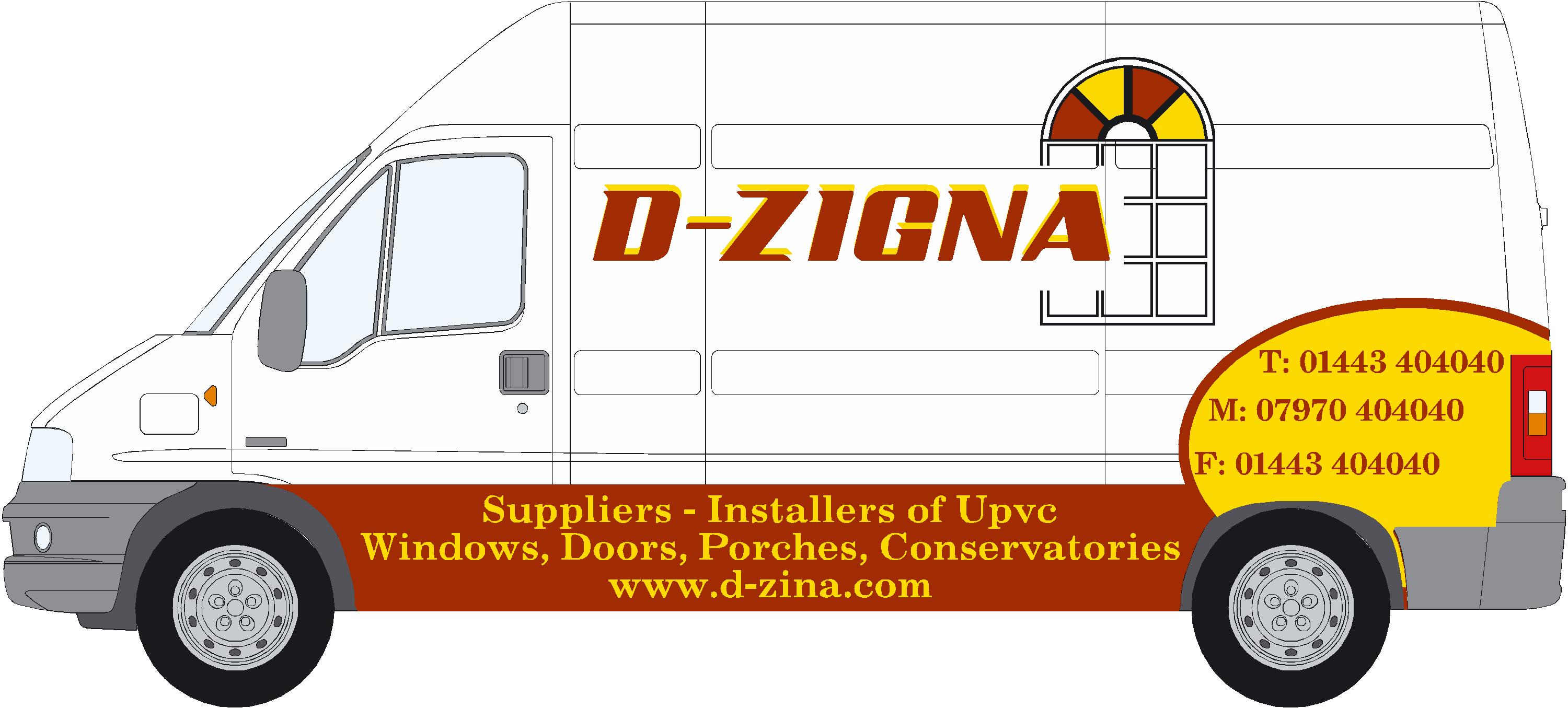
Posted by Scott.Evans on 13 September 2007 at 23:23don’t really like it myself
will have to have a look at other designs and pinch a few ideas i think
don’t all shout at me i will not be giving this to my customer
its got to be brown and gold.
layout? fonts?
what advice can you all give me on this design.i am really stuck on my company sign looks like i will have to change fonts and that means changing:
business cards
letter heads
t shirts
and 3 signs
will post some pics tomorrow of my current company signs and will take it from there based on your advice
Attachments:
 Frank_Galloway replied 18 years, 2 months ago 12 Members · 29 Replies
 -
29 Replies
-

Scott I don’t think any one shouted at you before, but you may need more time to take the info on board…… line spacing for one ?
Lynn
-

As a first word of advice. All of the elements are there. WHO they are, WHAT they do, and CONTACT details.
Personally, I’d avoid putting ANY information below the line of the wheel arches.
1, It’s get filthy and 2, Unless it’s something like a HUGE freephone number, it’s just too small to read / hold a person’s attention.Keep the information in the line of sight and in a logical order…LESS ‘design’ MORE clarity. The circle at the rear looks good – but the phone numbers will be just too hard to read.
What’s probably important to your client is that you get their business ‘advertised to the max’…if they are anything like most window companies!Try taking a few digital photos of the van & superimposing the layout (how I initially do most of my stuff) – and it practically guarantees a sale when they see it on THEIR van and not just a line drawing – and you’ll also see potential problem areas, locations of badges etc.
As always – for ANY job. Ask yourself "does it fulfill the customers needs…?"
-

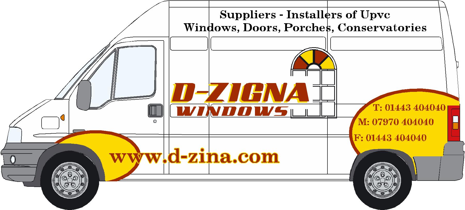
Agree with the line spacing, it would also be better if it said
d-zigna windows, as d-zigna is so far away from "designer" as far as the english language goes, people may just not take any notice even though there is a picture of a window on it.
Also the web address is spelled differently from the company name, is this intentional?Rather than cram the writing on the sill I would place it on the van itself.
The drop shadow would look better down and to the right and should be a dark colour, as yellow wont show too well on a white van
(if that is a white van)
The web address may be ok on the sill however as it will be a contrast to the colour of the paint.
Apart from that the window, main font and ellipse on the rear look good. -

Imagine that van passing you as you walk down the road. The most you would see is a name. It would not attract your attention or get the customer’s marketing message across.
Even if you did manage to spot the web address at the bottom it would not help as it is not spelled correctly.
Peter
-

the web address is spelled correctly. don’t know why he has bought that domain. iam sure dzigna.com or d-zigna.com is available.
instead of putting the text down there where do you think it should go?
and what font could you recommend me -
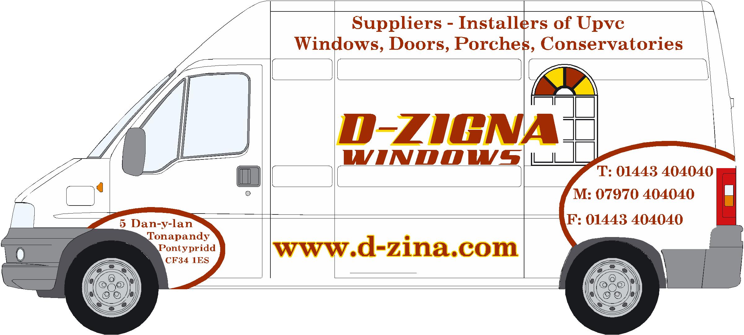
is that any better?
would like to change the font on all the text?
Attachments:
-

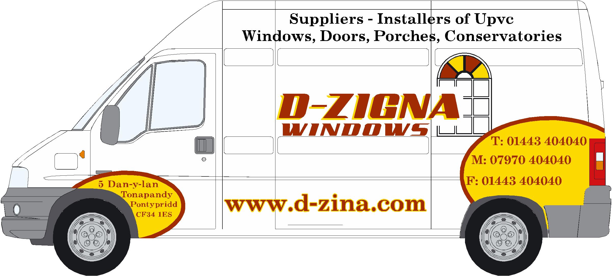
That looks better scott. Would it look better if you moved the D-ZIGNA up to the middle of the panel and the had the arched window comming out of the rear end circle with phone numbers in. Just drop the arched window down a bit too, move the web address over to middle of panel too.
Looking good though, How’s your sign comming on then matey?
Regards
Steve -
quote :the web address is spelled correctly. don’t know why he has bought that domain. iam sure dzigna.com or d-zigna.com is available.
Your customer is nuts !!!
Your second design is far better and I think is getting there. Have you thought how you will fit the yellow patches?
Peter
-
what you think on that steve?
still not fussed with the font will have a look at that now.the yellow and brown patches will be a bit tricky around the back light because of the recess.
the door shouldn’t be a problem.
i could just have a brown line that would be easier
what you think?
Attachments:
-
Hi Scott, Personally I would bring the main name over to the left and up a bit so it lines up with the top word windows, Then move the web address to the right to line up with the top two. It should clear the "A" out of the arched window as well, Which is a nice feature you done.
Maybe this job has to be done a bit more urgent but how is the shop sign coming along, Any good ideas yet? "He who dares wins Rodney" as the famous scholar said in Only Fools & Horses
Steve
-

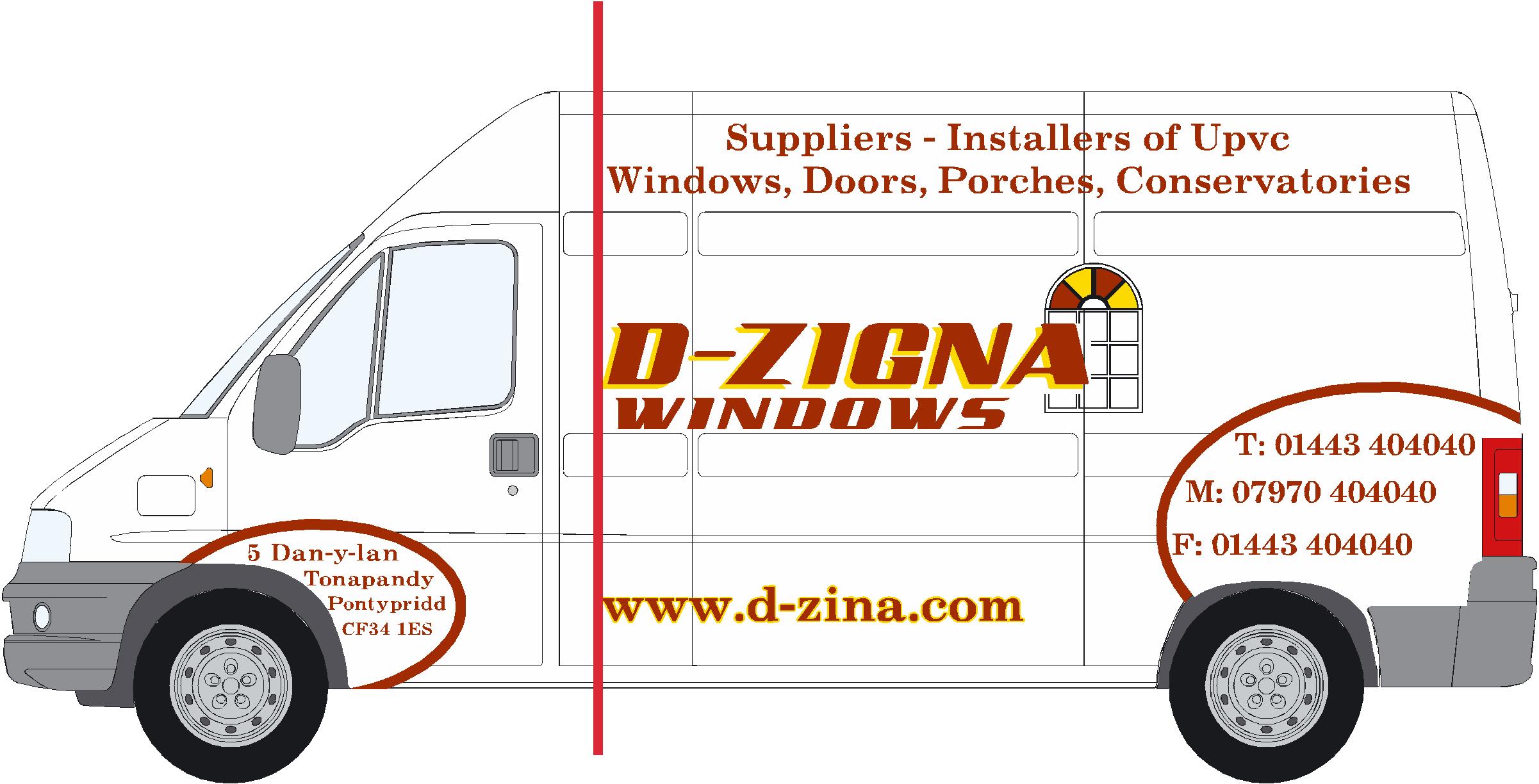
Definitely lose the fax number…I don’t think many people send faxes from their car.
I prefer the first layout with WINDOWS under the De-Zign part.
I’d bump the subcopy up off of the bottom and into the hole underneath.Love….Jill
-
DO YOU MEAN LINE IT UP LIKE THIS
WILL SHOW MY COMPANY SIGN NOW
Attachments:
-

I would have words with your customer as http://www.d-zigna.co.uk is unregistered and would be far better than http://www.d-zina.com which isn’t even his name.
-
when he comes for the design later ill tell him.
it will only be about £10 for http://www.d-zigna.com
Carnot see why he would want dzina.com -
Yes thats it Scott, But move d-zigna up to the middle of the panel more and move the window over to the right just away from the "A" of d-zigna. Then make the web address the same length as the name above. Only my opinion of course mate, But just think when he does come round to view look how many examples you can show him, I hope he buys you a pint for all the extra work.
Steve
-
what do you think on the result
it is a different van too the one I’ve posted on here, that one is coming in tomorrow.few questions i would like to ask you All
how long do you think it would take you to design cut and apply to this van?
how much would you charge?
what would you have done different ?
Attachments:
-
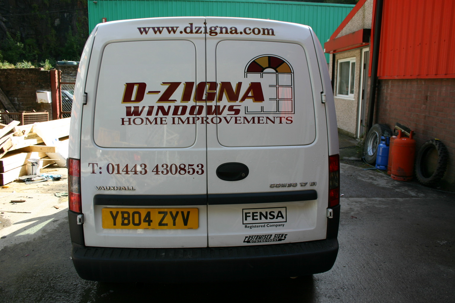
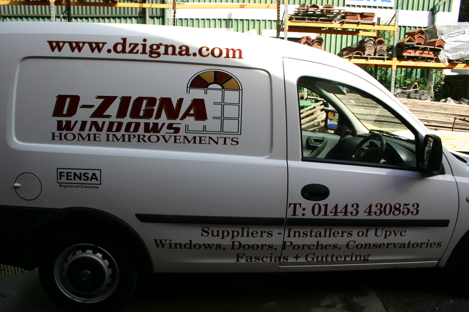
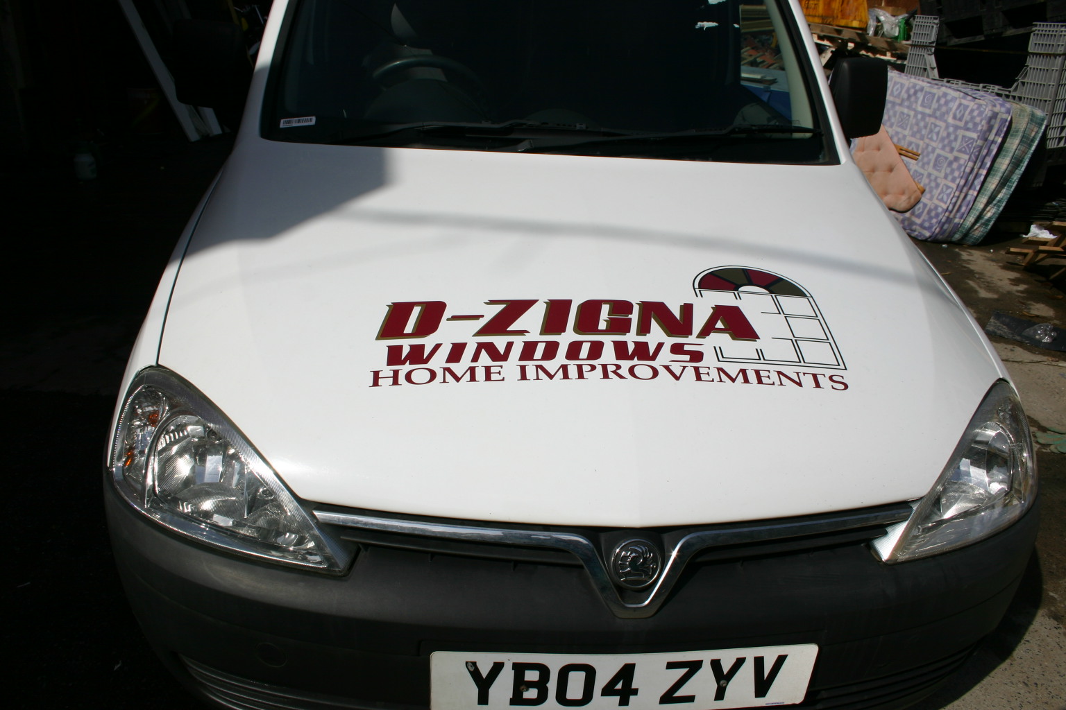
Looks great Scott, I see he changed the web site to suite the name. The only thing i would have done different is moved the number back a panel. How did you get on with the colored windows in the arch doesn’t seem to have been a problem for ya. 😛
Didn’t recognise you without the hat on there mate.
-
thanks mate
yea can see what your saying there, if i had put it back a panel and lined it up with the logo and web address.
put a few markers in for the window was easy enough
-


is it the camera or my eyes but the main design doesn;t seem t oline up with teh panels – also the phone number ?
I’ve never applied to a Vehicle before so maybe it’s a particularly bad model of van for curved panels i don;t know – but it looks a bit strange when the vinyl doesn;t run parallel to the trim/ panel gaps
How do you line it up before applying ? eye ?
-

Hi Scott,
A few tips crits.the phone number on the side doors would have been better, smaller and centred on the door.
the "home improvements" needs to have more space between it and "windows"
I wouldn’t have put as much, if anything below the rubbing strip. I would have reduced the size and put the words below the main panel.
As for lining up, it does look a tad out, The main panel, I would normally line up with the rubbing strip, it is not parallel to the ground, but such a bold line, it is the best datum point.
Yours could be lined up but in the photo, looks like its sloping to the back a little. when the van is loaded this may look wrong.
On Combi vans a little forward slope does not look out of place. this goes for other vans as well, such as the berlingo.Time wise, an experienced fitter would take no more than an hour,
design time is as long as it takes, but to cut and prep I would say about an hour to an hour an arf…If customer happy no problems
Peter
-
thanks pete
i was wandering what to line it up to in the end i went with the floor. wrong decision!Ive got a berlingo cumin in next week
what do you think i should line this to?when your applying do you measure out the van or do it by eye?
anyways thanks for your help
Attachments:
-

Scott!
Good afternoon, when I’m doing these vans (Berlingo, Kangoo, Partner) if there is one present I try to use the side impact plastic bump rail thingy as a marker to line everything up to. As has been said it may not be level to the ground but I find it looks better ‘to the eye’. Also you don’t have the problem with the letters looking unlevel once it is fully laden.
Just my thoughts, keep up the good work!
-

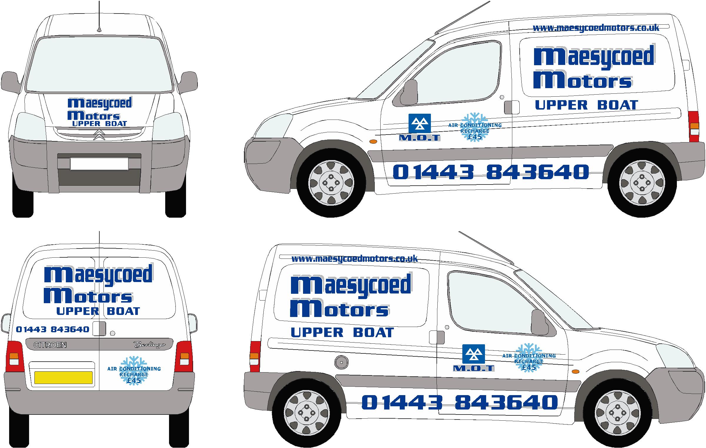
Here’s a similar one I did a while back. I aligned it with the bottom of the recessed panel. Having said that, I’m a great believer in "if it looks right, it is right" regardless of measurements.
Attachments:
-
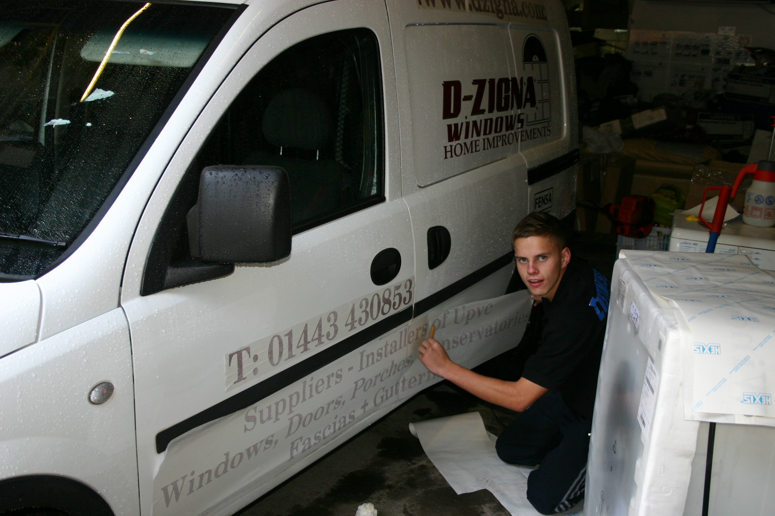
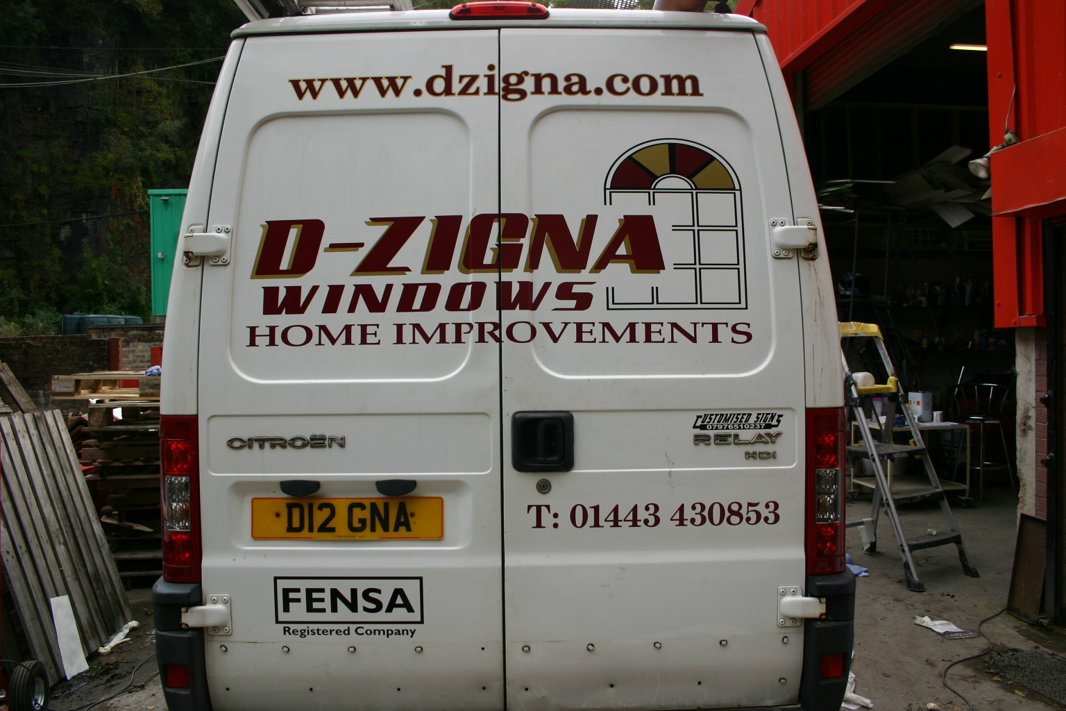
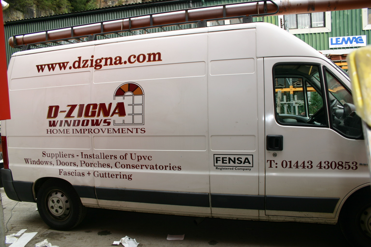
HERE’S THE FINISHED RESULT OF VAN 2
WHAT WOULD YOU HAVE DONE DIFFERENT?
Attachments:
-
I would have made the d-zigna and window thingy much bigger on the side with the window extending on to the next panel above.
I think the "home improvements" really looks out of place where it is.Also, the Times font on the other stuff to me is staid and old fashioned.
-
Hi Scott,
The back looks great mate came out really well. If you dont mind me saying the side dont look too good. Did you not change the services bit to go up the top I think it was mentioned and you did change it on your proof. It looks cramped down there and hard for anyone to read. I would have made the main logo alot bigger a well and put the web address down the bottom. None of it is more than 610 high so your cutter would have managed the length ok if you made it all longer, Was it a case of the customer and price that kept it smaller?
Still I like the window and the way the name goes into it so well done on the design front from me matey.Steve
-
i showed the customer lots of designs including the ones i posted on here.
he picked that so i went with it.
my cutter is 610 wide so i see i should of made it bigger.
all helping for my next design.i think the two vans look good next to each other. the combo looks the better though!
thanks guys
-
Shouldn’t matter what size your Plotter is.. if you need larger graphics then just use the "panelling" feature – most software has this don’t they ?
just putting an idea into words for you.
cheers
Frank.

Log in to reply.