Home › Forums › Sign Making Discussions › Graphic Design Help › design help needed please: steer inn
-
design help needed please: steer inn
Posted by Stephen Ingham on 11 September 2007 at 20:21Hi all, just a quick one, should be simple but i am having some kind of block…
All the info is there just need some advice on design improvements or layout.
Cheers for any help or advice offered
stephen
Attachments:
 Simon Strom replied 18 years, 1 month ago 9 Members · 18 Replies
 -
18 Replies
-

sorry don’t how to post it open for view
-

Here’s a suggestion, but it may be too "American".
Love….Jill
Attachments:
-

sorry to be so blunt… but needs a fair bit of work mate…
"the steer" means nothing to me… needs to look separate from the rest if its the business name.
text needs room to breath. needs to be better laid out so its easier to read.
zero space at left and right of sign blank etc etc
ide suggest grabbing all the text and dropping it to 80% its original size, then trying a reshuffle on layout and colours.
the font is too bland. if its a traditional type place, use a traditional type font and so on…
maybe try introducing some pictures of food etc…hope this helps a little…
-

Shuffled around a bit – kept it basic.
Quick & easy as it’s a bit ‘vague’.
Is it themed? Maybe introduce a western (like Jill’s) etc.
Colours? Not a white background, basic clipart.
Go cream & brown for example.
Attachments:
-

Jill…….that is very American but lovely and clever…….nice in mono as well
Cheers
-

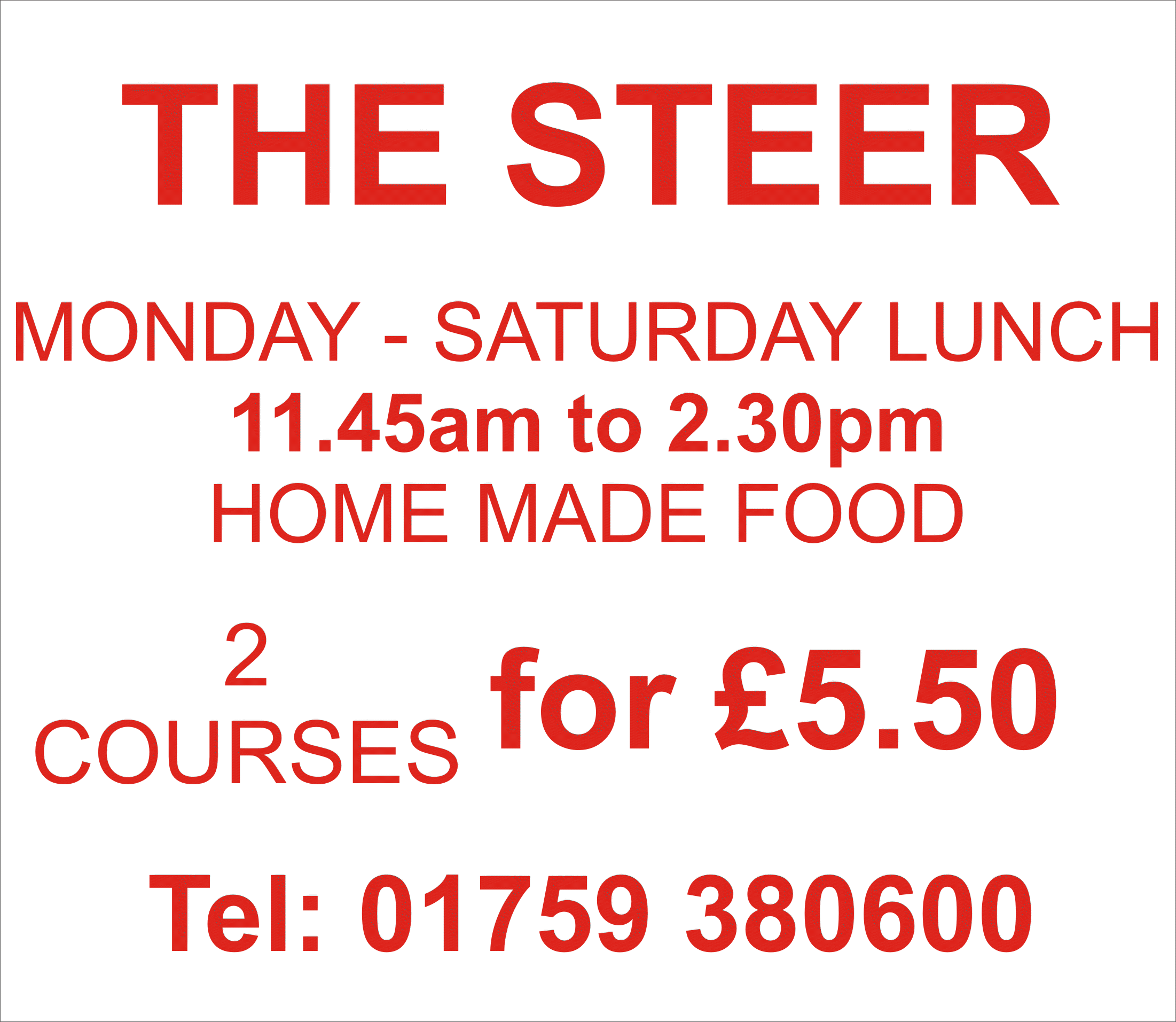
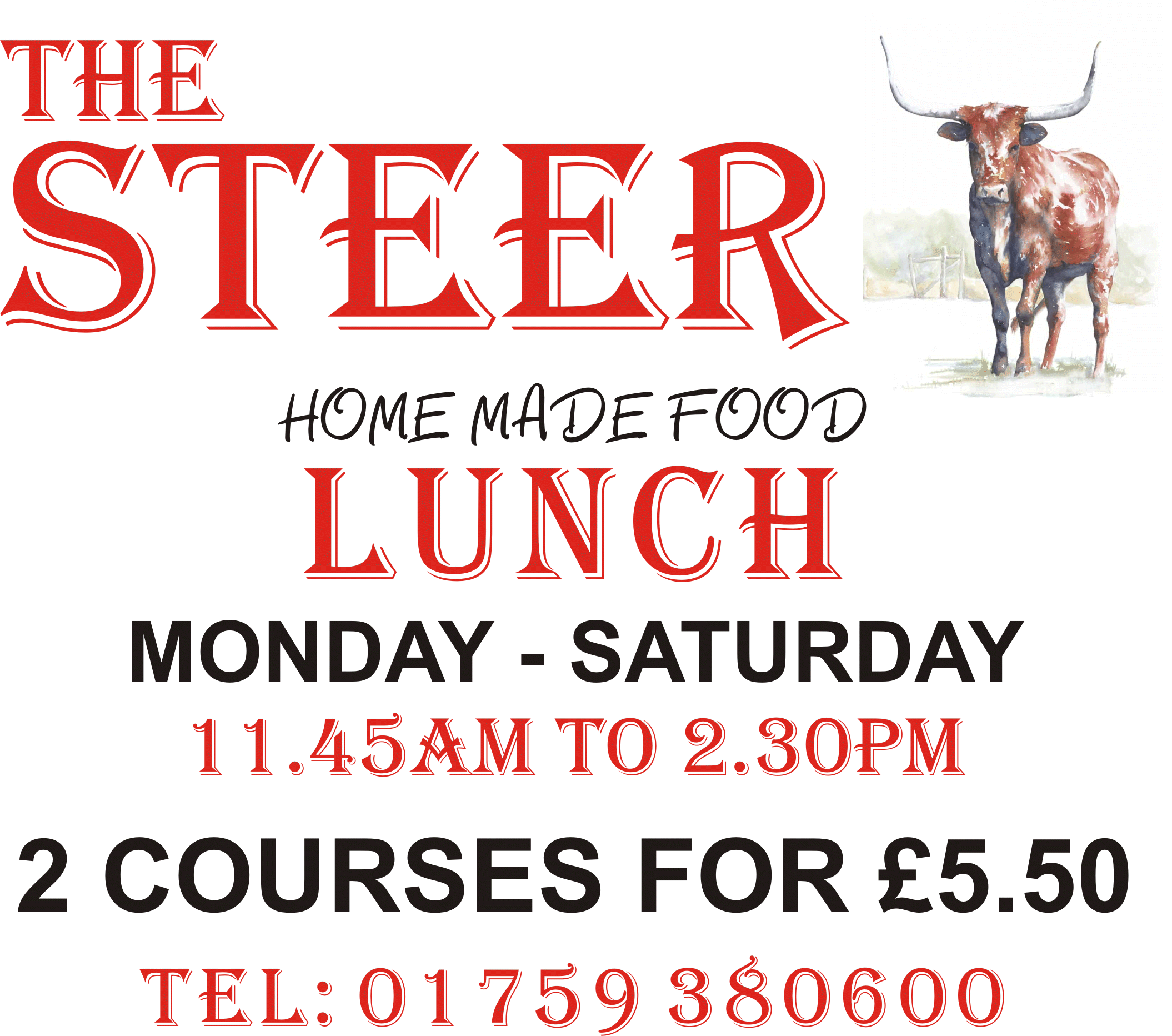
hi all thanks for the quick responses
heres another one i was working on..
cheers
stephen
Attachments:
-
Too many font…too cramped at the bottom.
‘THE STEER’ works in the ‘Algerian’ font – the ‘vag rounded’ does not. It’s just not ‘complimentary’ to the theme or any other the other typefaces.
Open it up (more space) – and step back a few feet from the monitor. What do you WANT to stand out?
-
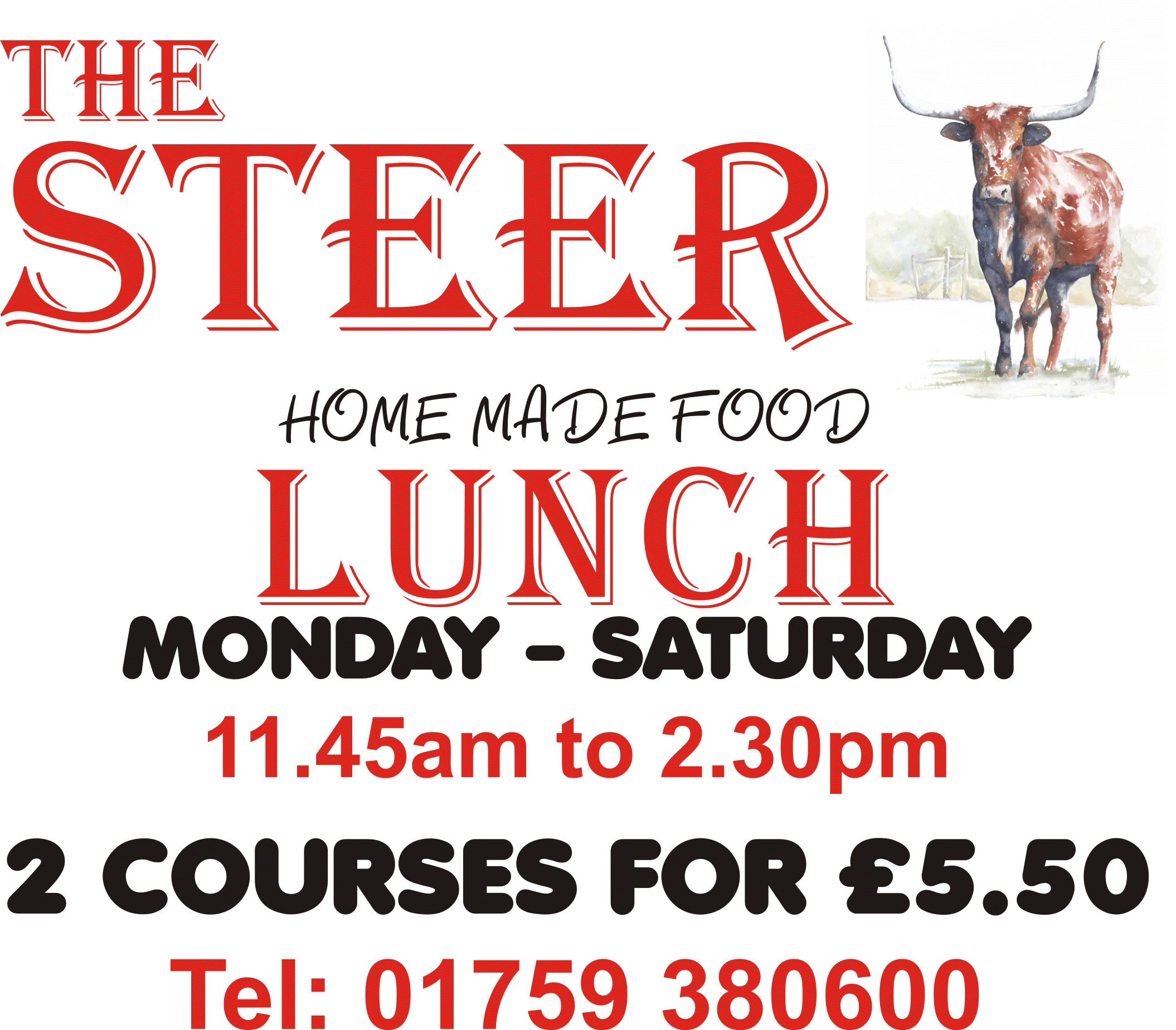
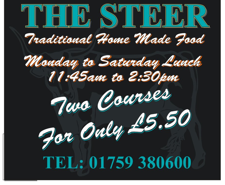
hi, is this any better??
cheers
stephen
Attachments:
-
What size is this sign?
Where will it be located, viewed from?
i.e. on a wall on location, viwed up close, road end to catch passing traffic etc? -
hi robert, we are only supplying the sign and not fitting, but i assume it will be going on a road edge.
it measures about 1220 x 1400mm
cheers
stephen -

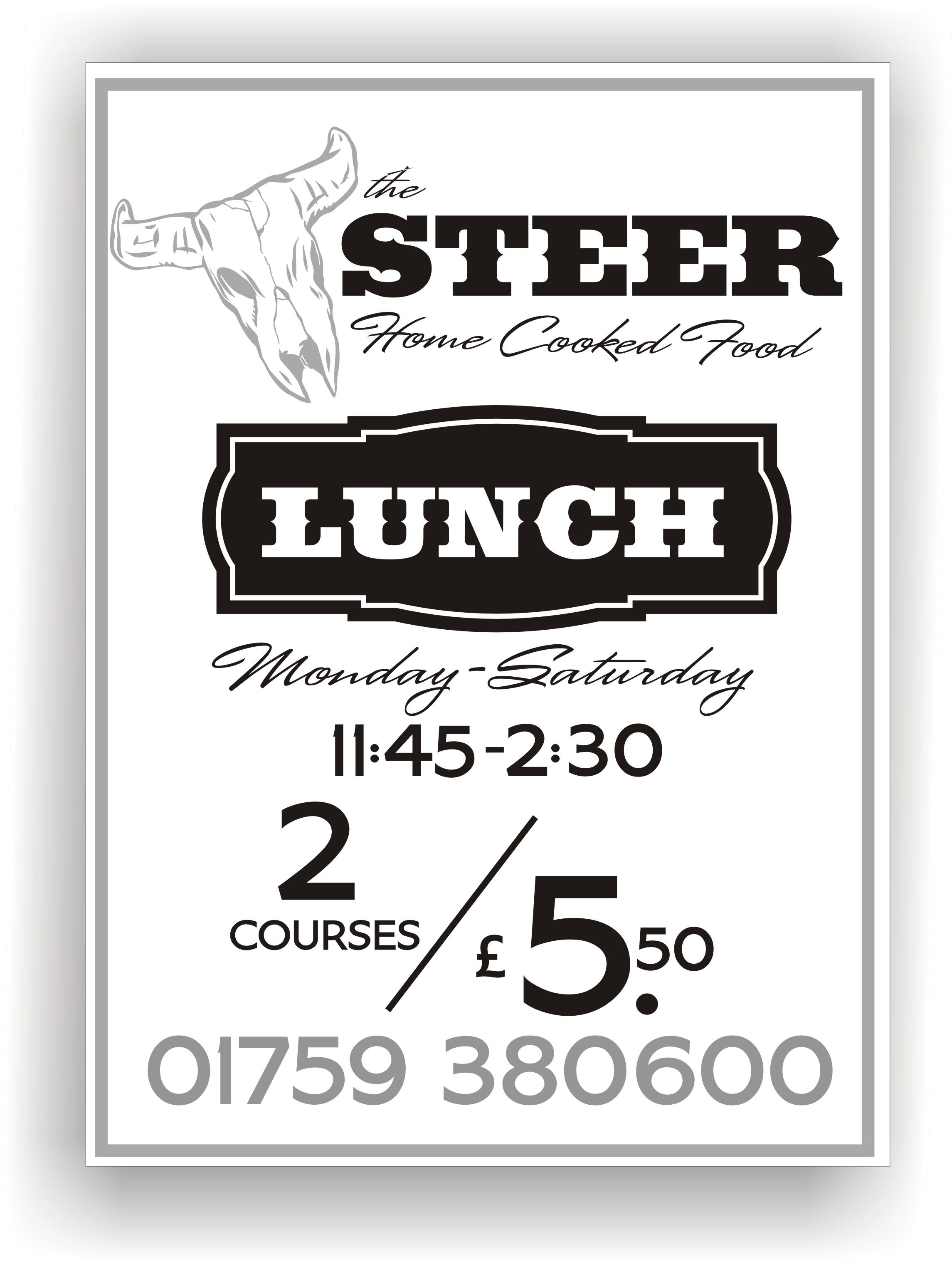
ooh, lots of posts while i messed about with my idea, i’m not overly keen on the colours i’ve used, they just kinda worked together ok(ish),
i would prob get as far away from plain red on white as possible, just too harsh imho, the sign needs to attract the interest of passers by, and be inviting,
anyways, forgive me for my efforts !….. 😮
Attachments:
-
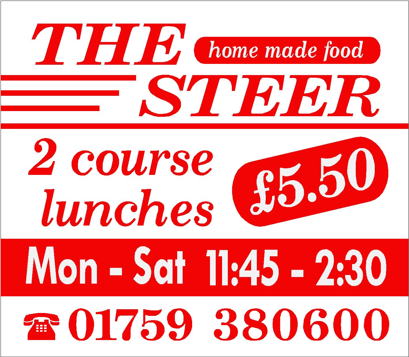
Please excuse the lack of fonts and design layout, as i am using photoshop only and limited to fonts and capabilities using this software. (i prefer signlab) But thought ide try and show a simple layout i have done that i think is easier on the eye and still manages to get the message across.
well at least i hope it does… :lol1:[c]
 [/c]
[/c].
-
Nice one rob, that looks really smart
cheers
stephen -
hi rob, would it be really cheeky to ask if i could scrounge a copy of the roast dinner picture, please.
I understand if not..
cheers
stephen -
hi stephen
ive no problem giving you the images mate but i only have them at around half a meg. so maybe not the quality you will be after for this job.
that said, the three of them are on istock.com at various qualities. -
Algerian is a font looked at here with about as much snide remarks as Brush Script, Comic Sans, and Papyrus.
Use it sparingly if at all.
I’d look for something "beefier"…pun intended.
Love…..Jill -

I’m not trying to hijack this forum. I just wanted to post another website that has good stock photos that you can use. Most of them are free, even though some have stipulations for use. You could probably find something on there hi resolution enough without having to shell out some money (although istockphoto is an excellent resource if you do have the cash to pay). http://www.sxc.hu/signup

Log in to reply.