Home › Forums › Sign Making Discussions › File Swapping › I am very curious about people’s opinion on stretching fonts
-
I am very curious about people’s opinion on stretching fonts
Posted by Angelique Muller on 6 August 2007 at 21:24I recently watched an interesting discussion on whether it is good or bad practice to stretch a font (on ‘Nature’s Table’)….
Some people were of the strong opinion that it’s not a good idea… But I was wondering: is it bad practice to manipulate fonts by giving them outline strokes and ‘fatten’ them up? Is that also considered to be a no-no?
I am very curious about people’s opinion……. 😀Andrew Boyle replied 18 years, 4 months ago 18 Members · 72 Replies -
72 Replies
-

I don’t agree with rules like that. If it looks OK, it is OK. Some fonts look alright when stretched or condensed a bit, some don’t. Same applies to any other effect.
-

I think that this is probably OK, as long as the characters remain legible,
and it isn’t overdone.It has got me out of a fix when I hadn’t got the weight I needed, but I
would prefer to use the correct weight where possible.Another practical use is to make an emboldened version of a font, where none exists.
Cheers,
Jamie -

have to agree with Andy, I suppose adding a shadow alters a font, but I think a bit of squishing and squashing some times makes the font look better, if it doesn’t look right you just know 🙄
Lynn
-

I disagree with extending or condensing fonts to fit an area and the like.
i see it as lazy designing… yes some fonts can be increased/decreased by about 10% without it being too obvious but for me its a no no…if you are designing you use the fonts/tools you have available. use extended fonts where required and use condensed fonts for same…
if you "need" to use a given font and trying extend the length of the line then the kerning can be opened or decreased if necessary.
every letter needs an element of space to make it legible, unless its in the design that requires you to basterdise the font to create a logo/effect etc then that’s fine.BIG is not always better, more legible etc but most think that way…
negative space is not always negative and can play a role in making a design work.
Outlines on letters are commonly used wrong by sign makers.
the wrong colour of outline will close a letter making it hard to read.
too much of an outline will do the same, but in most cases create a HALO of colour around letters/words as opposed an actual outline.
outlines are often applied to fonts that shouldn’t be applied too, such as light, narrow fonts.
Most forget to increase the kerning on letters before applying an outline. the extra space the kerning creates compensates for the "outline" this making the text still legible from a distance as the outline has not stolen the element of space surrounding the font/letter.
shadows are another common fault when designing. similar applies as with the outlines.
most common mistake with shadows are the colours used.
if you are creating a 3D letter then fine any suitable colour can be used. e.g. many sign makers will use a black shadow on red text on a white van.
reality is, when an object creates a shadow on a white background it will create a grey shadow. normal light grey… yet we see blue shadows on white, black etc etc again, a shadow is one thing, a 3D letter is another.im rabbiting on… so many design factors should be taken into account…
even the fonts used… a script font wouldnt be used for a heath and safety sign, just like times bold wouldnt look right on road sign.
ok, im off on one… im away back to cleaning my comp. 😳 :lol1: :lol1:
-

Thanks for that….
Question for Rob:
You seem to have a very strong opinion on the subject. Is this your own, that you formed trough experience or is it something you were taught?I find this subject quite fascinating… any good books you could recommend on the subject? I recently purchased the ‘logo, font and lettering bible’ by Leslie Cabarga… very interesting/enjoyable read…
Although calling your book a bible is possibly a bit pretentious (especially since he seems to ‘butcher’ a font on the cover by stretching it to the extreme…….) -
I as never taught as such Angelique, I would say my views/opinions in certain areas of design is through experience.
"I have made every mistake i have listed above and allot more over the years"
I have criticised sign designs from the past that i actually feel embarrassed thinking about today… these well laid out, tasteful signs took a right roasting from me in my early years of making signs. :lol1: (but it was me that was wrong!"
as time goes on you start to understand "why" certain fonts are used… what signs are good and badly laid out etc etc
Over time I would see nice signs out and about and mentally pinch ideas from them that you incorporate into your next job and so on… each time bettering your work.Everyone has their own personal taste, style… what works for me may not work for others. But i do believe there is practical design laws that shouldn’t be broke, but way too often are.
-

I would tend to agree with Andy as well, don’t think it is wrong to alter a font to some degree but what does bother me is when someone has stretched a font to such an extent that it looks completely wrong. Sometimes there is not an extended or condensed version of the font you need to use and you can only open up the kerning a certain amount before things start to look wrong. I am not sure I agree with Robert 100% when he says that signmakers that do it are lazy, in some cases I believe this is true but in other cases it will be down to either the designer doing it deliberately because they see no harm in it or at the other end of the scale someone doing it because they don’t know any better because of inexperience and it is the only way to get the text to fit the space.
-
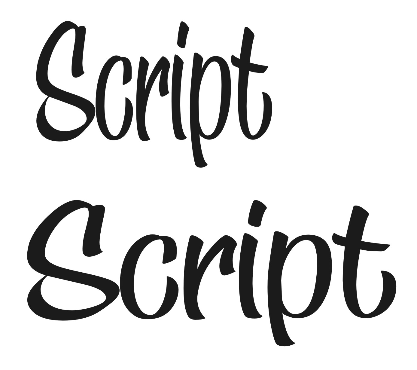
I agree mostly Rob, but…..
Sometimes things can be improved with a bit of tweaking. The example below shows an ultaltered font and the same one stretched. To me the original is too weak and the stretched version is an improvement.
Attachments:
-
Andy, with that font I think opening up the kerning a bit and putting a small outline on would also help.
-
Maybe, but the point I’m making is that you can stretch without making the text look nasty. It still looks fine to me. Not the case with all fonts but I still think there are no hard and fast rules for this.
-
Andy, yes I understand the point you were making but Angelique asked about adding outlines to thicken fonts up as well as stretching them, so I agree with you that stretching hasn’t spoilt the font and there are no hard and fast rules but that also applies to adding outlines as well as stretching.
-
Sorry, yes of course. The only thing to be careful of when adding outlines to bolden text is that you are keeping it legible. The proportions of a bolder font are totally different to it’s lighter version and it’s easy to make it a bit messy if you’re not careful.
Again, I think it’s fine if it looks right.
-

Wait till Jill sees this thread! we worship her
Anyway, stretching is always a no-no for me… but i take these points onboard.
The Adobe Helvetica font actually comes in about 20-30 different variations so you don’t really have to stretch it.
-
Dave, I never thought about what Jill would say.
I better go and delete all my posts on this thread before she reads them or I will be in loads of trouble :lol1:
-
I agree, in this case prefer the extended one too Andy, but it is no longer the font in question. You have basterdised it to create something new…
In which fashion would you do this to the font?
would it be to create a logo for a new company, or perhaps even a signed slogan at the bottom of a sign? in both cases you are creating something unique, part of your own design originating from the font.
where i would say it is wrong is if you took a line of text in that font and just stretched it to fit a space. In this case there is no real designing taking place… as i said, i see it as lazy/bad designing.
Scripts have interlocking letters most of the time… they are almost uniformed in how they look and seldom have a family.
Helevtica for instance has a large family… medium, condensed, light, bold, extended etc etc
If a font is stipulated for a sign, the sign should be laid out best using "that font" or one from its family. if the family doesnt have an extended version and one is needed for whatever reason, i would use an alternative before stretching. -
I never stretch what I would call ‘formal’ fonts, especially gothic font types. It is more acceptable with scripts I reckon, and the font I used as an example I always stretch a bit because I think it looks better.
As for Jill, she will go mental at me, especially as it’s a Letterhead font! 😮
-
Yer but you are brave Andy so you probably won’t mind Jill going mental at you, me I’m a whimp and have already started quivering.
-
I am interested in the shapes of lettering in general.
One point I tried to make in the previous posting ‘Nature’s Table’ was that: are you always sure that a font is a good design? There are so many fonts these days and they surely can’t be all that good. If a font is designed by a professional, does that mean it is good? As in all professions there are good and bad people out there. A bit of tweaking could possibly improve things. I also wonder who ‘desides’ what looks good, what the current ‘rules’ are so to speak. In general terms I believe the the ideas about esthetics change (look at fashion: years ago a size 12 was beautiful, these days it is to big). SO I am just trying to figure out how this applies to lettering and signs….
In the end it all boils down to personal opinion and taste, but I just like hearing what other people with experience in sign making have to say…As I am just starting out, I sometimes design something and feel ‘it doesn’t look right’, but then find it hard to figure out why. So with some guidance and basic rules I could look at something more precise and pinpoint what the problem might be….that’s the reason why I am ‘picking’ your brains…..
. 😀 -
Angelique, if you want to learn a bit more about design then you won’t go far wrong buying "Secrets of Design" by Mike Stevens. It’s a very good book to read and help understand more about design work and also comes in handy just to refer to latter on.
-
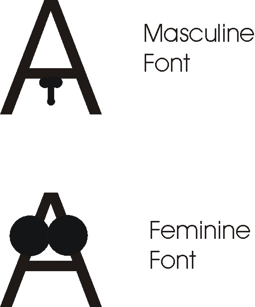
I don’t know if it’s any help or makes any sense to you at all, but the FIRST thing I decide upon when designing is Male or Female. There are styles and fonts that are obviously masculine or feminine and I try to match this to the intended customer base. Or neutral, of course.
Know what I mean?
-

while agree with Rob’s points, from a moral standing, i tend to favour Andy’s way of thinking in practice !
i have often messed fonts a little to fit, usually in the absence of a condensed or extrended version of the said font,
not sure it’s really lazy, to just stretch might be, but to really mess about with them is creative!!
on the shadow front, i often think it goes with what looks good, or what colours go together, though i nearly always use a silver / grey / black shadow !
-

For anyone wondering what is the difference between a masculine and a feminine font? (puppy-eyes)
Attachments:
-

I don’t know whether it is a view of the "old school" by that I mean sign makers that have been brought up with the traditional hand painted techniques that fonts can’t be tweaked….
In my first job (About 25 years ago) we used to use letraset to layout all the nameplates we used to make….we could tweak fonts on the reprographic camera if it was needed but we tended not to as it was just too much hassle…we longed for the day when an affordable computer system could take over the drudgery of laying out text by hand & now we have it & it has opened up a whole new way of designing.
I agree with what Andy has said….& as I said on the "Natures Table" thread….if it is still perfectly legible …why is it wrong to use a stretched font ??
We have so much more flexibility with today’s technology..I can see absaloutely no reason why we shouldn’t use it.
Like everything else …there will always be good & bad examples of stretched fonts.
Rob …Andy’s example of the script font has illustrated a perfectly good example of tweaking a font & it not looking wrong….do you think the customer will be at all bothered that the text can no longer be considered "such & such " font…if at the end of the day they are getting a design that is legible, attractive & advertising it’s intended purpose ??
-

Traditional signwriters have been stretching & ‘bastardising’ fonts forever, so I see no reason to act any differently. I agree with Andy. If it looks right, it is right. A little tweak here & there can often drastically improve an otherwise dull font, as per the example shown, & 99.9% of people wouldn’t know any different.
Take the Noble Automotive logo (petrolheads will know) A fine, easy to read non fussy logo, but the font is a very stretched microgramma med extended. It looks fine.
And lets not forget that fonts are usually created by designers. What do they know eh? 🙄
😉
-
quote Andy Gorman:I don’t know if it’s any help or makes any sense to you at all, but the FIRST thing I decide upon when designing is Male or Female. There are styles and fonts that are obviously masculine or feminine and I try to match this to the intended customer base. Or neutral, of course.
Know what I mean?
Actually, no… 😮 I haven’t a clue what you mean…. could you explain? 😀 Maybe a bit better than Phill?!?! (although that was entertaining……)
Give me an example of a male and female font… -

I am too lazy to type my opinion, but I basically echo everything Mr. Lambie has stated.
Andy, I’m gonna tattle on you to Arthur!
🙂
Love….Jill -

I would have to agree wholeheartedly with Angelique – it’s all fascinating!
I think it should be remembered that although we are talking about design this crosses over into loads of aspects of life in general. An example: I always try to write with capitals in the correct places and in ‘proper’ English. I’m no expert on the language and know of things that I don’t fully understand, but I make an effort. Text messages are a thing that annoys me, even my mum uses text speak!!! I find not typing things out fully to be lazy communication and showing less respect to the people who have to try and decipher what has been written. (This is my opinion only and I know I’m out on my own!)
As for design, we could all probably post up 3 examples of our favorite jobs and someone on here would be able to take at least on of them apart. Does that make them right? I would say…. wait for it…. it depends! Could I be any more non-commital? My point – who knows! I think Andy’s example is perfect, their is nothing wrong with that text and as has been stated, not many people would even know it’s been altered.
I’ll leave it there as I’m rambling….
G
-
Brilliant Post Phil… although did Alison was wondering what you was doing with that A?
Oh Jill… come on now, don’t run away
-
Angelique, here’s a couple of examples to show what I mean.
I think everybody does the same as me, albeit subconsciously. Next time you are in Boots have a look at mens’ and womens’ products, you’ll find that the typography on womens’ stuff is much more……erm…….girly.
Attachments:
-
I wonder if Phils illustration tells a story…..the female font is very well stacked ….whereas the male one……well ….. looks a little bit sorry for itself
I wonder 😀
-

this has been good reading ………… :lol1: :lol1: :lol1:
Phill – priceless ………….. Gavin, your rambling is hilarious. But at least in was in perfect English!!!! -
quote Andy Gorman:Angelique, here’s a couple of examples to show what I mean.
I think everybody does the same as me, albeit subconsciously. Next time you are in Boots have a look at mens’ and womens’ products, you’ll find that the typography on womens’ stuff is much more……erm…….girly.hhhhhmmmm…. I think I get what you mean but I shall have a look in the shops next time and have a critical look at at products……
(won’t be in Boots as there’s not one around here….) -
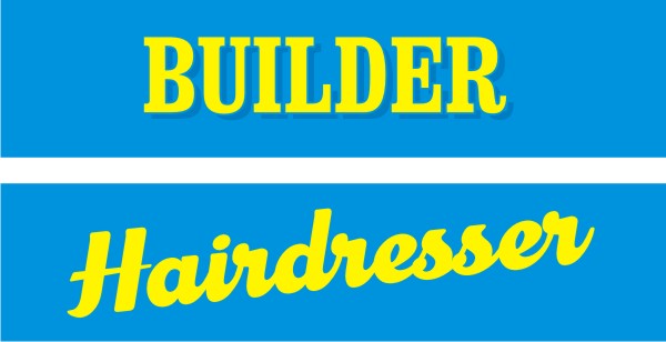
Andy’s right about the fonts…..although you always see the odd exception to the rule 😀
Attachments:
-
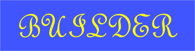
Jamie, I would hate to be the next Builder who comes to you for work :lol1:
-

I tend not to drag many fonts and don’t often use outlines or drop shadows, I think it makes things fuzzy.
The last time I used either was probably to create a traditional looking sign.
I do think you can change kerning etc sparingly and let things develop by looking and deciding what you like…….it’s also good to learn type shortcuts [left hand stuff] so you can see things change quickly.
The more you change the more you have to change
😕Cheers
-
Again, just my opinion…
Lets say those that tweak fonts here and there as and when they feel it works, are correct. lets say this is OK…
week one….
You design a main entrance sign for your new customer. approx 8×4…
you let loose your creative juices and come up with a basterdised master piece.week two…
Same customer calls… He would like all his doors throughout his offices done. 16"x2" blanks… the juices flow and you come up with 20 nice door signs.week three…
same customer, this time wants a directory system throughout the work.
this time on a narrow floor standing system with multiple lines of text.week four…
decides a larger sign on the front of the building is needed so adds a 16’x2′now "this" Mr customer is none the wiser and pays you… to some that’s a result! happy him, happy you…
the problem is, walking around his new premises, every sign in the place has been tweaked here and tweaked there to fit the odd sizes… till nothing is uniformed, no consistency in the company branding. it looks bad, very unprofessional…
but lets say now that this was a company that knows what they are looking for… I’m afraid you would be starting again from scratch. once paid it would probably be the last time you worked for this company.
this isn’t just with the above scenario… vehicle graphics too… companies have multiple makes of vehicles in various shapes and sizes. "the image must be consistent" or it looks bad, you look bad!
if we have no ground rules from kick off, where the hell can we expect to find ourselves half way into a large signing project?
A typical example of this is "Carpet Wise" or i think the name is "brunswick warehouse" im sure many have seen the warehouses around the UK… they are a mess! massive flexface illuminated signs… a waste of money in my view…
I’m sorry if this didn’t make much sense… I’m crap at explaining things, even worse when trying to type and explanation… :lol1:
P.S.
Phill… that masculine font you have used… is that the Charles rennie macintosh font in lower case? :lol1: -
Rob that is all true, but the same could be said of forgetting what colour you used on a job. Anyone who knows what they are doing should be able to replicate a style throughout a line of products. If I have a van to sign 6 months after making a fascia sign I don’t start from scratch, I copy and paste any customised content so it’s all the same.
I’m not disagreeing with your ethos, that’s your preference. All I’m saying is that a bit of tweaking isn’t necessarily wrong.
-
I agree with all you said Rob, I think from my point of view the amount of tweaking I find acceptable would not cause too many problems in this situation as I pretty much agree with not just stretching things to make them fit a space.
Have we not all had to explain to customers about proportions…. if you want 10” lettering it’s going to be 5′ long… I only want it 2′ long….. then you need to have smaller letters! Arghhh!! Seems like every day I have to explain this to some numpty… I’d live this job if it wasn’t for the customers! (kidding, some of our customers are ok :lol1: )
-
Rob…I don’t fully understand your scenario…… because from what you have said before….you’ve stated that if the sign required a condensed looking font you would use a standard condensed…..fair enough
In your scenario you are implying that a stretched font was needed in the "week 1, 8 x 4 sign"…..so you would have used a condensed font rather than tweaking another one……
You still face the same problem you are describing when it comes to the "week 3 directory system" in that your initial condensed font would look wrong….even if you did use the same family of font.
I think most people are advocating tweaking fonts sensibly rather than stretching them beyond all recognition
-

For quite a few clients I have to apply their livery to a range of vans, sometimes ranging from Fiestas to Transit LWBs, or even larger. It can sometimes be very difficult, but whatever happens we would NEVER change font compression from one vehicle to the next. Whatever proportions are on the original design go on everything.
How far can we take this? Fonts are generally designed in straight lines so are we "bastardising" them by, for example, putting them on an arc. Do we think that M. Garamond envisaged that when he sat at his drawing board doing his stuff.
And what about outlines and shadows? A very few fonts actually have a proper outline version, but surely the font designers, whom we all worship and revere, would have designed an outline font if they thought it appropriate?
My opinion, for what it’s worth, is that some of you have got religion about the sanctity of fonts. The great font designers were at the cutting edge of technology in their own time, and I think they may well have embraced the facilities available to us with open arms. Naturally, I’m not advocating extreme distortion but, done tastefully, it need not be offensive.
Basically, I’m with Andy. If it looks right it is right.
-
Hi Andy
I know what you mean mate and I agree things can and do work even when tweaked here and there. I just think that there should be some ground rules that should be kept to as much as possible and only broken to create equally as tasteful layouts or unique designs.Hi Glen
No, I’m not implying any sort of font “should be used” on any of the signs mate. Elongated panels do not mean an extended font should be used. Just like narrow signs don’t need to use a condensed font. That is up to the designer…
What I am getting at is… any type of design should and can be incorporated into any sort of sized panel, space etc It is here that it will show how good the designer really is. The must be able to take his first sign designed, “or” the spec given to him on the fonts, theme, logos and colours that should be used, and create various sized, shaped signage all “uniformed” and following the same theme/style throughout the entire branding.
This I guess is where we must know how to lay a sign out as well as choose appropriate fonts colours etc Moving from the 8’x4’ to the narrow directory system and just squashing the fonts up to make fit wouldn’t be acceptable. Just like shifting to the long narrow sign and stretching the font wouldn’t be either. Nor would introducing a new elongated or condensed font to do the job half way through the signage project. “Scaling up and down, tweaking the kerning slightly or rearranging the layout to suit is the only real options in my opinion.I remember a couple of years back a local sign firm to me branded an entire football stadium that had just been built. About a year later I was called to go up and see them because they were getting fedup with the sign firm. As I was taken around the stadium to measure up for new signs they needed I couldn’t believe how bad all this new signage was…. Walking down corridors I spotted simple door signage done wrong! e.g.
One door had OFFICE on it in capitals using a bold font 2inches high….
The next door down said something like “Changing Room 1” it was caps and case and about 1.5inches high using a medium font…and so on and so on all the way around the stadium. It was clear they just used the biggest text on each door they could get based on the amount of letters to be used. It was awful…. Yet they had been paid and done lots more like it afterwards.Does this make the job right?
Because it obviously did “look right” to the sign makers, it did look right to customer as they paid…
In my view the customer did not know any better… equally, “nor did the sign makers”.As I said above…
quote :I have criticised sign designs from the past that i actually feel embarrassed thinking about today… these well laid out, tasteful signs took a right roasting from me in my early years of making signs. ”but it was me that was wrong!”As I also said…
quote :Everyone has their own personal taste, style… what works for me may not work for others. But i do believe there is practical design laws that shouldn’t be broke, but way too often are. -
Well, I must say I have been really enjoying reading all your opinions on the subject 😀 (it’s just great as I could not have a discussion on this subject down the local pub….really).
I would like to say thank you to everyone!!!
Rob: you seem to be the ‘biggest’ voice in explaining why not to alter fonts & you have done a great job in explaining your point of view. I am still not sure if I agree or not, but one thing is for sure: I will certainly think very hard before I would change something and question if it is really necessary and if it is actually improving a design.
Again: if anyone can advise on any good books to read on the subject…. I would love to hear.
Martin: I tried to find the book you recommended on Amazon, but no luck there….. 🙁 -
 quote Angelique Muller:(it’s just great as I could not have a discussion on this subject down the local pub….really).
depends on who you invite Angelique 😀 😀 😀
would love to get my hands on a copy of the book too.
-
i think this is the book martin was mentioning, i have it here but havent read it. read some when i just got it… what i read was good… i need to dig it back out.
http://www.amazon.com/Mastering-Layout- … 79&sr=1-38 -
quote Harry Cleary:quote Angelique Muller:(it’s just great as I could not have a discussion on this subject down the local pub….really).
depends on who you invite Angelique 😀 😀 😀
oh you big flirt!!!!!!!! :lol1: :lol1: :lol1: :lol1: :lol1: :lol1:
He’s hinting Angelique…… BE AFRAID, BE VERY AFRAID!!!!!!! 😉
-
quote Marcella:quote Harry Cleary:quote Angelique Muller:(it’s just great as I could not have a discussion on this subject down the local pub….really).
depends on who you invite Angelique 😀 😀 😀
oh you big flirt!!!!!!!! :lol1: :lol1: :lol1: :lol1: :lol1: :lol1:
He’s hinting Angelique…… BE AFRAID, BE VERY AFRAID!!!!!!! 😉
Will I hide so?!?!? 😮
-
who me?? 😀
I just like a pint and talking about stretching 😮 😮cheers for that Rob!
-
quote Marcella:RUN FOR YOUR LIFE!!!!!!!!!! 😮
Oh, jeeeezzzz………. 😉
-
quote Robert Lambie:i think this is the book martin was mentioning, i have it here but havent read it. read some when i just got it… what i read was good… i need to dig it back out.
http://www.amazon.com/Mastering-Layout- … 79&sr=1-38I found that one on Amazon…… it’s a bit pricy at £32.20 🙁 Is it worth the money you recon?!?
-
😀 😀 typical…..Thomson gets me in hot water again!!!
I’m a pussycat really Angelique……. 😀 😀 honest! -
The book is indeed called "Mastering Layout, the Art of Eye Appeal" by Mike Stevens.
You can also get it thru Signcraft Magazine, which you should be subscribing to anyway.Warren, the 551 will fade in time long before the 751 or 851.
I’d rather pay a few bucks more at the start than have to replace something later.The only font altering I do is joining scripts and kerning. I never put lettering just typed out of my computer on a sign without checking the spacing.
Love…..Jill
-
Angelique I will send you the book if you want………….It’s the kind of stuff I appreciate but don’t know if I agree with or like 😀
Cheers
-
quote Angelique Muller:quote Robert Lambie:i think this is the book martin was mentioning, i have it here but havent read it. read some when i just got it… what i read was good… i need to dig it back out.
http://www.amazon.com/Mastering-Layout- … 79&sr=1-38I found that one on Amazon…… it’s a bit pricy at £32.20 🙁 Is it worth the money you recon?!?
I do think its worth it. as i said i didnt read much of it, mainly due to a massive hangover from the letterheads meet where i bought it. :lol1:
i skimmed through some pages and read one or two, what struck me was it is easily followed and makes good sense. many books and online info are hard to digest/follw. (bit like my posts :lol1:) this book has been done by someone that knows what they are talking about and make a good job at getting you to understand it with words and illustrations.
i dont think i paid £32 for it though… maybe i did, but i thought it was around £20 -
quote Harry Cleary:😀 😀 typical…..Thomson gets me in hot water again!!!
I’m a pussycat really Angelique……. 😀 😀 honest!Yeah…. thought so… good thing as I am no mood to ‘run for my life’ as Marcella puts it. I am absolutely knackered. I tiled a bathroom today: 16m2 , a record for me….. but I suppose this is the wrong forum to be discussing that! 😉
-
quote Andrew Boyle:Angelique I will send you the book if you want………….It’s the kind of stuff I appreciate but don’t know if I agree with or like 😀
Cheers
Well, that would be really nice! 😛
Are you sure? -
I’m another who would advocate any serious signmaker should study this book. I promise you, if you read and digest what it contains you will produce better layouts that your customers will appreciate.
Mike Stevens said that good layout is a skill that can be taught. It is not a "gift" but a matter of applying certain principles to ensure the designs and layouts you produce have "eye appeal".
Mike Stevens is sadly deceased, but this one book is his legacy that lives on.
-
I paid $30 for mine at my first Letterhead meet in 1994 and it literally changed my life.
That’s chump change compared to the added value it brings to your worth as a signwriter.
Love…..Jill -
quote Andrew Boyle:100% …..no problem 😀
Gosh, thanks… that is really generous of you!!
How can I give you my address? I am not sure what the rules on these things are….. Can you access my profile? -
Andrew, whats that quote about stretching you posted a while back….. ‘he who would…..blah blah blah’
Have been trying to find it. 😀 -
Angelique, I didn’t pay that much for it, I got it from a company that supply traditional sign writing materials even though I don’t have a scooby about traditional sign writing except for when I am dreaming :lol1:
I will see if I can remember where I got it as it was quite a bit cheaper than that.
-
The great type designer, Eric Gill, is credited with saying “he who would letterspace lower-case text, would steal sheep”. (The attribution is probably apocryphal: others are also credited with the remark. Stealing sheep was, in the 19th century, a capital offence in Britain.) As the remark suggests, though, letterspacing of upper-case text is less awful a crime; the technique used also to be used for emphasis of text set in Fraktur (or similar) fonts.
PSP 😀
-
quote Andrew Boyle:
The great type designer, Eric Gill, is credited with saying “he who would letterspace lower-case text, would steal sheep”. (The attribution is probably apocryphal: others are also credited with the remark. Stealing sheep was, in the 19th century, a capital offence in Britain.) As the remark suggests, though, letterspacing of upper-case text is less awful a crime; the technique used also to be used for emphasis of text set in Fraktur (or similar) fonts.
PSP 😀
😀 😀 😀 brilliant!
-
:lol1:
………… for the record I’m with Andy Gorman and John Childs on this one.
-
quote Marcella::lol1:
………… for the record I’m with Andy Gorman and John Childs on this one.
Marcella agrees with two people?…..now that is a record……you will start being nice to Elsewhere next!!!!! You mellowing??? 😀 😀 😀
-
 quote Jillbeans:And I do NOT stretch fonts even if a customer wants me to……
i agree too jill……… 😉
nik
-
If I was doing a type logo I would look at every single letter and compare the spacing and change most of them using ctrl option + arrows until I was happy, only then would I reduce the size knowing I thought it was correct…."If it looks right……." 😀 general type is always a compromise 😕
-
Have some pigs….will that do 😀 😀 with warped text (!)
Attachments:


Log in to reply.