Home Forums Sign Making Discussions File Swapping which font and colour should i go for?

  • which font and colour should i go for?

    Posted by Michael Potter on 10 May 2007 at 09:32

    Hi all just need to pick a few brains. Don’t forget I’m only a vinyl jockey .
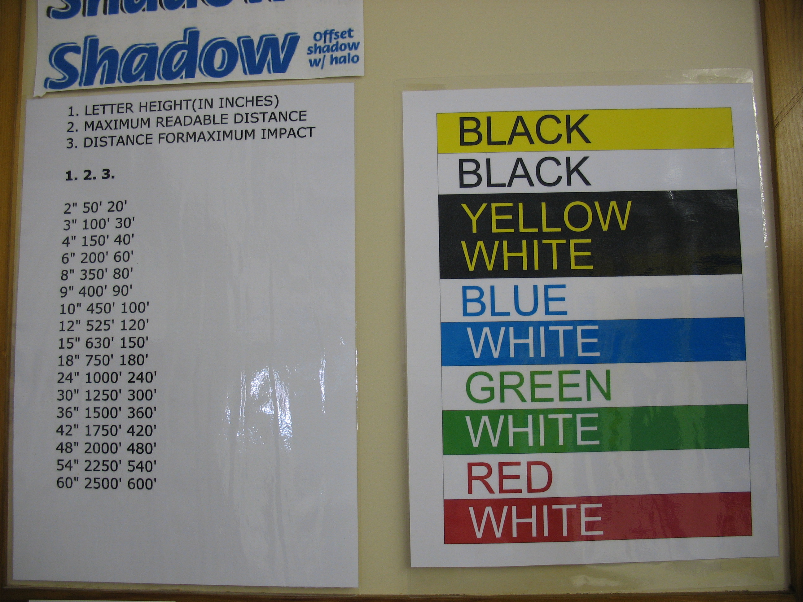
    I have a lady client who is doing it tuff and she would like a sign to go on a chainwire fence (probably signwhite she only wants the phone number address & scrapbooking on the sign She doesn’t have a large budget & we can’t afford to do it for nothing. the sign will be about 40meters from the road Speed limit 80kph which means most are doing 85kph.
    Now the question is what font and what colour scheme will get the best result for the dollar.
    If this shouldn’t be asked here or I am out of line please accept my apology & ignore.
    Many thanks
    Mike

    Shane Drew replied 18 years, 7 months ago 3 Members · 3 Replies
  • 3 Replies
  • Nick Minall

    Member
    10 May 2007 at 09:40

    I would go with black text on yellow at a text height of 12" to 15" high for max impact mate.

    ick.

  • Derek Heron

    Member
    10 May 2007 at 10:23

    Hi michael

    there is a post on here somewhere? which had a table
    for letter height and max reading distance etc also a simple colour chart.
    have just taken a pic and hopefully it is attached
    p.s spot the error in colour chart
    😉

    Derek


    Attachments:

  • Shane Drew

    Member
    10 May 2007 at 10:31
    quote Nick Minall:

    I would go with black text on yellow at a text height of 12″ to 15″ high for max impact mate.

    ick.

    Mike, Black/yellow combination is recognised as the best (see how long it takes to see a D!ck Smith store from a distance). The next best is black/white, then red/white.

    I agree with nick on heights, but if you stick to something like helv bold, you’ll have the best option when it comes to reading it. Stay away from condensing the font tho.

Log in to reply.