Home › Forums › Sign Making Discussions › Graphic Design Help › Can anyone advise on a better way to lay out this car?
-
Can anyone advise on a better way to lay out this car?
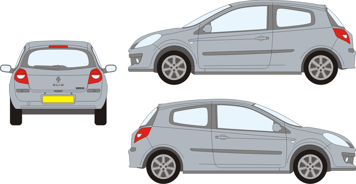
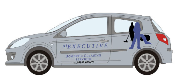
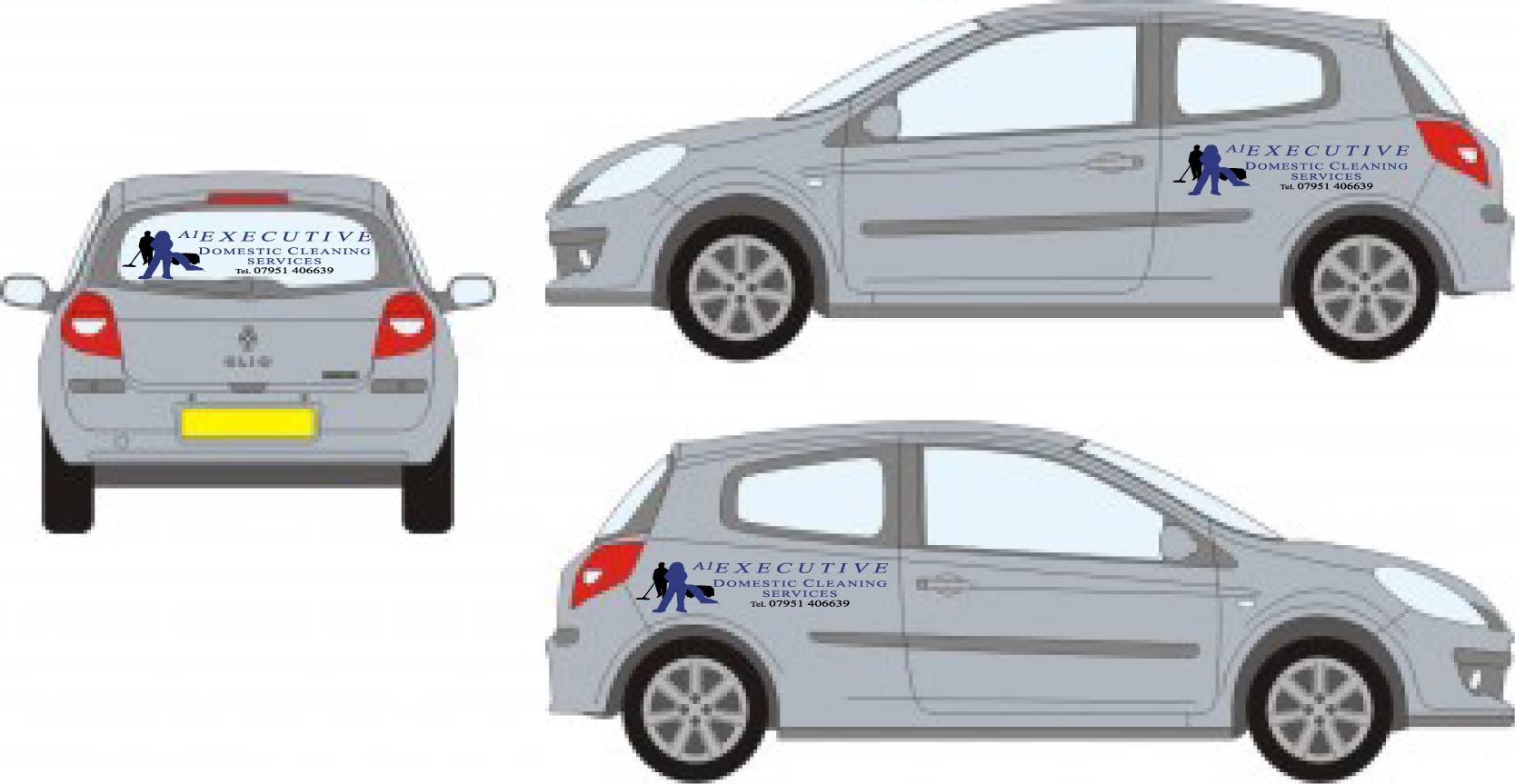
Posted by Marcella Ross on 27 March 2007 at 13:18I’ve got to do a layout for this Renault Clio. Nice car ……………… shame about the appalling logo 😮 How on EARTH do I put this logo on this car and make it look OK? Or am I asking an impossibilty.
Why do people insist on using their own ‘great’ artwork. I cannot change his logo at all, but I’m struggling to transfer this onto this car 🙁
I’ve attached the logo separately as an ai.Any ideas here would be most welcome………. any miracle workers out there?
Marcella
Martin Pearson replied 18 years, 8 months ago 9 Members · 16 Replies -
16 Replies
-

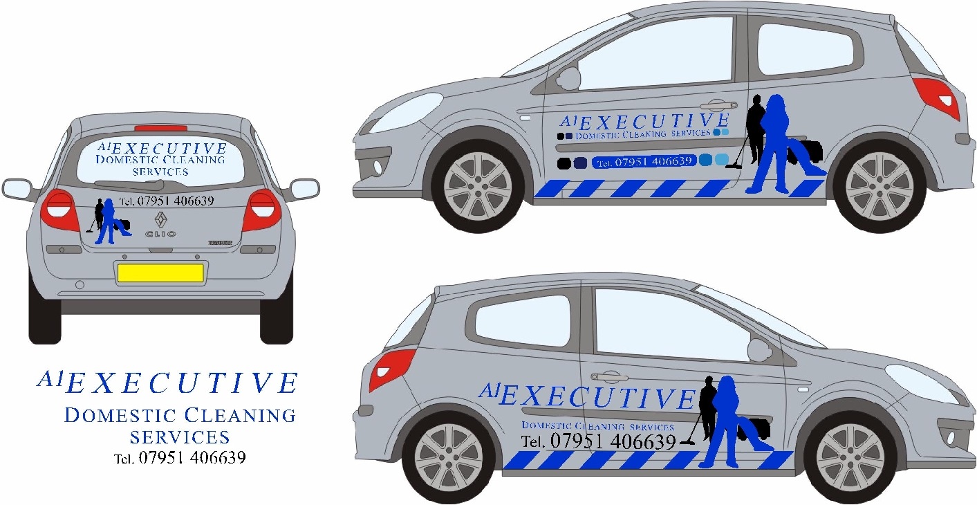
So if I’m right you may only use the logo as a group and not like what i attached?
In my experience, if I had something like this i showed the customer a fast preview like mine to convince them that it’s much better then using the logo as a group.
Attachments:
-

I could get away with breaking it up like that ………….. but it still looks naff doesn’t it. 😕 I always apply text straight and don’t follow lines on a car………… but it’s just not working with this Clio.
-

Hi Marcella
Not the best logo I agree 🙄 but I’ve had customers with worse 😀 New clios are a little bit like astra vans in that you have to angle the livery a degree or two. If you put them dead level the moulding strips and window lines give the optical illusion that the whole things pi$$ed !
Good luck with it
-
quote Dave Harrison:Hi Marcella
Not the best logo I agree 🙄
Good luck with itthanks Dave! :lol1: ………….. it seems like every job I’ve had lately has been like this ………. cr@p! 😕
-

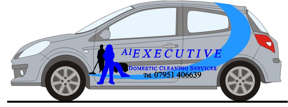
Oh, bit of a horrible one eh!
Just exercised some ‘creative license’….still nothing great though
Dave
Attachments:
-
thanks Dave …………. you know the only thing to make this Clio look good is to leave the vinyls off isn’t it!!!!!!!!!!!!! :lol1:
I’m just gonna have to show him something …………… he’ll probably like it!
I’ll need to do it undercover so no one can see me. 😳 -

Sorry to highjack your post Marcella.
Can anyone tell me how much the 2007 Clio van differs from the car?????
Just had a look on Renault site and the roof looks higher than the cars is it?
Thanks guys.
Tim.
-
can’t answer that one for you Tim ……….. the latest Impact disc doesn’t have a 2007 Clio van on it. 🙁
-
It’s not a nice logo at all.
Here’s another variation anyway.
Attachments:
-

I always have trouble with adding attachments but I have had a little go.
Probably the worst of the bunch but …..
Attachments:
-
thanks guys ………… I’ve got it sorted now ……….. Andrew it’s not too dissimilar to what you’ve just put up 😀 Customer was very particular…. so I didn’t have much scope. But he did add a red curve into his logo ……. just to make it worse 😮 😕
fitting it this week ……. NOT putting my name to. :lol1:
-

Well, we all get these difficult ones, and they can be a pig, but I would just like to add my fourpennorth……
We never put graphics on straight.
As a general principle, I find it usually looks better if we work with the shape of the vehicle rather than try to fight it.
-

Marcella, hope you got it sorted OK, as long as the customer is happy with it then thats all that really matters, I don’t know if I am a bit strange but sometimes with difficult vehicles like astra’s I put the graphics on straight and sometimes I don’t, what I normally do is explain the difficulties to the customer before I even design anything for the vehicle and when the time comes to apply them I will tack them in place straight on one side and how I think they look best on the other and then get the customer to decide which way they would prefer them. Takes a little longer but at least I don’t have customers complaining I have put them on wrong.

Log in to reply.