Home › Forums › Sign Making Discussions › Gallery › Vehicle Graphics – Tail Swishing
-
Vehicle Graphics – Tail Swishing
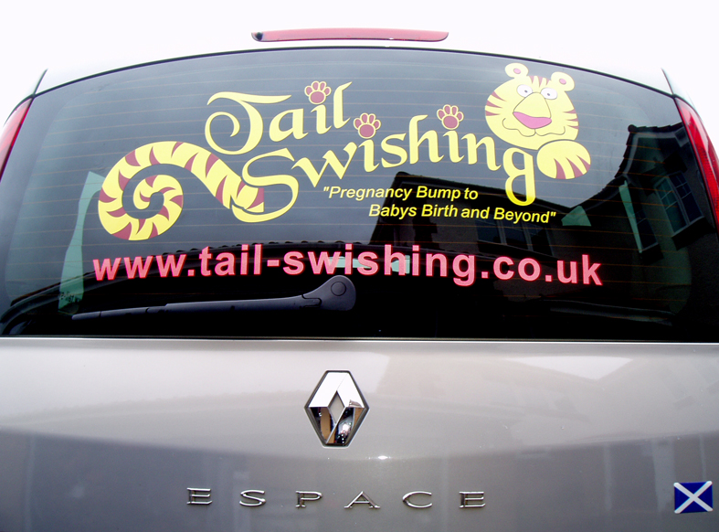
Posted by Garrie on 11 February 2007 at 18:00Hi all,
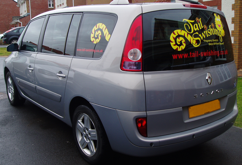
Just posting a quick job, just got back from fitting the below job and thought I post a few pics.
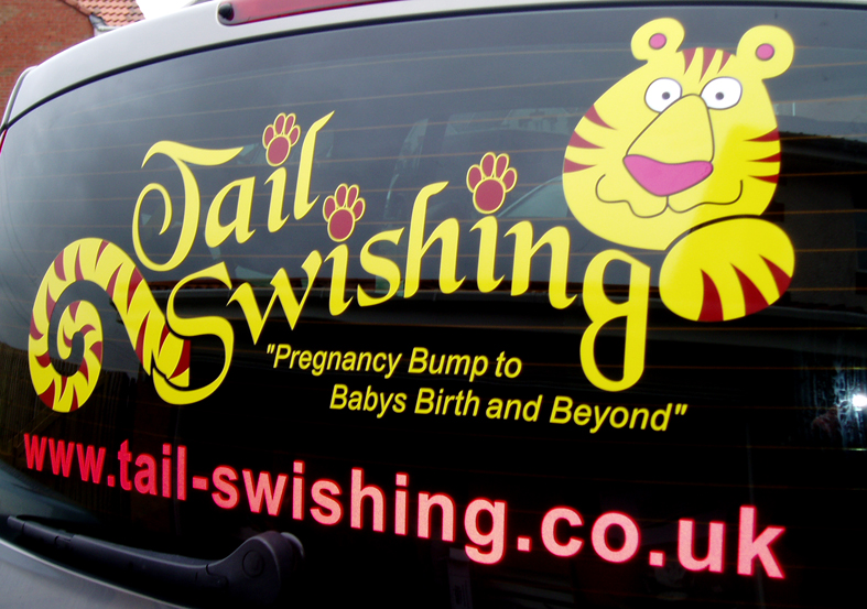
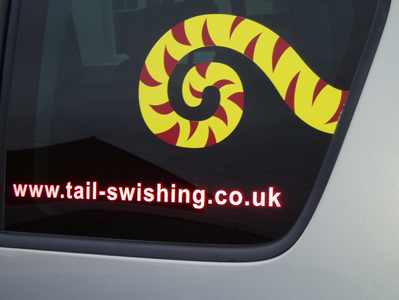
Vinyl is Mactac and reflective is LG chem.
Cheers
Garrie
Attachments:
 Garrie replied 18 years, 10 months ago 11 Members · 13 Replies
 -
13 Replies
-

Looks good overall Garrie,
Now the only problem is I read it as (****) swishing
Wonder if anyone else does….
Peter
-

Eye catching design
Will it be a problem with the window wiper?
Lee -

Looks good, initially read it as Jail Swishing though 😳 Made me look twice tho 😕
-
Good job Garrie,
Nice to see a wee bit of creativity. Very inspiring mate, well done.
Jim
-

Garrie, that is really smart! I love the design. But I too thought it was Jail Swishing at first!!!! 😳
Only down side is that it looks fab but it doesn’t say what they do? Or am I being thick? I’m sure that’s your clients decision to display exactly whats there tho.
But you’ve done a great job, nice one for your portfolio 😀
-

While I love the concept and the colors, the chosen font is one I dislike even more than Brush Script!
It gets used just as much here. I think it’s difficult to read.
I would have liked to see you use something like "Crazy Harold" instead.
Love…..Jill -
I think that’s the customers logo Jill ……………. don’t think he had a choice there……….
-
😉 Stupid me…I assumed he’d designed the logo as well…
😳 Thank you for pointing that out Marcella.
Love….Jill -

wow, thanks all for the positive replies.
Unfortunately that is the Customers logo and couldn’t be changed to much, I would have like the tail more into the S but such is life.
I choose the colours, (the orginal logo is slighty different colour wise) hence my embarrassing Vinyl thread, however the yellow and burgundy I have in stock goes together very well imho.
I was a bit unsure about using reflective but it works, and will no doubt look great at night.
Thanks again and I’ll see you all at signUK 😀

Log in to reply.