Home › Forums › Sign Making Discussions › Gallery › Vehicle Graphics – Eating Inn
-
Vehicle Graphics – Eating Inn
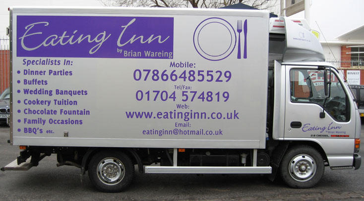
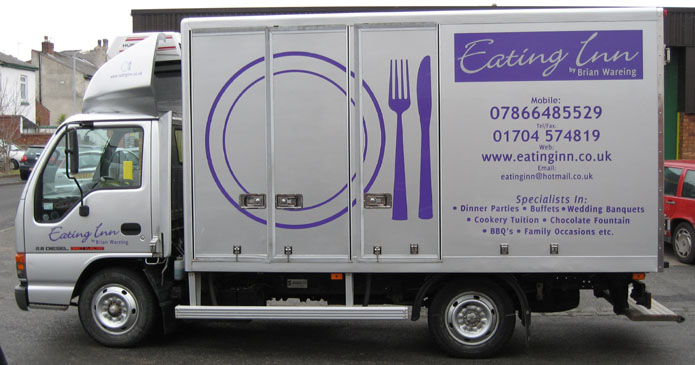
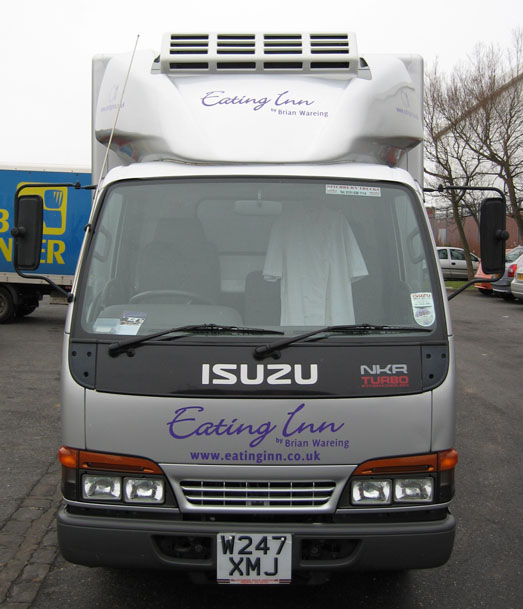
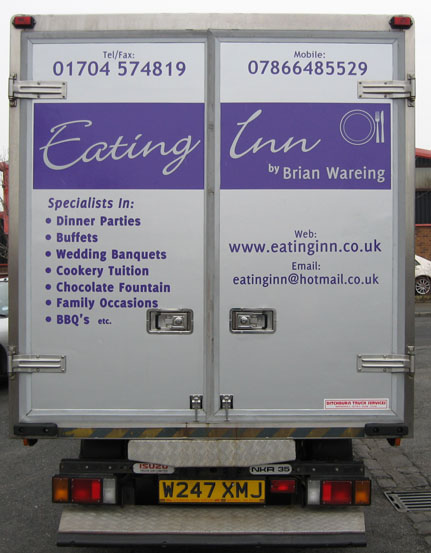
Posted by Kate and Danny on 8 February 2007 at 16:20Hi, Just thought we’d show an interesting way we decided to approach the problem of the doors on one side of this van. Overall we’re quite happy with this one, and Brian Wareing ( Chef Marcus Wareings brother ) was over the moon !!!
Dan
Karl Williams replied 18 years, 9 months ago 9 Members · 14 Replies -
14 Replies
-
i think you have done an excellent job of getting over the door problem and thinking in a different direction sometimes pays off, as in this case
well done
-
It looks fine to me, the design looks as if was ‘meant’ to be that way not cobbled together to avoid bits on the vehicle – good job.
Alan D -
I prefer the layout of the nearside of the vehicle and personally would have done both sides the same. Good job though.
-
quote Gary Robinson:I prefer the layout of the nearside of the vehicle and personally would have done both sides the same. Good job though.
me too, looks better balanced, I would have both sides like that too. 😀
-
like that and the colour, one minor crit on the drivers side I would have made the text a bit smaller and more spread out horizontally.(or should that be vertically) up and down in other words 😳 but good work Lynn
L
-
i prefer the graphics on the side 1 photo…as on the other side they are a bit too big and crushed, also the telephone number is almost bigger than the compnay name, which should be the other way around, nice job done though 😉
nik
-
quote Nicola Rowlands:i prefer the graphics on the side 1 photo…
nik
yep………… the nearside Nik 😀
-
quote Marcella:quote Nicola Rowlands:i prefer the graphics on the side 1 photo…
nikyep………… the nearside Nik 😀
how did you know i never knew what the nearside was…. :rofl: :rofl: 😳
nik
-
neither did I thats why I said drivers side 😛 what actually defines near side ? I thought it was the side nearer to you !!!!
sorry kate & Danny I didn’t start the hi- jackLynn
-
quote Lynn:neither did I thats why I said drivers side 😛 what actually defines near side ?
Lynn
- the side nearest the kerb. The other side being the ‘offside’.
-
Nice job! I can see why one side is different and I would presume doing it this way would 1, make the job easier and 2 stop the graphics disappearing over any gaps or recesses.
Karl.
Log in to reply.


