Home › Forums › Sign Making Discussions › Gallery › vehicle graphics: gilmartin
-
vehicle graphics: gilmartin
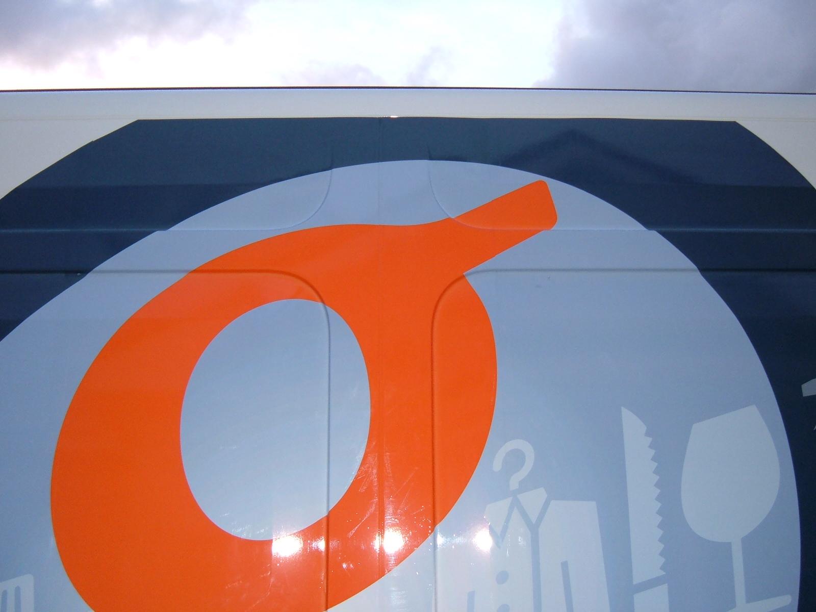
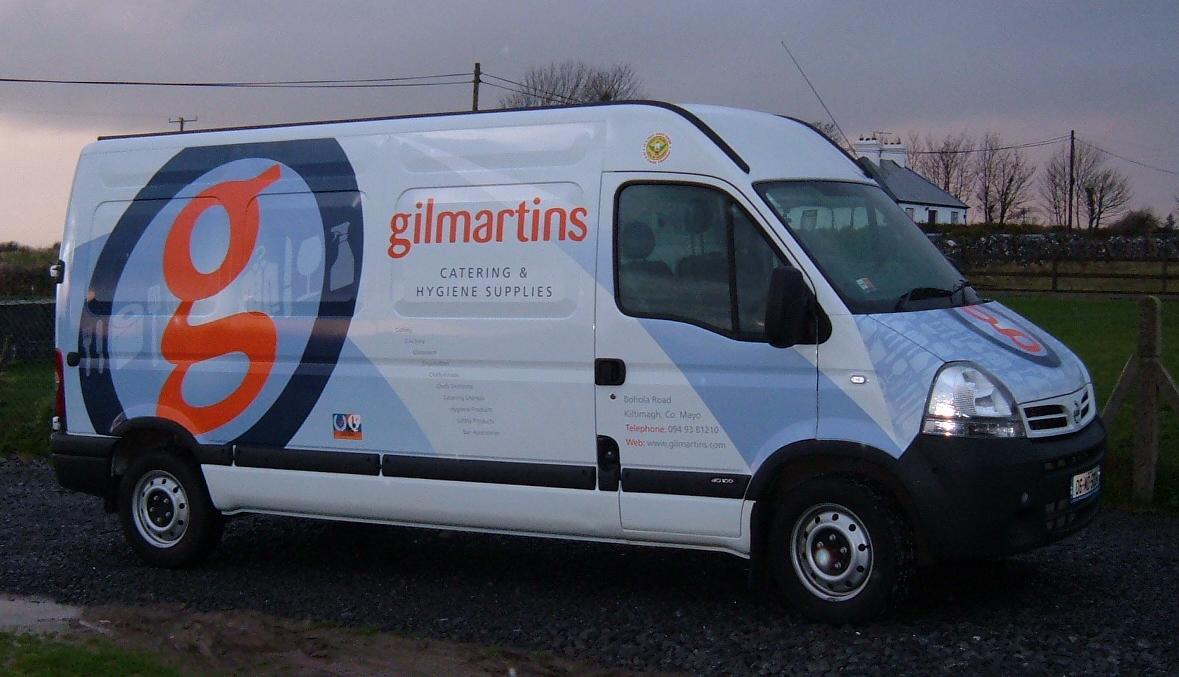
Posted by Russ on 15 December 2006 at 19:00Did this job about 4 weeks back
Attachments:
 Nicola McIntosh replied 19 years ago 7 Members · 8 Replies
 -
8 Replies
-

hi russ
good to see you back on the boards again mate… 😉 hope you have been busy!have to say i really like your design work. thats a few you have posted and they all seem tasteful, give required impression/impact but still dont go over the top… well done!
I am not sure if its just the picture but i think i can see some squeegee ghosting marks on the vinyl? (correct me if i am wrong) 😕
i hate getting these myself and they happen to us all.. heavy airborn dust landing on the van, then you proceed to rubb in after app tape has been removed can give these marks. (thats if you used app tape) as i said, could be wrong, as i am guessing from looking at the picture.thanks for taking the time to post your work mate. 😀
-

squeegee marks just me being a bit heavy handed, teeth sparking and ar$e cheeks clenched. No app tape just laminate. I have to add a friend of mine is the designer i dont have those skills.
Russ
-
:lol1: :lol1: well pressure will do it too mate :lol1: :lol1: :lol1:
keep that freind on tow mate… great tool to have in the box. 😉 (so to speak 😳 )
-

That is one of the best large format vehicle graphics I have seen. Too often they are far too busy, whereas that is very stylish and striking.
Nice one.
-

I like it russ, only critism is the "radiused list" is a bit to small. it would have been better to leave it off, same with the text on the door, the eye is not drawn to it, Just my opinion.
Was it a full wrap? or several bits combined?
btw, where ya bin?
Peter

Log in to reply.