Home › Forums › Sign Making Discussions › Gallery › pub signage: the tibury
-
pub signage: the tibury
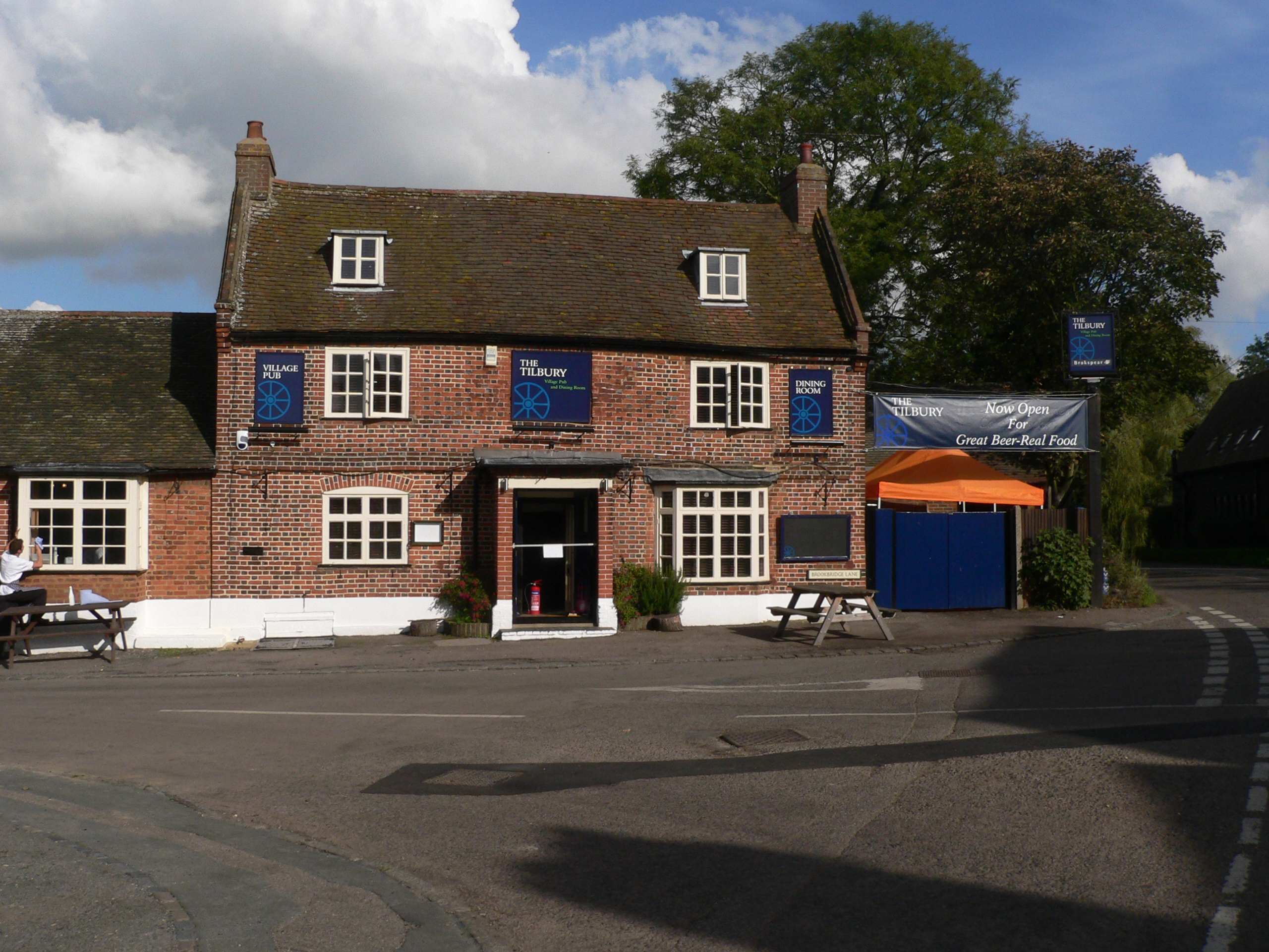
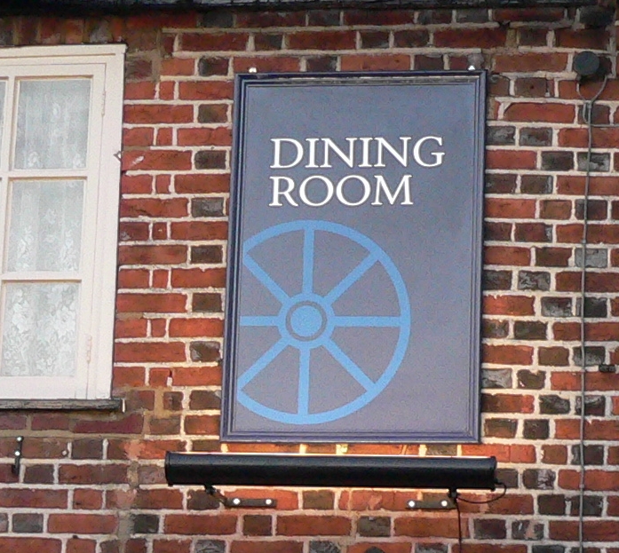
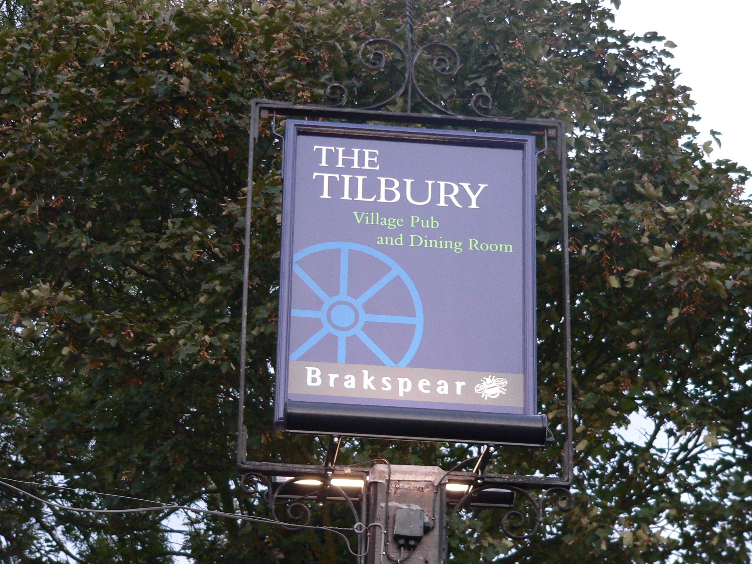
Posted by Peter Normington on 26 October 2006 at 22:38Did this recently. the artwork brief was "traditional contempory"
the boards on the pub were dibond, wooden frame and hand painted background in dulux weathershield then, sorry jill, vinyl graphics. I also made the swinging sign and banner, John singh did the interior brush work, will post a picture later.
Peter
Attachments:
 Bernardo Maldonado replied 19 years ago 8 Members · 8 Replies
 -
8 Replies
-

Very impressed with the work you did Peter
Had a very traditional look indeedParticularly impressed with the way you went about constructing the swing sign and the materials you used
Just think we ate our sandwiches out on the front
Blisteringly hot day – What is it with our weather? Freaky! -

nice one peter 😀 lynn was telling me all about them….they look great 😀
nik
-

Looks nice Peter, I wouldn’t have gone for blues but that’s just me. Great building, they just don’t build them like that any more.
You must remember to post a picture of the internal stuff, I don’t know if we’ve ever seen any of John’s work.
-

Actually Peter they do look great.
Vinyl is completely appropriate for contemporary signs.
I just wish you would have taken closer pictures.
Wow, if those walls could talk!
Neat place.
Love….Jill
PS
Now please show us some of John’s brushwork! -

Nice job Pete. Well done. I’m with Andy on the colour, but just my preference 😕
-

Thanks for the comments all. the colours were corporate so no choice,
We also fitted the trough lighting. The worst part of the job was getting the lights and signs to look level, if you look closely the pub is sinking at one end!Here is a closer view.
The swing sign I made from a routed timber frame, with a 25mm foam filled fibreglass panel.I will get some pics of Johns stuff next time I am passing, he was still hard at work when I left the job!
Peter
Attachments:
-

nice work i like the look of the pub looks like you get some good grub there. i agree on the colors too. i think that the color blue is generally avoided in the gastronomical branch when it comes to grafics. its too cold while the warm colors give you that cosy feeling you need to digest your food. but there you go customer´s the king as germans say. (der kunde ist könig). nice one.
bernardo

Log in to reply.