Home Forums Sign Making Discussions Graphic Design Help how can i layout this van to be read properly?

  • how can i layout this van to be read properly?

    Posted by Richard Urquhart on 7 October 2006 at 16:52

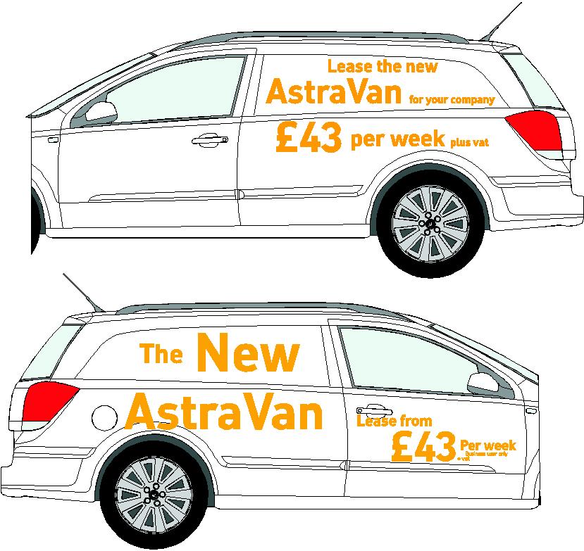
    hi all im having real problems getting this right for my customer

    font is as and cant be changed !!
    colour can !
    i have dont lots of designs and the top one is my last after the bottom one was again too messy !!!

    the text has changed from the one in the bottom pic to the one in the upper
    i have cut part the car off so as not to post one of brians outlines on here
    and changed dimensions on the car

    but if any one is not happy please delete this post as i dont wnat to cause any probs but as you can see im getting stuck

    ok so can any one come up with a better way of laying text out better than the one in the top pic

    thanks rich

    mods let me know if i can post the ai for the above


    Attachments:

    Richard Urquhart replied 19 years ago 3 Members · 3 Replies
  • 3 Replies
  • David Rowland

    Member
    8 October 2006 at 11:28

    twist it over the bonnet, is this going to be parked for front on advert or side?

  • autosign

    Member
    8 October 2006 at 12:03

    We do a lot of this type of stuff. I would make the pricing details the main focus. People can see it’s an Astra van so get the £43 much bigger.

    (mod-edit)

  • Richard Urquhart

    Member
    8 October 2006 at 15:22

    well thanks for the help
    but this customer is hard to work with

    at first the point in this was THE NEW ASTRA VAN
    then the payment was added

    any way i will have a play thanks i always make the payment stand out as that’s what we want the customer to see just working with vauxhall i guess

Log in to reply.