Home Forums Sign Making Discussions Graphic Design Help need a new design for layout would anyone have suggestions?

  • need a new design for layout would anyone have suggestions?

    Posted by Brian Maher on 13 September 2006 at 15:04

    hi all,
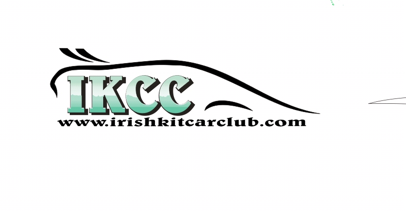
    i have to give the attached logo a bit of a kick in the A***,
    its for the Irish kit car club, and as a member its kinda expected to be a freebie….

    one of our memebers came up with the original back at the start but its a bit dated and doesnt look well on t-shirts etc when embroidered…

    the idea was not to show a specific type of kit car…

    my effort is a bit more colourful, needs a bit of tidying up,
    it would be fine on screenprinted shirts but not for stitching….
    plain text is also not good enough,

    any suggestions would be appreciated

    cheers

    brian

    Brian Maher replied 19 years, 1 month ago 3 Members · 11 Replies
  • 11 Replies
  • Hugh Potter

    Member
    17 September 2006 at 21:27

    i mght well have a quick stab at this, i like doing car stuff ! if not too late of course ?

  • Brian Maher

    Member
    17 September 2006 at 21:33

    cheers hugh….. never too late…. 😉

    just need something simple for t-shirts/ hats…that can be embroidered,

    still havent got anything else myself..

    thanks

  • Hugh Potter

    Member
    17 September 2006 at 22:13

    had you thought about using a shamrock sillhouette as opposed to the diamond in the background, or is that too cheesy ? it was my first thought.

  • Brian Maher

    Member
    17 September 2006 at 22:18

    :lol1: hugh…shamrock would possibly be ok,… no rules on this one..

    thanks

    brian

  • Hugh Potter

    Member
    17 September 2006 at 23:03

    ok, real quick effort, i know the cars are wrong, but this was the kinda thing i was thinkin.

    i think the space could be better used though !


    Attachments:

  • Hugh Potter

    Member
    18 September 2006 at 08:37

    now i’m awake again, i dont think i like it !

  • Darren Mooney

    Member
    18 September 2006 at 08:45

    I’d recommend a bit less detail if you’re designing for embroidery, the small cars will cause a bit of a prob, small writing could be a prob also…could you use the outline of a shamrock maybe, then inside a single kit car, with the text along the side of it? when you lay down a background colour like the diamond or the shamrock with a fill you’re making the shirt stiffer already, then when you lay a car, then another layer of text over that again that part of the shirt is rock hard, then when it’s washed you could end up with the t shirt shrinking and the logo buckling up nicely! just a few thoughts!

  • Hugh Potter

    Member
    18 September 2006 at 09:26

    lol, i forgot about the embroidery, i guess simple is better then, perhaps more along these lines ?


    Attachments:

  • Hugh Potter

    Member
    18 September 2006 at 09:35

    slight variation…


    Attachments:

  • Darren Mooney

    Member
    18 September 2006 at 09:41

    I think that looks pretty cool… for embroidery you’d use a solid fill, and might lose the shadow tho..

  • Brian Maher

    Member
    18 September 2006 at 17:14

    hugh…thats the kinda thing i reckon could work…looks great

    as darren says we need to keep the colours solid…..

    got me thinking again now..

    cheers guys

Log in to reply.