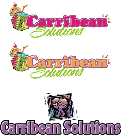
Home › Forums › Sign Making Discussions › Graphic Design Help › help please need text layout to read a bit better?
-
help please need text layout to read a bit better?
Posted by Richard Urquhart on 29 June 2006 at 19:52hi all hope all is good
one question its an easy one first thing that come into your head about this text layout??????
Richard Urquhart replied 19 years, 6 months ago 9 Members · 16 Replies -
16 Replies
-
-
-
nic sitting here copying from the piece of paper given to me by the customer its his business and your correct its 2 bs isnt it
-
one r gosh how bad is that
how funny is that the guy is Caribbean and he spells it incorrectly -
Your thinking of CarrieBean :lol1:
You have spelt it right.
So when you think of it, tree, boats, sun and sand. Although it is cuisine and food, so maybe the CS linked idea looks professional in gold onto black menus etc. Maybe just explore some fonts
-
Rich I liked the top one better (with correct spellings) and the addition of the tree it had nice flowing lines.
Lynn
-
OK i will work some more on this i can see it going pear shaped as the guy I’m working for is hard work he now wants clip art of a chef with out sounding rude but this guy has no taste and I’m going to have to put my foot down i think if my name is going to be linked to this job
thanks rich
if any one comes up with any ideas then feel free
rich -
Phil that is very sweet i like it
i need to see the customer and see how much i can extract from him but nice work
i would like to keep it cut vinylbut i bet i would not be saying that if i had a printer
still if i can get the customer to spend some more money I’m sure john and rainbow will print for me
thanks Phil -
Hi Rich
quote :but i bet i would not be saying that if i had a printercant you crack it on the P60?
John
-
-
re print on pc 60
no mate too big for that and would be cheaper to sub outthanks for all the other ideas im seeing the customer some time today
will see how we get onmany thanks for the input its a great help
rich
Log in to reply.


